One Kenmore Square | 560 Commonwealth Avenue | Kenmore Square

i agree. We don't need it to be traditional brick, terra cotta, orange or concrete. but of traditional pale, pinkish, beige limestone or granite, i was simply borrowing it generally for the more traditional massing as an alternative to the garish, awkward thing currently proposed.
 
i agree. We don't need it to be traditional brick, terra cotta, orange or concrete. but of traditional pale, pinkish, beige limestone or granite, i was simply borrowing it generally for the more traditional massing as an alternative to the garish, awkward thing currently proposed.

Opinions are always subjective, but a lot of folks feel the design and massing of this building is far more conscious and respectful to its surroundings than the BU Stack of Books building plunked down up the street.

.
 
Last edited:
^^as well they should. That is a matter of really not very good vs fucking terrible. Don't forget; they can fix the Pierce's [mechanicals]. With 380 Stewart St & Lendlease's design for Winthrop Square, the cool factor might wear off--and you're stuck with it. With BU's computer science bldg, there's no risk of that. An asston of people will hate it before it's halfway up.
 
Opinions are always subjective, but a lot of folks feel the design and massing of this building is far more conscious and respectful to its surroundings than the BU Stack of Books building plunked down up the street.

.

How so exactly? As you've stated, opinions are pretty subjective about both of these buildings. I personally find both visually interesting and will add to the vitality of Kenmore / BU, will increase pedestrian level street activity, and are replacing underutilized lots.
 
^^It's been pointed out over and over on dozens of projects: that's not good enough. This isn't Houston or Hartford--it's Boston. No one's ever argued any of these projects would not revitalize x part/s of such neighborhoods.
 
It's not clear what is being argued other than that these projects would look great at the turnpike.

While it may not be your preference, that doesn't mean "its not good enough."
 
How so exactly? As you've stated, opinions are pretty subjective about both of these buildings. I personally find both visually interesting and will add to the vitality of Kenmore / BU, will increase pedestrian level street activity, and are replacing underutilized lots.

I like this building, but to your point: architecturally interesting buildings detract from vitality far more often than they add to it.
 
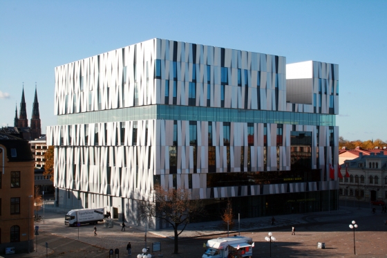
Case in point, the Uppsala Concert Hall in Sweden. A beautiful building, set back from the street in an almost condescending way and is surrounded by crummy post WWII euro blocks. It makes the surrounding area look worse.

henninglarsen_uppsala_concert_congress_hall1.jpg


I like this building, but to your point: architecturally interesting buildings detract from vitality far more often than they add to it.
 
Not to get too off topic but a good example of this right here in Boston is the Federal Reserve. The tower itself is fantastic, but the entire block is a dead-zone (or at least, a "pass through" zone) because of the overall aloofness of the complex.
 
However, One Kenmore is not intentionally setback from the square, it is proposing to actually enclose the square with better pedestrian connectivity. It is also not a standalone government or civic building that’ll sit idle like Uppsala concert. The ground floor retail and promenade is certainujg an improvement over the current design.
 
I like the BU tower, Kenmore, and Fenway center tbh and cant wait for them to be built and add a new cluster here. Theyre all pretty extreme and outside the box for Boston and I think we need that sometimes. At the same time theyre not big enough to really mess anything up for the people who dont like them either. Build em!
 
How so exactly? As you've stated, opinions are pretty subjective about both of these buildings. I personally find both visually interesting and will add to the vitality of Kenmore / BU, will increase pedestrian level street activity, and are replacing underutilized lots.

Fair question.

Once again, the architecture is subjective - - be that as it may - I like both buildings' architecture. The separation occurs in the next two points:

Second, 560 Comm is well shaped to its lot - - jutting into Kenmore Square and providing a larger sidewalk/plaza. Moreover and it took great pains to improve the crosswalk/safety of its area.

Third, the rounded shape of the point area converses with and actually ACKNOWLEDGES the existence of the 3 other rounded shaped buildings around it in the square - - it is contextual. It's not posing - - it's conversing.

#1 - - is purely subjective, and there are those that like the architecture of the Stack o' Books also - that's cool. I do too.

#2 and #3 - Stack o' Books doesn't seem to care about what's around it - - it only says "Look at me!!"

The developer of this 560 Comm Ave building cared about PLACE. Streetlife around Kenmore will benefit from it. I can't see the same benefits occurring from the Computer Building up the street. I like the Paul Pierce buildings (good teammate, made those around him better) over the Antoine Walker buildings (once you passed it to him it never came back). How a new building can improve its area. It's why I love that Converse HQ building across from the Garden. Not just because it's a great building, but also because of the transformative boardwalk/connecting walkway in front of it that improved the walkability, life of the area. Same with Rowes Wharf - - its greatness lies not just with its architecture but what how acknowledges its location and actively improves it.
 
Last edited:
Edited to remove a childish comment. Don”t drink and post :lol:
 
Last edited:
Odorous - didn’t you cream your jeans over the absurd cactus proposal a 1 Bromfield. You have no credibility to criticize any architecture after that laughing stock. Stick to counting inches of elevation. This proposal is out of your league.

Cream your jeans?
Good grief.
 
George I know you have been nominated by a couple of posters and I hope you become a moderator.

Thanks. Just calling it like I see it. Not trying to audition for the role 😊

I've never really appreciated posts that have no purpose other than smacking down another user...

To get back on track here, it sure is an interesting design. It's definitely different that what I expected and will be interesting to see how the design evolves through the process. This strikes me as one that could get really trashy if it's VE'd too much...

I don't disagree, but I'm not sure you hire Jeanne Gang to VE her...
 
I don't disagree, but I'm not sure you hire Jeanne Gang to VE her...

Nope ... you would have done your research and understood the premium you get with hiring a Name. Now ... BCDC will have not reason to not want to change things .. .and the neighborhood with pull their typical shenanigans so i doubt that we get what is being rendered here.

Truthfully I would like to see one more level of sophistication here. Its pretty one-liner-y to me.

cca

cca, as a non-architect I always enjoy learning from your perspectives. As an engineer, I feel I can often relate about the reality of optimization-within-constraints when facing client & stakeholder needs/demands.

So, when I read your "like to see one more level of sophistication" and "it's pretty one-liner-y to me" critiques, I feel they connect with what I'm feeling, but not sure...
So here's my take: this thing does not do a graceful enough job accommodating the fact that the client wants a certain large amount of square footage...yet is constrained by parcel and cost...so the thing has a pretty obvious reverse taper (fatter at the top)...and has a bunch of (admittedly cool) texture to try to deal with its top-heaviness.

But, to me, you can read it like a book: client wants X, architect proposes Y to deal with X.

To me the design screams "trade-off" as opposed to grace.
 

Back
Top