Photo of the Day, Boston Style - Part Deux

Status
Not open for further replies.
That picture makes me realize how lame the facade modulation is on the Brigham addition.

EDIT: I see it was done to symmetrically harmonize with the original portion, but in today's state it just looks ungainly.
 
img0825zx8.jpg
 
This was taken today. Poor tree is all sorts of confused..

 
^that is a funny image. I didn't even notice the backwardness of it until I took a second glance. :eek:
 
Since when did the South End become a body of water? :wink:
 
I don't know what the hell's going on in that, but it's sick. Nice, Bowwest.

And this, this is sick in the bad way. Talk about a botched facelift.

 
kz1000ps said:
I don't know what the hell's going on in that, but it's sick. Nice, Bowwest.

And this, this is sick in the bad way. Talk about a botched facelift.


Is that the corner of Beacon and Fairfield? How were those people allowed to basically destroy that building? Remember the couple that didn't have the right kind of window in the South End? I'd say this is a little worse. Aren't there historical preservation laws that prevent this kind of thing?
 
Actually Bowwest, the building is on Marlborough midblock between Gloucester and Fairfield, and going by this Local Live image (the white building in the middle), the facelift is a whole lot btter than what was there before. Apparently those hideously undersized windows are holdovers..

 
Oh I see. I thought the original building was identical to the one next to it.

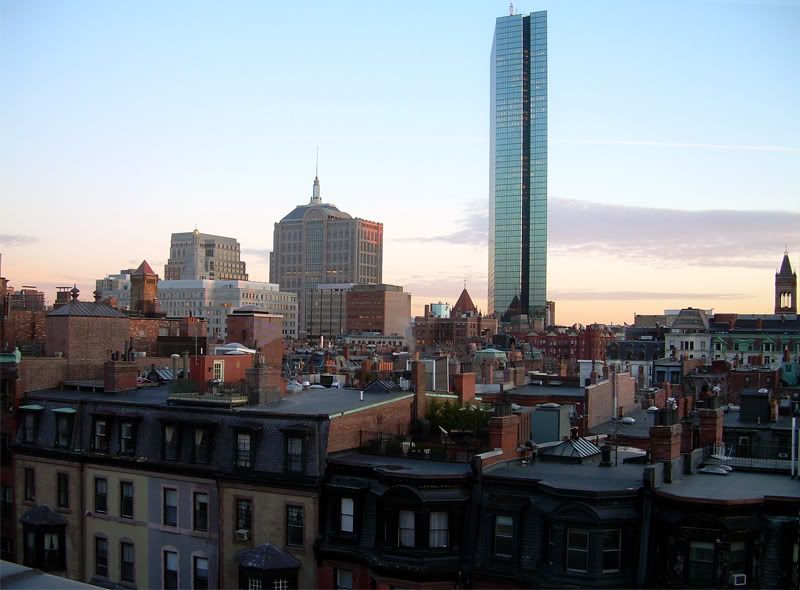
img8627po2.jpg
 
Status
Not open for further replies.
Back
Top