Pierce Boston (née The Point )| Boylston St/Brookline Av | Fenway

I like this building from the front, from the sides, it's kind of awkward. I would like it a lot more if they didn't use the gray panels and had it all glass. It looks a bit sloppy to me.
 
I like this building from the front, from the sides, it's kind of awkward. I would like it a lot more if they didn't use the gray panels and had it all glass. It looks a bit sloppy to me.

agree about the awkwardness from the sides, though instead of the gray panel lines, i wish they stuck with the white panels used on the front throughout the rest of the structure
 
...instead of the gray panel lines, i wish they stuck with the white panels used on the front throughout the rest of the structure

I agree with this. Originally there were supposed to be gradients from light to dark. Once they eliminated those, it is rather jarring to see it just change from white to gray. They should have stuck with one color, and the white looks better.
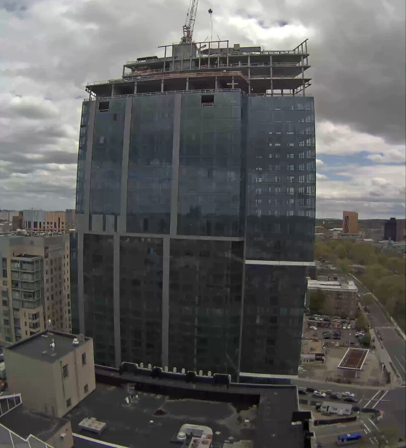
 
Framing for the crown/parapet is (finally) going up as of today.
 
I agree with this. Originally there were supposed to be gradients from light to dark. Once they eliminated those, it is rather jarring to see it just change from white to gray. They should have stuck with one color, and the white looks better.

Agree that white would have been better, but from all the renders I see, they were all a single gradient of gray on the sides. Where's the source for the gradient plan?
 
Re: The Point (Boylston/Brookline)

Gradient from the PNF.

8476300425_2e4bd97ddb_b.jpg
 
The spandrells and vertical opaque panels are much more apparent in that render. I like it a lot more than in reality which is a glazed panel with a solid behind it. Maybe it's the thin horizontal stripe midway up the facade that bugs me. Without the other horizontal elements and the vertical metal paneling not aligning, it feels very sloppy. Again, just my opinion.
 

First off I'm quoting this pic onto the next page because it's such an excellent view. To those of you interested, make sure you view it larger in flickr! Also, the rest of KentXie's Boston aerial set (as well as Seattle, as well as the brand new ones he just posted) contain some really fantastic shots.

With that said, below is the view right now (Monday, 5/8, at 12:40), taken from the webcam. As Downburst already mentioned, the framing for the top is finally going up!
Webcam link: http://www.birchcapital.com/eb-5/pierce/feed-updates/

Capture by David Z, on Flickr
 
The cage thing is almost up. Here's a screenshot of the webcam from just now, ~5:08 on Wednesday, 5/10.

Capture by David Z, on Flickr
 
I haven't seen the progress in person in a good while (full disclaimer), but at least from the pictures here, it seems that the gray vertical stripes would have looked much better had they been in white.
 

Back
Top