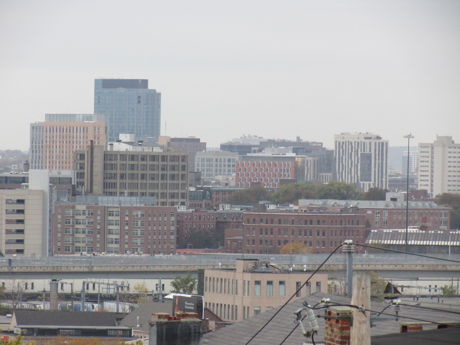
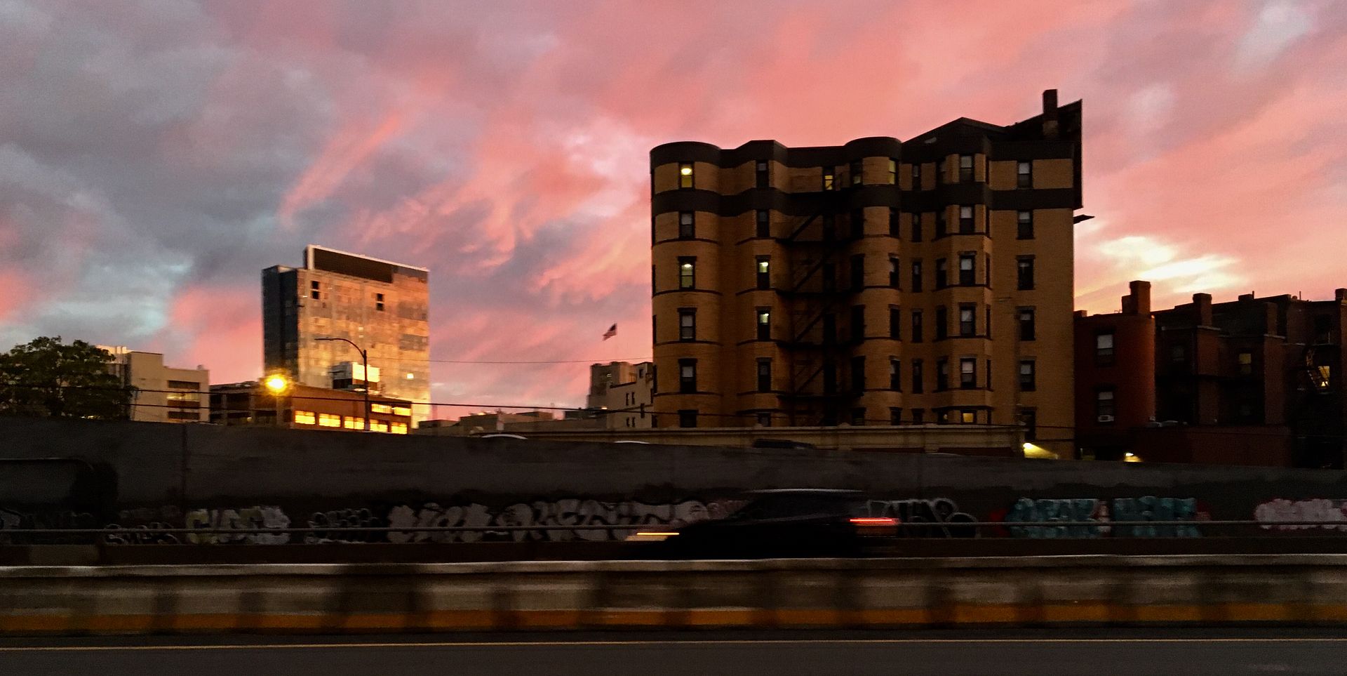
Pierce Boston (née The Point )| Boylston St/Brookline Av | Fenway

Its still the law. The building follows the law. What else do you imagine was going to happen?

The law protects the adjacent properties legal development rights, physical protection, and sets up clear expectations of what may happen in the future. The owner knew that this would be the result when they bought a zero lot line property.

I still don't get why everyone is so upset ... its the natural result of the legal constraints of building in an urban environment. It ain't the suburbs where every side of the building is the front.

cca

Not to mention, as blank walls go, that one really doesn't look that bad. Compare it the blank wall next to the Skanska development, for example.
 
Hummm.... 45 Province's blank wall is on the alley, Chapman Place. it is not on a property line. There is no abutting property to protect. What law forced the blank wall on an alley?

picture.php

Look friend. I was not the designer but I have designed buildings with this exact condition. If I had to guess I would say that that is a private alley which is not a public street. That the alley has a property line either on the 45 Prove side or right down the middle. Either way they fire code and building codes dictate that fire separations of roughly 30 from an ajacent property line must be maintained and that any part of the building inside of that must be fire rated.

No one makes a wall like that unless they are forced by code. It is not rare .. it is not strange and it is not bad design. It might be ugly but call it what it is. It is a result of code and laws. That's all.

cca
 
No one makes a wall like that unless they are forced by code. It is not rare .. it is not strange and it is not bad design. It might be ugly but call it what it is. It is a result of code and laws. That's all.

cca

They could have left it red like the rest of the building. There was no law saying it had to clash with, and be radically different than, the other 3 sides of the tower. It looks like shit because they chose to make it look like shit.

DZH22
 
They could have left it red like the rest of the building. There was no law saying it had to clash with, and be radically different than, the other 3 sides of the tower. It looks like shit because they chose to make it look like shit.

DZH22

That is a money choice. What is there is cheap ... and likely thought of a temporary because if an adjacent building is every built up close that material becomes buried behind another building.

I am not arguing that it is beautiful, I am arguing that it is not a bad design choice with the given criteria, and if the owner does not want to spend money on a wall that might be valueless in a few years ... that is a design criteria.
 
Nx45Ija.jpg

Our great, great, great, great grandchildren will be long dead and buried before any of this block is razed and replaced with a tower.
I agree that the was probably the best the architect could do within code with the budget they were given, but I'm sure had the developer opened their wallet to dress up a wall that we all know will be visible for the next 100+ years, the architect could have done much better while staying within code.
 
Am I the only person who doesn't give a flying fuck about this stupid blank wall? How many threads has it been discussed in?

STAHP
 
Am I the only person who doesn't give a flying fuck about this stupid blank wall? How many threads has it been discussed in?

STAHP

Welcome to the internet where people talk about things that you might not be interested in.

We will take this to PMs.

cca
 
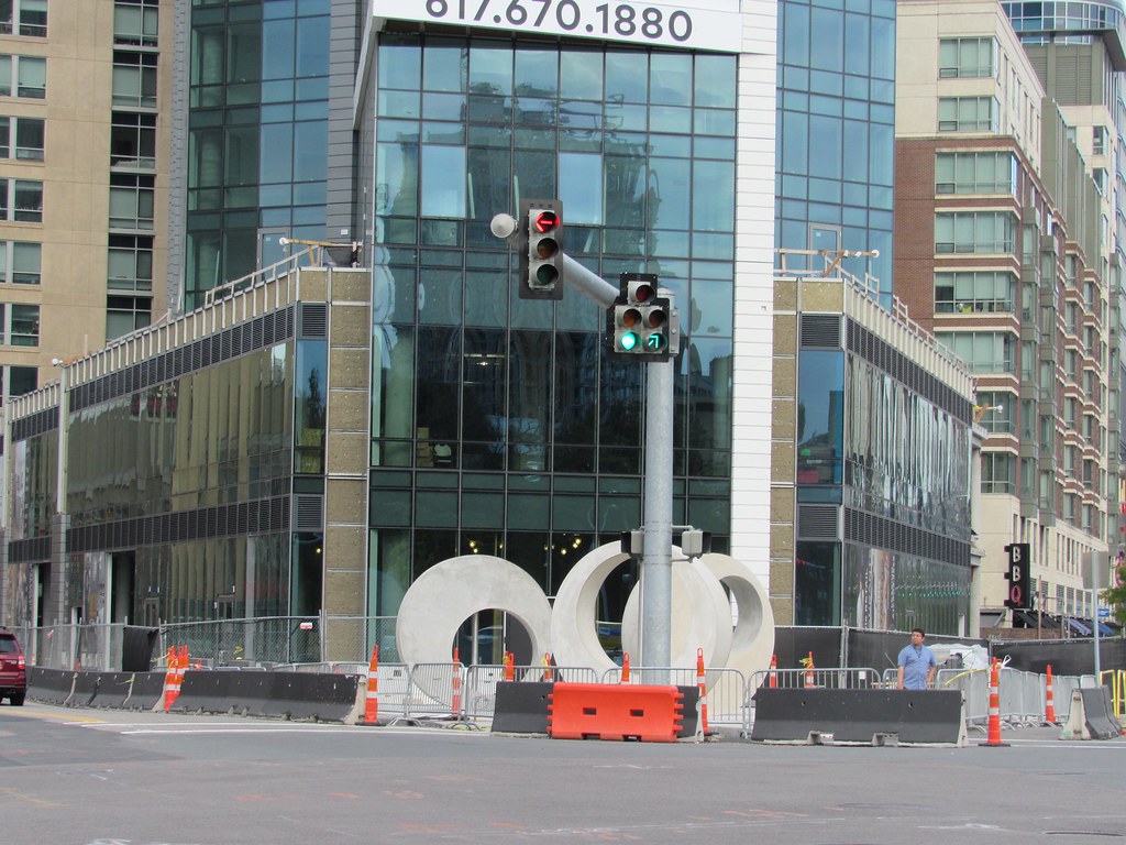
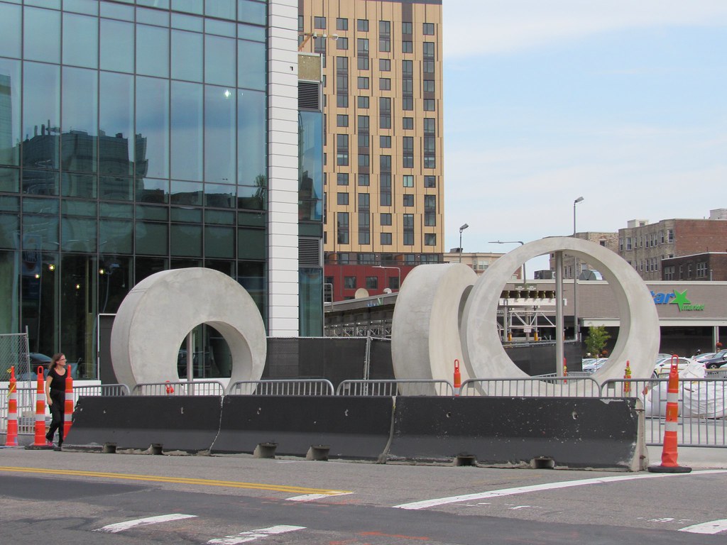
Looks like there are now renderings of the public art going up in front of this building:

Y0qHYTU.jpg


kqaCLSM.jpg


The art is by Brazilian artist Alexandre da Cunha. Source.
 
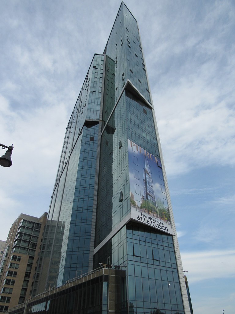
No but seriously what happened to the top

8476300425_2e4bd97ddb_b.jpg


Point-2.jpg


almost every building gets 10-20 appropriate floors sheered off.

i'm at a loss to understand the malevolence that results in such ugly building.

we lead the world in this garbage.

by contrast, the scale of highrise construction planned in (Los Angeles) is astonishing.

LA's current and future scale of building shouldn't be dwarfing Boston by this much.
 
Last edited:
^It's rather disingenuous of you to make a statement like that when the images you posted- of the original proposal, no less- depict a shorter tower than what we ended up with.
 
^^Indeed; a pleasant and much-welcomed example of planning for the future housing demand... *If it weren't for Martin Walsh's common sense approach the status quo might have been preserved.

But, it's still just fits and starts; short sighted, apologetic planning still rules much of the City; **(West End w/ several lowered towers..... 45 Worthington, and also 2 Charlesgate W which should (both) push toward 450~500') We will look back in a few years at so many opportunities for a stunning mix of architecture, height, density and desperately needed revenue (lost).

We laud a mix of height as the best way towards preserving the character Boston's neighborhoods, and still function as a modern (inclusive) City. The New York Streets (the best example) probably should have waited 5~10 years, and demand to mature, then got closer to the maximum 300'-325'. There are too many other parcels.

And the South End nimby's.... what legal recourse do they possess to hold back common-sense + BOLD planning in that part of Boston. It isn't Brookline.

Of all places, (it's actually current planning in LA) that's convinced me; a city with such limited land resources has to plan better and smarter than what we've seen (even) in the recent past.

i fear a half dozen cities starting to pull away from Boston in the future (15-20 years from now); when we might have trouble offering the capacity to attract the next Amazon/s.
 
Last edited:
The pierce actually had height added at the end of the process and then was pushed through. Theres buildings that make this argument, but not this one.
 
Ugh, that top.....

Agreed, the top looks pathetic, but the rest of it ain't so great, either. If it were in the midst of a bunch of other buildings of similar or greater height, it'd be OK filler, if rather meh. But it's actually in a location that cried out for something excellent and iconic; for its context, this thing came out a dud.
 

Back
Top