stick n move
Superstar
- Joined
- Oct 14, 2009
- Messages
- 12,078
- Reaction score
- 18,845
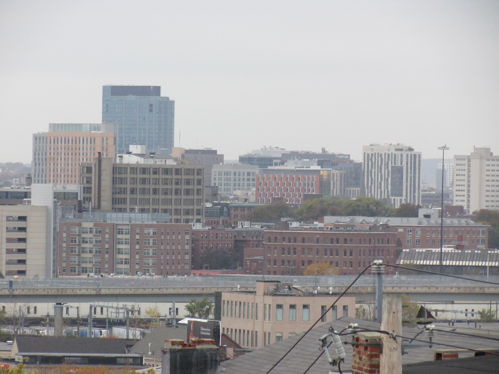
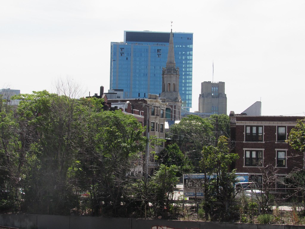
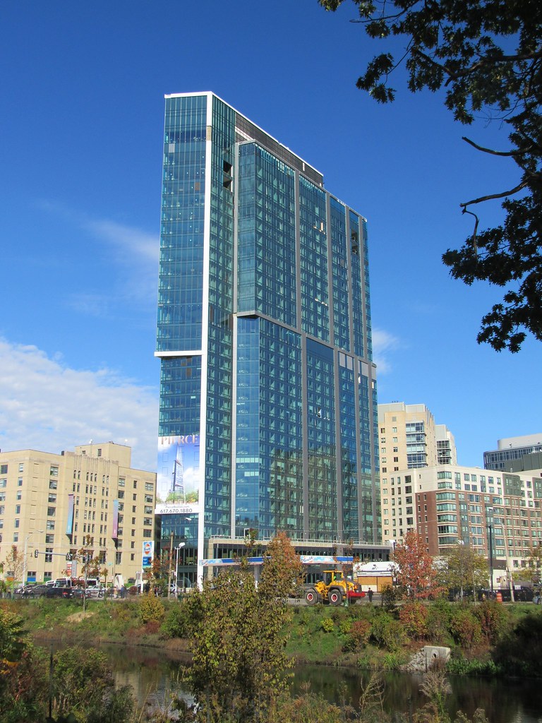
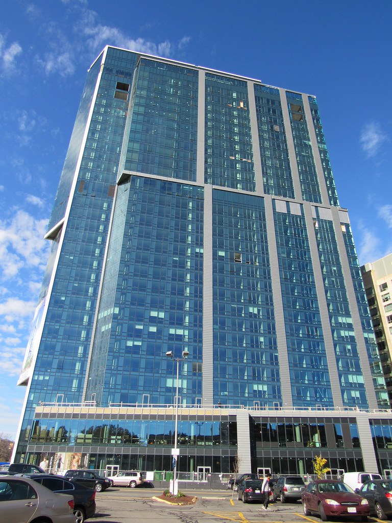
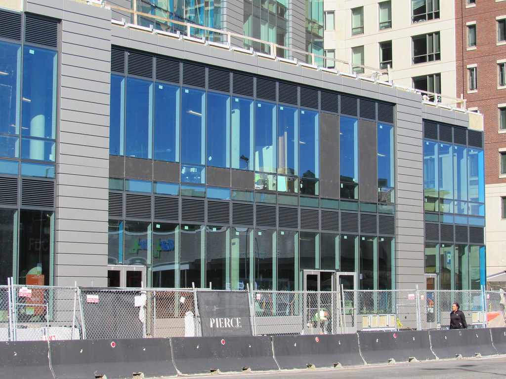
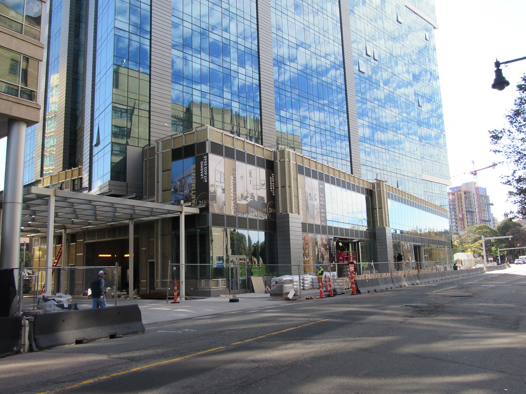
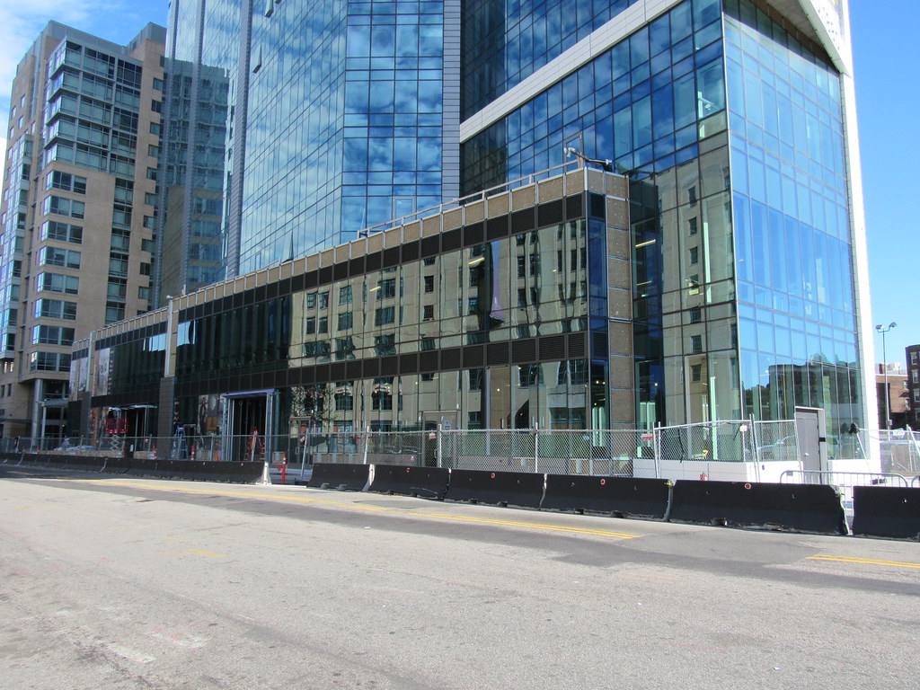
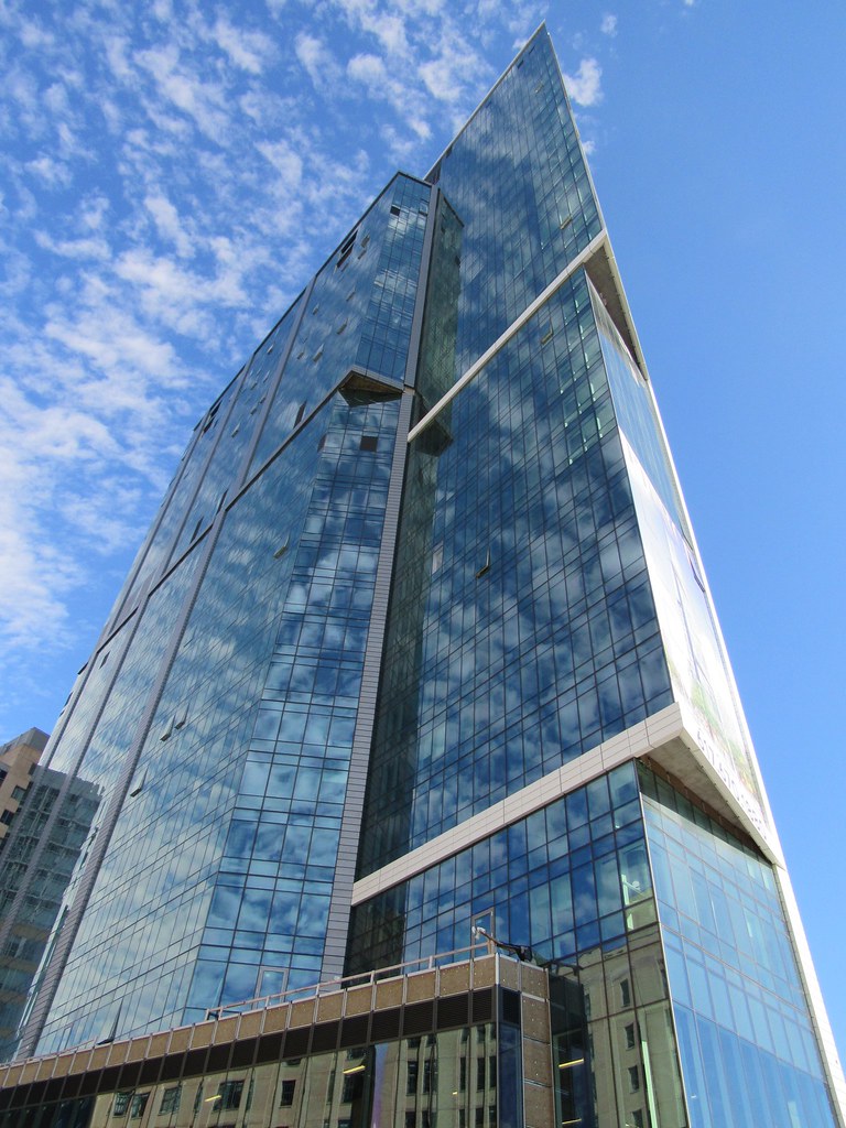
I like it. I know that were people that take time out of our days to post on a forum about architecture in Boston so we pay way more attention to things than your normal person, but just looking at this from your everyday civilian lense I think it looks good. Its interesting how its situated on the corner the way it is, its non offensive- use this facade and you cant really lose- reflective blue glass, ground floor retail, not huge but for the area it dominates, and it pulls the skyline westward. Yea they used grey where they should have used white and that black part on the crown isn't the Chrysler building.....overall this is a success and I think to 99% of people including myself it looks perfectly fine and effective.

