You are using an out of date browser. It may not display this or other websites correctly.
You should upgrade or use an alternative browser.
You should upgrade or use an alternative browser.
Quaker Lane + Congress Square | Downtown
- Thread starter 12345
- Start date
atlantaden
Senior Member
- Joined
- May 31, 2006
- Messages
- 2,606
- Reaction score
- 2,748
Re: Fidelity's HQ may go high
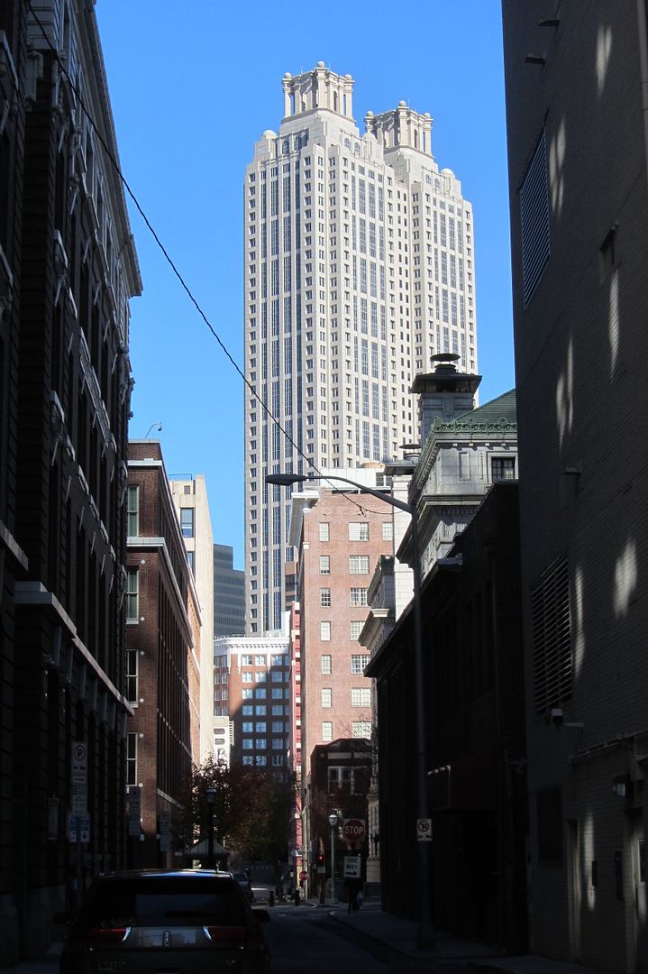
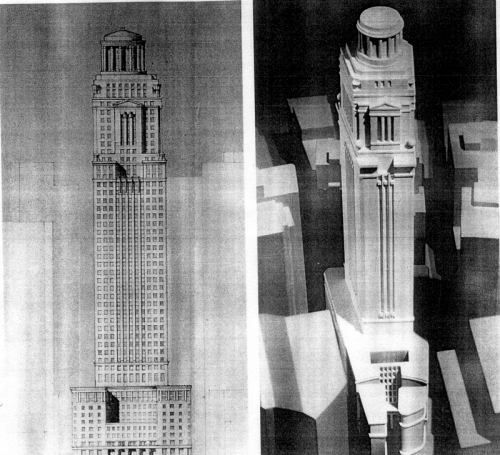
Looks like something Philip Johnson would have designed! There's a tower where in Atlanta that has a double cap almost identical to the single cap in the renderings that appear side by side!
Looks like something Philip Johnson would have designed! There's a tower where in Atlanta that has a double cap almost identical to the single cap in the renderings that appear side by side!
Equilibria
Senior Member
- Joined
- May 6, 2007
- Messages
- 7,086
- Reaction score
- 8,324
Re: Fidelity's HQ may go high
Fidelity selling the site isn't the same as moving away. They may just be divesting themselves of responsibility for the site to give themselves flexibility and consolidate costs. I wouldn't be so sure that their offices won't stay on-site, just in a taller building.
For comparison, State Street doesn't own One Lincoln, even with their name on top.
The 400' limit is the city zoning guideline, I bet. Given that towers proposed in Boston have generally been in the 500'-650' range (Filene's, Copley, etc.) I'd expect something like that proposed here, with a request for a variance. This is basically the same place as TNP with respect to the FAA, so if they set an 800' ceiling for that building one could expect the same for this site. Again, I don't think they go that high.
Did you even read the article?! Fidelity is SELLING the building. By definition, there will not be Fidelity-advertising sign placed on top of whatever gets developed there.
(Not only that, but Fidelity, though "Boston-based," of course, is famous for having sent thousands of jobs out of state to RI, etc., making your misplaced aspiration even more ironic.)
Fidelity selling the site isn't the same as moving away. They may just be divesting themselves of responsibility for the site to give themselves flexibility and consolidate costs. I wouldn't be so sure that their offices won't stay on-site, just in a taller building.
For comparison, State Street doesn't own One Lincoln, even with their name on top.
The 400' limit is the city zoning guideline, I bet. Given that towers proposed in Boston have generally been in the 500'-650' range (Filene's, Copley, etc.) I'd expect something like that proposed here, with a request for a variance. This is basically the same place as TNP with respect to the FAA, so if they set an 800' ceiling for that building one could expect the same for this site. Again, I don't think they go that high.
- Joined
- May 25, 2006
- Messages
- 7,034
- Reaction score
- 1,865
Re: Fidelity's HQ may go high
Tall and thin? Someone call Frank Gehry, this might be a great place to show off.
Tall and thin? Someone call Frank Gehry, this might be a great place to show off.
Re: Fidelity's HQ may go high
Devonshire has the best canyon in the city so my biggest concern is that the new project somehow detracts from this effect rather than add to it.
This is the building that you speak of. A real stunner on that skyline if you ask me.

Devonshire has the best canyon in the city so my biggest concern is that the new project somehow detracts from this effect rather than add to it.
Looks like something Philip Johnson would have designed! There's a tower where in Atlanta that has a double cap almost identical to the single cap in the renderings that appear side by side!
This is the building that you speak of. A real stunner on that skyline if you ask me.

czsz
Senior Member
- Joined
- Jan 12, 2007
- Messages
- 6,043
- Reaction score
- 7
Re: Fidelity's HQ may go high
Why would Gehry (or any starchitect) want to build something that would just be dwarfed and encased in the rest of the skyline?
You know whatever rises here will be boring, because it's only the nonprofit sector that builds great things in Boston these days (or maybe ever?)
DZH - that might be the most "urban" shot of Atlanta I've ever seen...almost thought it was somewhere in the Northeast before reading your post...
Re: Fidelity's HQ may go high
Look at photo of the day because I posted a "density" shot of Atlanta as an example. The downtown part is actually pretty dense and urban. It gets its bad name from midtown since that basically only has 1 main street and has the towers in the park feel.
DZH - that might be the most "urban" shot of Atlanta I've ever seen...almost thought it was somewhere in the Northeast before reading your post...
Look at photo of the day because I posted a "density" shot of Atlanta as an example. The downtown part is actually pretty dense and urban. It gets its bad name from midtown since that basically only has 1 main street and has the towers in the park feel.
- Joined
- Sep 15, 2010
- Messages
- 8,894
- Reaction score
- 271
Re: Fidelity's HQ may go high
Honestly, that PoMo "thing" has more detailing and care in that facade than pretty much all of the buildings built recently (80s and on) in Boston. I'd much prefer getting that PoMo stump with the random Parthenon/Pantheon fusion on the top to this:

by world-renowned OMA in China. They just won the competition today.
<Begin flaming...>
Honestly, that PoMo "thing" has more detailing and care in that facade than pretty much all of the buildings built recently (80s and on) in Boston. I'd much prefer getting that PoMo stump with the random Parthenon/Pantheon fusion on the top to this:

by world-renowned OMA in China. They just won the competition today.
<Begin flaming...>
Last edited:
Re: Fidelity's HQ may go high
That was KPF at the height of post-modernism. Similar to 125 Summer Street which is a slightly later vintage.

Holy overwrought pomo, Batman!
That was KPF at the height of post-modernism. Similar to 125 Summer Street which is a slightly later vintage.
Re: Fidelity's HQ may go high
I always did like this first one. The rest look terrible.
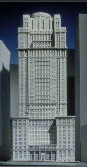
Here are the renderings I have of the previously proposed Fidelity HQ on that site.

I always did like this first one. The rest look terrible.
bosdevelopment
Active Member
- Joined
- May 26, 2006
- Messages
- 727
- Reaction score
- 2
Re: Fidelity's HQ may go high
Honestly i like the existing buildings. Fidelity will find a way to fuck it all up.. somehow.
Honestly i like the existing buildings. Fidelity will find a way to fuck it all up.. somehow.
Brad Plaid
Senior Member
- Joined
- Jan 17, 2013
- Messages
- 1,310
- Reaction score
- 1,559
Re: Fidelity's HQ may go high
For me there's little excitement or thrill when it comes to PoMo and I'll repeat here what I said about the new gothic buildings at BC: it's deja vu all over again, been there done that (although they do look well built with quality materials.)
Mostly though with PoMo I don't see authenticity or "realness". There is a stage set thinness/cheapness that mocks rather than pays homage to the bravura towers of the 20's and 30's they try to emulate. It's grave robbing the corpse of this or that historical style, propping it up, and then expecting people to see it as something living.
Honestly, that PoMo "thing" has more detailing and care in that facade than pretty much all of the buildings built recently (80s and on) in Boston. I'd much prefer getting that PoMo stump with the random Parthenon/Pantheon fusion on the top to this:

by world-renowned SOM in China. They just won the competition today.
<Begin flaming...>
For me there's little excitement or thrill when it comes to PoMo and I'll repeat here what I said about the new gothic buildings at BC: it's deja vu all over again, been there done that (although they do look well built with quality materials.)
Mostly though with PoMo I don't see authenticity or "realness". There is a stage set thinness/cheapness that mocks rather than pays homage to the bravura towers of the 20's and 30's they try to emulate. It's grave robbing the corpse of this or that historical style, propping it up, and then expecting people to see it as something living.
- Joined
- Sep 15, 2010
- Messages
- 8,894
- Reaction score
- 271
Re: Fidelity's HQ may go high
I agree with you actually, especially in the case of BC. I'm SO tired of the faux gothic. They need some modern architecture, but contextual modern architecture. CorTen and glass would work wonders for a new building on campus.
I guess I've been softened by Boston's recent swath of horrendous architecture when making judgements of quality. PoMo with all the bells and whistles is actually quality design when compared what's going up now like the Kensington. These PoMo proposals actually have depth and some sort of a facade, albeit completely bizarre and unfounded in theory. The massing is gorgeous though. You can definitely pull some great historical vibes (dare I say the ESB?) from the massing of those models. It's sort of art deco meets classicism and there you have the birth of PoMo.
For me there's little excitement or thrill when it comes to PoMo and I'll repeat here what I said about the new gothic buildings at BC: it's deja vu all over again, been there done that (although they do look well built with quality materials.)
Mostly though with PoMo I don't see authenticity or "realness". There is a stage set thinness/cheapness that mocks rather than pays homage to the bravura towers of the 20's and 30's they try to emulate. It's grave robbing the corpse of this or that historical style, propping it up, and then expecting people to see it as something living.
I agree with you actually, especially in the case of BC. I'm SO tired of the faux gothic. They need some modern architecture, but contextual modern architecture. CorTen and glass would work wonders for a new building on campus.
I guess I've been softened by Boston's recent swath of horrendous architecture when making judgements of quality. PoMo with all the bells and whistles is actually quality design when compared what's going up now like the Kensington. These PoMo proposals actually have depth and some sort of a facade, albeit completely bizarre and unfounded in theory. The massing is gorgeous though. You can definitely pull some great historical vibes (dare I say the ESB?) from the massing of those models. It's sort of art deco meets classicism and there you have the birth of PoMo.
Re: Fidelity's HQ may go high
PoMo's defenders love to point out that the cheap appearance and horrible throw-everything-at-the-wall motifs are simply "whimsical" and "ironic".
Being stuck with a mishmash of styles that looks like a poor imitation doesn't amuse me. The only statement it conveys is how far quality and design can sink.
For me there's little excitement or thrill when it comes to PoMo and I'll repeat here what I said about the new gothic buildings at BC: it's deja vu all over again, been there done that (although they do look well built with quality materials.)
Mostly though with PoMo I don't see authenticity or "realness". There is a stage set thinness/cheapness that mocks rather than pays homage to the bravura towers of the 20's and 30's they try to emulate. It's grave robbing the corpse of this or that historical style, propping it up, and then expecting people to see it as something living.
PoMo's defenders love to point out that the cheap appearance and horrible throw-everything-at-the-wall motifs are simply "whimsical" and "ironic".
Being stuck with a mishmash of styles that looks like a poor imitation doesn't amuse me. The only statement it conveys is how far quality and design can sink.
Re: Fidelity's HQ may go high
People enjoy heaping criticism on pomo, and with good reason, but don't some/all of the following buildings fall into that category?
Wells Fargo Center - Minneapolis
Key Tower - Cleveland
BOA - Charlotte
One Liberty Place - Philadelphia
Sun Trust Plaza - Atlanta
US Bank Tower - LA
BOA - Houston
191 Peachtree (posted above) - Atlanta
Fountain Place - Dallas
Mellon Bank - Pittsburgh
PPG Place - Pittsburgh
Wells Fargo Center - Denver
Carnegie Hall Tower - NYC
Wachovia Financial - Miami
I'm just asking because I love these buildings!!! (and many more that seem to fit the category)
czsz
Senior Member
- Joined
- Jan 12, 2007
- Messages
- 6,043
- Reaction score
- 7
Re: Fidelity's HQ may go high
The thing is, early PoMo did seem whimsical and ironic. But then the philistines seized upon its "traditional" qualities and what we got were cheap, nouveau riche imitations of classical architecture that tarnished PoMo's name.
PoMo's defenders love to point out that the cheap appearance and horrible throw-everything-at-the-wall motifs are simply "whimsical" and "ironic".
The thing is, early PoMo did seem whimsical and ironic. But then the philistines seized upon its "traditional" qualities and what we got were cheap, nouveau riche imitations of classical architecture that tarnished PoMo's name.
Beton Brut
Senior Member
- Joined
- May 25, 2006
- Messages
- 4,382
- Reaction score
- 338
Re: Fidelity's HQ may go high
Tragedy and farce in equal measure.
This would have ended up as much of a cartoon as 500 Boylston.
Tragedy and farce in equal measure.
JohnCostello
Active Member
- Joined
- May 14, 2008
- Messages
- 299
- Reaction score
- 273
Re: Fidelity's HQ may go high
The office space inside those buildings is obselete for downtown based large companies. BB&H another major tenant in the building is leaving and consolidatiing offices at 185 Franklin Street (New England Telephone). Fideility is always seeking lower cost for office space. That is why they have been at 245 Summer Street, WTC, and other buildings for years. The Devonshire buildings were last upgraded in the mid-1980's, leaving them in need of systems upgrades and the like.
A huge company like this needs wide open work spaces, not warrens of small spaces which these buildings provide. As far as Fido being in NH and RI, it all comes down to taxes. People complain about them moving jobs around to other states, but for where they are located in NH (Salem) and RI (North Smithfield) they are still in the Greater Boston economic umbrella. The workers still spend money within this area and the company makes more money. Don't like that, too bad. Call 617-722-2000, ask for Deval, Robert, or Terry and ask them about it.
As far as Devonshire goes, there is a lot of extra land there to support a tower. You have most of Quaker Lane and the "Spite Parcel" on Devonshire to consider in your FAR. As an added bonus, Showtime is showing the original Thomas Crown Affair. The bank robbery takes place in the old Shawmut bank on the Congress Street side.
kz1000ps
Senior Member
- Joined
- May 28, 2006
- Messages
- 8,975
- Reaction score
- 11,766
Re: Fidelity's HQ may go high
Of course it was KPF! I have a serious love/hate relationship with their work from that period.
That was KPF at the height of post-modernism. Similar to 125 Summer Street which is a slightly later vintage.
Of course it was KPF! I have a serious love/hate relationship with their work from that period.
Re: Fidelity's HQ may go high
+1. I would hardly call myself a PoMo "defender" or "fan" - I typically find it thin gruel compared to any of the pre-war architecture it imitated.
However, I find cheap modernism, or cheap modernist schlock that doesn't necessarily even consider itself modernism but has been enabled by the modernist movement (Kensington being as fine an example as any), to be (a) much worse, and (b) omnipresent.
The OMA project would have been refreshing once upon a time, and I'm sure for its first 10 years it will look good - the "new car smell" sparkle and whatnot. However, the nearly oppressive ubiquity and creeping sameness of modernism (and the even-larger number of buildings enabled by modernism without being considered part of any school of architecture) have left me screaming for *anything* else, PoMo or otherwise.
... And ... one confession: 500 Boylston is fine in my book (cringes in anticipation). I thank our lucky stars that we don't have a Kensington (or Federal Reserve Building, or One Boston Place, or First National Bank, One Financial Center, One Post Office Square, One Beacon Street ... you get the picture) in its place.
Honestly, that PoMo "thing" has more detailing and care in that facade than pretty much all of the buildings built recently (80s and on) in Boston. I'd much prefer getting that PoMo stump with the random Parthenon/Pantheon fusion on the top to this by world-renowned OMA in China. They just won the competition today.
+1. I would hardly call myself a PoMo "defender" or "fan" - I typically find it thin gruel compared to any of the pre-war architecture it imitated.
However, I find cheap modernism, or cheap modernist schlock that doesn't necessarily even consider itself modernism but has been enabled by the modernist movement (Kensington being as fine an example as any), to be (a) much worse, and (b) omnipresent.
The OMA project would have been refreshing once upon a time, and I'm sure for its first 10 years it will look good - the "new car smell" sparkle and whatnot. However, the nearly oppressive ubiquity and creeping sameness of modernism (and the even-larger number of buildings enabled by modernism without being considered part of any school of architecture) have left me screaming for *anything* else, PoMo or otherwise.
... And ... one confession: 500 Boylston is fine in my book (cringes in anticipation). I thank our lucky stars that we don't have a Kensington (or Federal Reserve Building, or One Boston Place, or First National Bank, One Financial Center, One Post Office Square, One Beacon Street ... you get the picture) in its place.
