bobthebuilder
Active Member
- Joined
- Oct 17, 2013
- Messages
- 434
- Reaction score
- 159
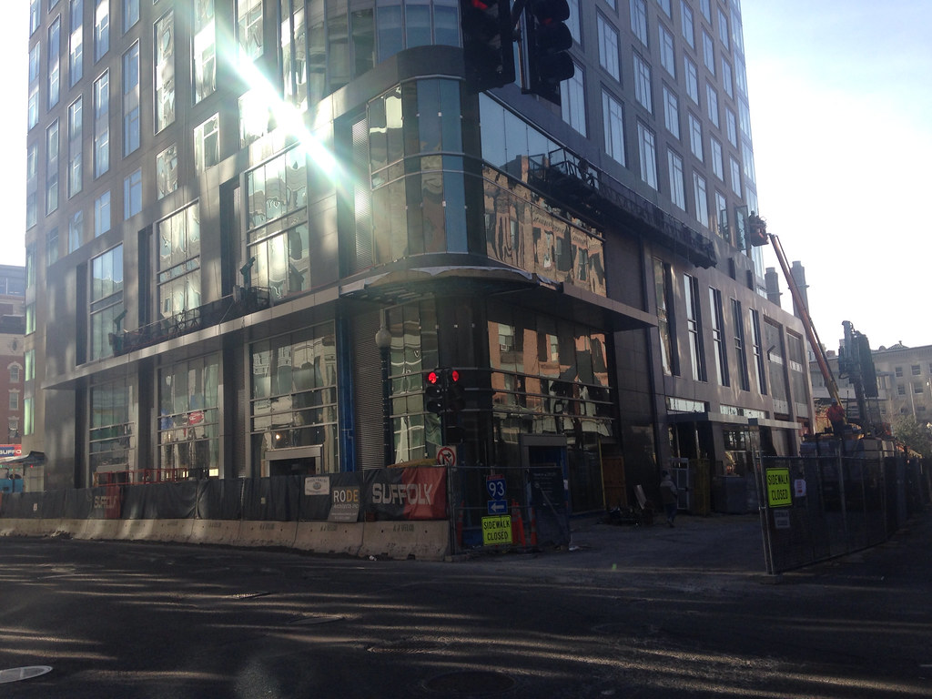
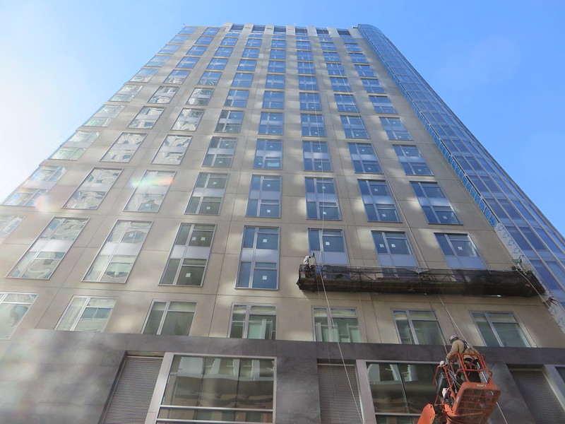
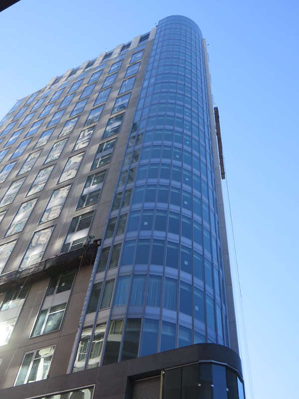
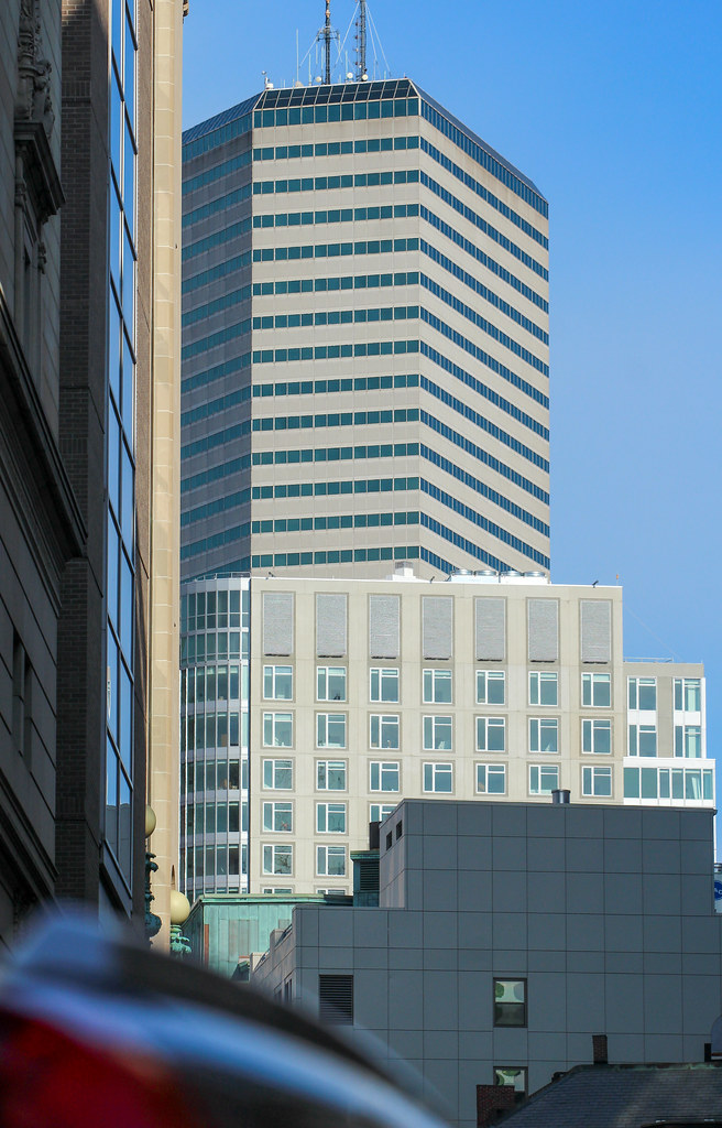
There's really only one thing about this building that I'm not crazy about, the two flat faces of the building. They're just so incredibly plain and boring. Could this be just that they didn't want to waste money on a facade that might see future tall building next to it? I may be wishful thinking just a bit.
Last edited: