Radian (Dainty Dot) | 120 Kingston Street | Chinatown

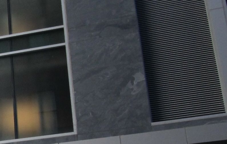
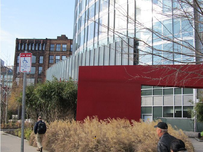
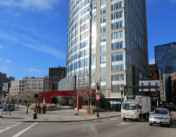
I walked by this with a friend of mine who absolutely LOVED the little park, black wall of death thing, etc. It helps add liveliness to that little section of asphalt known as "Chinatown Park". Nothing amazing, but that whole area kind of felt like a no-man's-land and this helps stitch it back together a bit. It also interacts every bit as well as the buildings around it. I think you're holding it to unreasonable standards. Par for the course at Archboston.
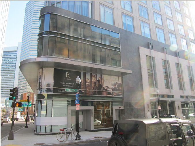
I don't mind the 'black wall of death', its the Kingston and Essex St facades that are not very engaging, --part of which is due to their masking the parking garage. (Google Streetview was updated this summer, so one can take more than a leisurely glance.)
 
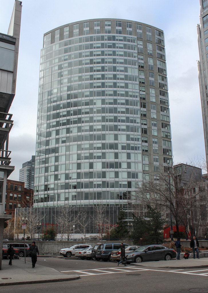
DSC03673b.JPG
 
It's funny how this building always looks like a rendering when photographed.
 
It's funny how this building always looks like a rendering when photographed.

To my eye it looks like a lot of HDR in that photo.

But on a second look it is only the building. The cars don't look cartoonish.
 
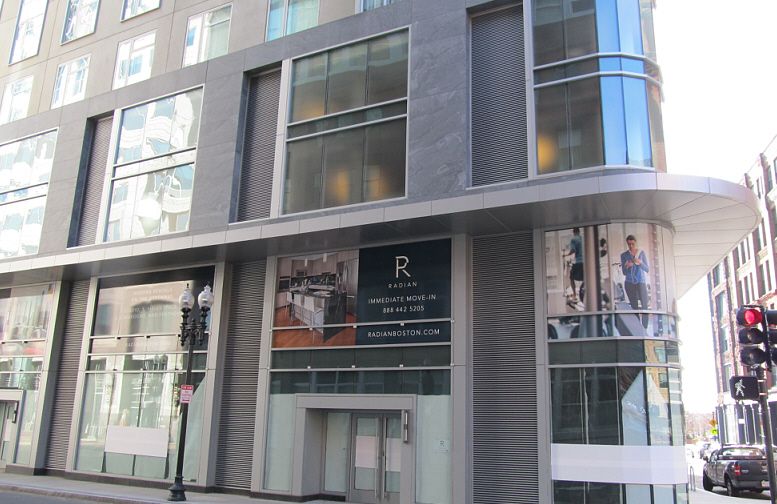
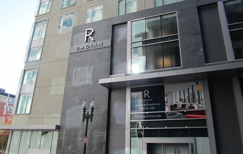
This building at ground level looks sterile and cold. Chinatown is arguably one of the most animated neighborhoods in all of Boston, and this building contributes nothing, --doesn't engage the neighborhood at all. The elevations work nicely with the Financial District, but street level, the building shouts 'I don't belong here, and I don't care'. I understand that the above-ground parking garage is the reason for this, but retaining the old Dainty Dot facade might have led to some modest street presence.


faux stone panel


The red 'arch' looks cheesy cheap.
 
I walked through the area of the red arch last night and it was HQ for a couple of homeless people. That area is basically screened on three sides, which makes it feel pretty sketchy.

However, the construction of the ground-floor restaurant (Townsman) is making progress. With the restaurant open -- especially with outdoor seating in the warm months -- there will be much more street level activation.

I do not disagree with anything that Stellarfun is saying above but I am leaning towards giving the Radian a shot as it sounds like Abdinoor is. Essex St is very barren in terms of ground floor activation. If Townsman can make a dent then it is a win.

The red arch pre-dates the Radian and is part of Chinatown Park. Chinatown Park is an incredible mix of families with kids on scooters, competitive gambling among Chinatown residents, and addicts being addicts. Perhaps a little more monitoring could help; as could kindly asking the Chinatown liquor store to stop selling nips and to delay opening until after 12pm (maybe?).
 
I mean this building literally just opened. You can't expect it to have restaurants already set up on the ground in such short amount of time and it's not like that area was seeing a lot of pedestrian activity before. You need to just give it time; real life is not SimCity.
 
boston deserves so much better than this building, at least when it comes to residential... totally bland, unspecial, site-unspecific, no wonder they are struggling to find residents. (sorry for such a negative first comment, but there you have it!)
 
I mean this building literally just opened. You can't expect it to have restaurants already set up on the ground in such short amount of time and it's not like that area was seeing a lot of pedestrian activity before. You need to just give it time; real life is not SimCity.

I appreciate that when the garage was moved from below-grade to above-grade, and the Dainty Dot facade went into the dumpsters, that the opportunity to have this building enliven this intersection/entrance to Chinatown was largely lost. Townsman may be a great restaurant / a dining destination but the menu, as I read it, is New England brasserie. That simply reinforces the notion of the Radian being separate from Chinatown.

Here is a Curbed article on tweaking a building design in San Francisco to provide cultural context.

http://sf.curbed.com/archives/2014/...n_tweaks_respond_to_cultural_context.php#more

Also note use of photo murals to avoid a blank 'wall of death'.

Maybe if the Radian was a bit more Asian in appearance, the interest of overseas Chinese in having a residence there would be greater. Why exactly was the original Chinese architect shown the door?
 
I appreciate that when the garage was moved from below-grade to above-grade, and the Dainty Dot facade went into the dumpsters, that the opportunity to have this building enliven this intersection/entrance to Chinatown was largely lost. Townsman may be a great restaurant / a dining destination but the menu, as I read it, is New England brasserie. That simply reinforces the notion of the Radian being separate from Chinatown.

Totally agree. It's a nice residential building and much better than the Kensington, Watermark, & Park Lane Seaport, but I wish it had more contextual relationship to Chinatown. It could have been so much better if the Dainty Dot facade was saved. I'm heartbroken over that.
 
I appreciate that when the garage was moved from below-grade to above-grade, and the Dainty Dot facade went into the dumpsters, that the opportunity to have this building enliven this intersection/entrance to Chinatown was largely lost. Townsman may be a great restaurant / a dining destination but the menu, as I read it, is New England brasserie. That simply reinforces the notion of the Radian being separate from Chinatown.

Here is a Curbed article on tweaking a building design in San Francisco to provide cultural context.

http://sf.curbed.com/archives/2014/...n_tweaks_respond_to_cultural_context.php#more

Also note use of photo murals to avoid a blank 'wall of death'.

Maybe if the Radian was a bit more Asian in appearance, the interest of overseas Chinese in having a residence there would be greater. Why exactly was the original Chinese architect shown the door?

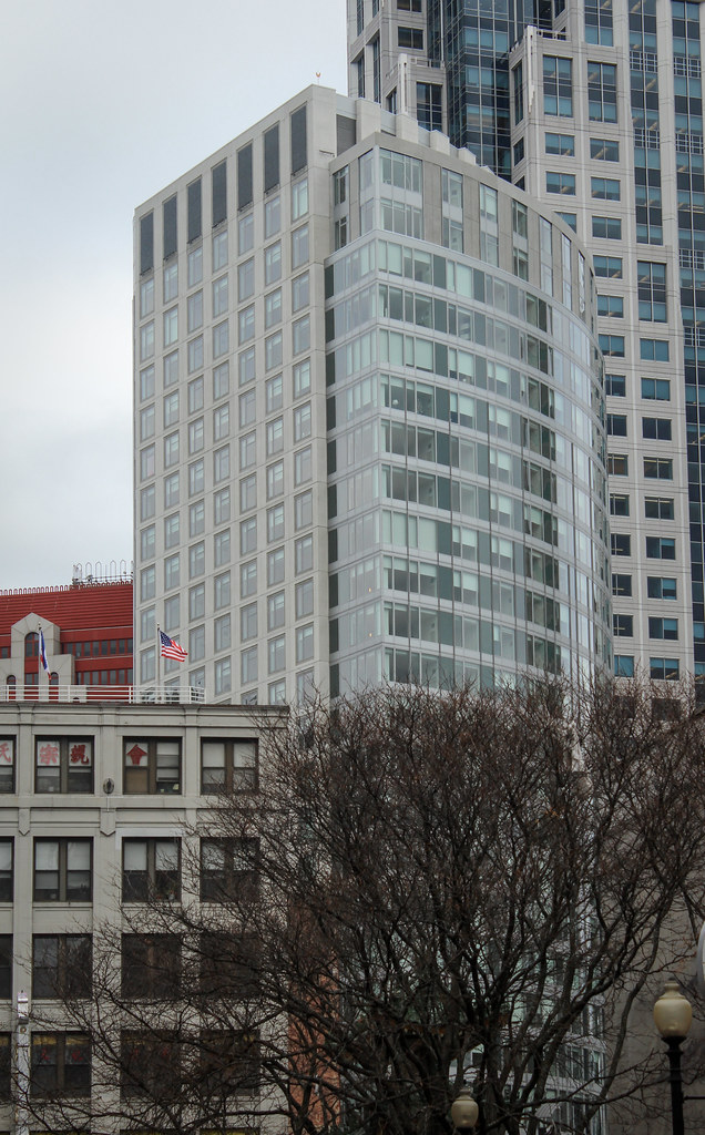
Stel -- the Radian is a residence on the Greenway -- just like Fan Pier is on the water
it ultimately stands or falls [rhetorically] about its relationship to the Greenway
 
Having now seen this in person I really don't get the hatred for it. It isn't perfect but it's actually better than other new towers in Chinatown (Kensington, for one).
 
Having now seen this in person I really don't get the hatred for it. It isn't perfect but it's actually better than other new towers in Chinatown (Kensington, for one).

I don't hate it. I said the elevations fit nicely within the context of the Financial District. Its the street level engagement at the entrance to Chinatown that represents an opportunity lost. After all, did not the developer boast about adding about a tenth of an acre to the Chinatown park portion of the Greenway? Perhaps, he felt that was enough.
 
I don't hate it. I said the elevations fit nicely within the context of the Financial District. Its the street level engagement at the entrance to Chinatown that represents an opportunity lost. After all, did not the developer boast about adding about a tenth of an acre to the Chinatown park portion of the Greenway? Perhaps, he felt that was enough.

None of the recent towers that went up in Chinatown provide cultural context (i.e. Kensington, Archstone, Millennium Place Towers, One Greenway, Jacob Wirth) with the exception of the Metropolitan Tower. Why is this tower being singled out?
 
None of the recent towers that went up in Chinatown provide cultural context (i.e. Kensington, Archstone, Millennium Place Towers, One Greenway, Jacob Wirth) with the exception of the Metropolitan Tower. Why is this tower being singled out?

And I feel as if any of them did have Asian flare tacked onto the street level, they would be decried as cheesy. I think The Metropolitan does the cultural context right. The tops are modern, yet subtle homages.

This tower's base doesn't need Asian decorating, what it really needs is some material and scaled context with the neighborhood in which it sits. It's very sterile and grand at the street, looking like it belongs in the Back Bay on Boylston rather than in Chinatown on Kingston.

I noticed that a couple of start ups have moved into the building across the street. Perhaps some sort of modern Asian cafe and bakery on the ground floor somewhere could liven it up.
 
BTW, hooray for the only building in Chinatown that has bike racks out front.
 
This building at ground level looks sterile and cold. Chinatown is arguably one of the most animated neighborhoods in all of Boston, and this building contributes nothing, --doesn't engage the neighborhood at all. The elevations work nicely with the Financial District, but street level, the building shouts 'I don't belong here, and I don't care'. I understand that the above-ground parking garage is the reason for this, but retaining the old Dainty Dot facade might have led to some modest street presence.

The red 'arch' looks cheesy cheap.

I really do wish they could have preserved the old Dainty Dot facade on the lower levels and built the tower on top (much like they did on Atlantic Wharf up the road)
dainty-dot-proposal.jpg


dainty-dott.jpg


And I believe they needed to build the parking garage above ground due to the Big Dig below...
 

Back
Top