You are using an out of date browser. It may not display this or other websites correctly.
You should upgrade or use an alternative browser.
You should upgrade or use an alternative browser.
Seaport Neighborhood - Infill and Discussion
- Thread starter statler
- Start date
Smuttynose
Active Member
- Joined
- May 26, 2006
- Messages
- 741
- Reaction score
- 4,166
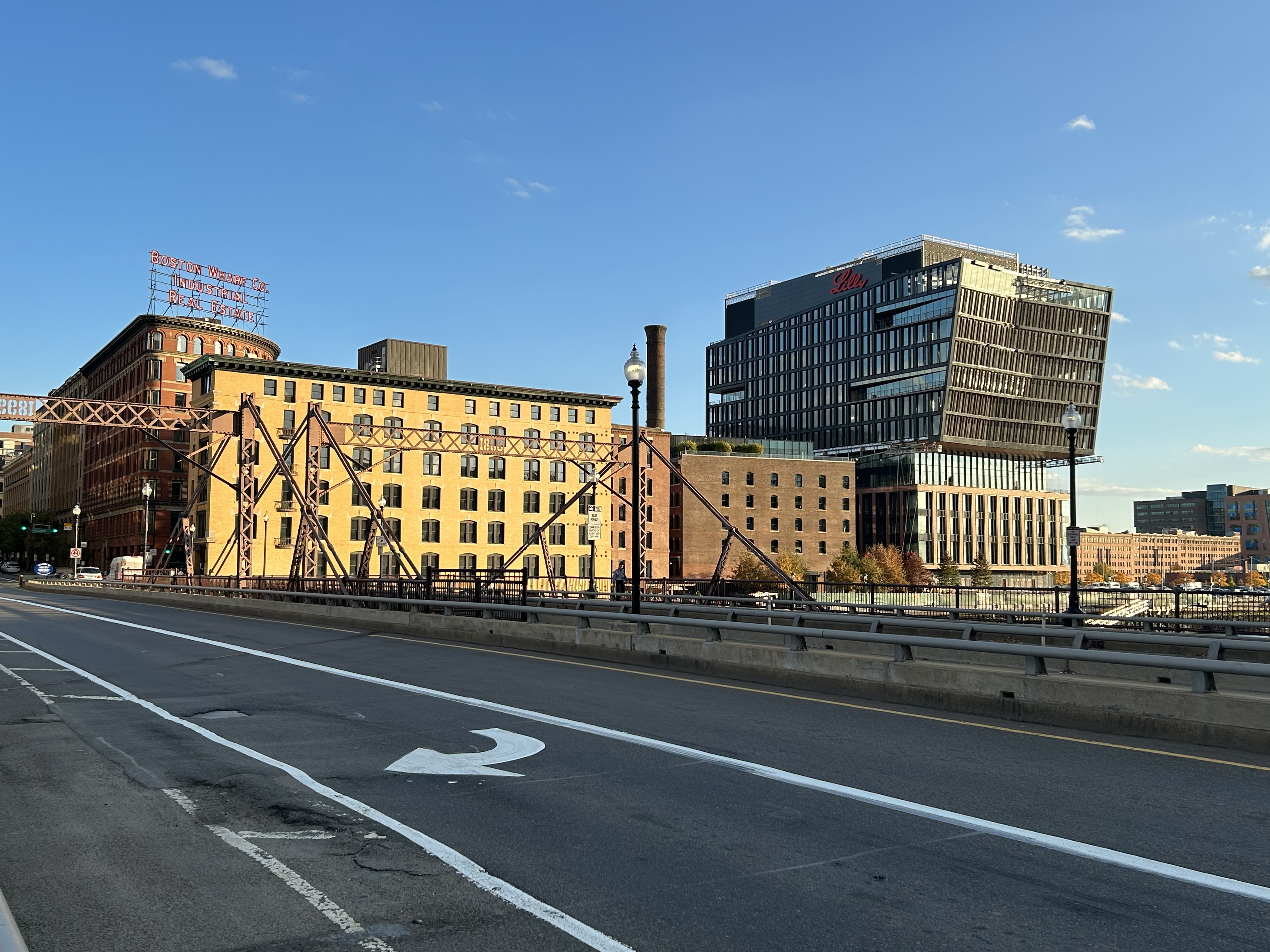
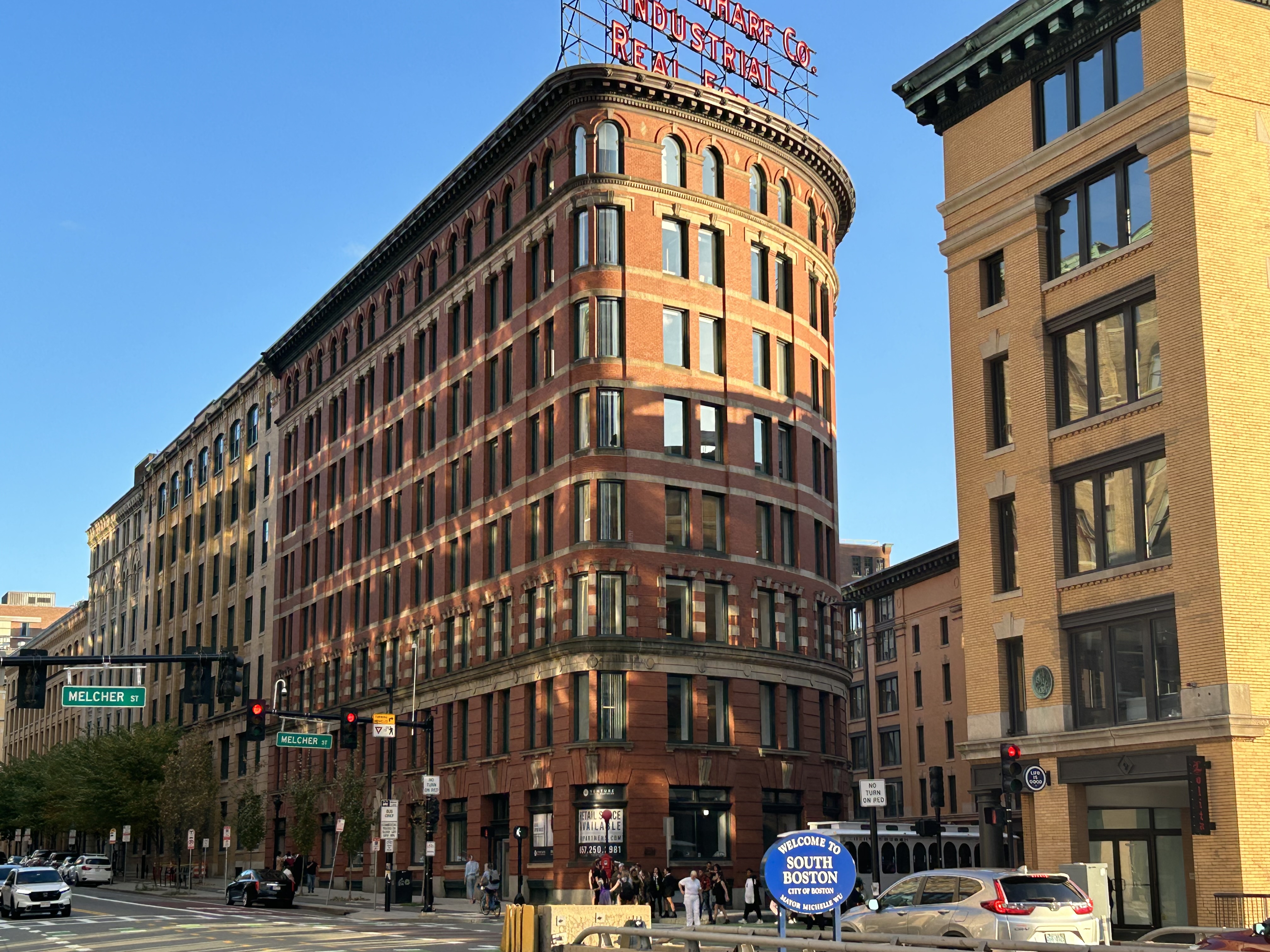
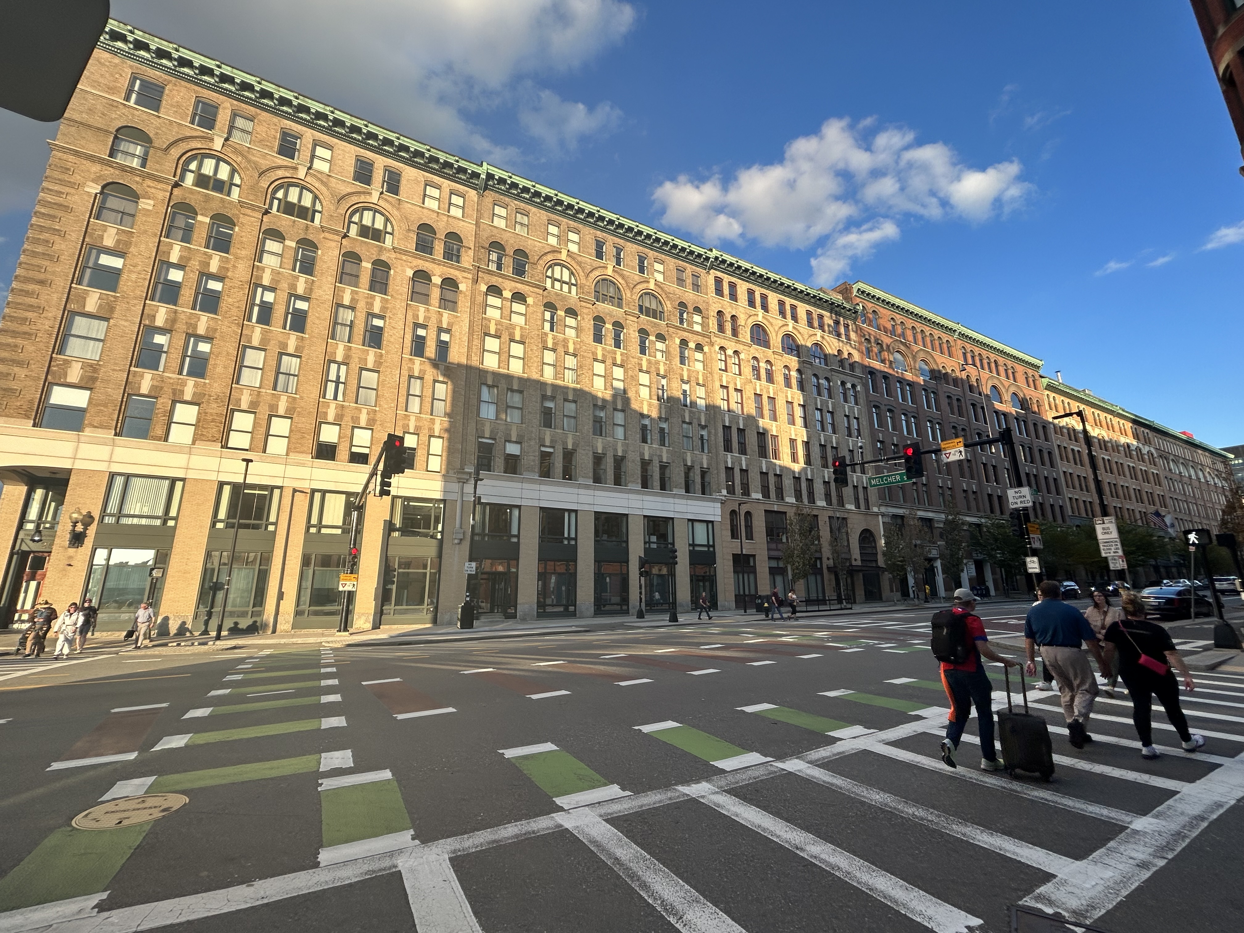
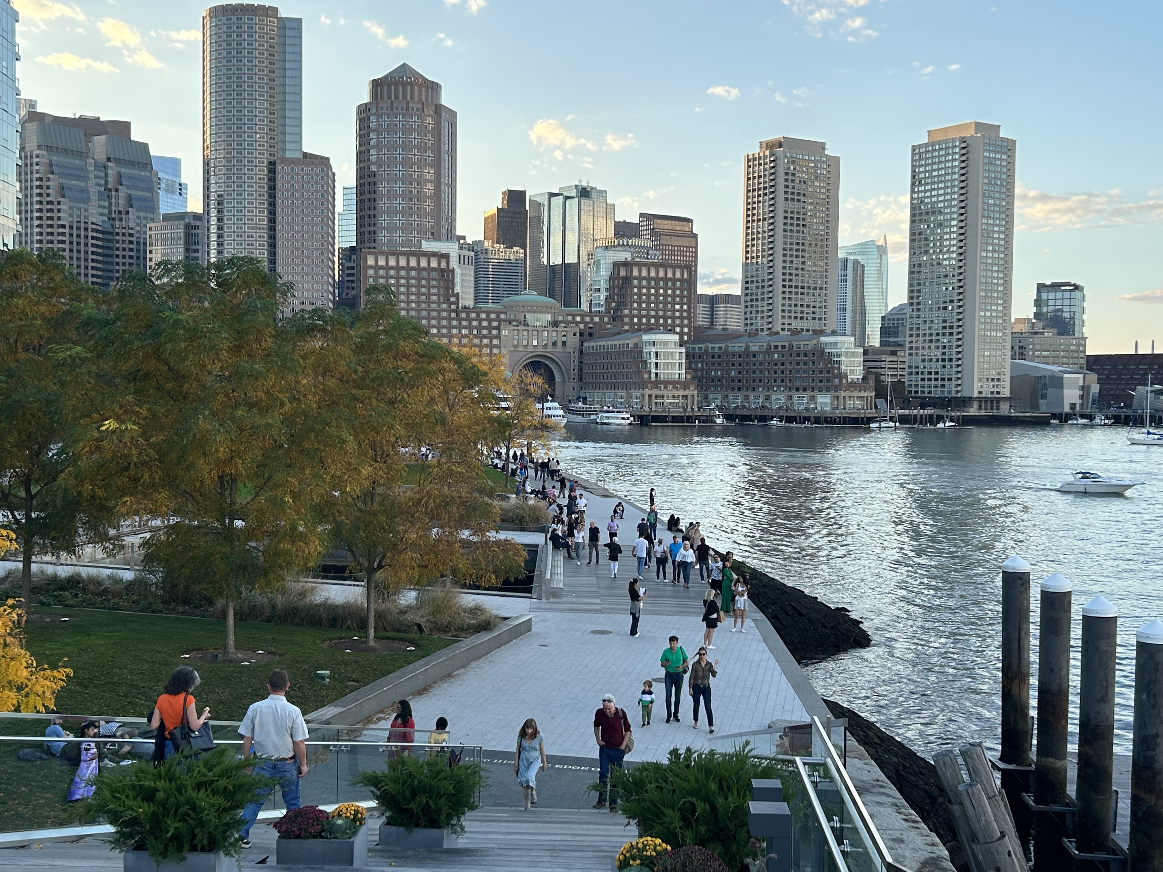
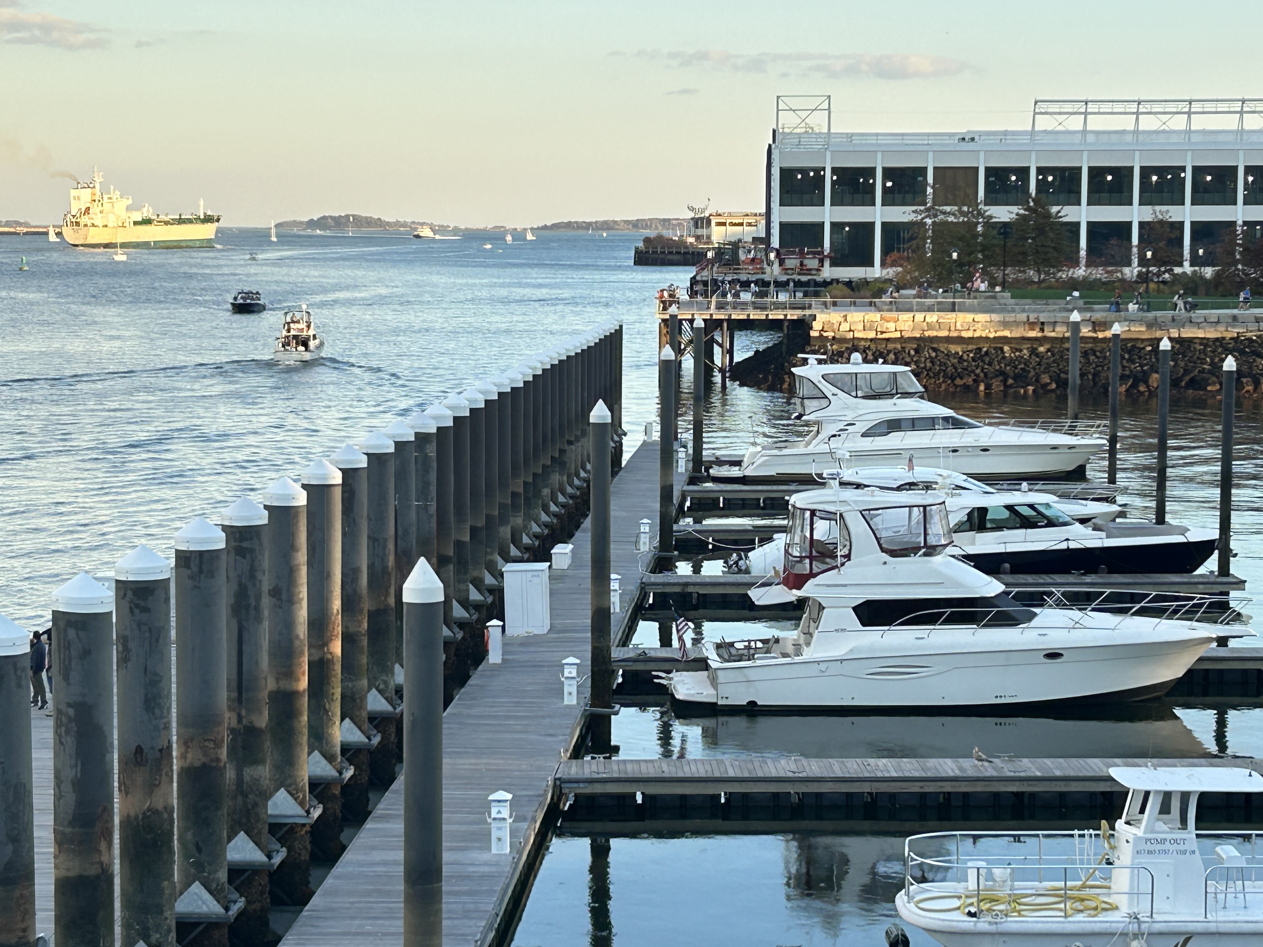
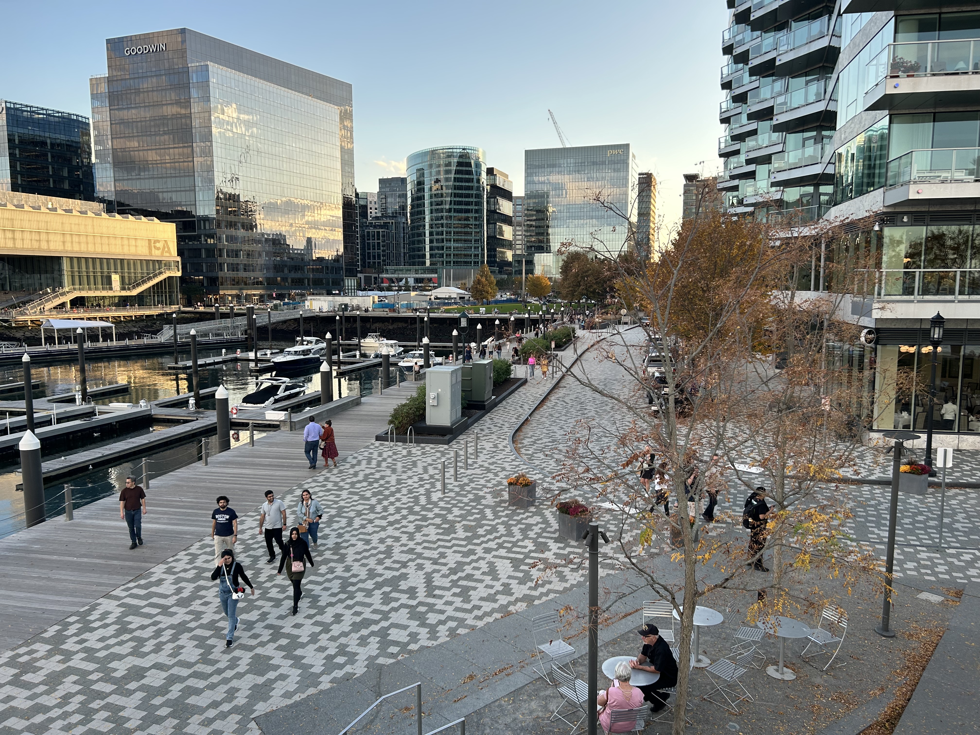
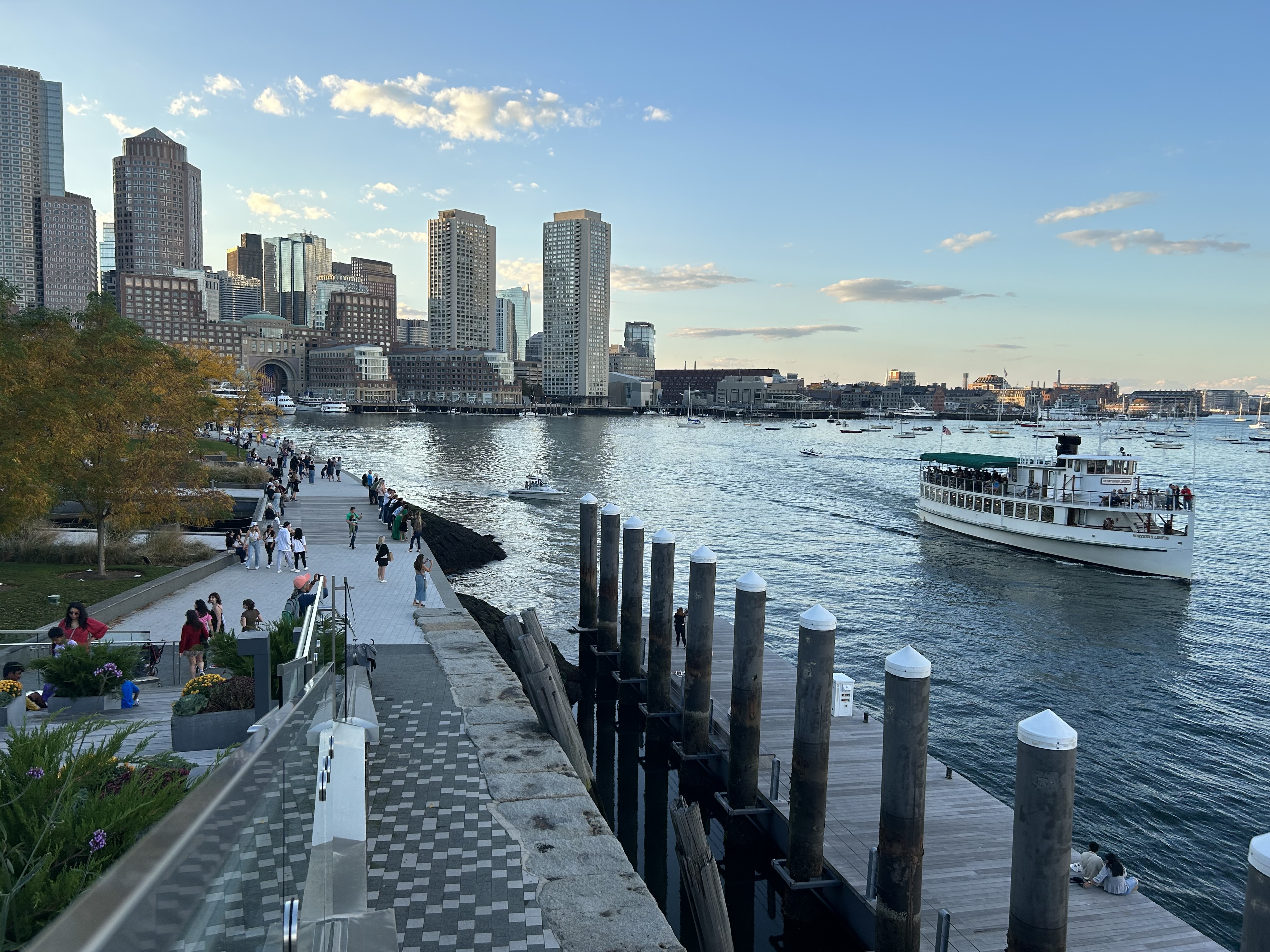
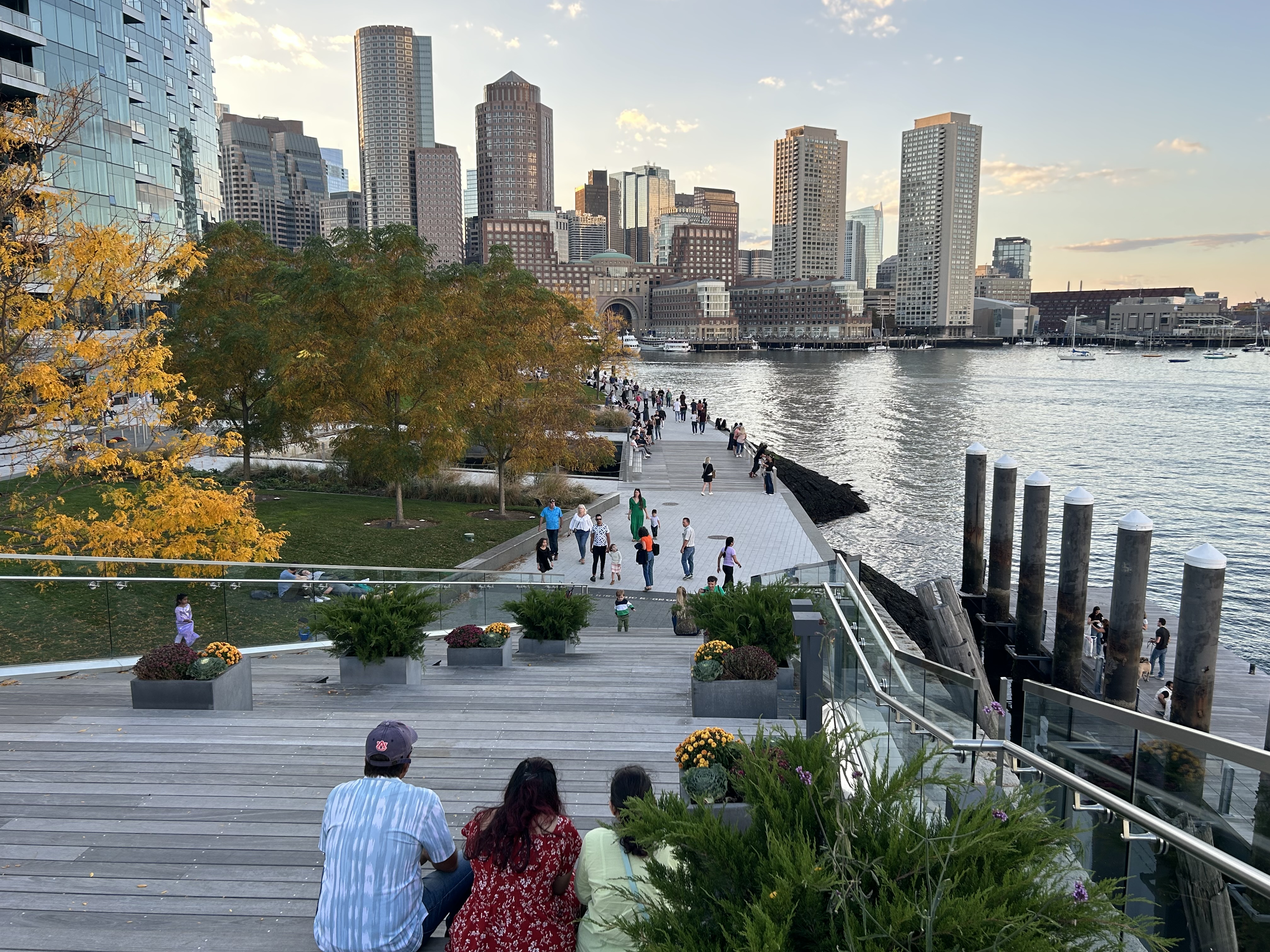
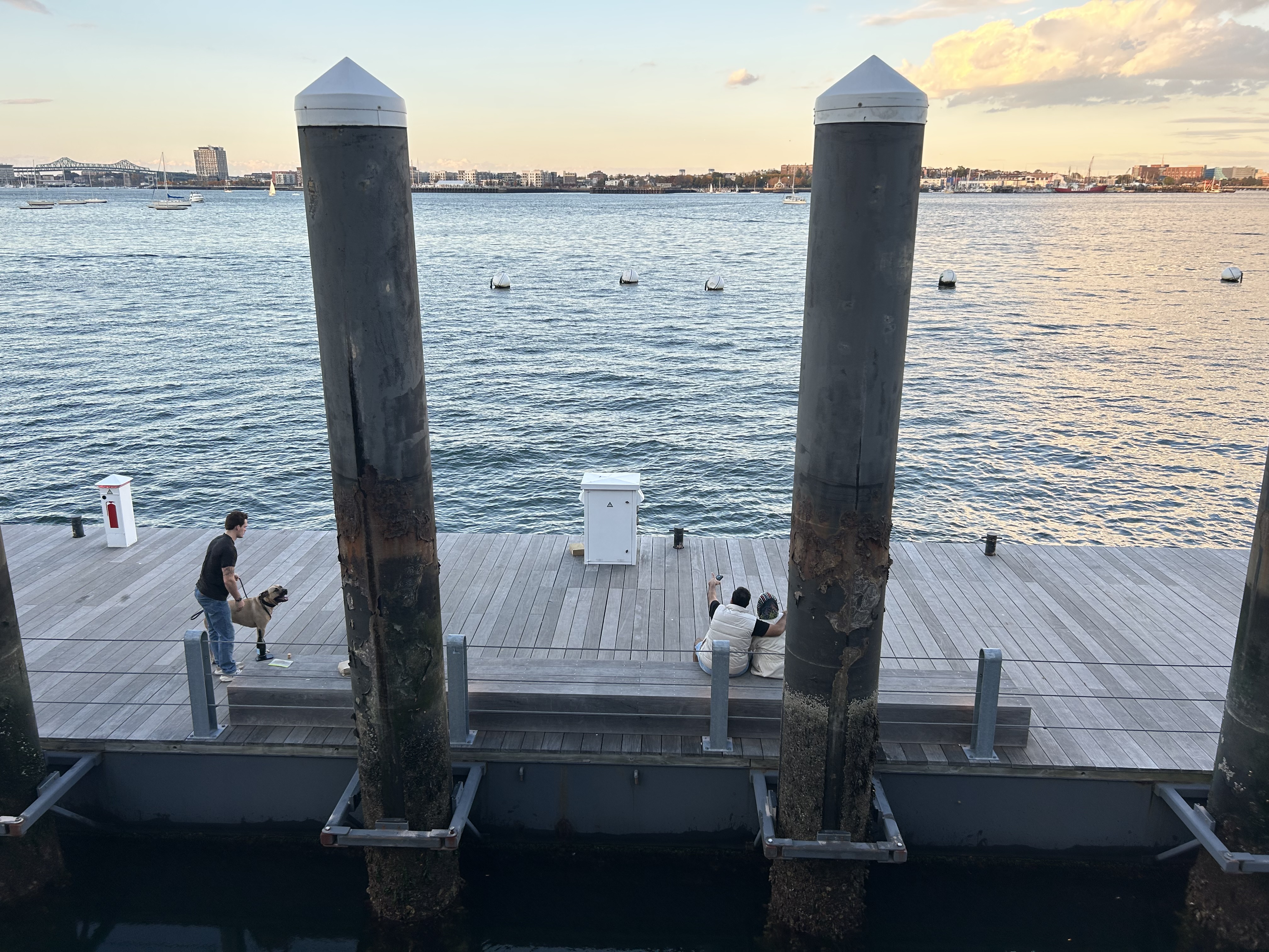
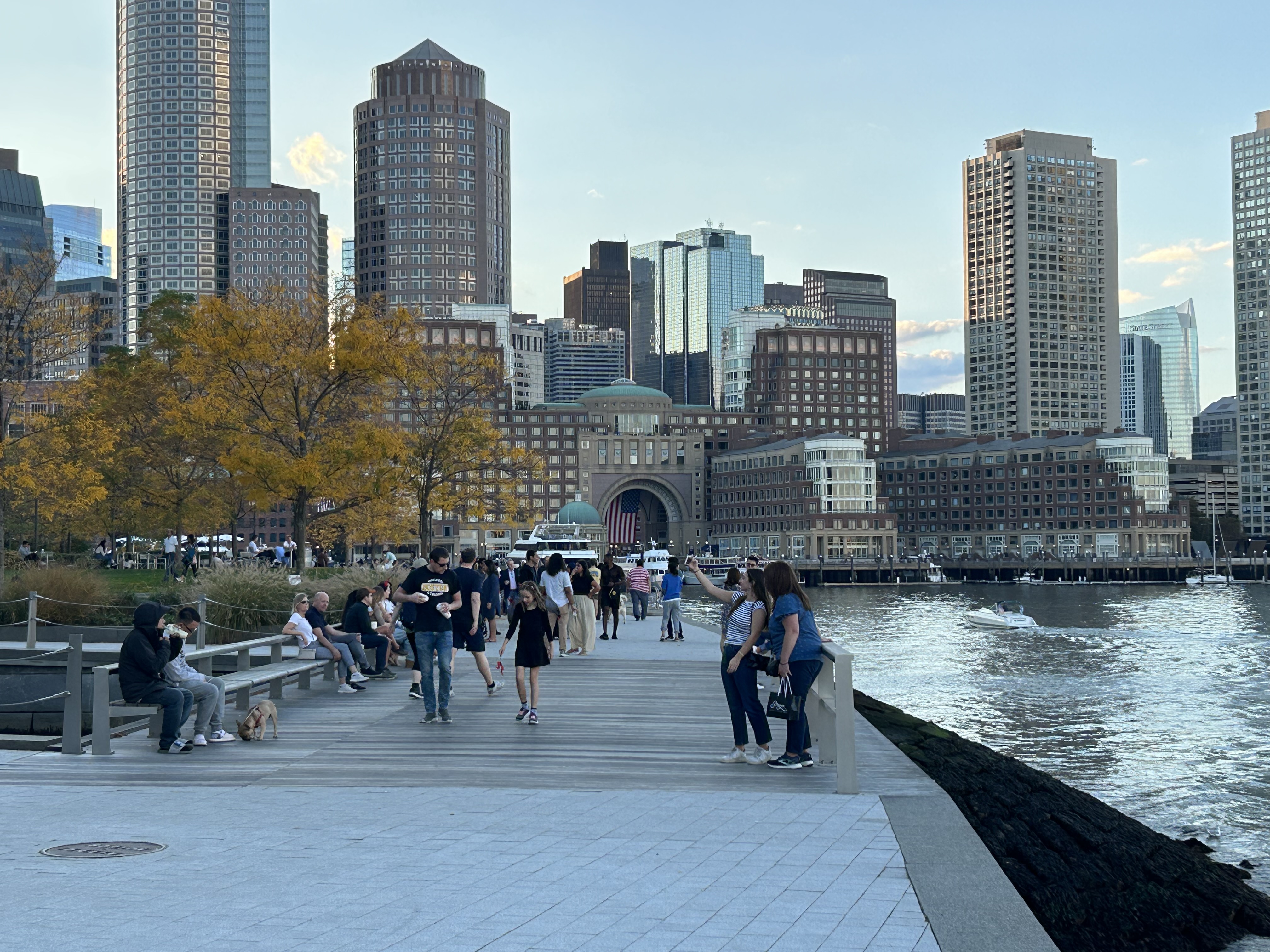
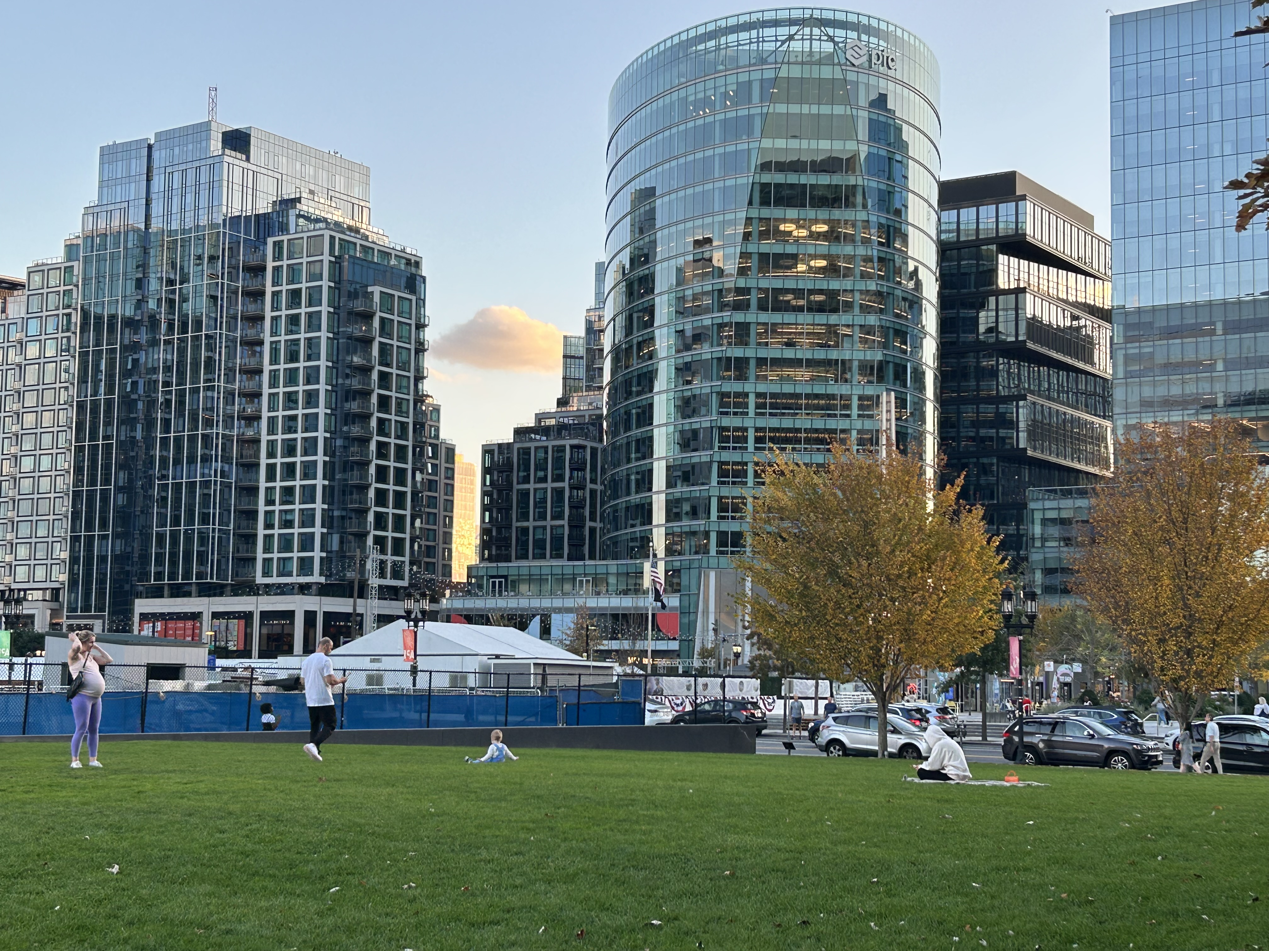
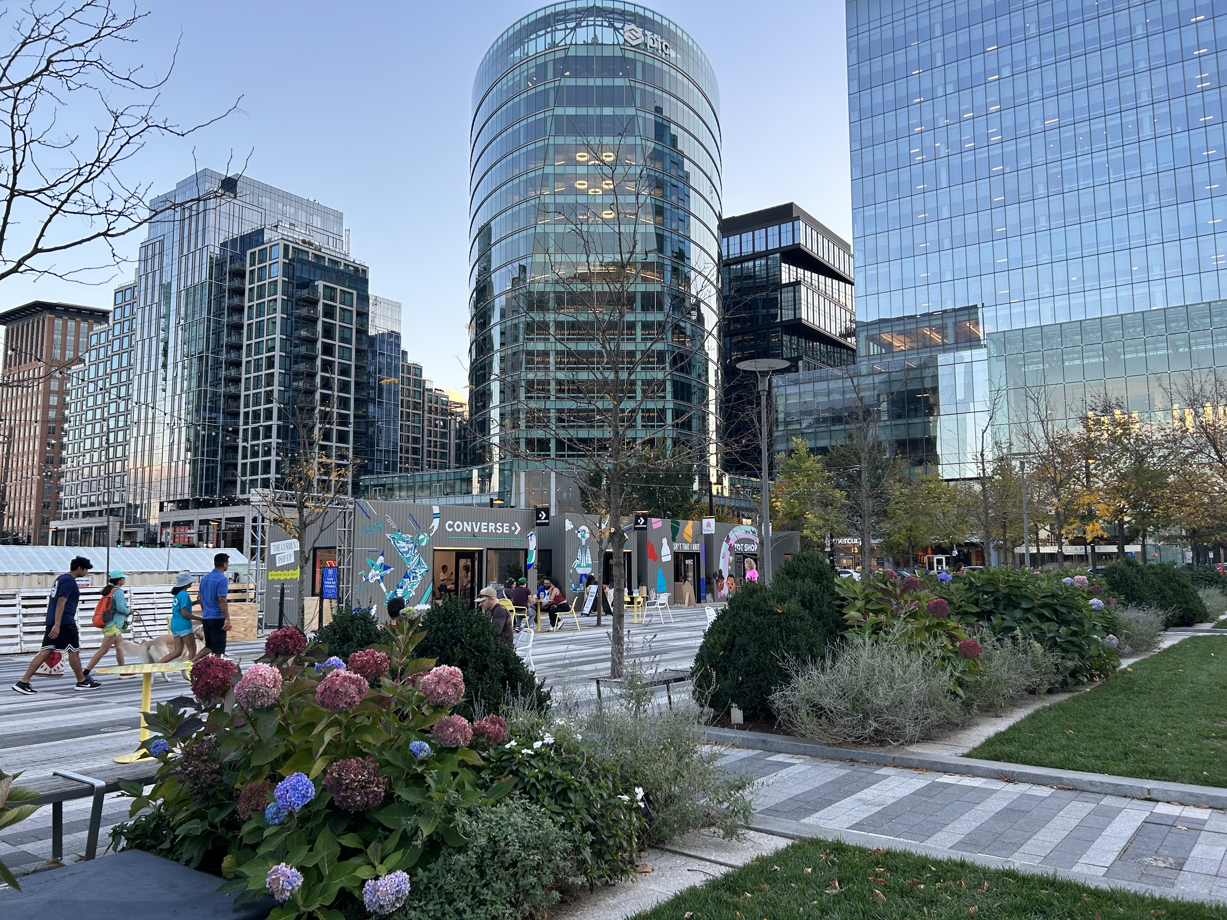
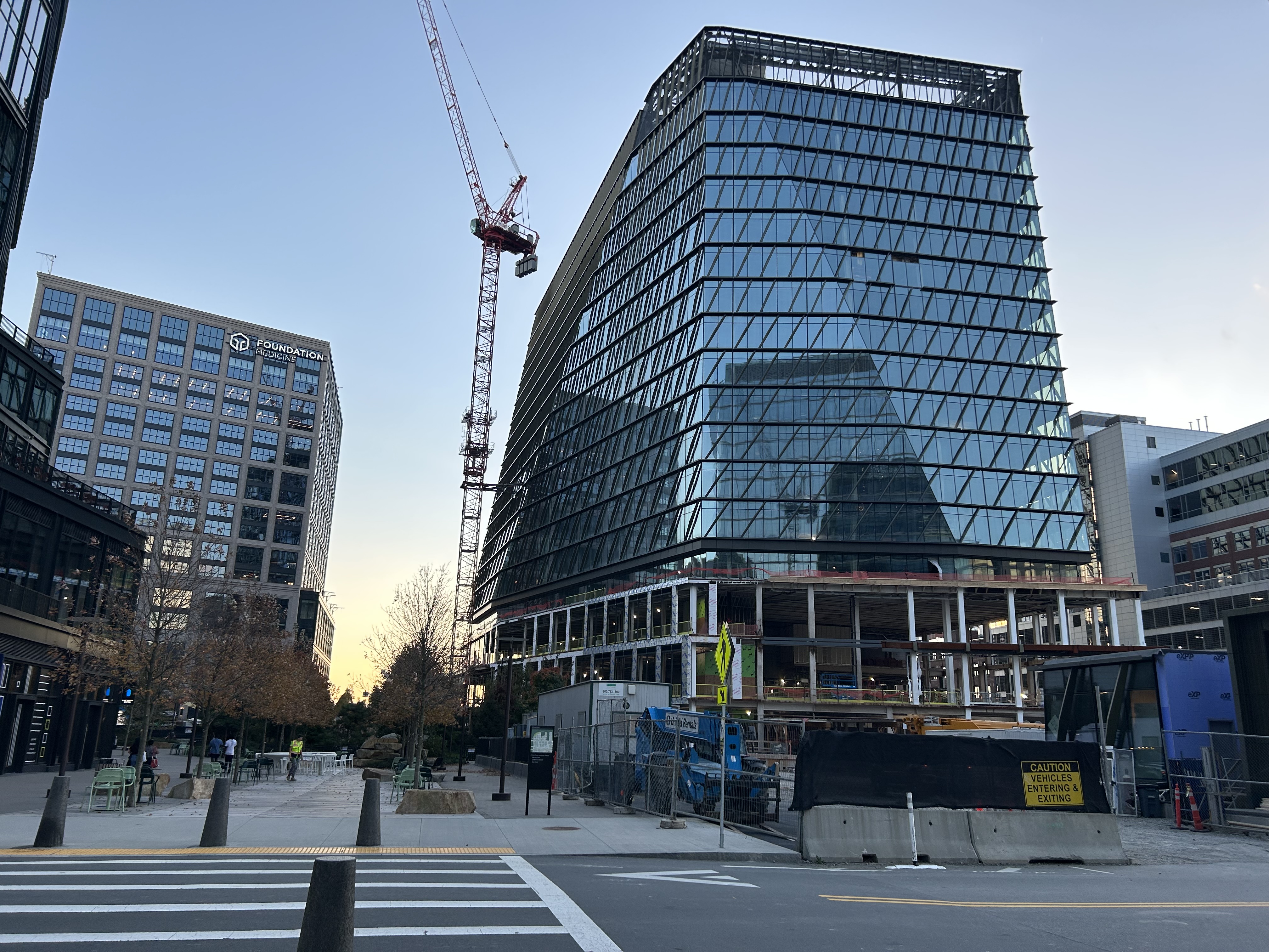
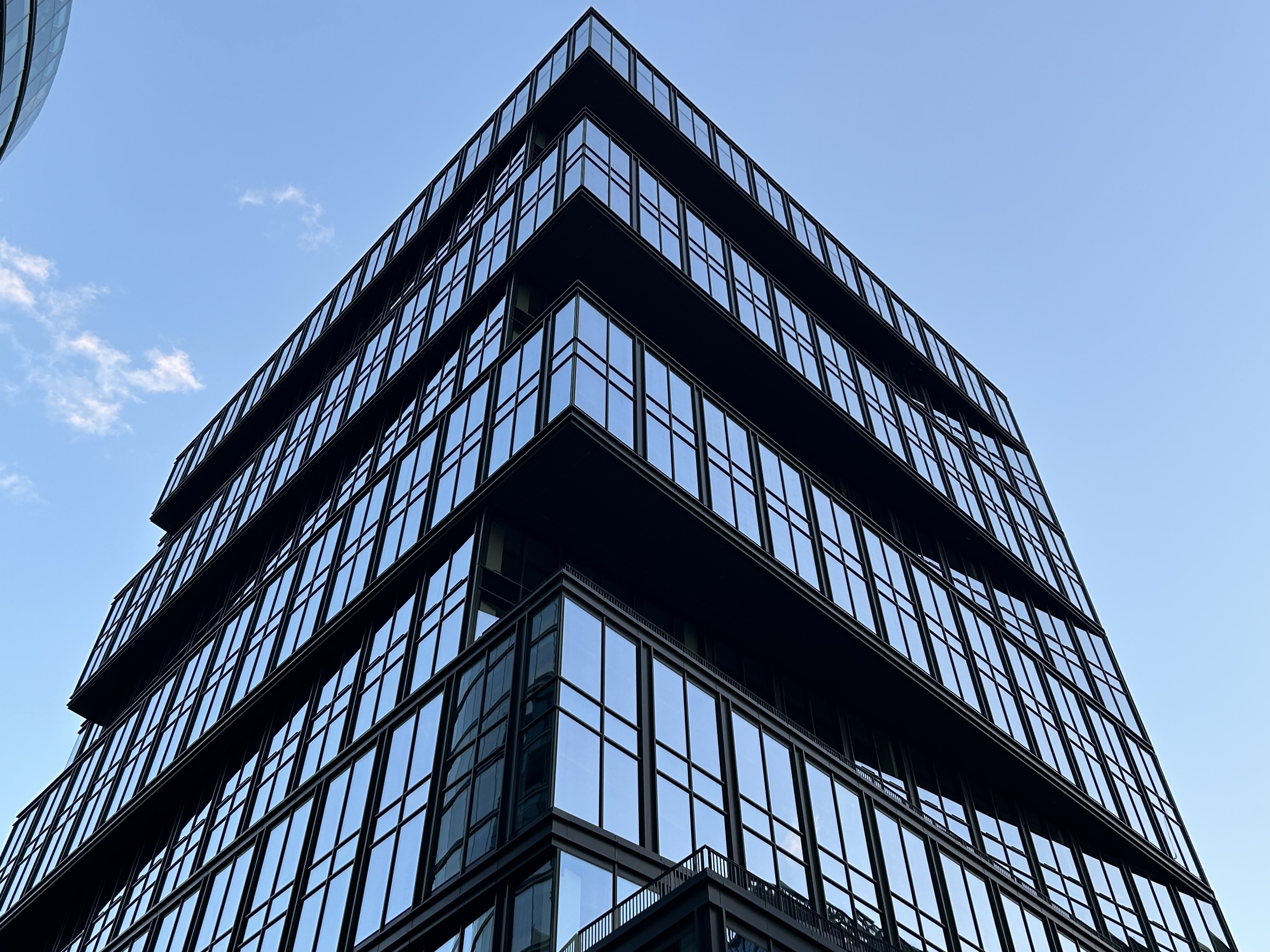
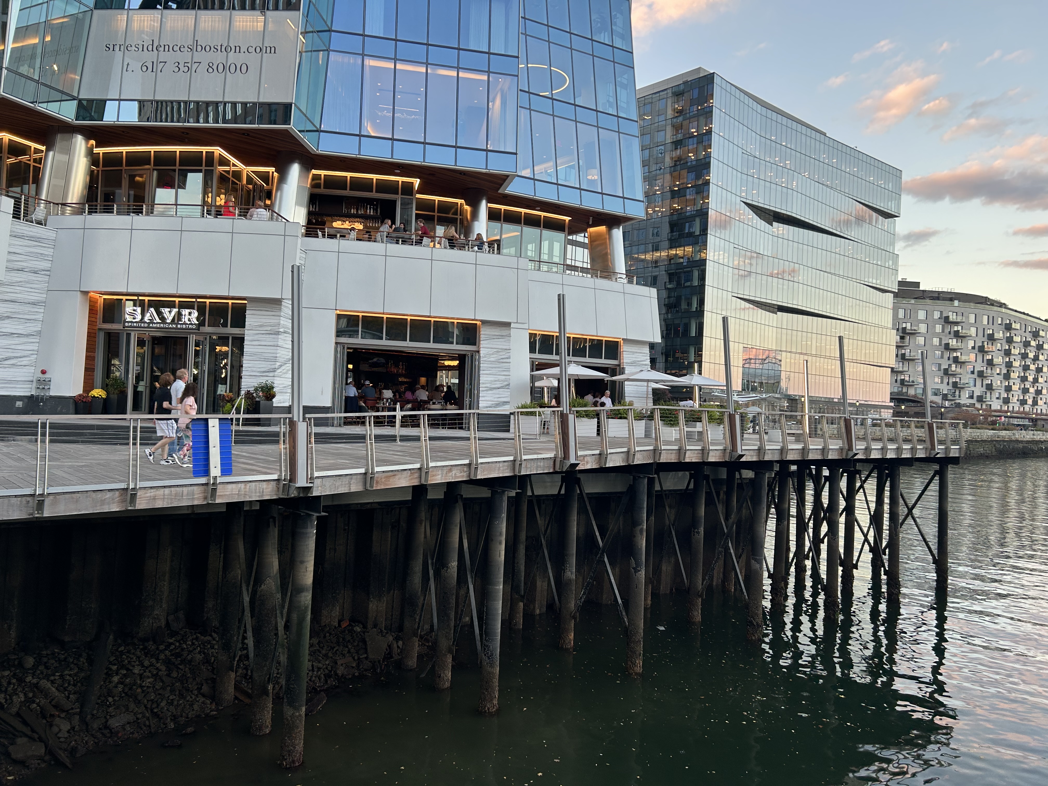
These are from this past Saturday (10/28) - probably the last acceptable day to wear shorts outside of 2023 —
Justbuildit
Senior Member
- Joined
- Nov 27, 2022
- Messages
- 1,063
- Reaction score
- 3,709
Stairs between Summer and Congress are open! The sidewalks, parking garage, and general area are also opening up. No sign of activity on the 350 Summer plot though.
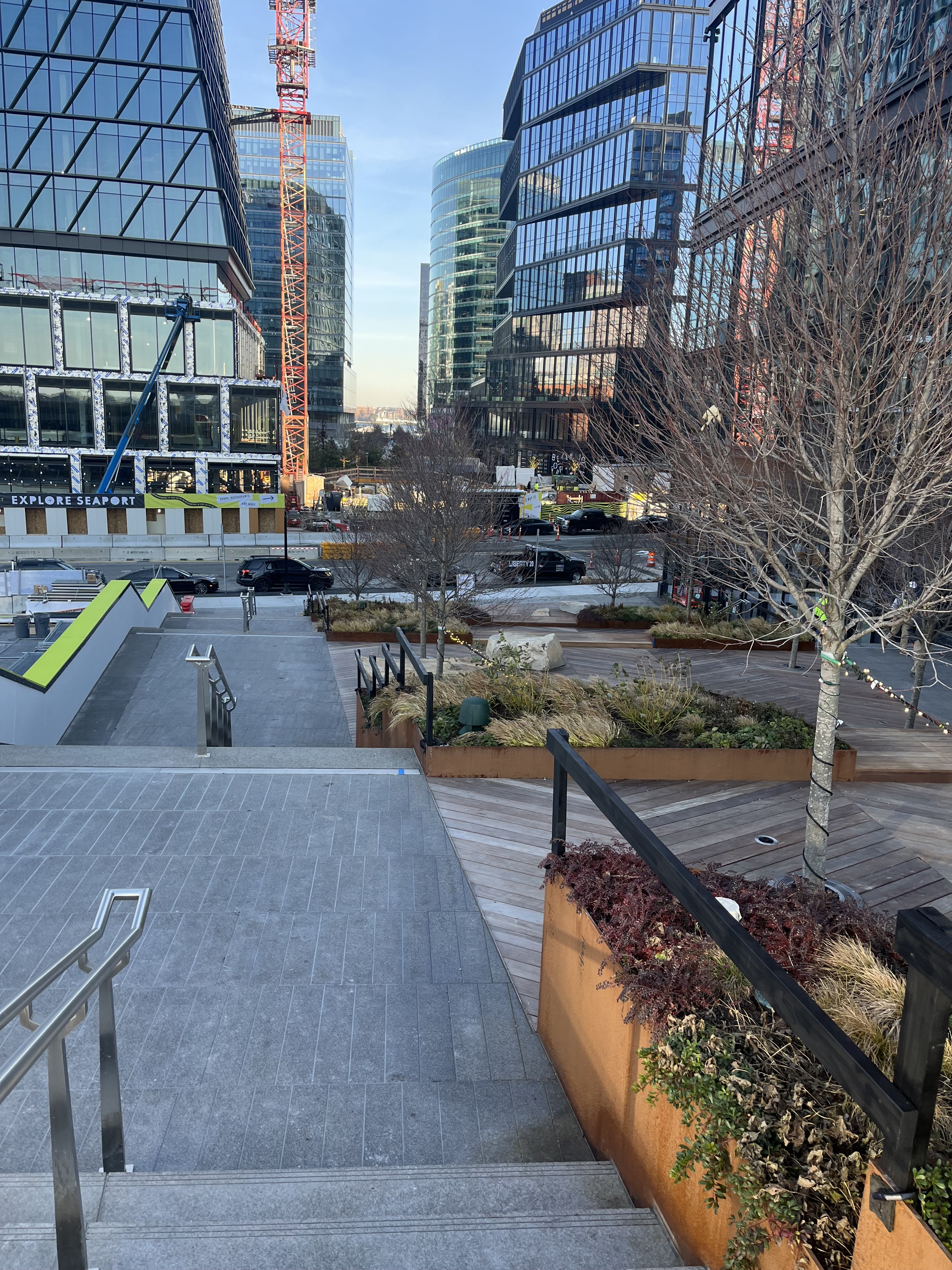
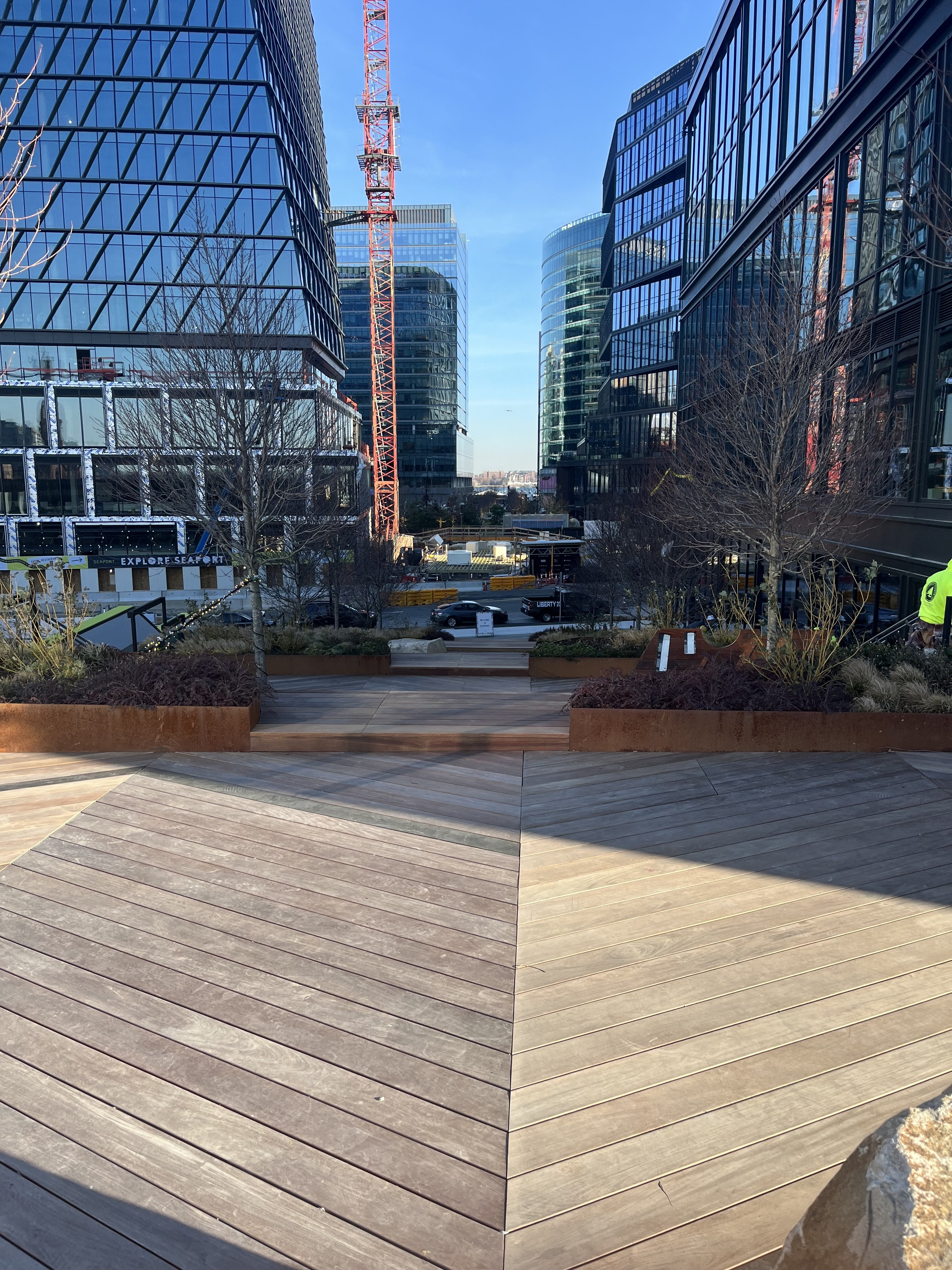
I was hoping the steps would look a bit monumental. These just look kinda bland and prosaic.Stairs between Summer and Congress are open! The sidewalks, parking garage, and general area are also opening up. No sign of activity on the 350 Summer plot though.View attachment 45166
View attachment 45167
dhawkins
Active Member
- Joined
- Jan 25, 2014
- Messages
- 904
- Reaction score
- 3,179
They are keeping it down to earth for the average person that wants to hang out on the back deck. It will be a great space to have another beer garden.I was hoping the steps would look a bit monumental. These just look kinda bland and prosaic.
Last edited:
Justbuildit
Senior Member
- Joined
- Nov 27, 2022
- Messages
- 1,063
- Reaction score
- 3,709
I was hoping the steps would look a bit monumental. These just look kinda bland and prosaic.
They're good and aesthetically pleasing, but will ultimately be in a valley between two office/lab buildings, so my expectations were never too high. For me it does two things:
1. Connects Summer and Congress without using the pigeon-shit covered stairways on A street or walking down past B St to that hidden stairway across from St. Regis.
2. Makes a linear connection between Summer, kind of the "edge" of part of Fort Point down to the waterfront, with a united aesthetic between the wood, copper, and stone finishes (once the Amazon building is done).
Thinking of someone at a conference wanting to go to Row34 or down to the waterfront or ICA, this makes it much easier to navigate. They need a new crossing signal at Congress though, it's pretty hostile still.
Generally progress, but not a transformational addition, in my opinion.
JeffDowntown
Senior Member
- Joined
- May 28, 2007
- Messages
- 5,006
- Reaction score
- 4,128
Your connectivity comment is right on target.They're good and aesthetically pleasing, but will ultimately be in a valley between two office/lab buildings, so my expectations were never too high. For me it does two things:
1. Connects Summer and Congress without using the pigeon-shit covered stairways on A street or walking down past B St to that hidden stairway across from St. Regis.
2. Makes a linear connection between Summer, kind of the "edge" of part of Fort Point down to the waterfront, with a united aesthetic between the wood, copper, and stone finishes (once the Amazon building is done).
Thinking of someone at a conference wanting to go to Row34 or down to the waterfront or ICA, this makes it much easier to navigate. They need a new crossing signal at Congress though, it's pretty hostile still.
Generally progress, but not a transformational addition, in my opinion.
I have had the experience of inviting someone at a conference at BCEC to meet me for dinner at Row 34. They arrive about a 1/2 hour late, and were pretty exasperated. Basically their comment was: "It looked so close on the map; I had no idea how hard it was to walk here".
Why on earth would you want to keep it "down to earth" here? Why let such a potentially awesome vista and grand entrance to the Seaport go to waste? It's not like views like this one are a dime a dozen that you can afford to make such paltry use of it.They are keeping it down to earth for the average person that wants to hang out on the back deck. It will be a great space to have another beer garden.
Besides, the average person can probably drink a beer and appreciate a great view simultaneously. It doesn't have to be one or the other.
That's exactly my point. It should have been a transformational addition. The ghost of Daniel Burnham would like a word with you about your expectations.They're good and aesthetically pleasing, but will ultimately be in a valley between two office/lab buildings, so my expectations were never too high. For me it does two things:
1. Connects Summer and Congress without using the pigeon-shit covered stairways on A street or walking down past B St to that hidden stairway across from St. Regis.
2. Makes a linear connection between Summer, kind of the "edge" of part of Fort Point down to the waterfront, with a united aesthetic between the wood, copper, and stone finishes (once the Amazon building is done).
Thinking of someone at a conference wanting to go to Row34 or down to the waterfront or ICA, this makes it much easier to navigate. They need a new crossing signal at Congress though, it's pretty hostile still.
Generally progress, but not a transformational addition, in my opinion.
A sweeping open vista would have worked better here. There'll be plenty of trees and shade and seating along Harbor Way itself, so it's not like there's a desperate need to have those things here. And it's not like there aren't precedents they could have used as models. Imagine yourself walking down these steps
versus walking down these steps
It seems like the former is going to be a pretty underwhelming experience, even though the latter is even more enclosed. The difference is that the latter frames an open vista and leads you to it. The Summer St. steps also frame a vista, but it's obstructed by the trees, even with the tree branches bare.
This is too much visual clutter, and will get even more cluttered when the trees turn green.
Should have looked more like this. Minimal clutter to preserve a wide open vista. There's no point in trying to make the place where you're sitting look nice if you're looking at a view that's a hundred times nicer. Doing so just creates a needless distraction.
The middle seating area should have been modeled on the ICA steps or the steps at Pier 4. They work pretty well without trees and other clutter.

Following the ICA and Pier 4 models would have given people the opportunity to sit here and enjoy a great vista down the canyon and over Harbor Way. Instead they'll just be frustrated by obstructed views. Maybe the designers wanted to replicate the experience of having a beer in some seats at Fenway?
There are plenty of transformational precedents like the WTC steps, the ICA steps and Pier 4 that they could have used as models. Instead we get progress but no transformation. What a lost opportunity!
BTW, none of the images are mine. They're from other aB posts and youTube.
stick n move
Superstar
- Joined
- Oct 14, 2009
- Messages
- 13,361
- Reaction score
- 23,944
Idk I like it but maybe I just have low expectations due to following the development process in boston closely. Sharing the fan pier steps and ica steps really do hit home how iconic they are though. The fan pier steps are a top 5 view in the city imo. What are you suggesting they did different exactly though less trees and no buildings on either side? The steps need the landings after so many steps due to the americans with disabilities act I believe too.
To rephrase a point I made in my earlier post, you can have both connectivity and at least a hint of urban grandeur. The two are not mutually exclusive. But "down to earth" and "urban grandeur" definitely are mutually exclusive, so I'm just surprised and disappointed that they went with the former instead of the latter in this particular space.Your connectivity comment is right on target.
I have had the experience of inviting someone at a conference at BCEC to meet me for dinner at Row 34. They arrive about a 1/2 hour late, and were pretty exasperated. Basically their comment was: "It looked so close on the map; I had no idea how hard it was to walk here".
The steps would have worked better as a grand entrance to the Seaport and an anteroom to Harbor Way rather than as part of the Harbor Way itself, which seems to be what the designers are shooting for. The former approach has a placemaking aspect to it, while the latter will probably feel more functional in spirit, rather like a bigger version of the metal staircase that goes from Summer St. down to A St. It won't be so much a "place" as a "means" to get from one place to another. At least that's how the responders to my post seem to be thinking about it, and how you think about it is going to influence how you use it. If you think about it as a means to get from Summer St. to Congress St. you'll probably use it like tourists use the steps beside City Hall to get to Quincy Market. If you think about it as a place you're more likely to use it like tourists use the Spanish Steps in Rome. The little observation platform at the end of Fan Pier works as a place you go to, but I doubt these steps will work the same. Hopefully they'll be used both ways, but given the emphasis the replies to my post have given to "connectivity" makes it unlikely, and that's because the "down to earth" design makes it look like a place you go through rather than a place you go to. But we'll see.
As I see it, the ICA and Fan Pier steps aren't iconic in and of themselves. They're iconic because of the views you get from them. If you look at Justbuildit's photos you can see that the Summer St. steps are looking at an iconic canyon view, but it's going to be hidden from sight by all the trees, and all the other greenery on the steps will be competing for your attention and making it seem that they're what you're supposed to look at, so they just take attention away from the view of the Harbor Way tree canopy seen from above and the surrounding canyon formed by the buildings.Idk I like it but maybe I just have low expectations due to following the development process in boston closely. Sharing the fan pier steps and ica steps really do hit home how iconic they are though. The fan pier steps are a top 5 view in the city imo. What are you suggesting they did different exactly though less trees and no buildings on either side? The steps need the landings after so many steps due to the americans with disabilities act I believe too.
The buildings and the landings have to stay, of course. It's just the trees and shrubbery that need to go. Most of them, anyway. The other things I don't like are the railings at the edges of the steps and the choice of paving. I would have made the edge railings the same as the center railing, which is much more classier-looking, and used a paving that both relates better to the pattern and contrasts more with the color of the boardwalk. Not being any sort of designer I can't really give you an example of that, but the paving should have a pattern that's eye-catching and complements the boardwalk, rather than being drab and fading into the background while also clashing with the boardwalk like this one does.
Justbuildit
Senior Member
- Joined
- Nov 27, 2022
- Messages
- 1,063
- Reaction score
- 3,709
I don't know, the path from Summer to the harbor have been designed (and in the case of the way between Seaport and Autumn, REdesigned) to have a single aesthetic. That aesthetic is rocky, non-linear, tree-filled, with copper and wood features that mirror the deck of a ship and recall the industrial history of the neighborhood. Not sure if you've been following neighborhood resident feedback but the response has been pretty clearly in favor of more trees and diverse greenery in a part of the city that could definitely use more greenspace. If anything I wish the whole area was wider and became a multi-tiered plaza that happened to also serve as stairs.
I also don't want to over-index on the two shots I quickly took without breaking stride this morning. Go check it out and decide for yourself! For me, it's mostly about breaking the parallel, non-intersecting Congress/Summer roads that badly needed to be connected.
I also don't want to over-index on the two shots I quickly took without breaking stride this morning. Go check it out and decide for yourself! For me, it's mostly about breaking the parallel, non-intersecting Congress/Summer roads that badly needed to be connected.
Should have looked more like this. Minimal clutter to preserve a wide open vista. There's no point in trying to make the place where you're sitting look nice if you're looking at a view that's a hundred times nicer. Doing so just creates a needless distraction.

The Fan Pier view qualifies in your "100x nicer" scenario, but the view from the Summer Street steps doesn't come close.
Can you provide some details on the single aesthetic? What exactly do they mean by that? Is the paving on either side of the boardwalk going to be the same from start to end? The paving on the steps in your photos looks nothing like the paving I've seen in photos of the segment between 101 and 121 Seaport Blvd. I thought that section was completed. Is the paving there going to be done over to match the paving on the steps? Or maybe I've been looking at really old pics. Do you happen to have any recent pics of that section you could post?I don't know, the path from Summer to the harbor have been designed (and in the case of the way between Seaport and Autumn, REdesigned) to have a single aesthetic. That aesthetic is rocky, non-linear, tree-filled, with copper and wood features that mirror the deck of a ship and recall the industrial history of the neighborhood. Not sure if you've been following neighborhood resident feedback but the response has been pretty clearly in favor of more trees and diverse greenery in a part of the city that could definitely use more greenspace. If anything I wish the whole area was wider and became a multi-tiered plaza that happened to also serve as stairs.
I also don't want to over-index on the two shots I quickly took without breaking stride this morning. Go check it out and decide for yourself! For me, it's mostly about breaking the parallel, non-intersecting Congress/Summer roads that badly needed to be connected.
I do have to say, though, that if the aesthetic was meant to be non-linear then they've failed miserably. From what I've seen of the plans, you can walk a straight line from Summer St. all the way to Northern Ave. and the illustrations of Harbor Way look like the embodiment of a traditional French allée with its attendant Cartesian linearity and rigid symmetry.
There's no conflict between having a lot more trees and preserving a sight line down the canyon lining Harbor Way. Just don't put the trees in the middle where they block what could become an iconic picture-postcard view looking down the canyon from the top of the steps at Summer Street all the way to the harbor. Like they could put a ton of trees on the two sides where the steps are now and move the steps to the middle and join them to make one wider staircase, so you step down the middle and have an open vista in front of you looking all the way to the harbor.
Making the area a multi-tiered plaza that also functions as a stair is exactly the kind of thing I'm talking about. Make this a place in its own right, as opposed to a mere connection that just lets you go from one place to another and serves no other purpose.
True. And it will come even less close if you block it off with trees.The Fan Pier view qualifies in your "100x nicer" scenario, but the view from the Summer Street steps doesn't come close.
stick n move
Superstar
- Joined
- Oct 14, 2009
- Messages
- 13,361
- Reaction score
- 23,944
Yea they did rip up the ped path between 101 and 121 seaport (which was only a couple years old) and made it have the same boardwalk aesthetic as the rest of harbor way. It was only recently done so if you havent been there in a while you wouldnt know besides the pics on here.Can you provide some details on the single aesthetic? What exactly do they mean by that? Is the paving on either side of the boardwalk going to be the same from start to end? The paving on the steps in your photos looks nothing like the paving I've seen in photos of the segment between 101 and 121 Seaport Blvd. I thought that section was completed. Is the paving there going to be done over to match the paving on the steps? Or maybe I've been looking at really old pics. Do you happen to have any recent pics of that section you could post?
Heres a pic from the last page in this thread thanks to atlantaden.
Took a walk around the Seaport last week! I do love the Seaport!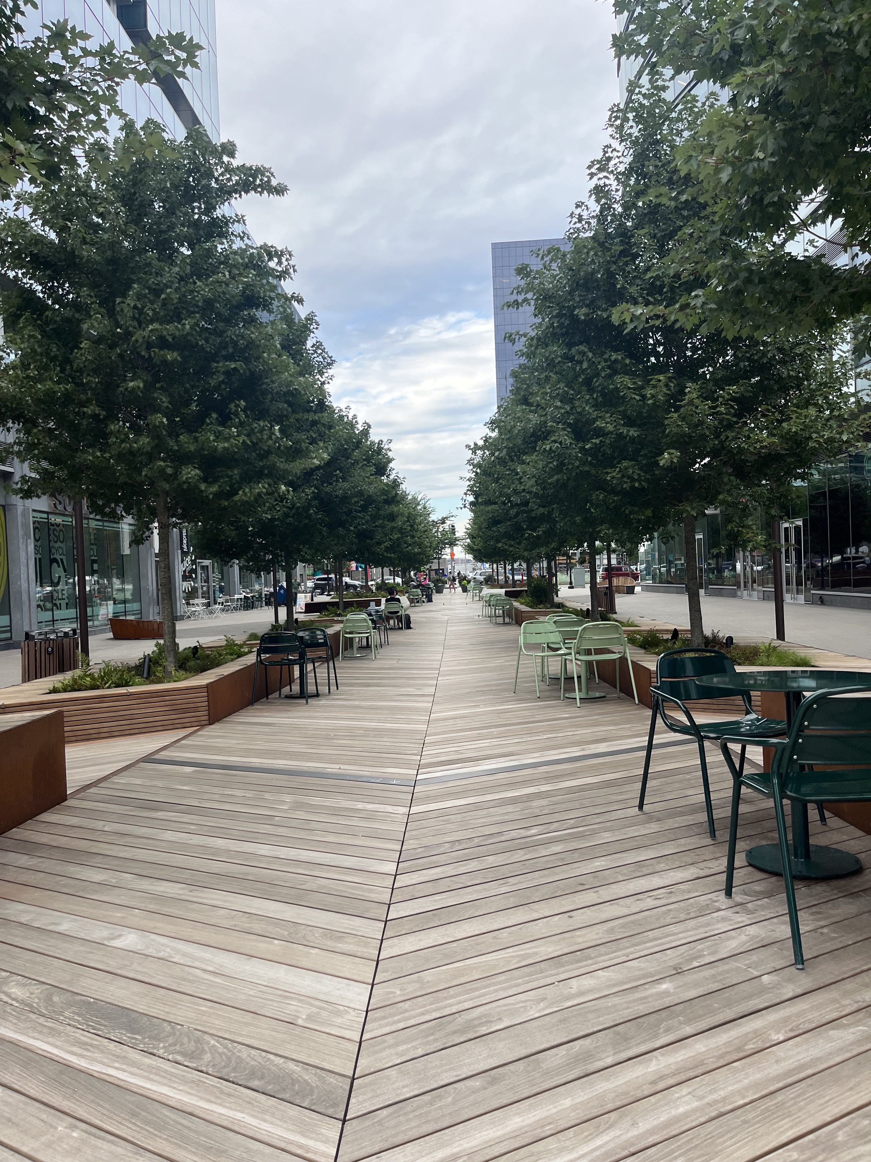
Thanks. I actually haven't been there at all yet, and probably won't until next year in late spring or early summer, though I'm thinking of holding off and going as late as possible so Commonwealth Pier will also be done by the time I get there. That's something else I'm really looking forward to seeing when complete. I'll be kinda disappointed if they don't put back all the flags, though.Yea they did rip up the ped path between 101 and 121 seaport (which was only a couple years old) and made it have the same boardwalk aesthetic as the rest of harbor way. It was only recently done so if you havent been there in a while you wouldnt know besides the pics on here.
That's a nice pic. This is going to be a great urban space when it's complete. Having said that, there's a couple of things about the pic that confuse me. First, I totally cannot figure out how that scene embraces a non-linear aesthetic. Second, I don't understand why there are tables and chairs on the boardwalk. I would expect you'd want to keep the central promenade clear so people have plenty of room to stroll and move around in comfort. I don't think I'll ever understand the logic behind modern design.
Justbuildit
Senior Member
- Joined
- Nov 27, 2022
- Messages
- 1,063
- Reaction score
- 3,709
Go take a look and report back, I think you’ll be pleasantly surprised. It’s net linear overall but the area between the Amazon buildings was built more as a meander than a pure straight linear park, with some grass and seats and installed chairs. Thanks to Stick for the picture. Even if it’s not transformational it’s at least coherent and has a clear aesthetic.
Gunner02
Active Member
- Joined
- Oct 10, 2019
- Messages
- 352
- Reaction score
- 1,592
The Monday Morning QB here is insane. The net gain from everything done is unquantifiable, rhetorically  . We went from parking lots to not just full development but housing (I know what you're going to say, relax), business, economy, urban planning... I mean everyone just stop bitching. The fact that this is what it has become and the brick and mortar business that was 'dead forever' two years is booming there is such a testament to foot traffic brought by genuinely attractive planning. This city in just 10 years BLEW UP; One congress, WT, conversion of north station and South Station Tower is no doubt beyond what any of us ever dreamed possible a decade ago. In addition to ALL of seaport, One Dalton, Raffles, MT, etc etc etc etc., like come on.
Seaport may have started out 'square' but it had no leverage for attracting businesses, let alone ones of any notoriety; let alone ones the city could actually instruct on design or on urban planning contribution. As it grew, so did the leverage, and I think it's honestly pretty impressive. Furthermore, dealing with FAA air rights restrictions under 300'.
And also, stop bringing politics into this. The same underlying 'foundations', 'groups', conservationists and environmentalists, are going to be there during any respective party's term. Outcome deviation wouldn't fluctuate anywhere near the exaggeration of blame floated in this forum.
Last edited:
