Seaport Square (Formerly McCourt Seaport Parcels)

Anyone still think this is a failure? If there is anyone left Ill ask again after pier 4 and parcel M are done.

Far from it. Though, I think they went a little overboard with the variety of facade styles. Also, the tired, "large, multistory frame around the windows" motif on one side didn't need to be there, as it's not like the other elevations try to mask the true height of the building.
 
Looks like tremont on the common times 2...only glass
 
^^Yes, and Yes!!

We build Vegas style buildings then turn em on their sides here in Boston.

Because even Vegas style ain't wide enough!

Ain't no conspiracy theory! Goddarnit, it's who we are!

It feels just like Tremont On The Common.... and my mind won't let go!!


https://www.youtube.com/watch?v=yrDaJFeqGng
 
I'll propose a baseball analogy for these buildings.

They are kind of like a "base on balls". They don't strike out, and certainly do not create a double play, but neither are they home runs or even base hits. But they kind of move the game (area) forward in a vaguely positive way.
 
I'll propose a baseball analogy for these buildings.

They are kind of like a "base on balls". They don't strike out, and certainly do not create a double play, but neither are they home runs or even base hits. But they kind of move the game (area) forward in a vaguely positive way.

Very apt analogy (and I am generally not a fan of sports analogies). You hit the mark with this one.
 
I'll propose a baseball analogy for these buildings.

They are kind of like a "base on balls". They don't strike out, and certainly do not create a double play, but neither are they home runs or even base hits. But they kind of move the game (area) forward in a vaguely positive way.


Never heard the saying (recited thousands of times per day at little league games from coast to coast) "a walk is as good as a hit?"
 
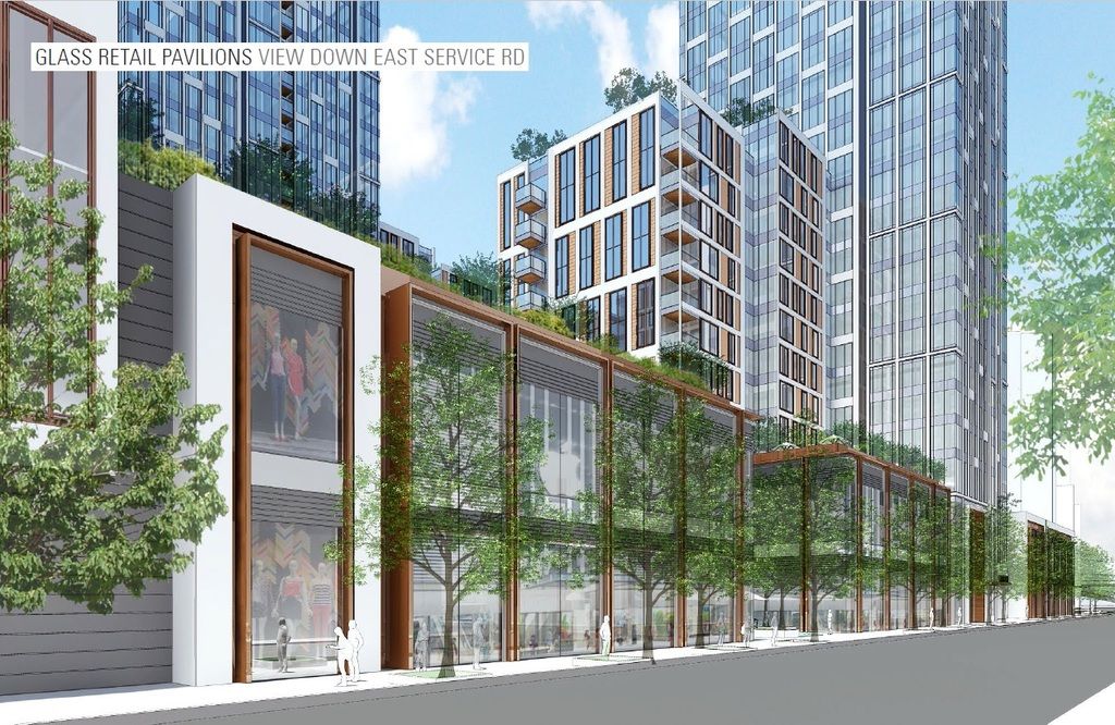
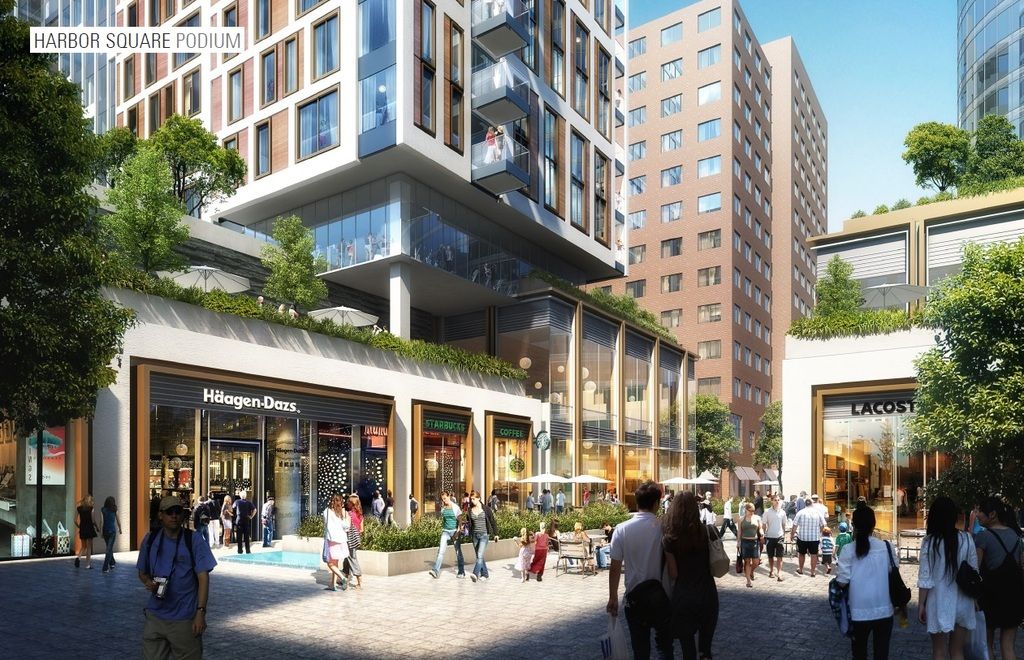
I'm just curious what people would have preferred instead. Speaking specifically for Seaport Blvd, you have ground floor retail, a not too wide street, a variety in building designs, etc - checking all the boxes that people ask for. Yes, the buildings are all the same height but you'd need to chat with the FAA about that.
 
Never heard the saying (recited thousands of times per day at little league games from coast to coast) "a walk is as good as a hit?"

Yes, but is is not quite true, if you have base runners. Base runners have more potential for advancement with a hit than a walk.
 
I'm just curious what people would have preferred instead. Speaking specifically for Seaport Blvd, you have ground floor retail, a not too wide street, a variety in building designs, etc - checking all the boxes that people ask for. Yes, the buildings are all the same height but you'd need to chat with the FAA about that.

Let me preface this by saying that I am not trying to restart the same discussion that has been had here many times, simply answering the above question: what would "people" have preferred? Real architecture. Buildings that don't just try to maximize profits. Buildings a long time ago before all the crazy land swaps that made everything astronomically expensive. Developments that aren't so car-based. Non-luxury housing. Development that followed a carefully devised, community-oriented plan rather than the whims of developers. Did I mention better architecture? Transit access. Also, Seaport Blvd. is pretty wide.

But things are improving.
 
I'll propose a baseball analogy for these buildings.

They are kind of like a "base on balls". They don't strike out, and certainly do not create a double play, but neither are they home runs or even base hits. But they kind of move the game (area) forward in a vaguely positive way.

Otherwise, known here as "filler".
 
Did I mention better architecture?

Its coming.


1.jpg


020217StairRendering.jpg


CYzwUeqUsAAKz7P.jpg:large


CYzwkooUwAAWEUq.jpg:large


Seaport%20Square%20Parcels%20M1-M2%20Boston%2019.jpg
 
As stand alone buildings, either parcel B or C would be a base hit easily. Together as a whole development, I have no problem calling them a double or a home run (a triple happening less often than either and also being more exciting often times.) These serve so many needs of (and help establish the area as) a real neighborhood.

No matter how many classes or lectures you've sat through on the subject, architecture (good or bad) is subjective. Knowing all the names, styles, derivations, or history thereof do not make your opinion of whether something is good, bad, or "true" architecture any more valid or weight deserving than any others.

I might argue that current "architecture" is harder and much more involved than in yesteryear when beautiful palaces and monuments of beauty and glory were erected all over the world. Many were built without real cost limits or under strict building code requirements. You weren't operating within our very expensive boundaries of cost of construction balanced against developer ROI.

Are these going to be all over the pages of art as architecture magazines? No, probably not. But, will they be covered in rags devoted to urban design, and housing the masses in our modern cities? Absolutely.

The buildings have their warts. Definitely. But, 99% of the public who view them will not see most of or any of them. Nit pickers on pages like this (which is fine, it's why we have these types of sites) will see them, and over react to them. It's an overreaction because we so often feel our opinions on these types of matters reflect the public's opinion. Which in cases like this, it almost certainly will not. The scientists, or engineers, or lawyers, or bakers, or whomever, are not going to gripe and bemoan the multiple storeys in a single frame motif that is overplayed. Because they've never heard of it, don't notice it, and if you tell them about it..... still don't care.

Not an attempt to belittle anyone's opinion, because so many on here know much more than me about architecture. Just a reminder to keep your own opinion in perspective. The things you think ruin a development, building, or neighborhood, will go unnoticed by so many who actually live in and use said building, development, or neighborhood. (Not including dead street walls, loading docks, and over sized lobbies. These are the devil's creation.)

Maybe my doctor is right... I should go see the neurologist.
 
^^exactly.

btw, what building has the best curtain wall?

is it the JHT or the Bronze striped Onyx (Seagram)

or will someone dare blaspheme the Most High by naming another.
 
Let me preface this by saying that I am not trying to restart the same discussion that has been had here many times, simply answering the above question: what would "people" have preferred? Real architecture. Buildings that don't just try to maximize profits. Buildings a long time ago before all the crazy land swaps that made everything astronomically expensive. Developments that aren't so car-based. Non-luxury housing. Development that followed a carefully devised, community-oriented plan rather than the whims of developers. Did I mention better architecture? Transit access. Also, Seaport Blvd. is pretty wide.

But things are improving.

I agree that I don't want to rehash past discussions, but land swaps don't make things expensive. Current demand sets pricing, not past real estate transactions.

Cases in point: Waterside Place. It's Exhibit A in the case against shitty Seaport architecture and its units are just as expensive to rent as the ones down the street in Seaport Square. Yet it's built on land owned by a public authority (Massport) that hasn't changed hands among developers in decades.
 
Whats worse waterside place or 1MPD. My opinion 1MPD by a mile.

Theres already some good architecture here, but whats going up soon is very good. The buildings have to be wide because of how short they are so they still need to make a building look good while maximizing available space which leads to the same general massing with variances thrown in there. 121 seaport they compromised JUST to make it look good, they're losing money by not making it a box, but they made it look good and that can be a selling point too.
 
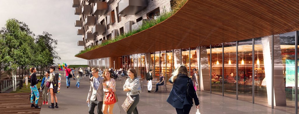
If you stop on the second pic down in 2622 and really imagine what the areas going to be like in real life that is an absolutely incredible public realm. This is going to be a major hit for the people. That beautiful wooden floored court yard at seaport square also leads directly into the mediterranean inspired court yard at parcel M.... this is going to be some shit.

Dont forget the 2nd building will have the back side of it covered by another tower in the coming future.
 
Last edited:
If you stop on the second pic down in 2622 and really imagine what the areas going to be like in real life that is an absolutely incredible public realm. This is going to be a major hit for the people. That beautiful wooden floored court yard at seaport square also leads directly into the pier 4 court yard.... this is going to be some shit.

what development is that? Parcels L3-L6?
 
what development is that? Parcels L3-L6?

Thats parcel N and P shown again here. These stairs lead up to Summer st.

020217StairRendering.jpg


Note the M parcels court yard has changed since this picture was made along with parcels 3-6. The alignment of the road leading up to it is the same though.

Seaport-Square-B1-651x516.jpg


The pedestrian area between 101 seaport and 121 Seaport leads directly into the bottom of this picture. Heres L3-6.

020217seaportsc001.jpg


Heres where the pedestrian area starts that goes all the way up to summer st. It leads directly into the bottom of the above picture.

121Seaport_01.jpg


Autumn Lane leads into the opening between the M parcels. Here is that area. The brick building in this picture is a place holder and is shown by the glass tower above in L4.

Seaport%20Square%20Parcels%20M1-M2%20Boston%207.jpg


The opening on the right of the picture of parcels 3-6 leads into the old fort point area.
 
Last edited:
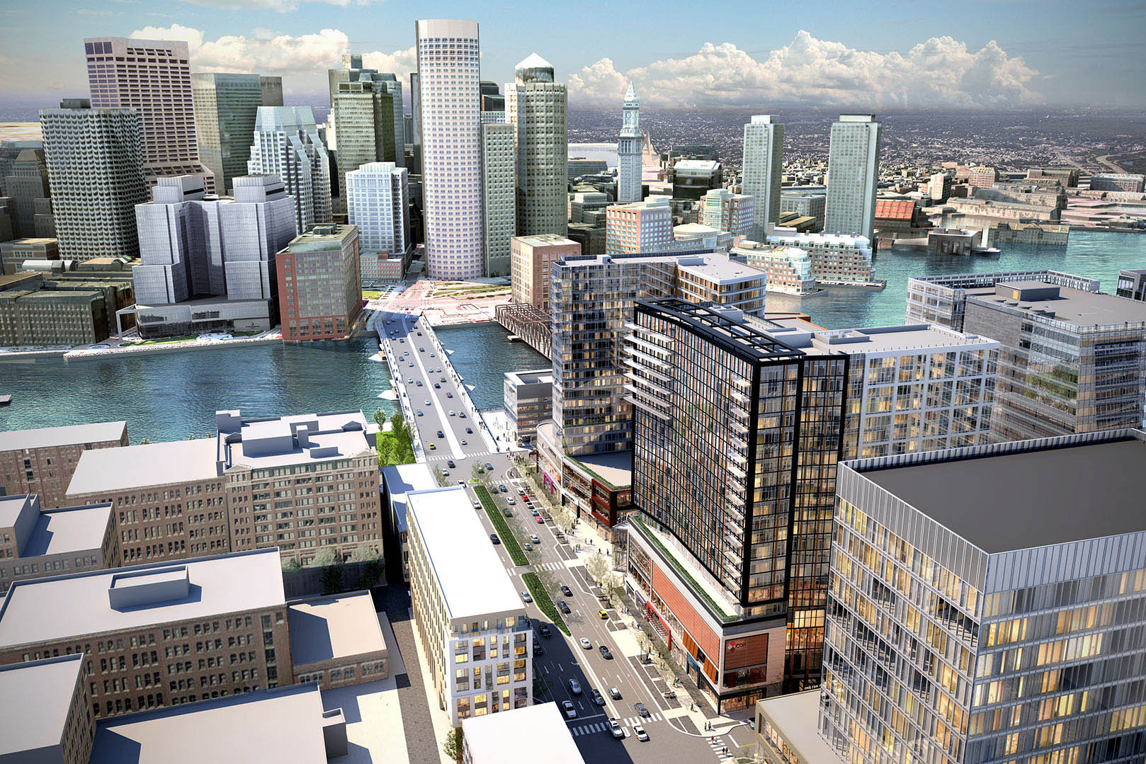
Parcel D at the bottom right of this picture also appears to be an extension of 1 seaport square making it 33% bigger with multiple floors of retail just like whats going up now. So once whats being done at one seaport square now is finished theres still another tower to go up adding 1/3 more space.

01.seaport-square.jpg
 

Back
Top