- Joined
- May 25, 2006
- Messages
- 7,064
- Reaction score
- 1,990
This is a good looking building. Shame it's not 100 stories tall.
Unfortunately, it would look like 432 Park Ave.This is a good looking building. Shame it's not 100 stories tall.
Unfortunately, it would look like 432 Park Ave.
It has all the low rise joy of K Street, D.C.Unfortunately, it would look like 432 Park Ave.
Walking by it today, there is something about the glass that is deadening. It doesn’t reflect the adjacent buildings or sky well, and it doesn’t have the transparency of something like the Apple Store cube.
It gives the vibe of floor after floor of soul sucking cube farms.Walking by it today, there is something about the glass that is deadening. It doesn’t reflect the adjacent buildings or sky well, and it doesn’t have the transparency of something like the Apple Store cube.
Walking by it today, there is something about the glass that is deadening. It doesn’t reflect the adjacent buildings or sky well, and it doesn’t have the transparency of something like the Apple Store cube.
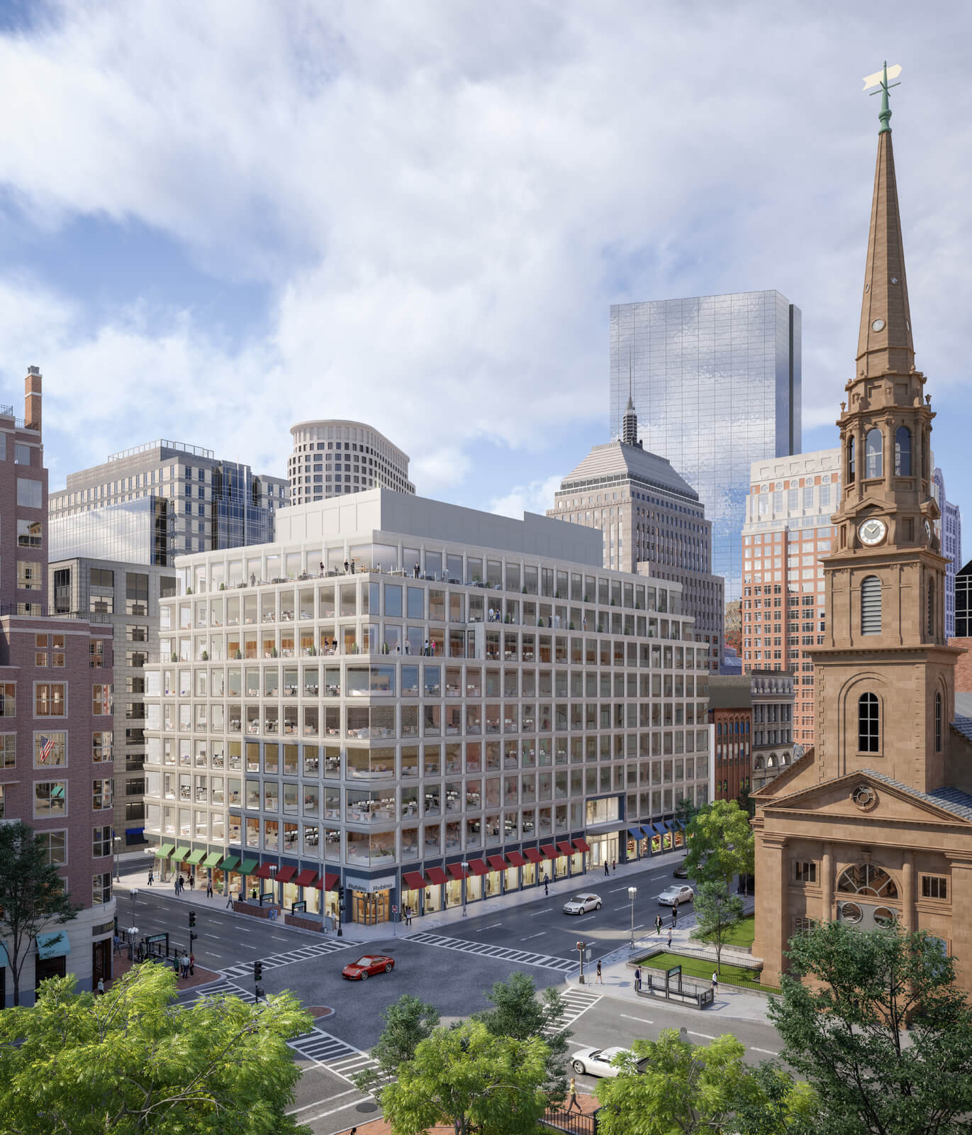
The city has the authority to deny a COO but they very rarely use it and certainly will not here.The frustrating thing to me is that the renders clearly advertised a very transparent and translucent window style. And since the windows are such a dominant part of the architecture, it has a huge effect on the overall appearance and is just a major downgrade. If the windows are dramatically different than what the City approved, I sure hope the City follows up with enforcement on it.
It has been 2 decades, but the city did just that with the Hotel Commonwealth. In 2003 BU had to shell out $2 million to replace the façade that did not match the approved plans.The city has the authority to deny a COO but they very rarely use it and certainly will not here.
Taketern's photo of the southeast corner supra shows there is some reflectivity in the glass. The original SC&L building had a generous amount of glass. That building was designed to be used as a commercial school for young women at a time when interior lighting was transitioning from illuminating gas to incandescent bulbs.Walking by it today, there is something about the glass that is deadening. It doesn’t reflect the adjacent buildings or sky well, and it doesn’t have the transparency of something like the Apple Store cube.
I know it’s still under construction, so the backdrop is dark steel instead of a lighter interior. However, I don’t think that accounts for all the difference between the render and reality.
Thank you for digging up this article. This struck me:It has been 2 decades, but the city did just that with the Hotel Commonwealth. In 2003 BU had to shell out $2 million to replace the façade that did not match the approved plans.
STAFF EDIT: Replacing hotel facade wise
In a case that proves appearances can be crucial, Boston University is fronting $1.9 million to make the Hotel Commonwealth's façade look less like a plastic Disneyland structure and more like a four-star hotel that will fit in with its Kenmore Square surroundings.dailyfreepress.com
Fisher Pricey might have been more apt - although I do remember the outrage over this and having never been to Disney, the term certainly fit what my imagination came up with 20 years ago.Thank you for digging up this article. This struck me:
"In a case that proves appearances can be crucial, Boston University is fronting $1.9 million to make the Hotel Commonwealth’s façade look less like a plastic Disneyland structure and more like a four-star hotel that will fit in with its Kenmore Square surroundings."
As far as fake facades go, does anyone actually do them better than Disney? They have plenty of Second Empire inspired facades splintered around their parks.
And you know who designed most of them? You got it -- RAMSA.
Sory of off topic, RAMSA is currently designing a hotel in Charleston, SC. A city known to be scrupulous in its design standards and attention to detail:
https://www.ramsa.com/projects/project/north-market-hotel
I think the reference at the time was to Michael Graves' PoMo (stuff) the Dolphin and Swan. Basically cartoon caricatures of architecture.Thank you for digging up this article. This struck me:
"In a case that proves appearances can be crucial, Boston University is fronting $1.9 million to make the Hotel Commonwealth’s façade look less like a plastic Disneyland structure and more like a four-star hotel that will fit in with its Kenmore Square surroundings."
As far as fake facades go, does anyone actually do them better than Disney? They have plenty of Second Empire inspired facades splintered around their parks.
And you know who designed most of them? You got it -- RAMSA.
Sory of off topic, RAMSA is currently designing a hotel in Charleston, SC. A city known to be scrupulous in its design standards and attention to detail:
https://www.ramsa.com/projects/project/north-market-hotel