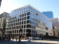
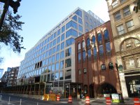
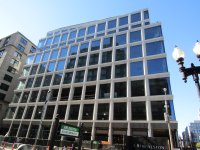
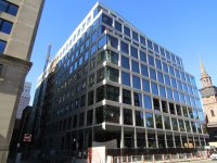
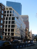
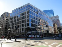
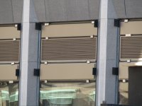
Shreve, Crump & Low Redevelopment | 334-364 Boylston Street | Back Bay

We need more Hugh Ferriss and less megaplex CGI in our renders.
Spme of the pre-CAD renders back in the 1960s were inspirational, absolute works of art. CAD has made the renders these days somewhat sterile and lifeless looking.
 
As of 10/27.
 

Attachments

  • IMG_7170.JPG
    IMG_7170.JPG
    5.5 MB · Views: 1,665
  • IMG_7171.JPG
    IMG_7171.JPG
    4.3 MB · Views: 159
  • IMG_7173.JPG
    IMG_7173.JPG
    6.3 MB · Views: 151
  • IMG_7177.JPG
    IMG_7177.JPG
    5.1 MB · Views: 148
  • IMG_7178.JPG
    IMG_7178.JPG
    4.6 MB · Views: 148
  • IMG_7179.JPG
    IMG_7179.JPG
    4.9 MB · Views: 153
  • IMG_7169.jpg
    IMG_7169.jpg
    5.3 MB · Views: 168
Although the JFK low-rise has a much better corner.
Agree. I think the low-rise part of the Fed Building would have fit into the context of the Shreve Crump & Low site much better than the glass box they ended up with.
 
The idea that the JFK building is preferable is nonsense. 350 boylston will have street level retail which might be its only saving grace but single handedly makes the comparison silly. It’s much much better to have street level activation.

Totally agree about the street level activation.. That's a given for any building on a bustling urban site. The style of the building is what I was focusing on, a more masonry type structure instead of the all glass cube punctuated by plain white frames. If the JFK was done in masonry, something like that at this location would have fit the context a lot better, IMO, Something with some style, to fit into a very stylish locale, instead of a cube.
 
Last edited:
img_6749-jpg.56213


Transparent glass is not reflective The notion that high-paid consultants would embrace transparency into their affairs as much as the ladies in the windows in Amsterdam do in theirs is more than a bit ludicrous.
 
I'm
img_6749-jpg.56213


Transparent glass is not reflective The notion that high-paid consultants would embrace transparency into their affairs as much as the ladies in the windows in Amsterdam do in theirs is more than a bit ludicrous.

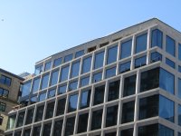
The glass looks way too dark, like looking into a black hole.
 
Q6uJrce.png


Google streetview from 2007. The old glass was more reflective than I thought. The larger expanse of the old windows was softened by muntins and mullions, and there was less contrast when set against the brown brick columns, in contrast to the current whitish limestone. And what a chopped up, VE'd façade of irregular symmetry the Arlington St. side had.
 
Holding off on the glass color comments until there are inevitable acres of ACT, numbing LED light fixtures, and window shades put up in the interior.

However, on the corner window treatment: it's a miss and cheapens/dates the building. If it's trying to be modern, it should define the corner more prominently and break up the pattern, not just end it abruptly. If it's trying to be traditional, drop the continuous windows.

I think with how marketers drive design these days, RAMSA was forced to put in a corner window with no columns, which is great for the 5% of people in those conference rooms/offices that will notice there's no column at the corner of the room they're watching or editing a PowerPoint in, but really deters from the rest of the exterior design. RAMSA is a respectable Architect, and has shown they can achieve better corners with this requirement, below, which makes me more disappointed with the Development Team here. Similar design to here for the 90% of the rest of the facade, but a more intentional corner:

1730676383464.png

https://www.ramsa.com/projects/project/900-16th-street-nw (acknowledge this building has already been referenced upthread)
 
The corner is bad, but I otherwise don't hate this?
To me it feels like a bastard child of Lyrik in Back Bay's facade style and Parcel P (Foundation Medicine) in the Seaport's square windows (though there are probably better examples, but these came to mind first). I can't tell if I like it yet. Something feels uncanny-valley about the mashup of the styles in my amateur eyes--like industrial boxy windows and modern clean lines? I can't put my finger on it
 

Back
Top