You are using an out of date browser. It may not display this or other websites correctly.
You should upgrade or use an alternative browser.
You should upgrade or use an alternative browser.
Somerville High School Renovation & Expansion | 81 Highland Ave | Somerville
- Thread starter Javier
- Start date
Bananarama
Active Member
- Joined
- Mar 18, 2020
- Messages
- 605
- Reaction score
- 1,249
Do you have a weekly quota that requires 9/10 posts to be intentionally contrarian? lolAn awful school building. Imagine cursing generations of children with this thing.
AmericanFolkLegend
Senior Member
- Joined
- Jun 29, 2009
- Messages
- 2,214
- Reaction score
- 248
Contrarian and hyperbolic.Do you have a weekly quota that requires 9/10 posts to be intentionally contrarian? lol
Desire Path
New member
- Joined
- Feb 13, 2023
- Messages
- 9
- Reaction score
- 11
It looks like a reel of music from a player piano. I'm actually kind of baffled that anyone on this forum thinks otherwise.
K-12 education architectural guidelines are incredibly strict and offers very little wiggle room for experimentation. Despite that, SMMA designed something that was unique, mixed modern with preservation, and stayed true to what the greater community looks like and needs.
If you haven't had the opportunity to tour the building, I strongly suggest it. Although you may not change your mind about the design, you will see that a truly fantastic space for learning was designed. The diversity of programing space alone will be a draw for new and old residents for decades.
Worth noting the students don't go to school on the wall. They use the school. And the school is rather nice inside. Also, the wall will retain a sizable ballfield where before there was a parking lot and giant furnace. So... better?
I have to admit, I hated the look of this building as it was going up but it's definitely grown on me. At least from the Highland side.
I think the new building and renovated building do a great job of connecting the old building and city hall to the library. Add to that the new playground and landscaping outside the library and the whole area is beginning to come together.
Once they fix up highland and the new trees mature a bit, this stretch will be an excellent civic space.
The Gillman side seems like a bit of a mess but I reserve judgement because I misjudged the other side.
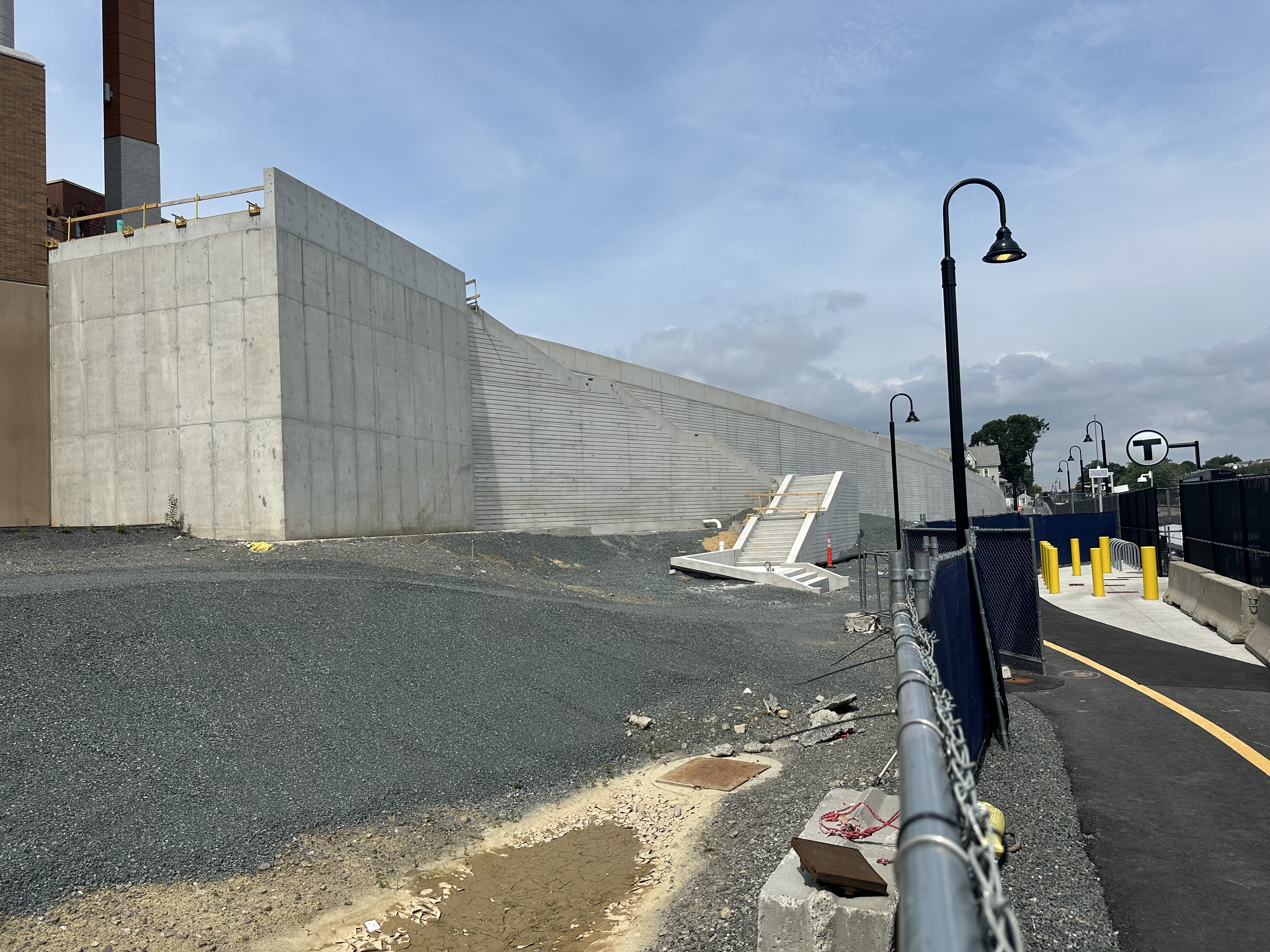
Do people know where this new forest is going? Is it covering some of that enormous wall running the length of the path?
Also, the new school is amazing inside.
Nice to see tax dollars well spent!
It has the exact same lazy and already dated aLtErNaTinG windows scheme that is routinely and righteously mocked on this very forum. God forbid a SCHOOL BUILDING would maintain some kind of order.Very good points ^^^
Additionally, the building looks quite nice from the outside.
Trolls gonna troll.
It is ordered.It has the exact same lazy and already dated aLtErNaTinG windows scheme that is routinely and righteously mocked on this very forum. God forbid a SCHOOL BUILDING would maintain some kind of order.
Look a bit closer.
It has the exact same lazy and already dated aLtErNaTinG windows scheme that is routinely and righteously mocked on this very forum. God forbid a SCHOOL BUILDING would maintain some kind of order.
I guess I admire your persistence.
lol you’ve gotta be fucking kidding me
no, not at all.lol you’ve gotta be fucking kidding me
I look at that building and I can see patterns in the window layout. It's not totally random.
It wouldn't bother me if it was, It'd likely cost a fortune to build, but it's not.
There's a pattern, or an order to it.
If you lay those windows out in a grid format. It would look like a gigantic monolith, a hunking great block on top of a hill.
The broken vertical lines help break up the mass of the structure.
The faked randomness is worse than actual randomness.no, not at all.
I look at that building and I can see patterns in the window layout. It's not totally random.
It wouldn't bother me if it was, It'd likely cost a fortune to build, but it's not.
There's a pattern, or an order to it.
If you lay those windows out in a grid format. It would look like a gigantic monolith, a hunking great block on top of a hill.
The broken vertical lines help break up the mass of the structure.
BostonObserver
Active Member
- Joined
- Dec 26, 2006
- Messages
- 573
- Reaction score
- 103
An awful school building. Imagine cursing generations of children with this thing.
Medusa windows!!!
BostonObserver
Active Member
- Joined
- Dec 26, 2006
- Messages
- 573
- Reaction score
- 103
Maybe we can do a sequel to this movie

Beware the windows that paralyze!!
Beware the windows that paralyze!!
Dr. Rosen Rosen
Senior Member
- Joined
- Jul 19, 2021
- Messages
- 1,197
- Reaction score
- 7,023
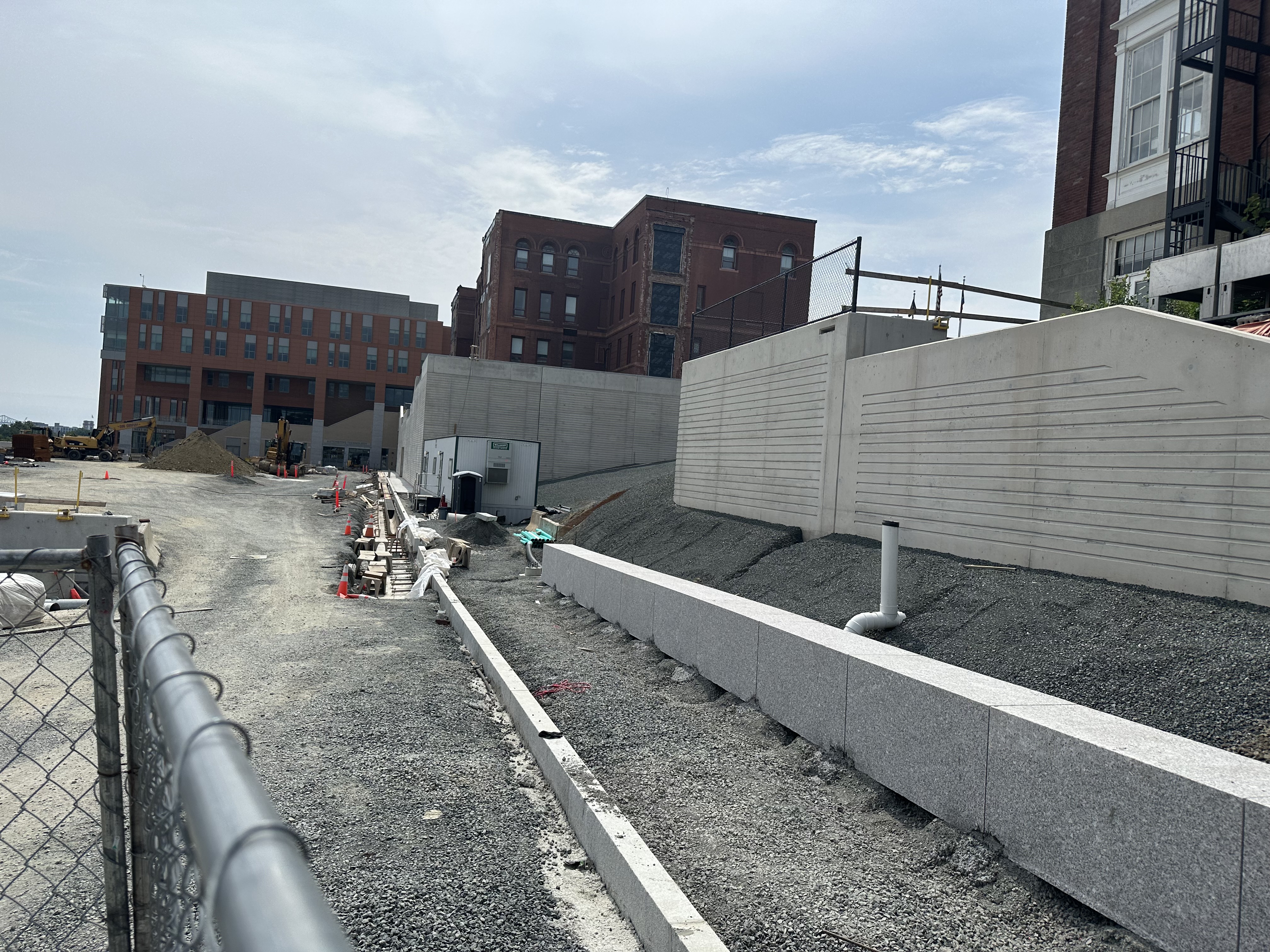
Looks like curbs and sidewalk going in along the upper wall.


stick n move
Superstar
- Joined
- Oct 14, 2009
- Messages
- 13,361
- Reaction score
- 23,942
RandomWalk
Senior Member
- Joined
- Feb 2, 2014
- Messages
- 3,713
- Reaction score
- 6,502
Looking at the curbing on the long ramp between the bike path and the field, it looks like there is going to be a driveway up to the field level. I really hope it doesn’t end up turning into parking for random city employees.
