You are using an out of date browser. It may not display this or other websites correctly.
You should upgrade or use an alternative browser.
You should upgrade or use an alternative browser.
Somerville Infill and Small Developments
- Thread starter George_Apley
- Start date
- Joined
- May 25, 2006
- Messages
- 7,062
- Reaction score
- 1,976
I hear the manischewitz is great!
bigpicture7
Senior Member
- Joined
- May 5, 2016
- Messages
- 4,043
- Reaction score
- 10,368
This seems like more than "infill and small projects," and perhaps it's been posted somewhere on aB before (but I couldn't find it). If it's posted somewhere else, my apologies. The city is overseeing the redevelopment of a few parcels surrounding the intersections of Washington and New Washington near the new GLX stop:

There's been some public input gathered already, e.g.:

And apparently there is a public meeting scheduled for October 6th:
 www.somervillema.gov
Here's the city site for this project:

There's been some public input gathered already, e.g.:

And apparently there is a public meeting scheduled for October 6th:
90 Washington Street Redevelopment Public Meeting, October 6
Mayor Katjana Ballantyne and City of Somerville staff invite you to attend the next community meeting to discuss 90 Washington Street, a 4-acre site near the East Somerville Green Line station envisioned as the home of a new Public Safety Building and a range of civic, commercial, and...
Here's the city site for this project:
Dr. Rosen Rosen
Senior Member
- Joined
- Jul 19, 2021
- Messages
- 1,197
- Reaction score
- 7,023
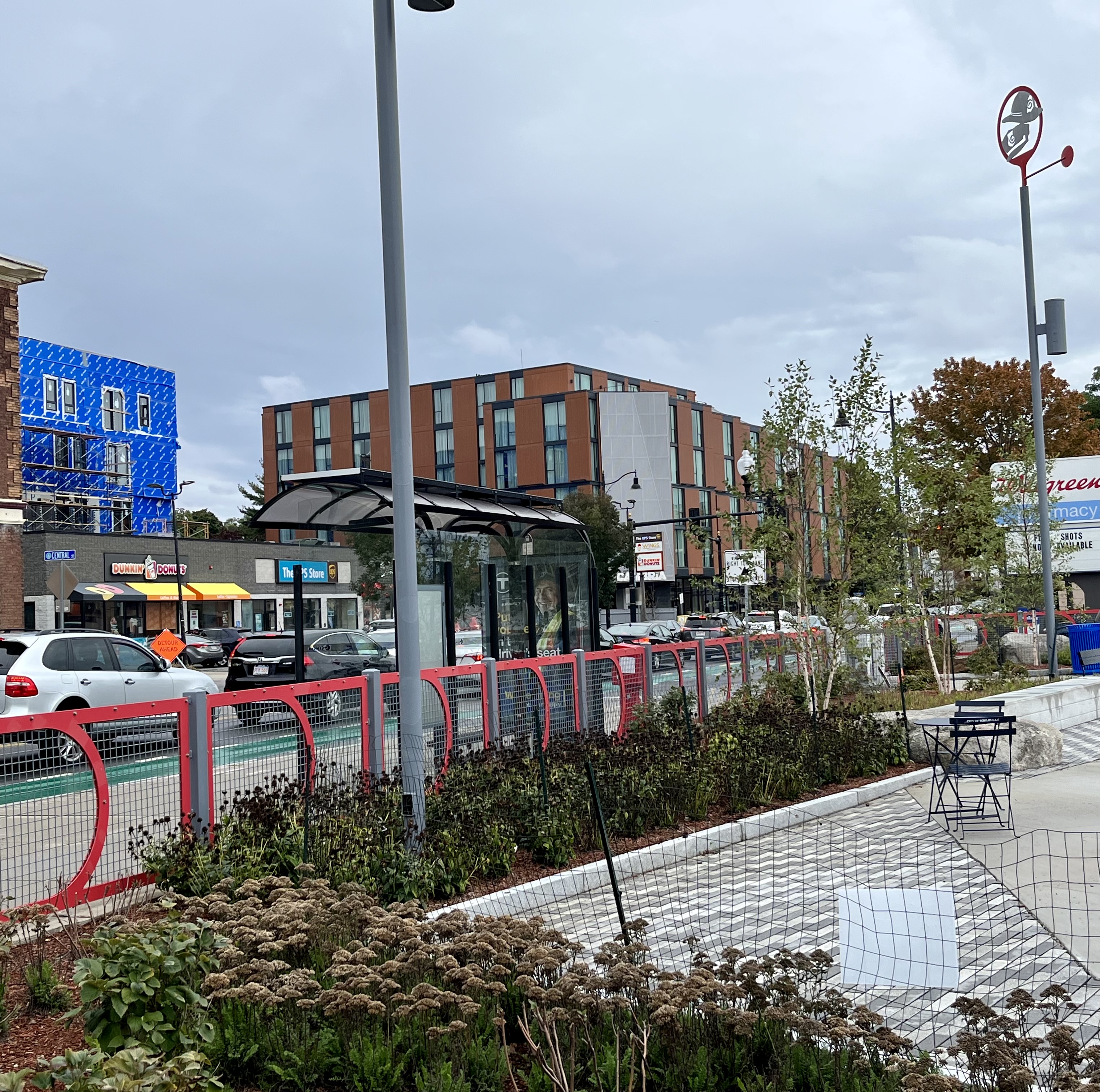
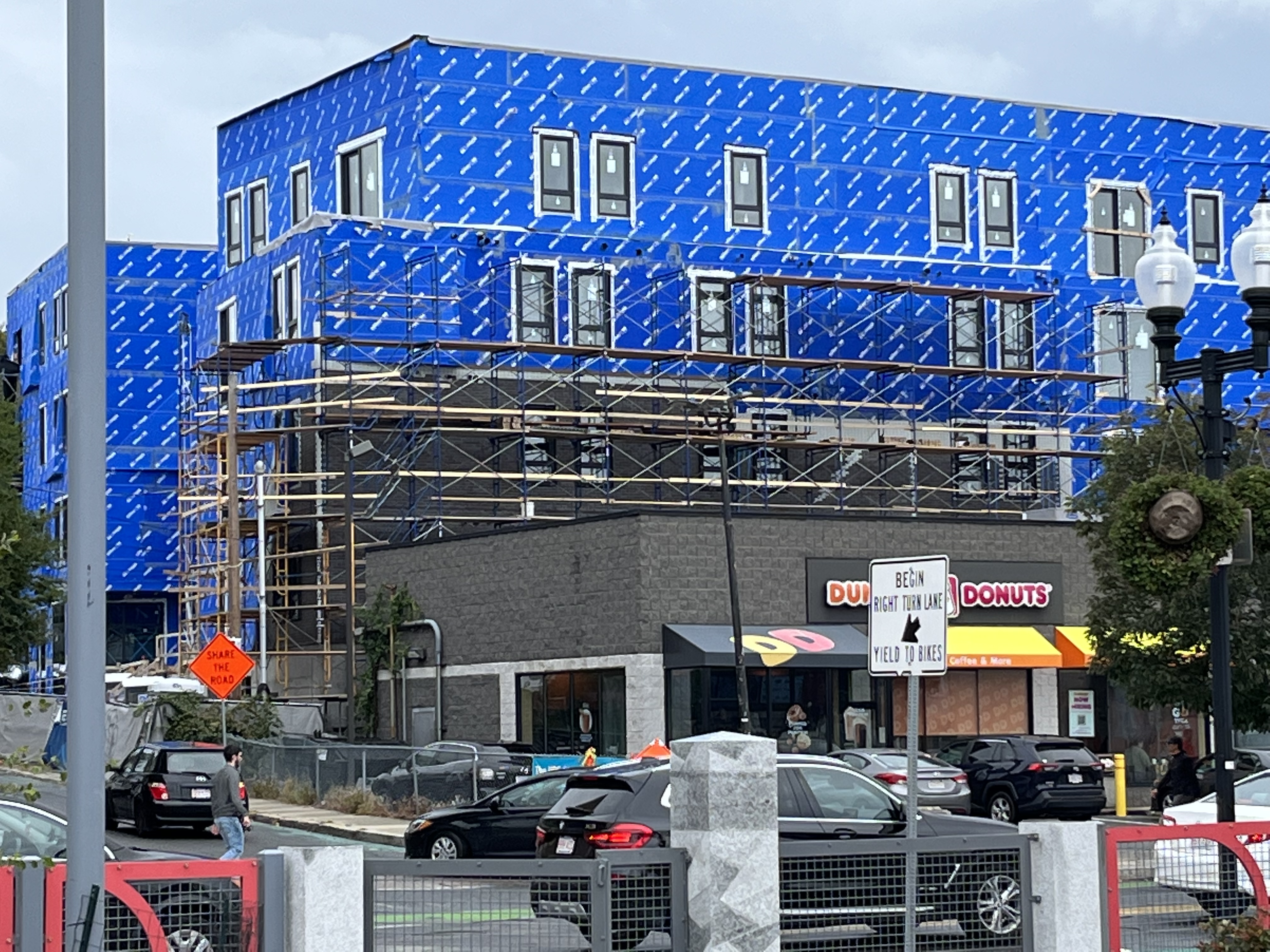
Apartments at Central and Somerville. Brickettes being installed?

Dr. Rosen Rosen
Senior Member
- Joined
- Jul 19, 2021
- Messages
- 1,197
- Reaction score
- 7,023
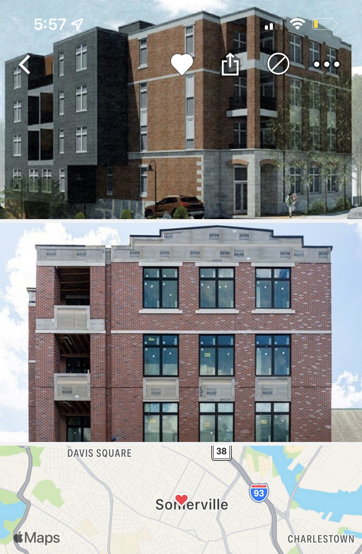
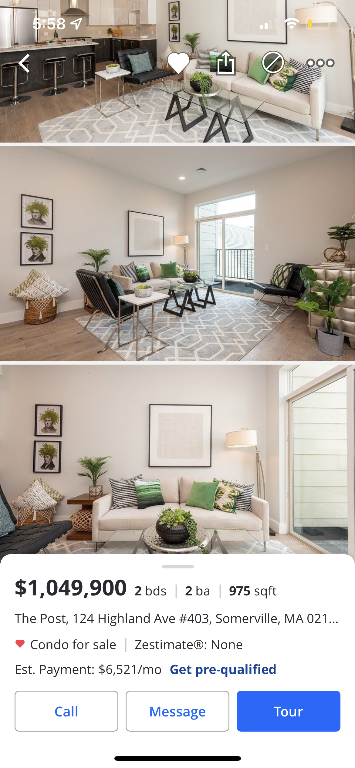
Nice tall ceilings.
Brick Top
New member
- Joined
- Feb 18, 2022
- Messages
- 67
- Reaction score
- 217
Nice tall ceilings.
Been on the market for 123 days. When interest rates were ~3%, this would have been gone in a jiffy; now, >$1000/square foot is going to be a really tough sell in Somerville, especially with interior design and appliances that scream "high end Home Depot." If I'm paying $1M for only 1000 square feet, I expect real wood cabinets, not laminate, and Sub-Zero or Miele appliances, not midrange Bosch:
As an aside, putting a range hood designed to sit above an island against a wall like this is a huge design pet peeve of mine. It looks so out of place, especially in between those tall 42" cabinets, which don't even look level with the soffit.
Last edited:
As an aside, putting a range hood designed to sit above an island against a wall like this is a huge design pet peeve of mine. It looks so out of place, especially in between those tall 42" cabinets, which don't even look level with the soffit.
This whole thing is a disaster. The upper shelves of those cabinets are not getting used by anyone in the normal 5' 6" to 6' 0" height range.
This whole thing is a disaster. The upper shelves of those cabinets are not getting used by anyone in the normal 5' 6" to 6' 0" height range.
Cabinets to the ceiling paired with high ceilings are fabulously useful. Yes, you need a stool to get stuff out of them, but it's a great place to stash infrequently needed stuff.
bigpicture7
Senior Member
- Joined
- May 5, 2016
- Messages
- 4,043
- Reaction score
- 10,368
Been on the market for 123 days. When interest rates were ~3%, this would have been gone in a jiffy; now, >$1000/square foot is going to be a really tough sell in Somerville, especially with interior design and appliances that scream "high end Home Depot." If I'm paying $1M for only 1000 square feet, I expect real wood cabinets, not laminate, and Sub-Zero or Miele appliances, not midrange Bosch:
...
As an aside, putting a range hood designed to sit above an island against a wall like this is a huge design pet peeve of mine. It looks so out of place, especially in between those tall 42" cabinets, which don't even look level with the soffit.
Your general point about the level of finishes/workmanship needed to justify that sort of price point in Somerville makes full sense, and I don't disagree at all regarding what we seem to see here. However, some of the things you list above are stylistic preferences, not specifically violators of high-end finish. That style of range hood shown is definitely not meant to be an island hood. It is totally flush on one side and flared on the other; certainly meant to be a wall mount. Now, one can argue that the style connotes island (and therefore is dissonant here) and so forth, but I have seen this style all over the place lately on walls. Modernism is more minimalist and accentuates function over form; everyone knows the exhaust duct is way narrower than the hood itself; a modernist approach doesn't try to hide that pure functional element, rather it showcases it. Now I fully agree that this is a cheap implementation of that style...if you're gonna have a high ceiling and flush mount hood/duct, you oughta do something interesting behind the duct and do a better job integrating the duct (look at how the stainless steel has a messy/uneven gap at the soffit). But I've seen beautiful implementations of this style hood with a huge counter-to-ceiling slab of marble behind it a well-installed duct and it looked great. I'm totally with the others about high cabinets being a good thing; I've got them in my own home and I have a one-hand-unfold step ladder that gives me easy access...it's where you put all the seldom-used stuff that you don't want in the way anywhere else (serving platters you only use for entertaining; baking supplies used a few times a year, etc); if you're gonna have high ceilings (which are great) then a kitchen designer has to figure out how to deal with that (and a ginormous gap or huge soffit is not the answer). Also, there are definitely high end modernist cabinets that are a quality laminate finish (or, more likely, a thick, high-quality lacquer); wood-that-looks-like-wood is not a match everywhere. Now that said, this particular installation looks rather cheap-o...and the gap at the soffit is awful, especially when you look at the range hood area (your eye asks: wait, does that tile extend back behind there?...your brain answers 'no way'...and it feels cheap/unfinished). A scan around the rest of the unit shows a dearth of nice finishes too, so this kitchen's attempt to appear upscale/modern does feel fake here.
Brick Top
New member
- Joined
- Feb 18, 2022
- Messages
- 67
- Reaction score
- 217
That style of range hood shown is definitely not meant to be an island hood. It is totally flush on one side and flared on the other; certainly meant to be a wall mount.
Now I fully agree that this is a cheap implementation of that style...if you're gonna have a high ceiling and flush mount hood/duct, you oughta do something interesting behind the duct and do a better job integrating the duct (look at how the stainless steel has a messy/uneven gap at the soffit). But I've seen beautiful implementations of this style hood with a huge counter-to-ceiling slab of marble behind it a well-installed duct and it looked great.
Very true. I should have said "island style hood," or "chimney hood." That said, wall-mounted chimney hoods are a general design pet peeve of mine, since they usually feel shoehorned in to a cohesive line of cabinets, and thus feel really out of place. Here are a couple extreme examples:
I do agree they can look great in certain circumstances; namely, when they're not crowded against adjacent cabinets, for example:
Now, one can argue that the style connotes island (and therefore is dissonant here) and so forth, but I have seen this style all over the place lately on walls. Modernism is more minimalist and accentuates function over form; everyone knows the exhaust duct is way narrower than the hood itself; a modernist approach doesn't try to hide that pure functional element, rather it showcases it.
On the other hand, everyone knows the actual duct itself is so narrow that it can easily fit in a cabinet above and still leave plenty of room for storage. If you're going to mount a range hood in close quarters with adjacent cabinets, there's only one right way to do it IMO:
I'm totally with the others about high cabinets being a good thing; I've got them in my own home and I have a one-hand-unfold step ladder that gives me easy access...it's where you put all the seldom-used stuff that you don't want in the way anywhere else (serving platters you only use for entertaining; baking supplies used a few times a year, etc); if you're gonna have high ceilings (which are great) then a kitchen designer has to figure out how to deal with that (and a ginormous gap or huge soffit is not the answer).
100% agreed. The fact that the developer sprung for 42" cabinets is the only high-end touch in the kitchen. I once visited a house with ~10' ceilings that had standard height upper cabinets with absolutely nothing above, and it looked horrible.
Also, there are definitely high end modernist cabinets that are a quality laminate finish (or, more likely, a thick, high-quality lacquer); wood-that-looks-like-wood is not a match everywhere.
Agreed. I was referring to the cheap veneer of the lower cabinets and the island. It's hard to judge the quality of the finish of the upper cabinets, though given the rest of the build, I'm not optimistic. Nothing seems to be perfectly flush!
The fit of the filler panel on the right side is especially atrocious:
Dr. Rosen Rosen
Senior Member
- Joined
- Jul 19, 2021
- Messages
- 1,197
- Reaction score
- 7,023
Slow progress, but picking back up. I hope the brick works out.
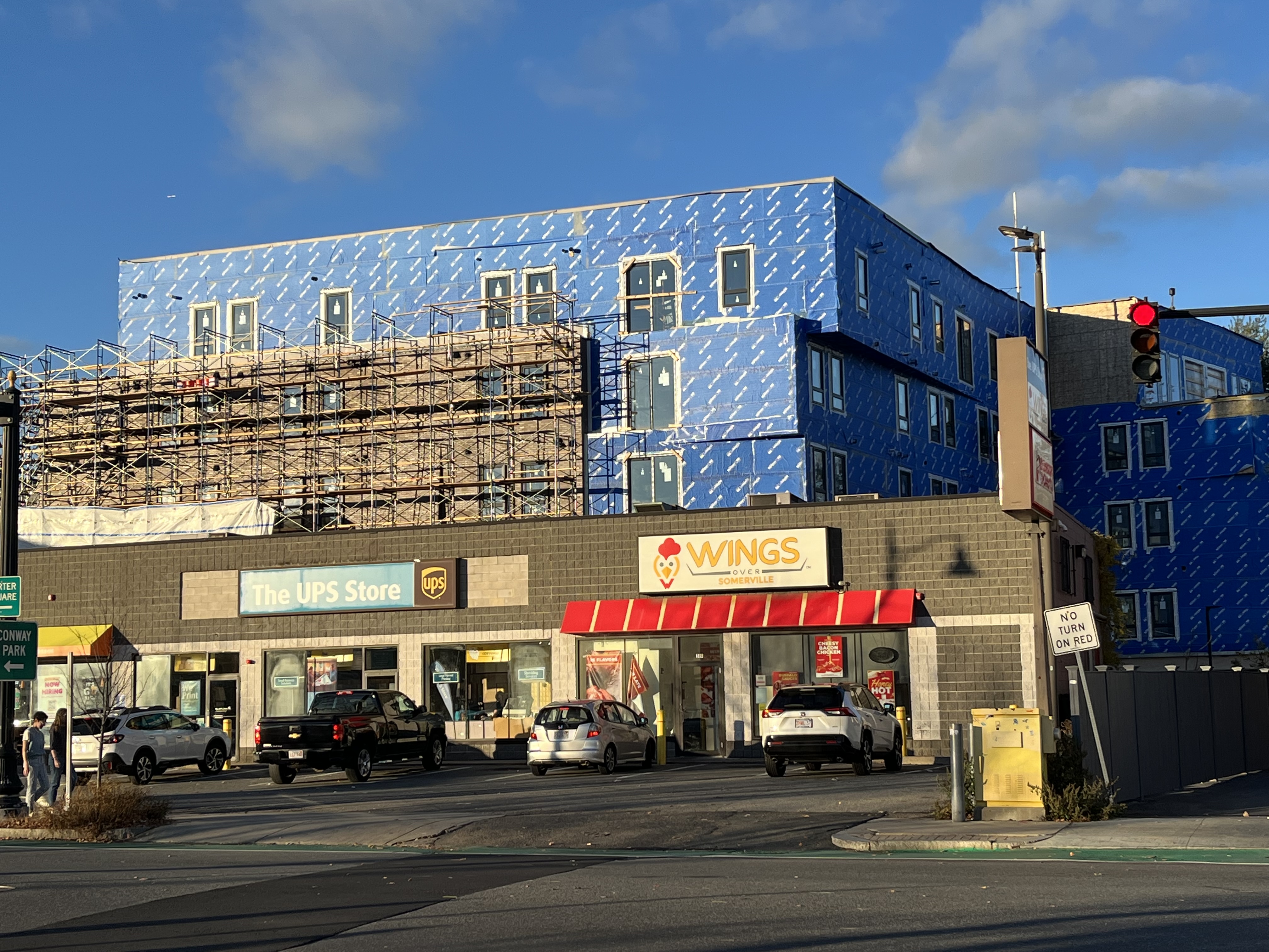
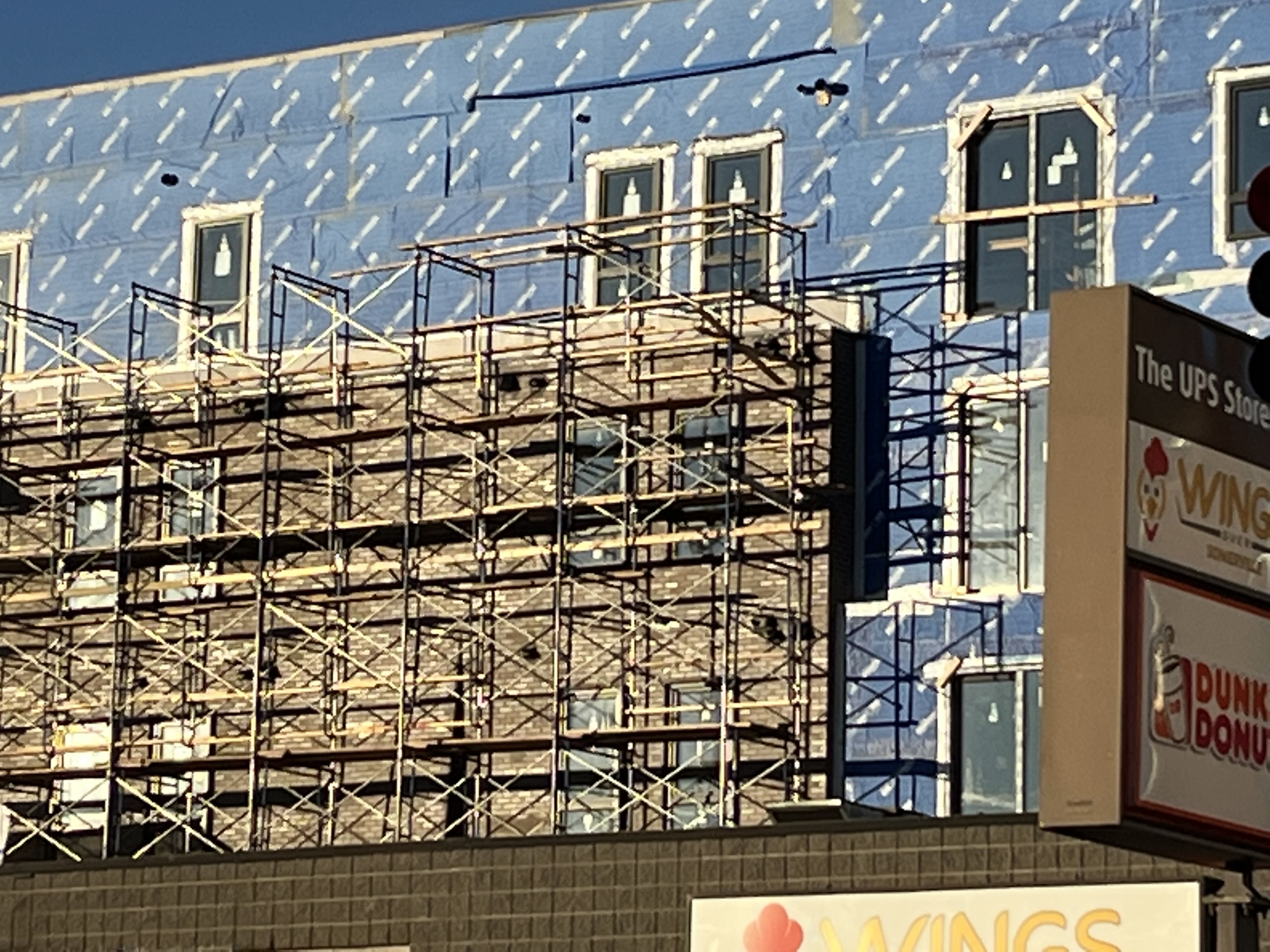
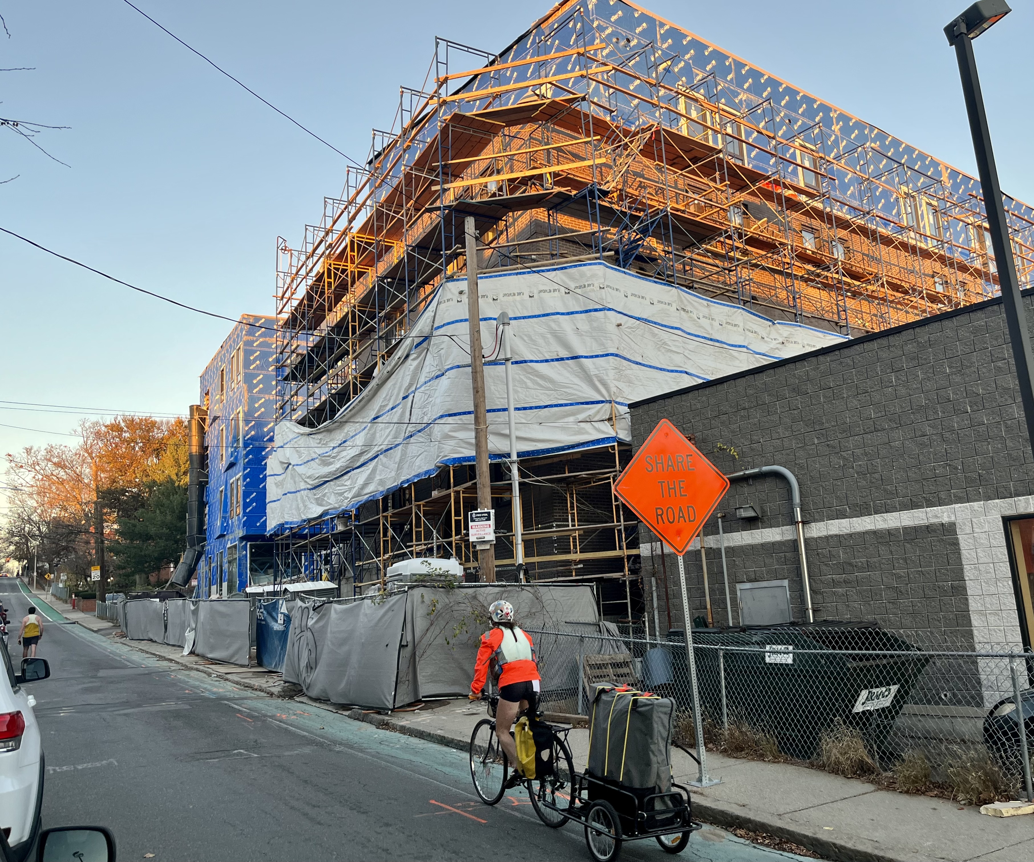
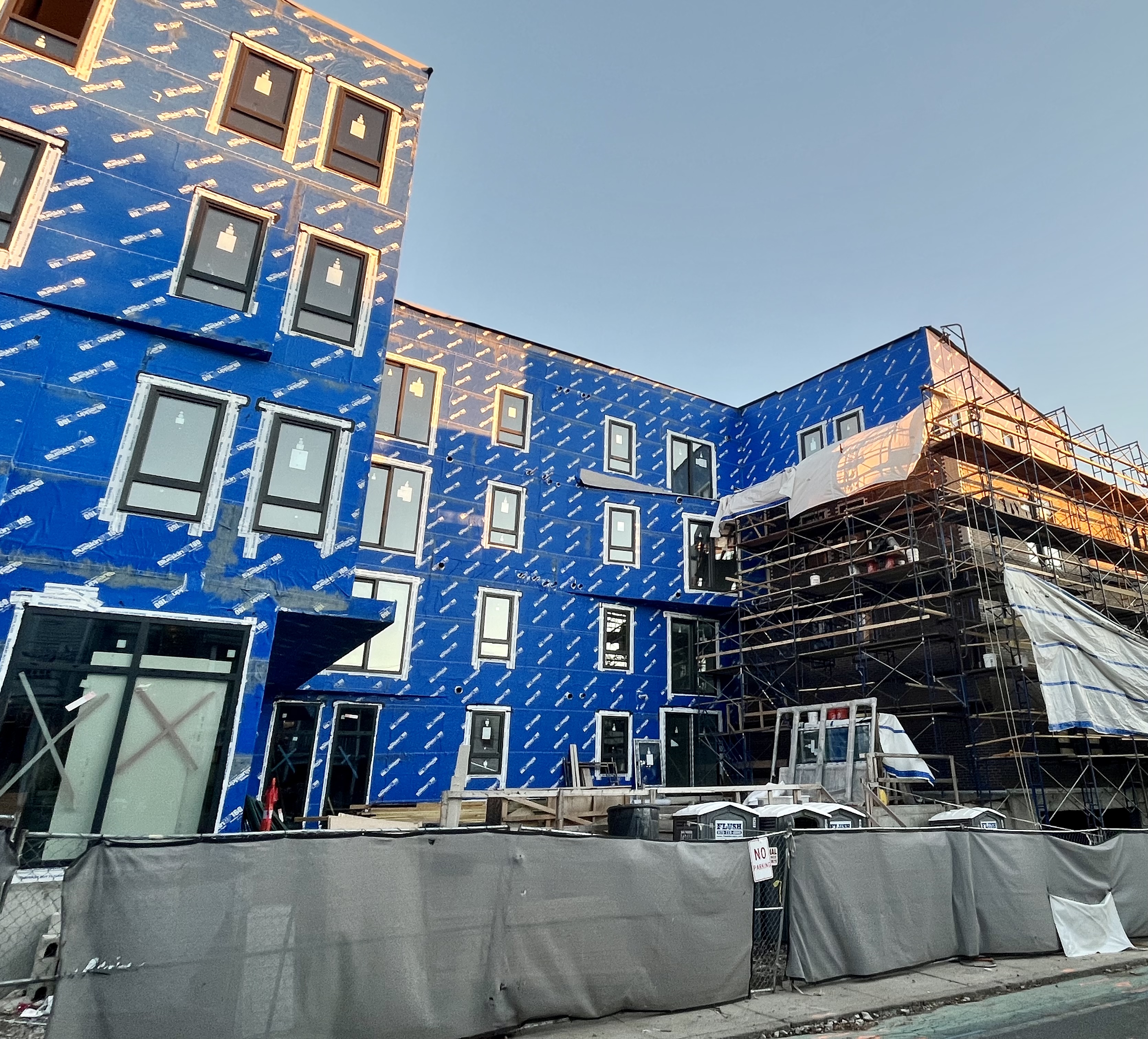
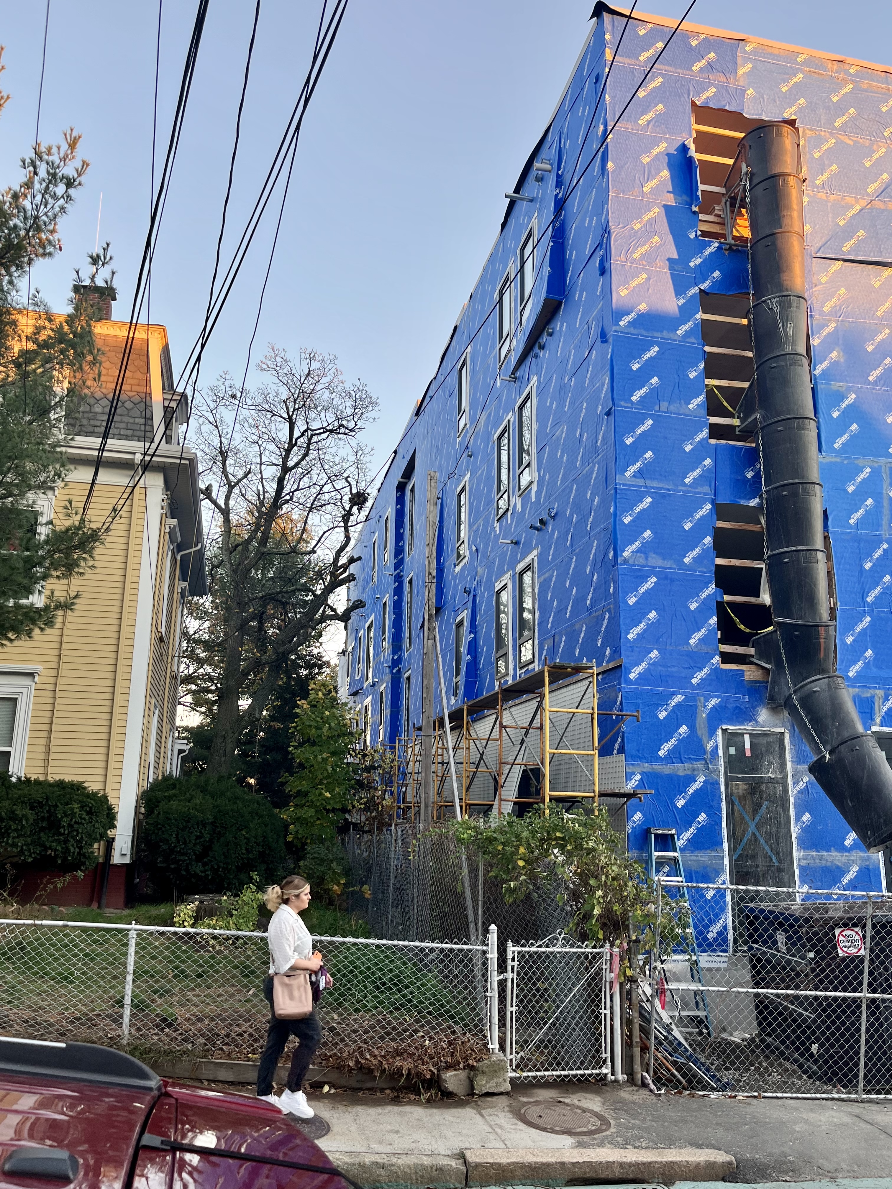
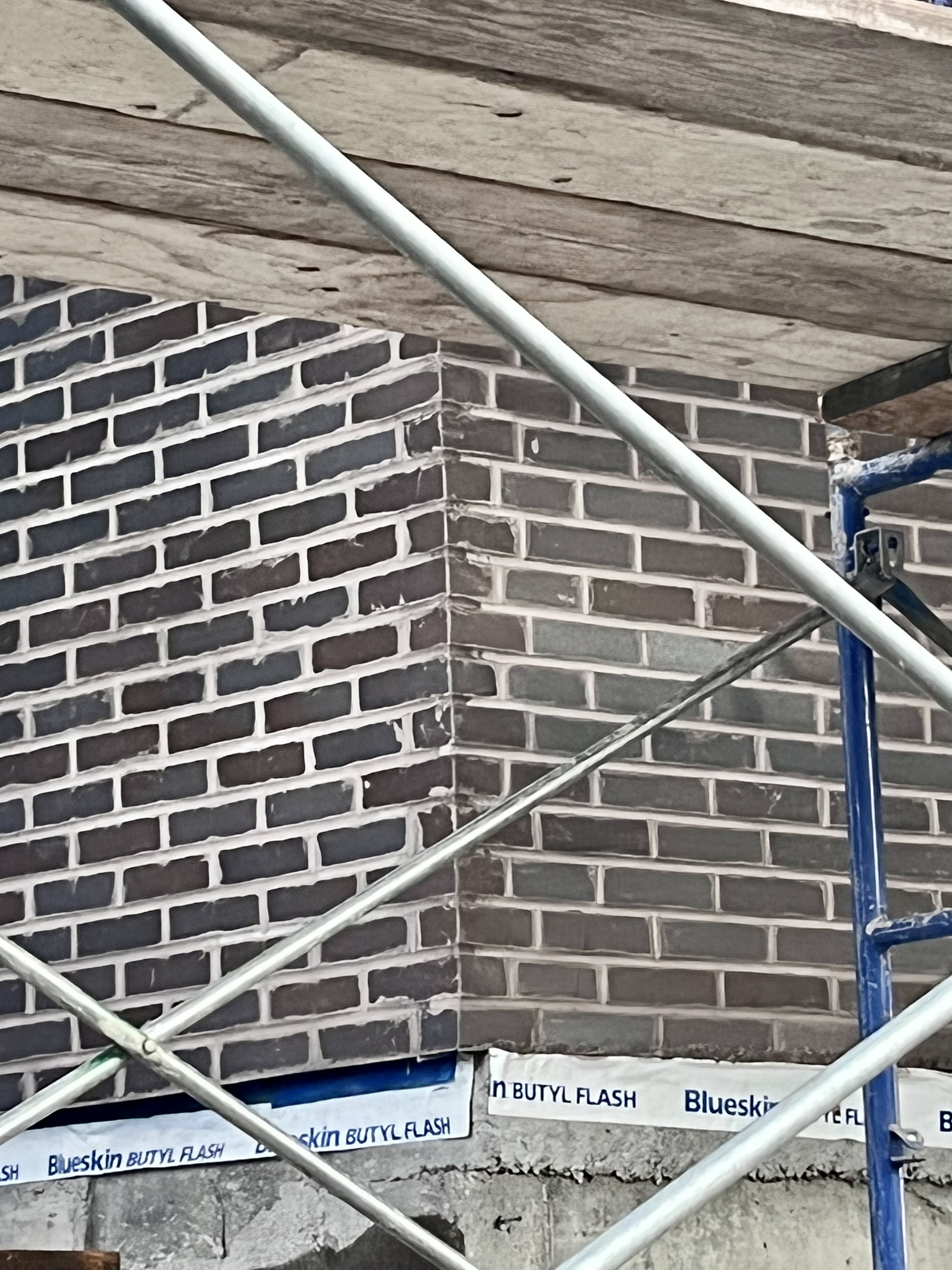
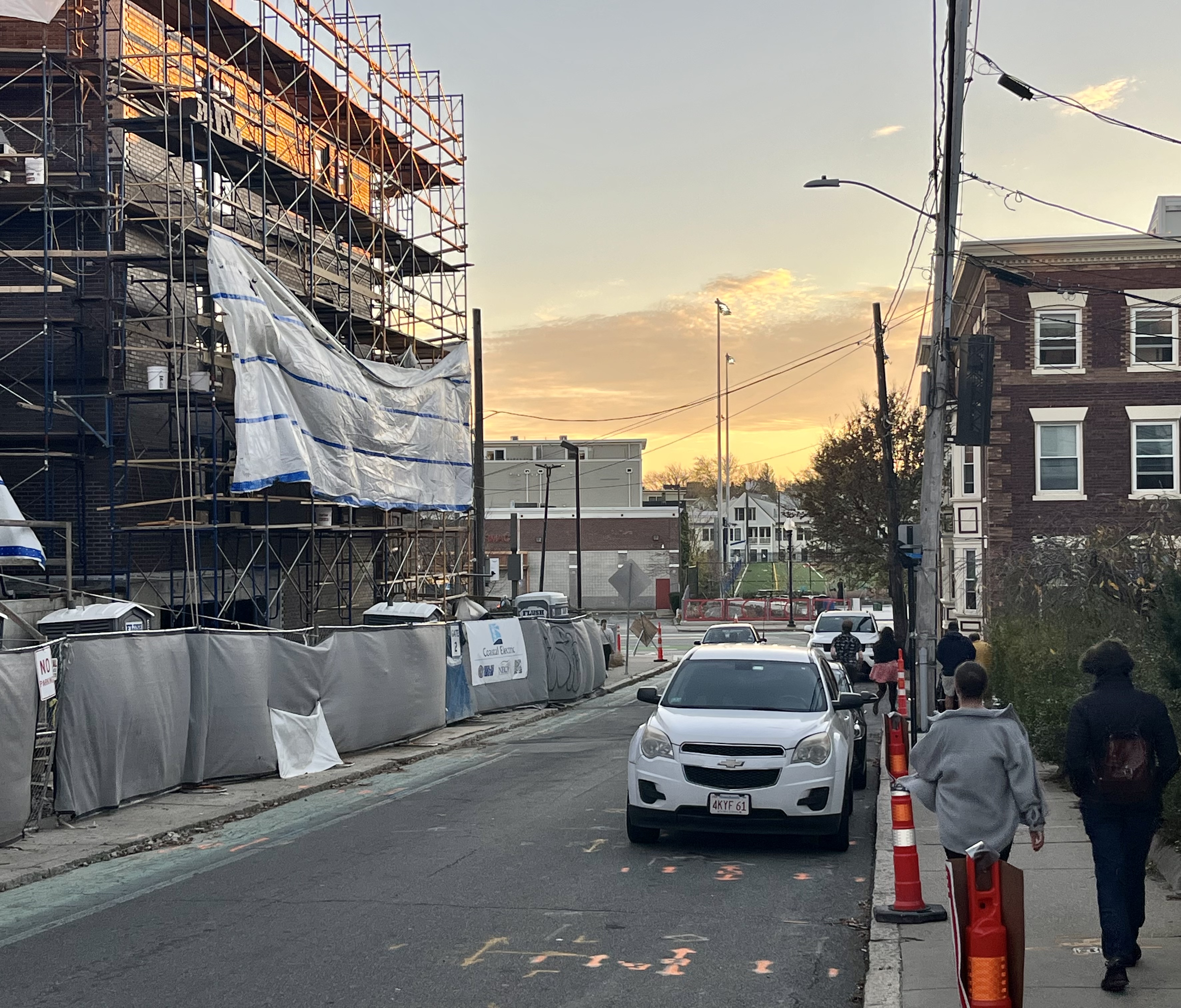
Last edited:
SomervilleRed
New member
- Joined
- Oct 6, 2022
- Messages
- 43
- Reaction score
- 218
Princeton St. Across the Bike Path from Maxwell’s Green.
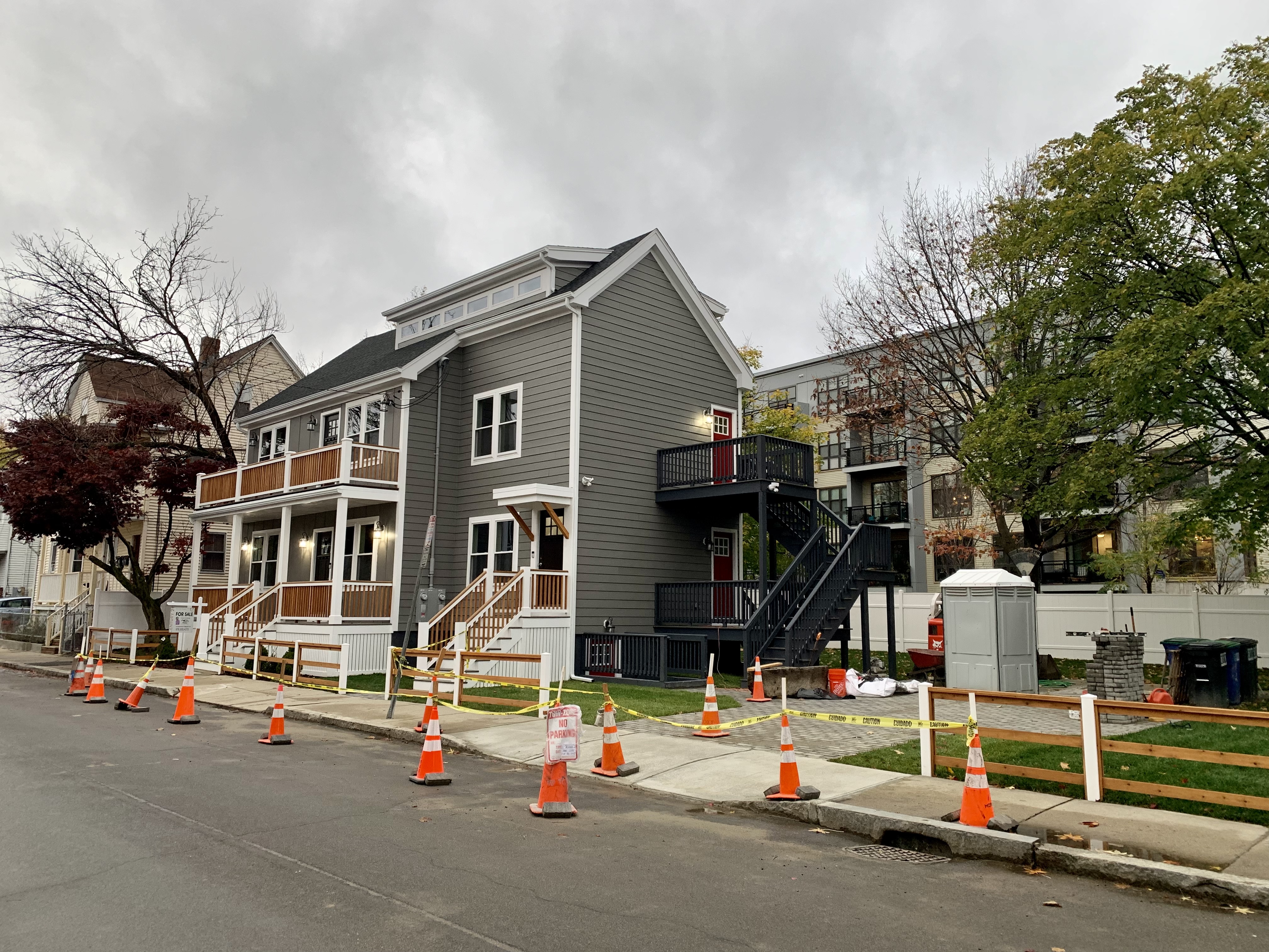
RandomWalk
Senior Member
- Joined
- Feb 2, 2014
- Messages
- 3,713
- Reaction score
- 6,500
That lot could have gone with at least four townhouses if they didn’t have off-street parking. Instead it went from a single-family to a two-family.
Dr. Rosen Rosen
Senior Member
- Joined
- Jul 19, 2021
- Messages
- 1,197
- Reaction score
- 7,023
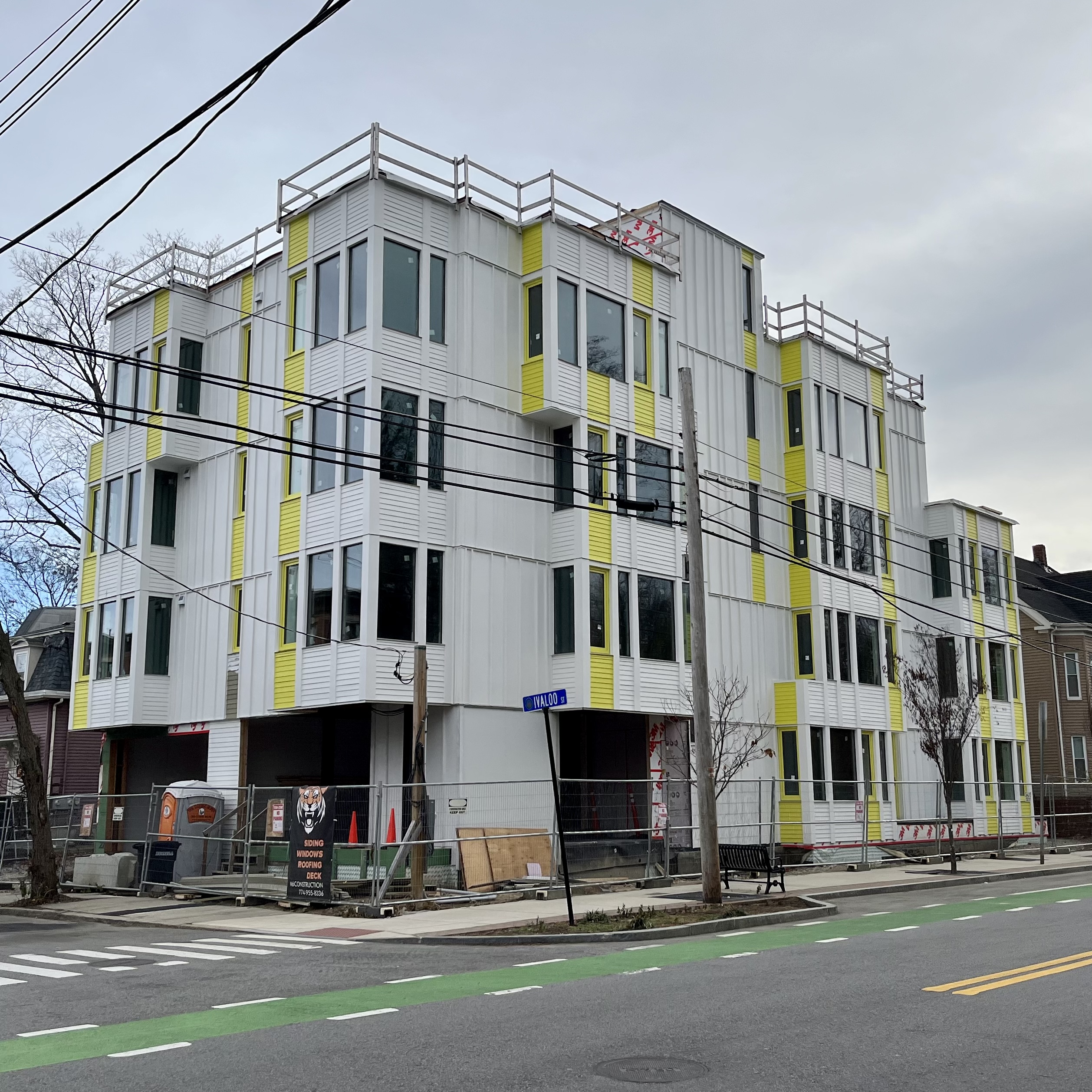
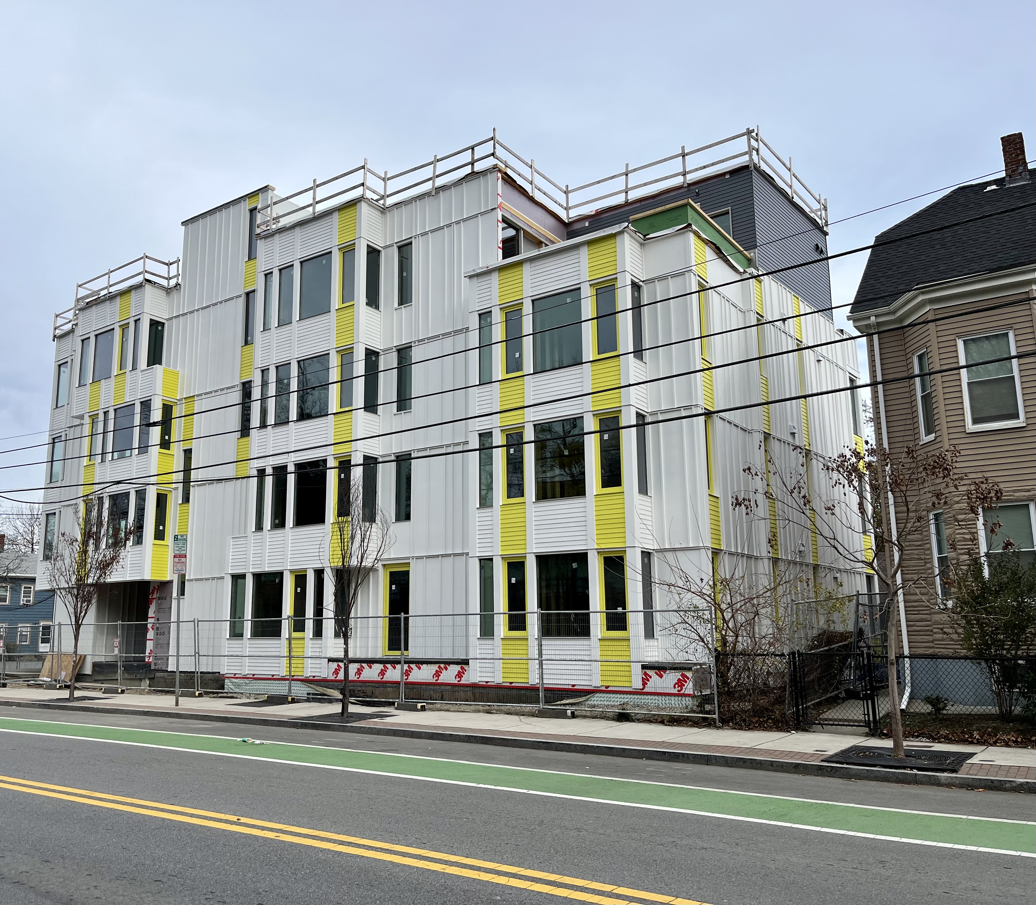
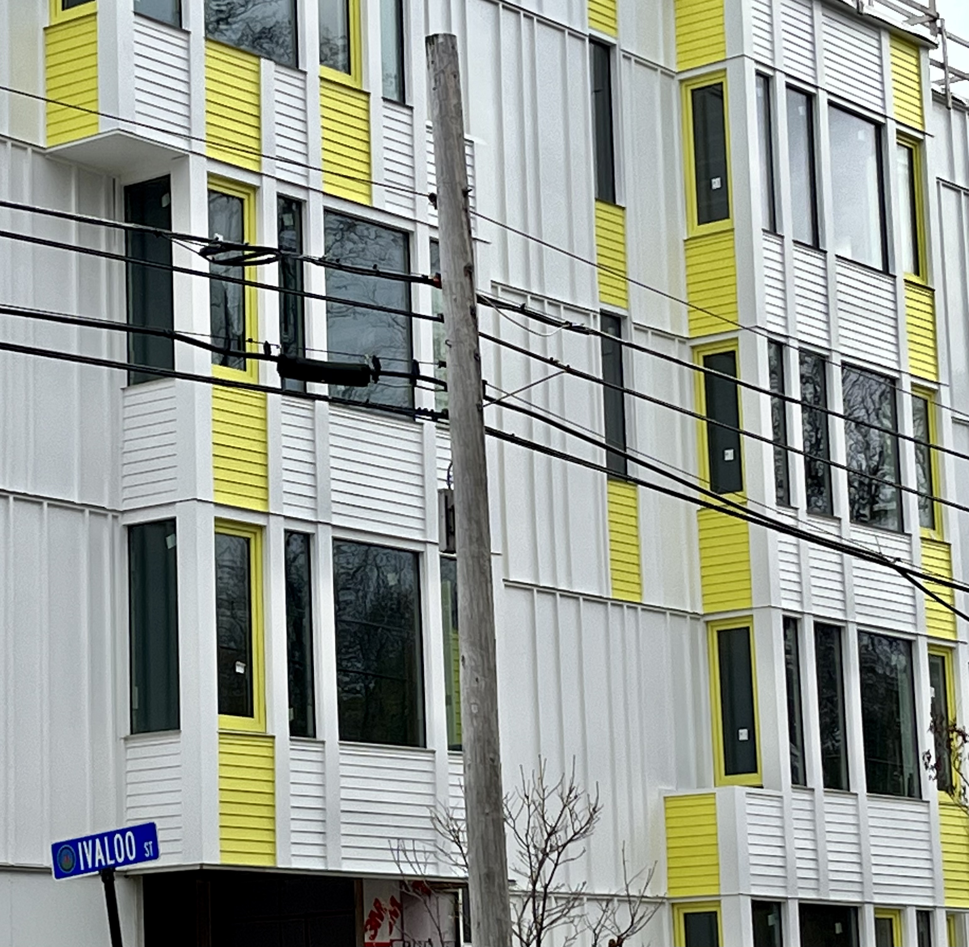
Apartments on Beacon near Park St. Not sure I like the yellow color - looks like highlighter color. Also, I’m not a fan of inoperable windows on small residential projects - seems oppressive.
Last edited:
Equilibria
Senior Member
- Joined
- May 6, 2007
- Messages
- 7,219
- Reaction score
- 8,728
Apartments on Beacon near Park St. Not sure I like the yellow color - looks like highlighter color. Also, I’m not a fan of inoperable windows on small residential projects - seems oppressive.
View attachment 31103View attachment 31104View attachment 31105
Yeah, that's unpleasant.

 IMG_3859