South End Infill and Small Developments

^ John, those regulations are for renovations to existing historic structures. Are you saying those should apply to new construction, too?

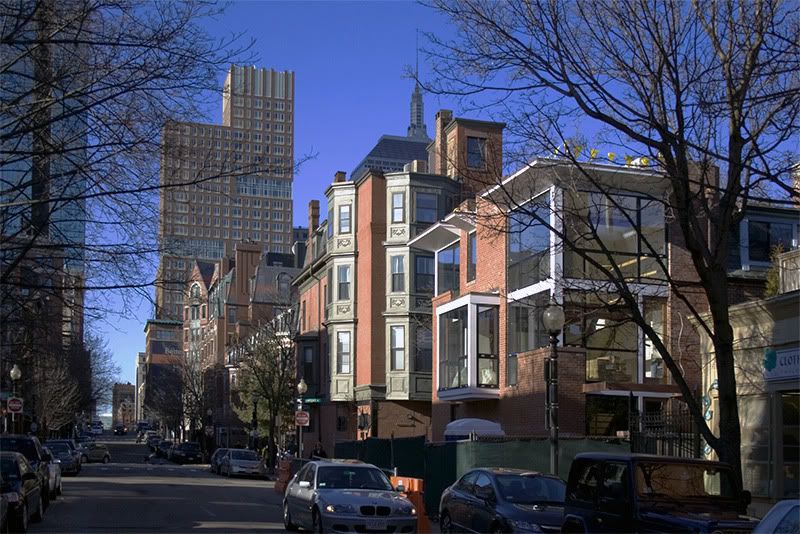
this new house, though unashamedly un-Victorian, nonetheless plays nice with it's Victorian neighbors. It's different, but not outrageous or disruptive, as some have alluded.

^ I agree. Additionally, all the talk of the white is irrelevant - that is just how the trim comes from the factory. According to the architect, it will be painted a warm gray. IMO it should blend nicely into the neighborhood.

By the way, the house on Bradford that briv posted pics of is also a Grassi design.
 
That new addition to Peters Park also does a great job of fitting into a historical context with a modern addition. I really like they new developments.
 
Great pics Briv. The lighting is so cool in the first pic of the Clarendon building that I thought it was a rendering until I saw the construction fence.
The Bradford St project looks great.
 
^ Agreed re: the lighting in Briv's pic -- it really adds some sizzle!

And I know some people here will hose me for even mentioning NYC, but Briv's pic almost fooled me into thinking Boston was NYC for a moment, what with the bold new townhouse, rectilinear street grid and towers looming in the background.

These new modern South End townhouses do have a Brooklyn feel to them.
 
Yeah, I was thinking a Brooklyn townhouse wandered into Clinton.
 
This building is getting lots of attention. Seems like everyone that walks by is gawking at it.

clarendon1.jpg
No wonder; this building does so many things right!

It animates the entire street, partly because it's so transparent, open and skeletal in places; and partly because its discontinuous cornice introduces such a musical (dare I say, syncopated?) rhythm into the street's engaging jumble. This is what scale is all about. If you cover the two gaps in the cornice with your fingers and imagine it to be continuous, the building immediately lurches toward the humdrum (and looks a little out of scale).

Come to think of it, the other townhouse by the same architect is already well on its way there; its cornice is continuous and its form is much less open. Still nice, but no comparison.

Since the better house is the architect's own, you can use it as an example of how an architect with control of his design is often a better architect; he doesn't have a client to impede his creativity (or budget?).
 
Thanks.

Now I have Simon & Garfunkel's The Dangling Conversation stuck in my head.
 
The black cornice on the other townhouse could easily have been broken up where the brick protrudes from the side wall at center. It's obviously not a neighborhood mandate, given the first example.
 
ablarc said:
its discontinuous cornice introduces such a musical (dare I say, syncopated?) rhythm into the street's engaging jumble.

Syncopated it is! This ain't no "four on the floor" dance beat, which is good since nobody else nearby thinks they're at the disco.
 
Thanks.

Now I have Simon & Garfunkel's The Dangling Conversation stuck in my head.

Every time I see or hear the word 'bus' it's "At the Zoo" for me. Every. Single. Time.

But you can take the crosstown bus if it's raining or it's cold/ And the animals will love it if you doo...
 
^ The only question is, will anything else make the list?

4421675608_abcae6bc15_b.jpg


4420911867_a297a96e87_b.jpg


4421678538_2d8e09d329_b.jpg


4420914909_2f164d2289_b.jpg


4421681394_d9d2803726_b.jpg


4421683452_d9fe80d531_b.jpg


4421682386_89087a53d5_b.jpg
 
It's this little stuff I wish we talked about more on this board. Sure the skyscrapers get all the press but Boston does this little stuff so well (sometimes).
 
The problem is that it doesn't do as much little stuff as it should.

Or, at least, it can't seem to do much little stuff on a large scale.
 

Back
Top