You are using an out of date browser. It may not display this or other websites correctly.
You should upgrade or use an alternative browser.
You should upgrade or use an alternative browser.
State Street HQ | One Congress | Bulfinch Crossing | West End
- Thread starter FitchburgLine
- Start date
Boston02124
Senior Member
- Joined
- Sep 6, 2007
- Messages
- 6,934
- Reaction score
- 7,068
citydweller
Active Member
- Joined
- Aug 23, 2019
- Messages
- 479
- Reaction score
- 752
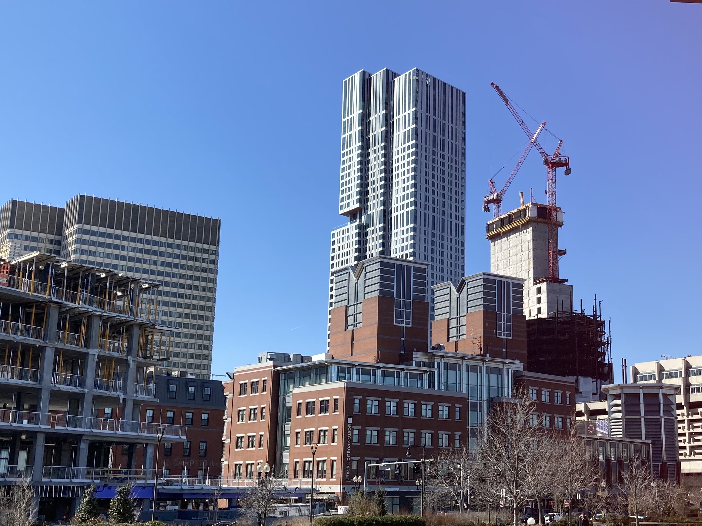
That's a rare view of the skyline, at least for me anyway. A like the perspective.
Boston02124
Senior Member
- Joined
- Sep 6, 2007
- Messages
- 6,934
- Reaction score
- 7,068
I really wish they had put the antenna on the Verizon building it wd appear as the tallest from this viewThat's a rare view of the skyline, at least for me anyway. A like the perspective.
I really wish they had put the antenna on the Verizon building it wd appear as the tallest from this view
Instead, State Street is going to appear as the tallest. Isn't that better?
citydweller
Active Member
- Joined
- Aug 23, 2019
- Messages
- 479
- Reaction score
- 752
Instead, State Street is going to appear as the tallest. Isn't that better?
Indeed, I think that State Street from that vantage point will look amazing and will fill in a noticeable void in the skyline.
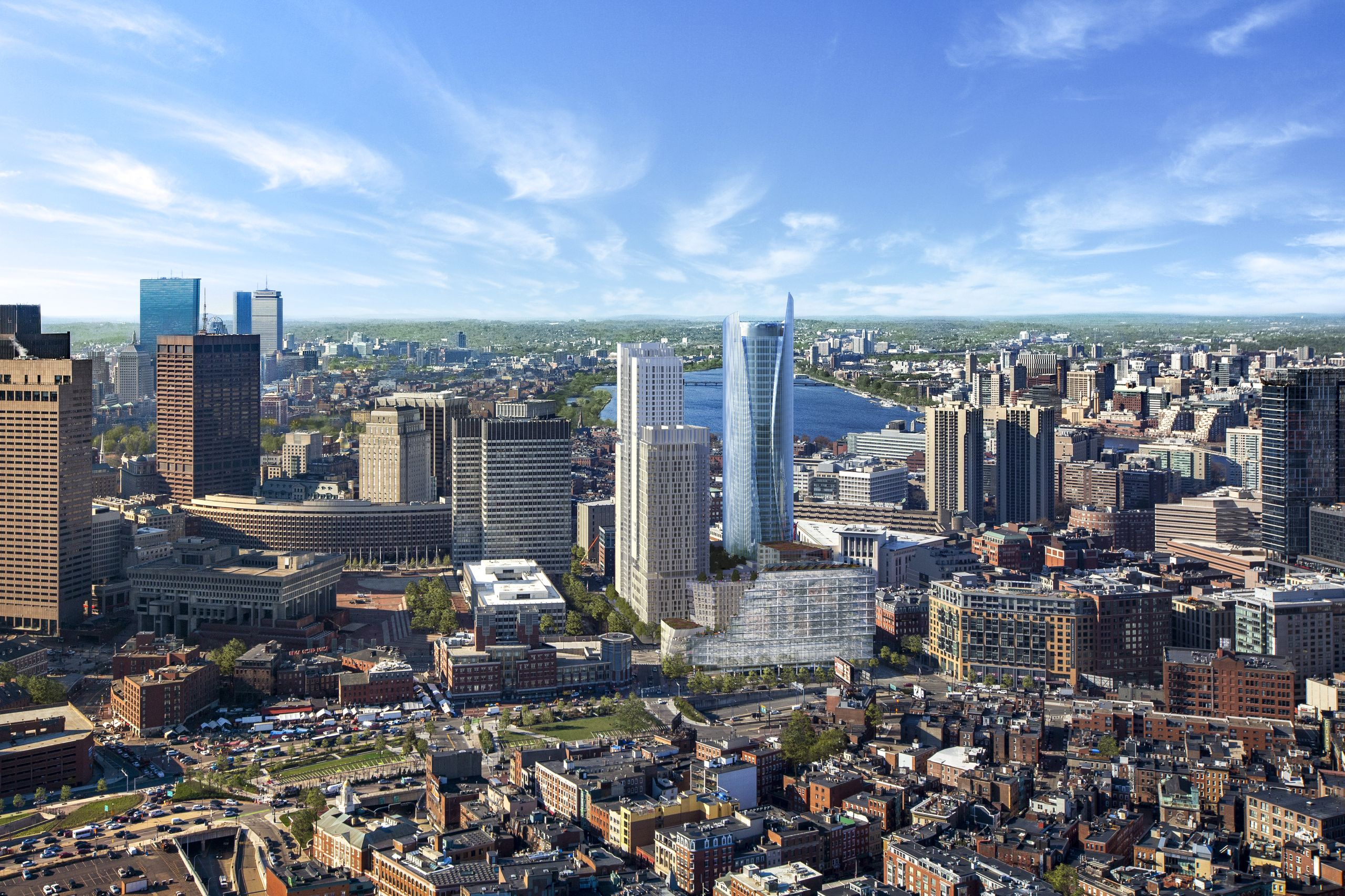
I'm not sure if this has been posted before. In this render the tower sure looks like it's more like 620'+ to the top of that fin rather than just 600'. It's well above the top of 1 Boston Place. Keep in mind we're not seeing the bottom of it either, only where it meets the garage. An older diagram showed The Sudbury to be 547' above sea level (approx 520'-535' total height given the hill) and SST was 647' above, a full 100' taller while starting slightly downhill. If that diagram is still correct the higher fin has to be a minimum of 620'. I guess once it's up we can return to this conversation...
Massachoicetts
Active Member
- Joined
- Jun 4, 2019
- Messages
- 573
- Reaction score
- 714
I'm not sure if this has been posted before. In this render the tower sure looks like it's more like 620'+ to the top of that fin rather than just 600'. It's well above the top of 1 Boston Place. Keep in mind we're not seeing the bottom of it either, only where it meets the garage. An older diagram showed The Sudbury to be 547' above sea level (approx 520'-535' total height given the hill) and SST was 647' above, a full 100' taller while starting slightly downhill. If that diagram is still correct the higher fin has to be a minimum of 620'. I guess once it's up we can return to this conversation...
View attachment 10889
Great find there! I really like the tower...
bigpicture7
Senior Member
- Joined
- May 5, 2016
- Messages
- 4,043
- Reaction score
- 10,370
Today
Great find there! I really like the tower...
If I'm not mistaken (and I sincerely hope that I am), the final design took about 25-40 feet off the tip of the fin (due to wind-resistance that the structure would've encountered). As a result, one side of the fin will still be taller than the other, but not as much as originally depicted in the first many images provided. Unfortunately, I don't know for sure if the image posted is an earlier rendition, but I think it is. I'm eager to find out for sure in a few months.
Last edited:
I'm not sure if this has been posted before. In this render the tower sure looks like it's more like 620'+ to the top of that fin rather than just 600'. It's well above the top of 1 Boston Place. Keep in mind we're not seeing the bottom of it either, only where it meets the garage. An older diagram showed The Sudbury to be 547' above sea level (approx 520'-535' total height given the hill) and SST was 647' above, a full 100' taller while starting slightly downhill. If that diagram is still correct the higher fin has to be a minimum of 620'. I guess once it's up we can return to this conversation...
View attachment 10889
Most exciting about this render is that use of a street wall along the Greenway and a fantastic relief from the homogeneous neighboring brick monoliths.
Where did you read/see/learn this?If I'm not mistaken (and I sincerely hope that I am), the final design took a about 25-40 feet off the tip of the fin (due to wind-resistance that the structure would've encountered). As a result, one side of the fin will still be taller than the other, but not as much as originally depicted in the first many images provided. Unfortunately, I don't know for sure if the image posted is an earlier rendition, but I think it is. I'm eager to find out for sure in a few months.
dirtywater
Active Member
- Joined
- Nov 16, 2006
- Messages
- 686
- Reaction score
- 357
If you look at the rendering on the opening page of the Bulfinch Crossing website, that appears to be the case unfortunately.If I'm not mistaken (and I sincerely hope that I am), the final design took a about 25-40 feet off the tip of the fin (due to wind-resistance that the structure would've encountered). As a result, one side of the fin will still be taller than the other, but not as much as originally depicted in the first many images provided. Unfortunately, I don't know for sure if the image posted is an earlier rendition, but I think it is. I'm eager to find out for sure in a few months.
Bananarama
Active Member
- Joined
- Mar 18, 2020
- Messages
- 605
- Reaction score
- 1,249
I'm looking forward to this project replacing the monster garage. And I don't mind the more exuberant shape of it.
But I hadn't looked at any of the up-close façade images... The grid of windows with the outset mullions is completely totalized across the pleats(?). The only variation looks like it's in the tint color of the center vertical portion, but I'm not sure that's the case - some of the exterior renderings look monolithic and that portion only glows at night because it's fully lit behind, but will that really be the case? I don't recall the floor plans ever showing any meaningful space division around there.
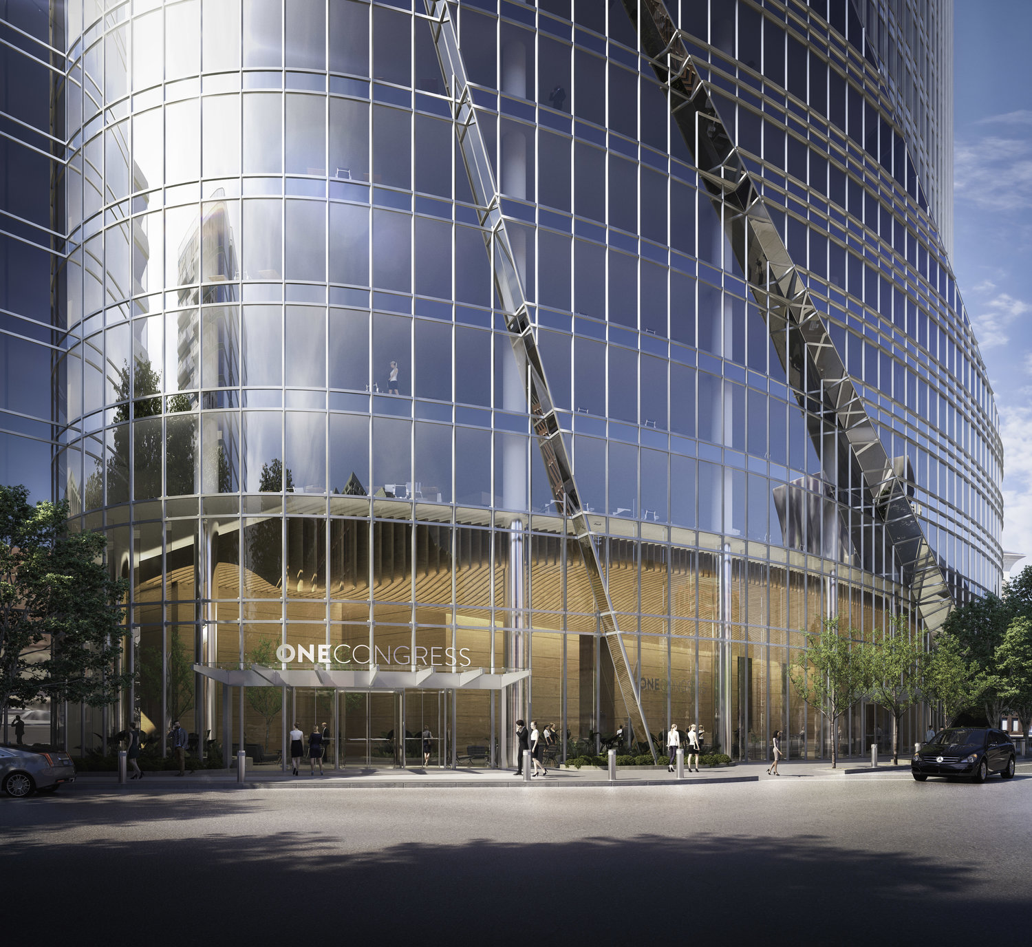
Getting some early 2000s-esque glass vibes from it all, especially with the highly reflective glass and bright silver mullions... It would have been a lot nicer if each plane of the façade read distinct from the next, either with a material change along that narrow strip (instead of just wrapping the glass), or bypassing the glass along the outer face. Sort of like how the crown piece is doing in the other direction.
But I hadn't looked at any of the up-close façade images... The grid of windows with the outset mullions is completely totalized across the pleats(?). The only variation looks like it's in the tint color of the center vertical portion, but I'm not sure that's the case - some of the exterior renderings look monolithic and that portion only glows at night because it's fully lit behind, but will that really be the case? I don't recall the floor plans ever showing any meaningful space division around there.
Getting some early 2000s-esque glass vibes from it all, especially with the highly reflective glass and bright silver mullions... It would have been a lot nicer if each plane of the façade read distinct from the next, either with a material change along that narrow strip (instead of just wrapping the glass), or bypassing the glass along the outer face. Sort of like how the crown piece is doing in the other direction.
Charlie_mta
Senior Member
- Joined
- Jul 15, 2006
- Messages
- 5,088
- Reaction score
- 7,615
I hear what you're saying, but having the same treatment across the pleats reminds me of waves on the ocean. It also has a sci-fi feel to it, like the warping of space with cgi effects.I'm looking forward to this project replacing the monster garage. And I don't mind the more exuberant shape of it.
But I hadn't looked at any of the up-close façade images... The grid of windows with the outset mullions is completely totalized across the pleats(?). The only variation looks like it's in the tint color of the center vertical portion, but I'm not sure that's the case - some of the exterior renderings look monolithic and that portion only glows at night because it's fully lit behind, but will that really be the case? I don't recall the floor plans ever showing any meaningful space division around there.
View attachment 10902
Getting some early 2000s-esque glass vibes from it all, especially with the highly reflective glass and bright silver mullions... It would have been a lot nicer if each plane of the façade read distinct from the next, either with a material change along that narrow strip (instead of just wrapping the glass), or bypassing the glass along the outer face. Sort of like how the crown piece is doing in the other direction.
citydweller
Active Member
- Joined
- Aug 23, 2019
- Messages
- 479
- Reaction score
- 752
This bold design (exuberant or Dubai-ish?) is a head-scratcher since that end of the city still has a historic vib and feel to it. It will be interesting to see how this plays out and how it fits with the surrounding architecture. The JHT worked out quite nicely so I'm assuming this one will as well. We'll see soon enough.
Charlie_mta
Senior Member
- Joined
- Jul 15, 2006
- Messages
- 5,088
- Reaction score
- 7,615
The Louvre Museum worked out well. IMO, with a futuristic building added near the historic building.This bold design (exuberant or Dubai-ish?) is a head-scratcher since that end of the city still has a historic vib and feel to it. It will be interesting to see how this plays out and how it fits with the surrounding architecture. The JHT worked out quite nicely so I'm assuming this one will as well. We'll see soon enough.
Downburst
Senior Member
- Joined
- Jul 20, 2012
- Messages
- 1,452
- Reaction score
- 347
A little bit of contrast never hurt anybody. I wouldn't advocate for a city filled with One Congresses but I feel the building's presence will enrich the city's diverse architectural history.
At the very least, it is better than what it is replacing.
At the very least, it is better than what it is replacing.
Nibbles O’Plenty
Active Member
- Joined
- Aug 24, 2020
- Messages
- 213
- Reaction score
- 738
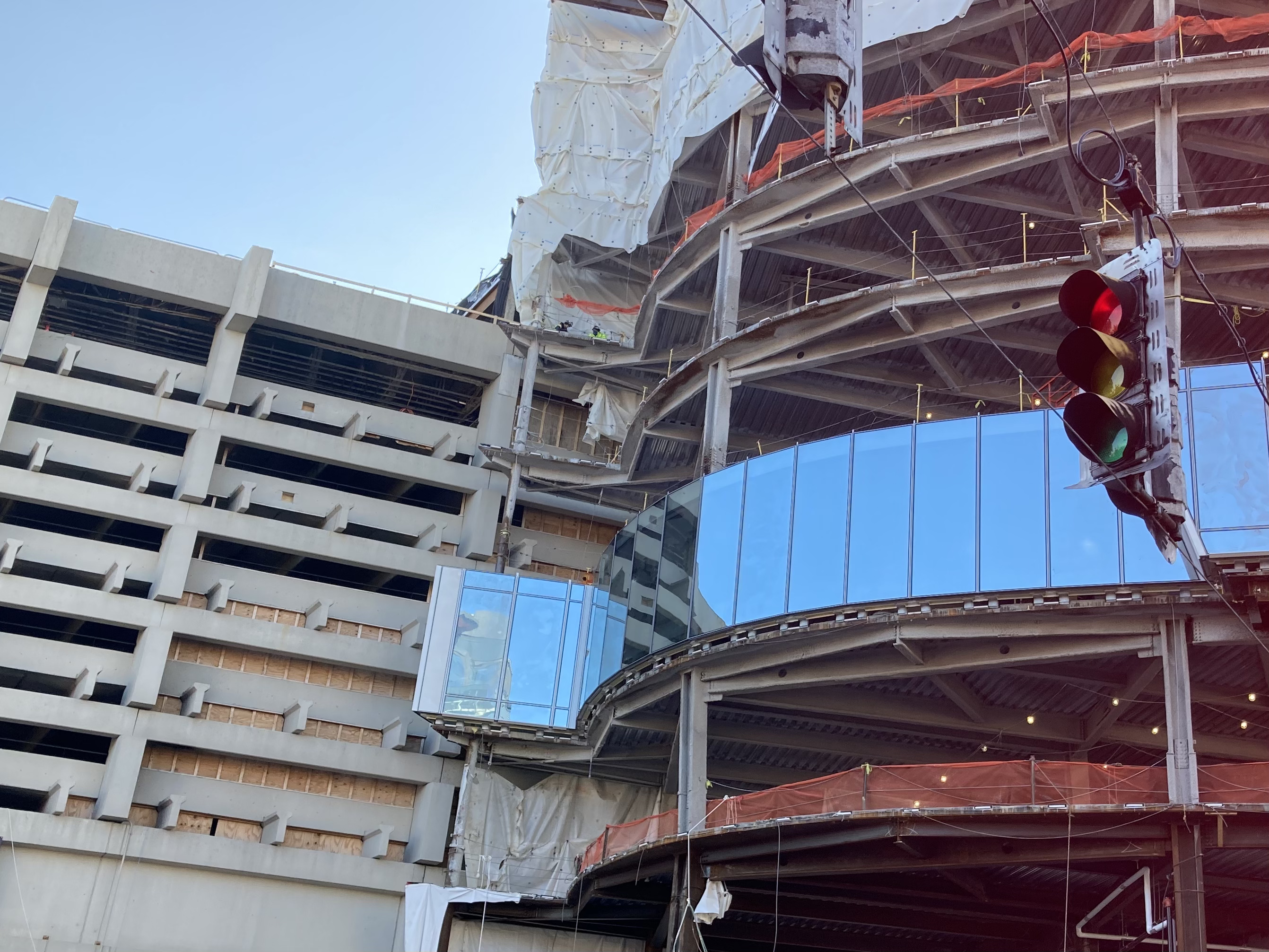
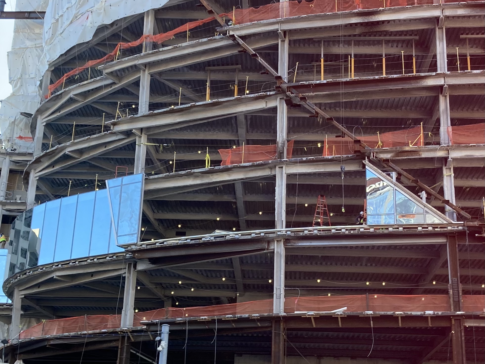
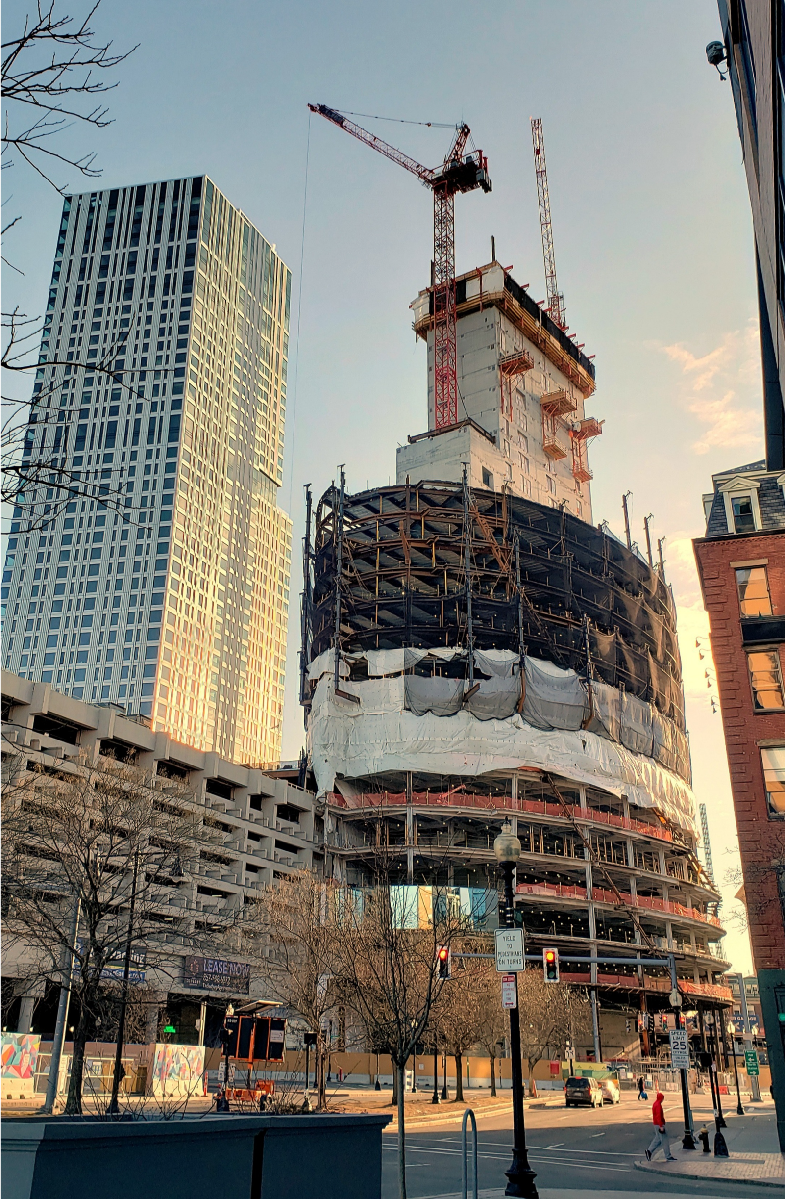
Rising from Greenway. Windows being installed.
