tobyjug
Senior Member
- Joined
- Jul 21, 2007
- Messages
- 3,408
- Reaction score
- 475
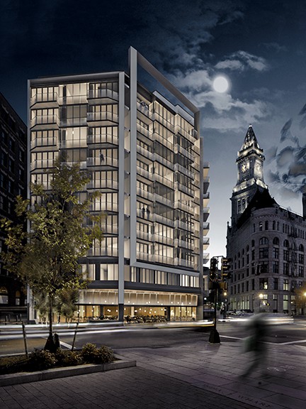
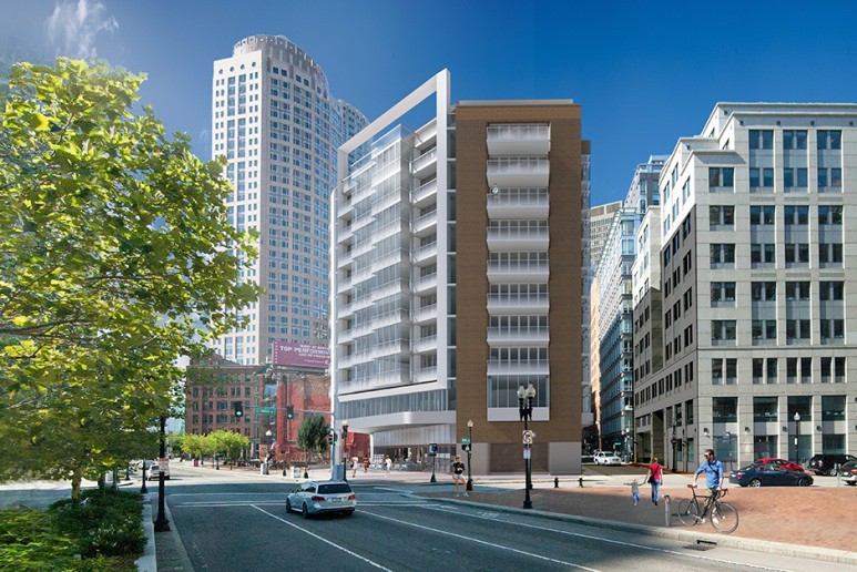
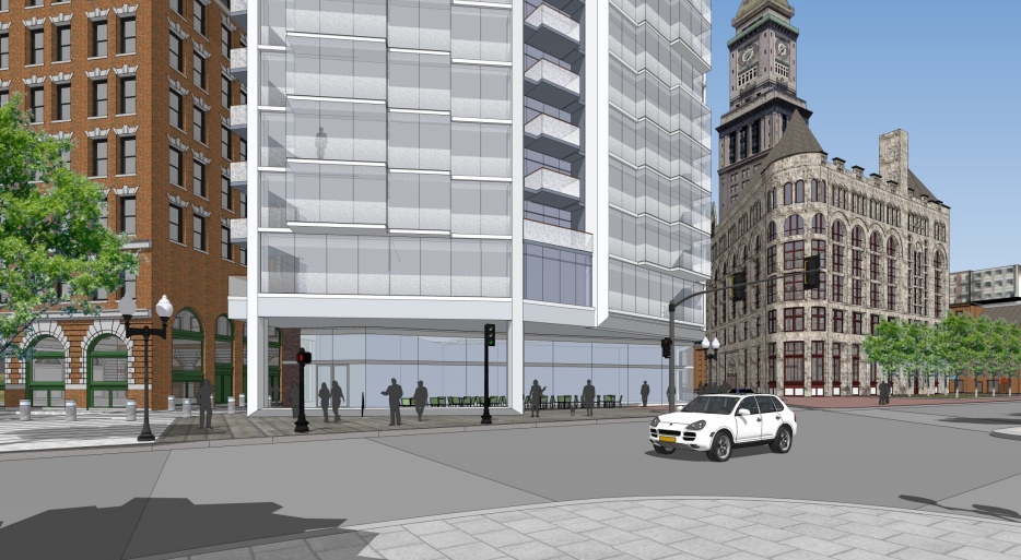
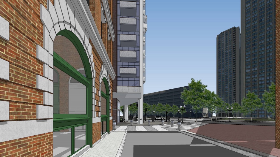
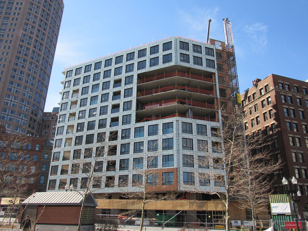
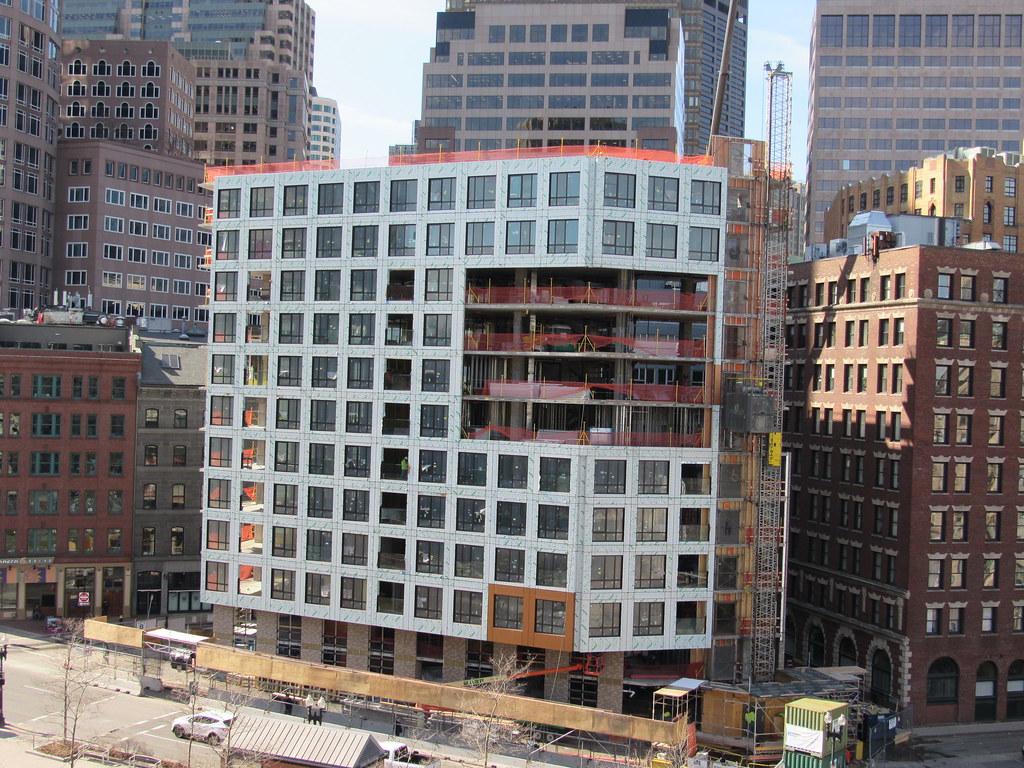
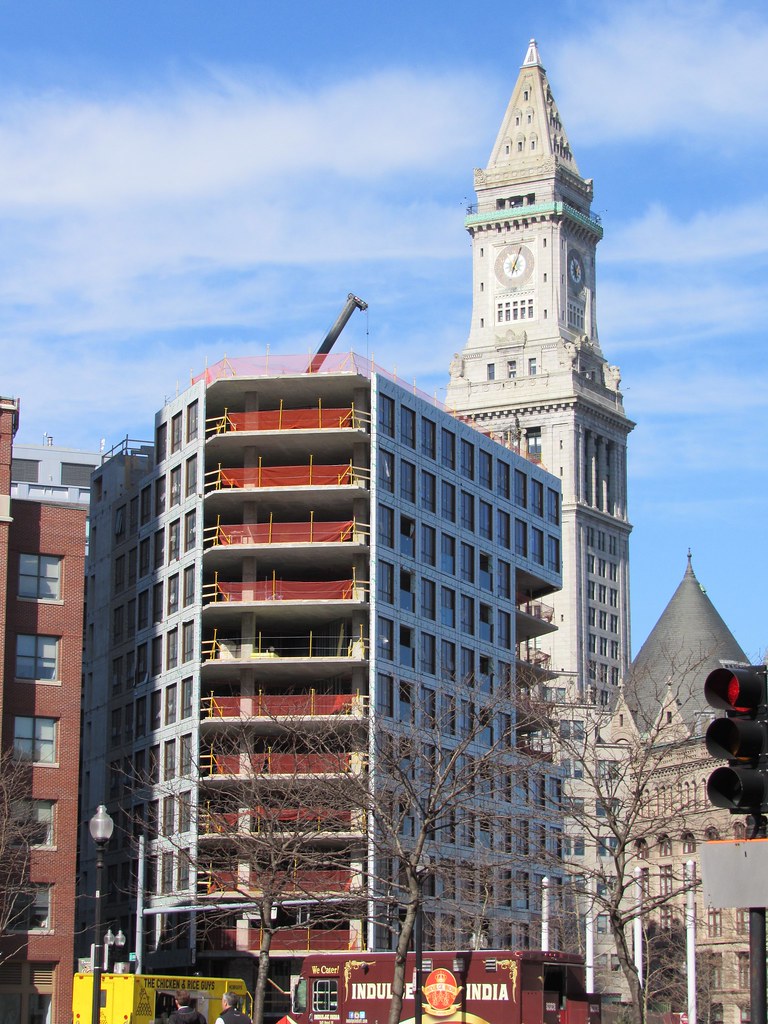
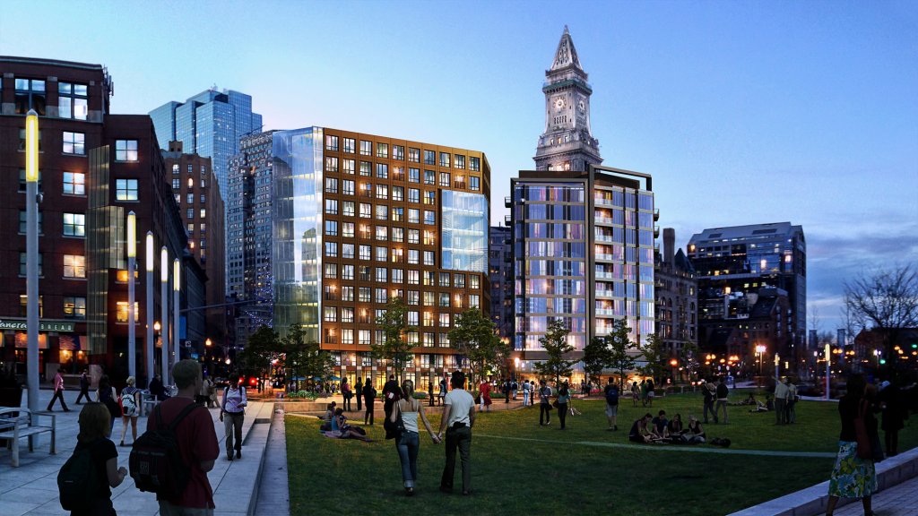
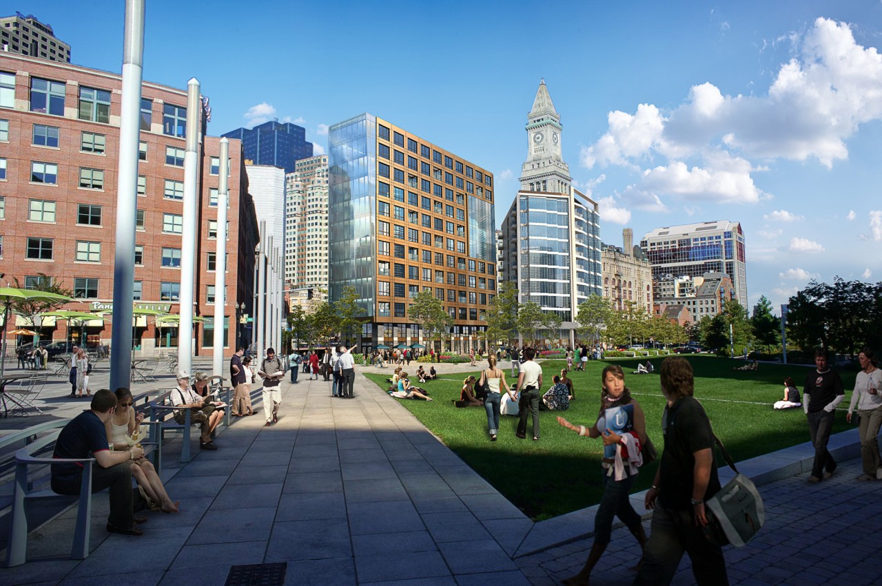
Not orange. Copper.
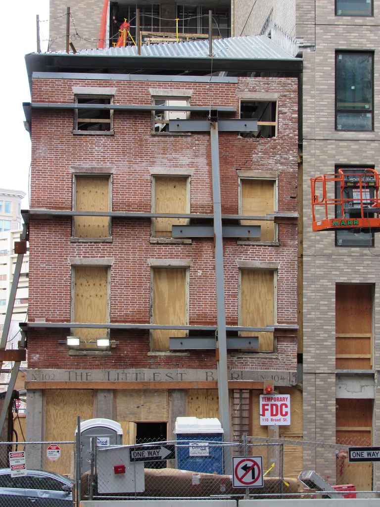
And don't get me started on the "we've lost all the craft of the past" thing. There is not a thing on that original building facade that was not the cheapest, quickest, get-it-done technique for building a building at its time. If this forum existed at the time that building was being designed we would have crucified it for being lazy, and probably for being too short (just kidding about that one).l
Good one!
200 plus years ago a utilitarian building was more likely to follow "classical" rules of design. Because technology was basic and there was no cheaper tech, profit didn't suffer from design. Profit was preserved by less sumptuous fabric and fitment, not by altering the traditional design formula . That's why even a cheap old building often looks good today.
When building technology evolved, profit and classical design diverged. Today we can hope for a profitable, clever design, but often get hack jobs like this project.


:format(jpeg)/cdn.vox-cdn.com/uploads/chorus_image/image/52714627/110_Broad_Street_Finegold_Alexander_Architects_8.0.jpg)