You are using an out of date browser. It may not display this or other websites correctly.
You should upgrade or use an alternative browser.
You should upgrade or use an alternative browser.
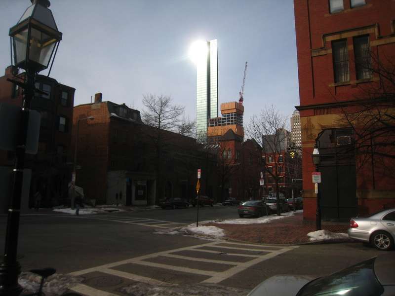
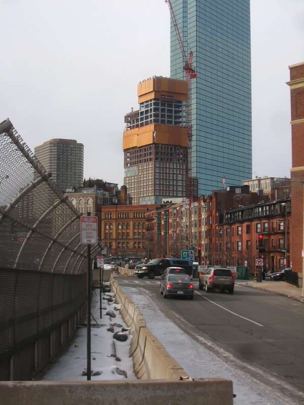
The Clarendon
- Thread starter quadratdackel
- Start date
- Status
- Not open for further replies.
- Joined
- May 25, 2006
- Messages
- 7,034
- Reaction score
- 1,875
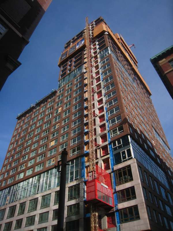
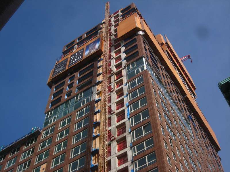
That is really shaping up nicely. Good shot too, did you desaturate it?
TheBostonBoy
Active Member
- Joined
- May 8, 2007
- Messages
- 442
- Reaction score
- 0
Great pictures. I like how they massed this building. Either this or 45 Province are my favorite new buildings. Although W Hotel is a close favorite too. These three are just great additions to Boston in my opinion. They are all in the 30 story range which is a cool coincidence lol
Boston02124
Senior Member
- Joined
- Sep 6, 2007
- Messages
- 6,893
- Reaction score
- 6,639
I see the topping off tree on the top I think? are they done or is the crown yet to be buil
 t?
t?

Boston02124
Senior Member
- Joined
- Sep 6, 2007
- Messages
- 6,893
- Reaction score
- 6,639
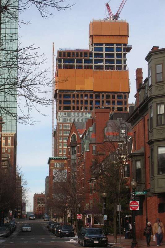
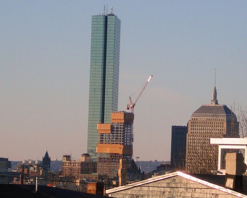
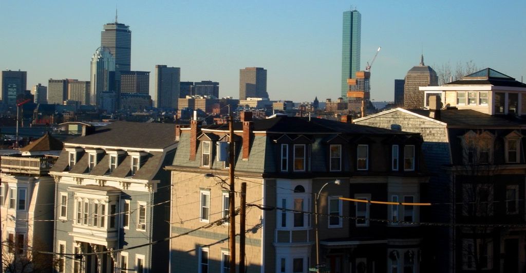
Today from So. Boston,nice to see the old Pine St Inn tower returned to the skyline after being used as a bill board for so many years!


tmac9wr
Senior Member
- Joined
- Jun 14, 2006
- Messages
- 1,446
- Reaction score
- 68
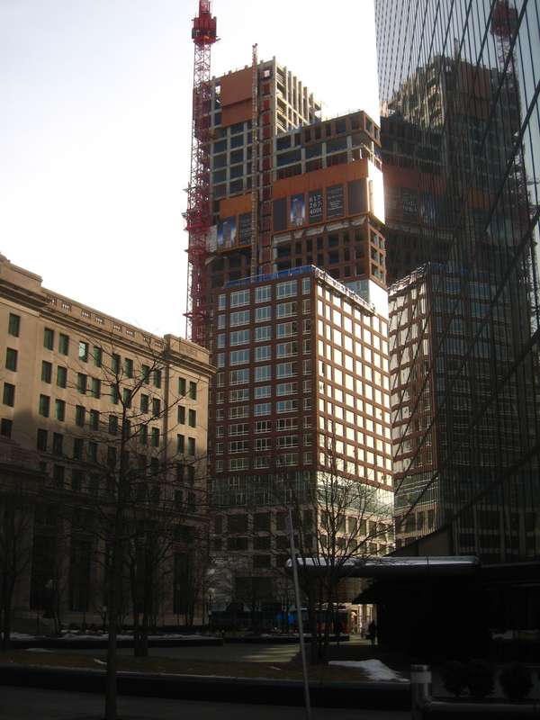
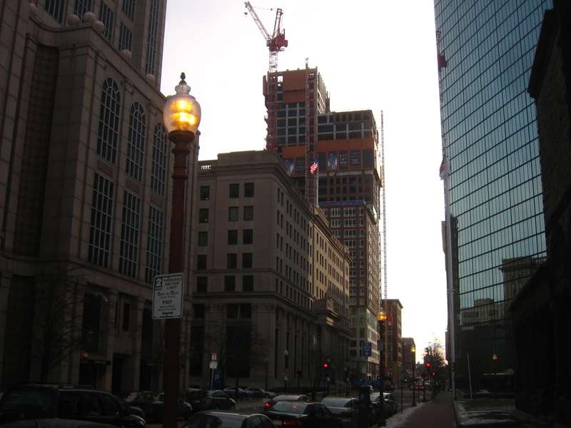
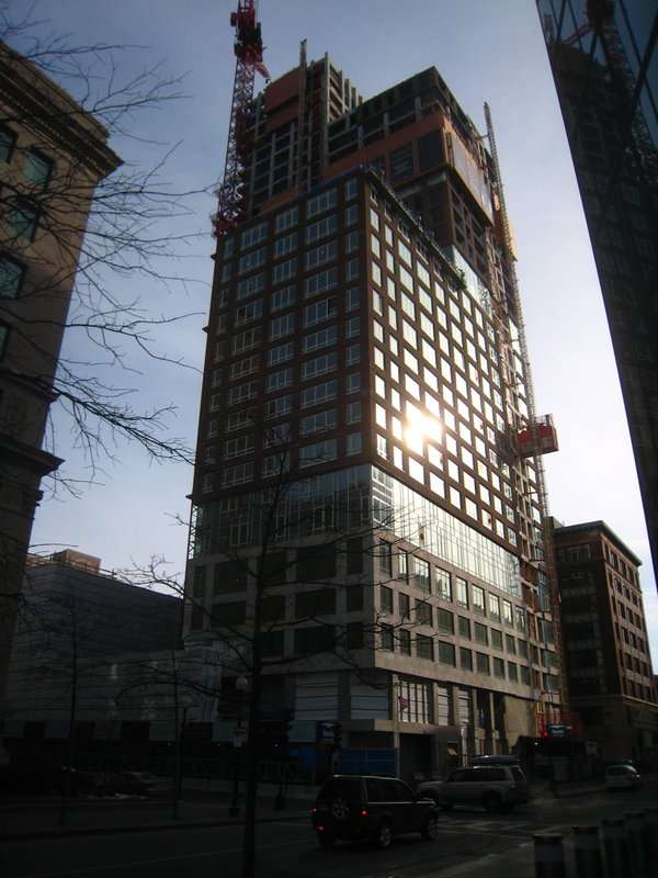
I just started working in the John Hancock Tower last Thursday, so I've been able to see the Clarendon a lot. I was surprised by the quality of materials being used...it looks really classy, and much better than I anticipated. Here's a couple quick snaps I took this morning...sorry bout the quality, I wanted to get out of the cold and I carrying Dunkin Donuts stuff:
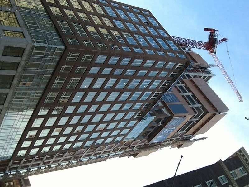
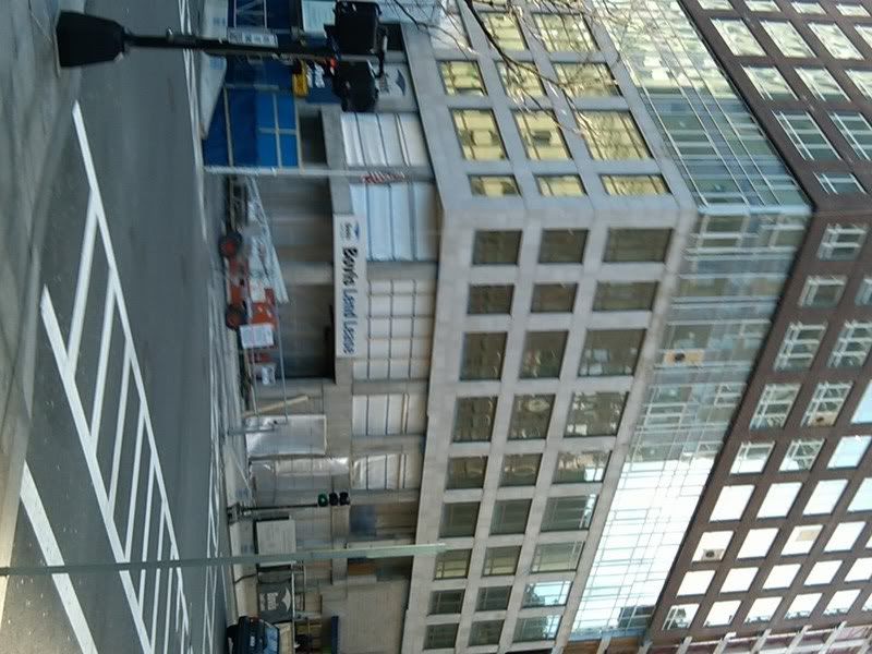


Despite liking the way The Clarendon is progressing--it looks much more handsome in person than in the renderings--I prefer views of the Hancock Tower when it stood alone, especially when looking toward its narrow sides.
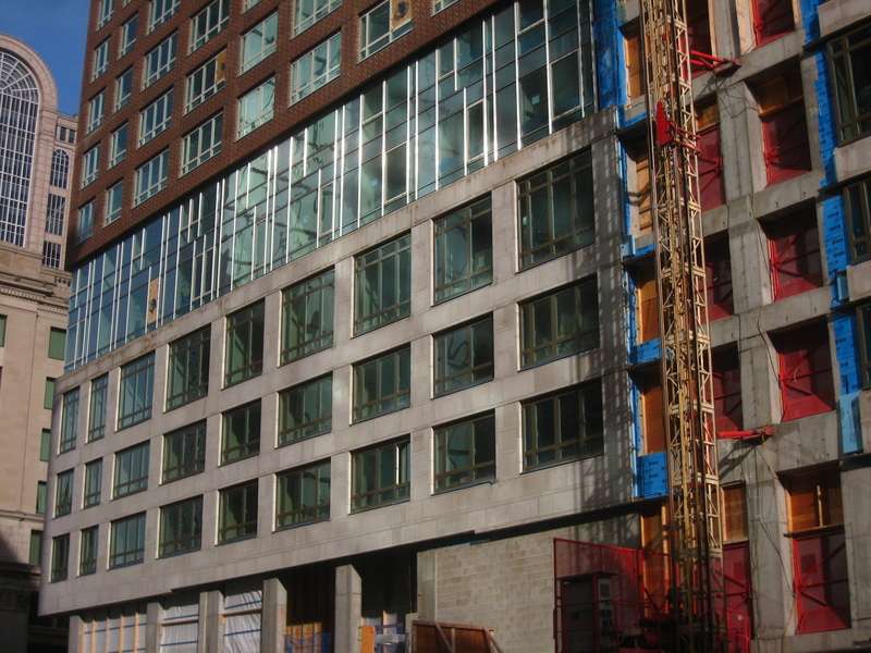
I'm going to modify my fawning. I see what Stern was trying to do with the base, and I agree with it, but I am not fully convinced by the pictures just above of the execution of this idea. (I'll say no more, let you all look at it more carefully, and then come to your own conclusions.)
I'm going to modify my fawning. I see what Stern was trying to do with the base, and I agree with it, but I am not fully convinced by the pictures just above of the execution of this idea. (I'll say no more, let you all look at it more carefully, and then come to your own conclusions.)
Last edited:
tobyjug
Senior Member
- Joined
- Jul 21, 2007
- Messages
- 3,408
- Reaction score
- 473
Thanks for the photos! It is funny how a small bit of lower portion "stone" cladding relates to the old Hancock, Liberty Mutual and Salada Tea Building, but the rest is brick more like the YWCA and University Club. I could do without all the the "brick", but it is a nice building regardless!
- Joined
- May 25, 2006
- Messages
- 7,034
- Reaction score
- 1,875
I have to agree. I walked by today and the quality of the materials used really stands out. Pictures on their way.
Patriots_1228
Active Member
- Joined
- Jun 19, 2007
- Messages
- 368
- Reaction score
- 1
12/30
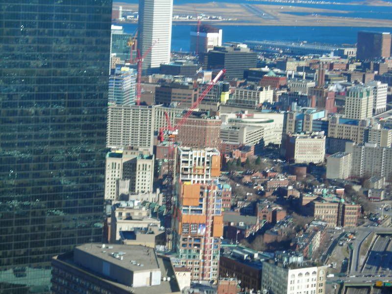
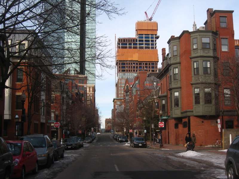
sorry...i have a habit of shakin the camera abit when i take pictures. nice to contribute though. You can also see fan pier and the W hotel in the background

sorry...i have a habit of shakin the camera abit when i take pictures. nice to contribute though. You can also see fan pier and the W hotel in the background
Boston02124
Senior Member
- Joined
- Sep 6, 2007
- Messages
- 6,893
- Reaction score
- 6,639
russia wharf too!^
Meadowhawk
Active Member
- Joined
- Jun 16, 2007
- Messages
- 265
- Reaction score
- 0
Might as well add that you can see Tufts Dental too!
blade_bltz
Active Member
- Joined
- Jul 9, 2006
- Messages
- 808
- Reaction score
- 0
And 2 Financial
kennedy
Senior Member
- Joined
- Feb 12, 2007
- Messages
- 2,820
- Reaction score
- 7
1/10:

This looks like they're building the Hancock from the top down. Cool shot.
Going through the whole New Development section, I love it when KZ updates all of the pictures. Pic and Pedal on, dude.
Meadowhawk
Active Member
- Joined
- Jun 16, 2007
- Messages
- 265
- Reaction score
- 0
1/10:
Thanks Kz for these pictures. You have a great eye. They're very good indeed.
- Status
- Not open for further replies.


