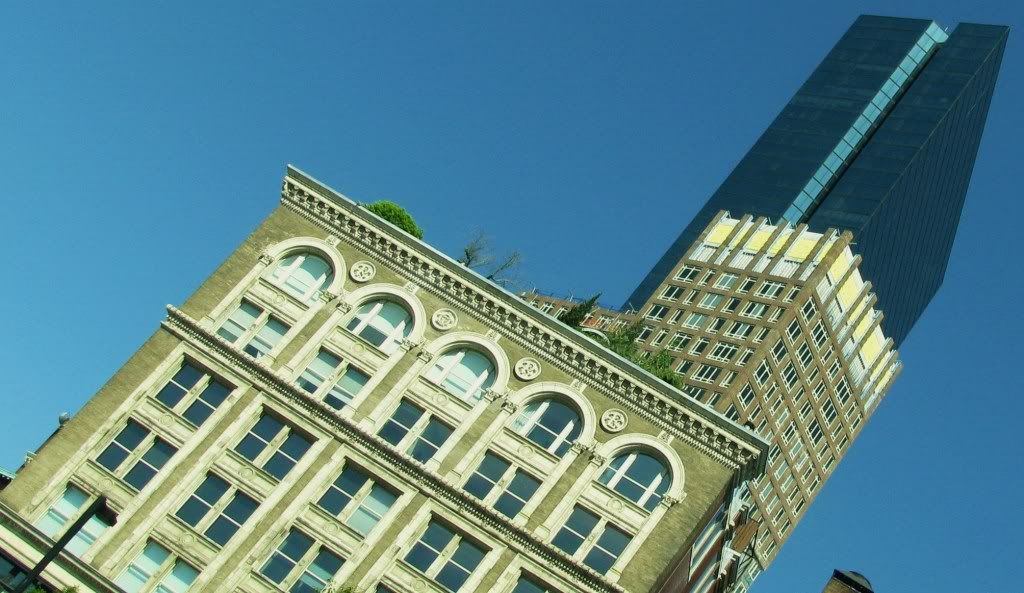
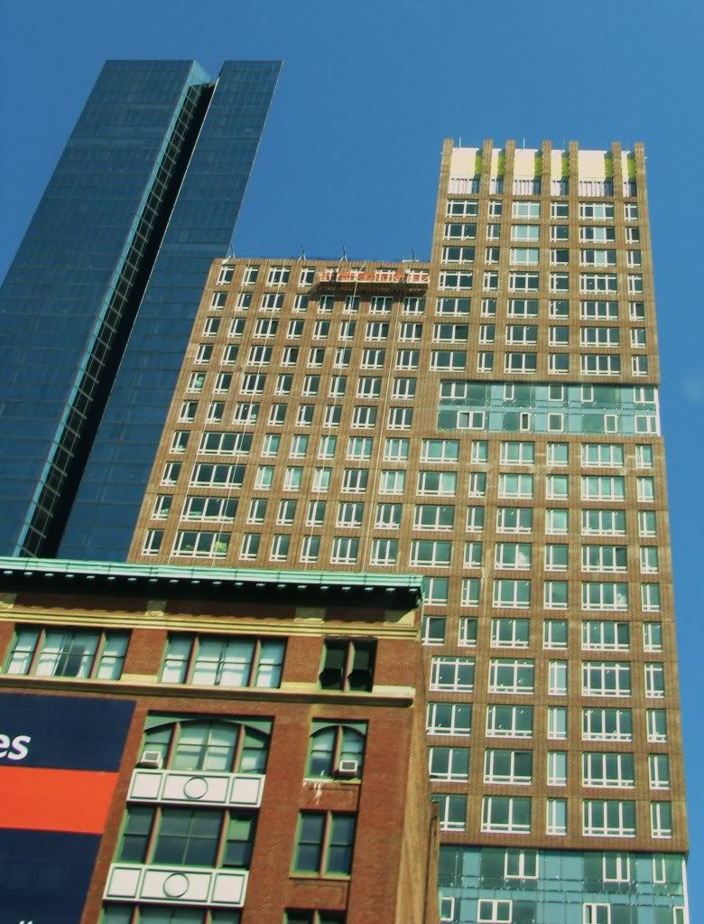
The Clarendon

Status
Not open for further replies.
'cept the NIMBYs are fighting to save the grass in parks from dreaded shade, and strip malls in Allston, and their views, while buildings like Shreve go unheralded.

It's funny, isn't it? I was reading public comments recently, a member of NABB said horizontal development is always preferred over vertical development. (The shadows, etc.)

I saw her the next day, and asked where she thought this organization should/could develop horizontally.

Her response was something like, "Well, I don't really know. Maybe the Fenway. Or the South End. Or maybe they should move to Downtown Crossing. Just no height anywhere near HERE. It would set a precedent for other developers to build horrid skyscrapers above 100' and drench the Comm Ave Mall in shade."

It's never their backyard. Someone else's though? Sure.
 
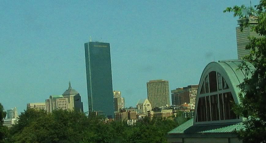
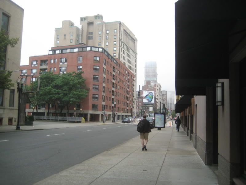
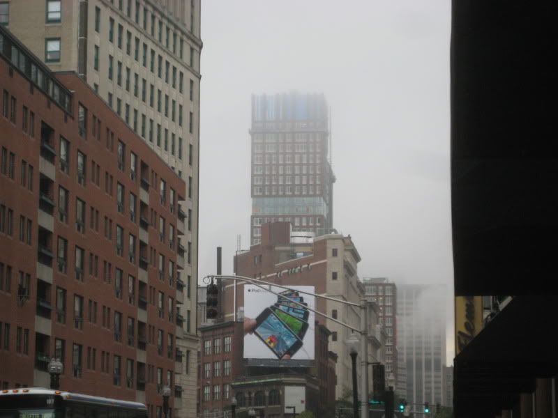
more mass pike drive bys!
034-5.jpg
035-8.jpg
 
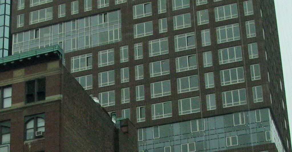
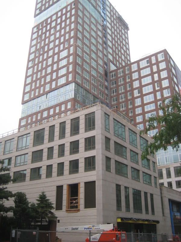
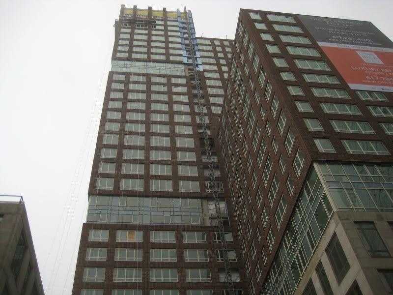
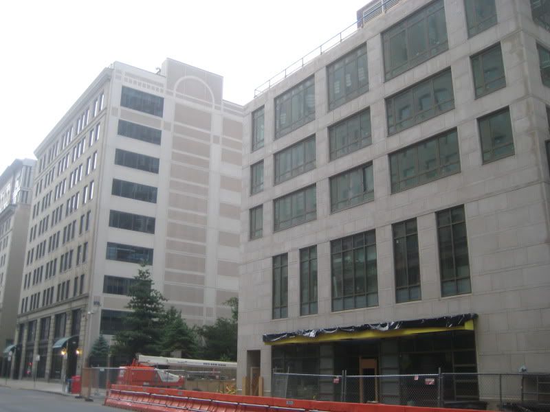
One of the main objections I have to the Clarendon is the way the brick and glass are used. IMO Stern made a big mistake by recessing the glass portions of the building. As a result the brick literally sticks out and looks artificially tacked onto the side of the building. While this is factually accurate, it is aesthetically unappealing. The same mistake was made, far more egregiously, on the Congress Street garage building that is located above Haymarket station. Arrowstreet was the designer. The result is a tacky mashup that looks unfinished and fake.
 
^I disagree.

Historically windows have always been recessed into brick facades. Contemporary architecture typically flattens the facade treatment into a sort of wallpaper. This is refreshing...IMO the setback gives both the brick depth and the facade texture.

I couldn't agree with you more about the new Haymarket garage. That thing is an abomination.
 
Ah, it's those white mullions that bother me the most about this building. Try to picture the facade without all that white, and it looks much better. If they had to go this route, why didn't they use black instead of glaring white?
 
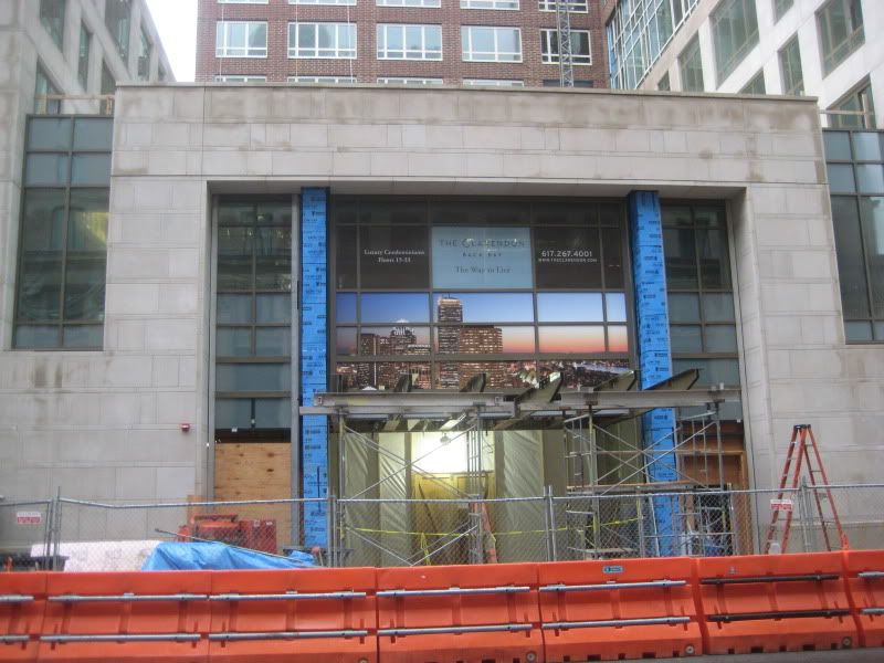
I don't think you're seeing what I'm alluding to...look at the bottom picture. There is a strip of glass wall at the bottom of the photo. Above that glass wall is protruding brick that is not supported by any visible structural element. It looks completely tacked on. The windows are fine. You are correct, the windows should be recessed.
 
^ah...ok, thanks for clarifying what you were referring to. I see your point...the anti-gravity brick is a funky detail (not a good funky).
 
The white really does kill it for me. Why did they decide to use the weird, offset mullions? It's sort of like it can't decide if it wants to be modern or traditional; and it totally fails at being both. The anti-gravity brick needs some sort of a frame, you're right, a simple concrete moulding would've done it for me. Or just made the glass flush.
 
The thing I hate the most about this silly little building is that it is constructed in concrete with "open corner" floors that could have allowed corner glazing. Stern's design bricked over that opportunity.

The ridiculous horizontal cut-outs could have been nodes of interior amenities (interior gardens, pool, fitness center, restaurant/bar, etc) expressed on the facade, or else eliminated.

More evidence that Stern is a hack.
 
Beton Brut said:
The thing I hate the most about this silly little building is that it is constructed in concrete with "open corner" floors that could have allowed corner glazing. Stern's design bricked over that opportunity.

You first mentioned that months ago, and ever since then every time I look at the building your (very valid) criticism pops into my head. Thanks for ruining it for me! ;)
 
what did they do to the windows???

did change the panes or add a final layer of frosted glass? or did they simply draw down some white blinds?

either way it helps TREMENDOUSLY...it's amazing...the apparently new contrast between the white and the brick....
 
Last edited:
I think it's just the overcast conditions as reflected by the windows creating that toned-down effect. It's something I too noticed and wish it was done on purpose, but in the last shot you can see the bottom windows, those which are reflecting the building across the street, still have those same awful contrast issues going on.
 
Also, from that first shot, you kind of get the idea of how much a cornice, even a postmodern interpretation of one, would have helped this building out.

And yes, the window blinds or overcast conditions or frosted glass do help tremendously.
 
Ok, my last set of pics from yesterday. Now, someone go do cambridge!

IMG_1530.jpg

IMG_1531.jpg

IMG_1532.jpg

IMG_1533.jpg

IMG_1534.jpg

IMG_1535.jpg
 
Status
Not open for further replies.

Back
Top