You are using an out of date browser. It may not display this or other websites correctly.
You should upgrade or use an alternative browser.
You should upgrade or use an alternative browser.
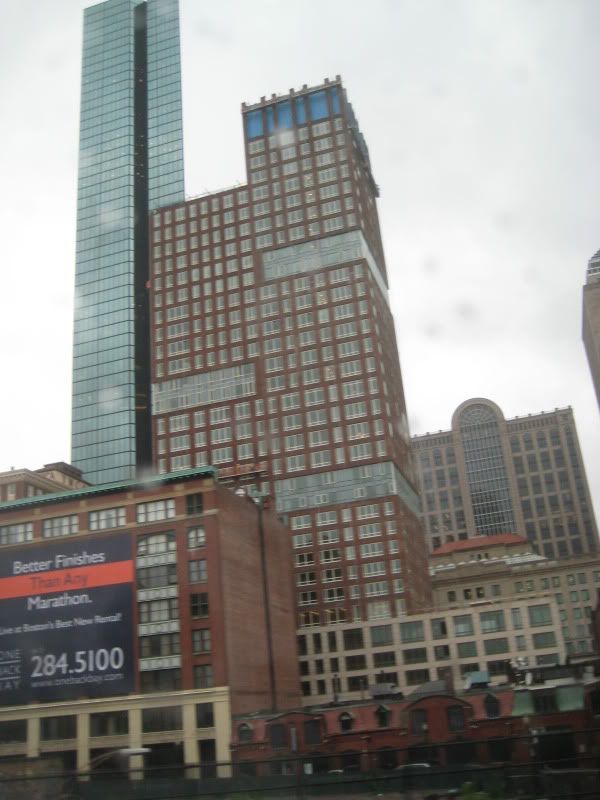
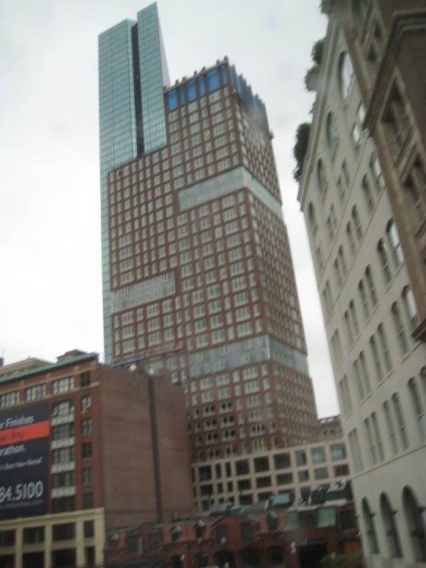
The Clarendon
- Thread starter quadratdackel
- Start date
- Status
- Not open for further replies.
A
atltransplant
Guest
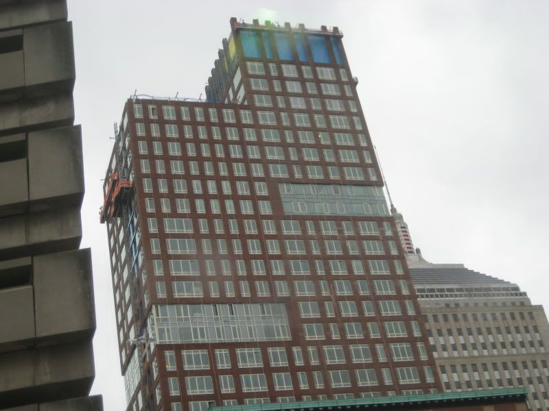
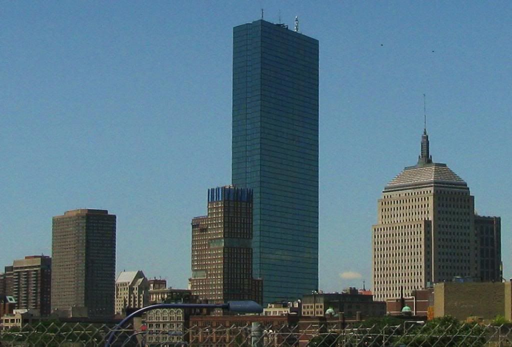
I love the penultimate picture. The new building disects the Hancock at the point of the Golden section, delineated by the indentation in the older building. That's good architectural rhetoric.
SeamusMcFly
Senior Member
- Joined
- Apr 3, 2008
- Messages
- 2,050
- Reaction score
- 110
Wow just noticed the big S for the first time. If they had only centered the upper 5 floor high section, it would look like a big $. As in it will cost lots of these to live here. Almost our own Trump building.
Boston02124
Senior Member
- Joined
- Sep 6, 2007
- Messages
- 6,936
- Reaction score
- 7,088
today from carson beach
- Joined
- May 25, 2006
- Messages
- 7,064
- Reaction score
- 1,990
That is a great shot. I don't know how you can get some of the shots you do with your little point-and-shoot.
PlanBoston
Active Member
- Joined
- Jun 16, 2006
- Messages
- 128
- Reaction score
- 12
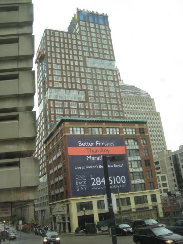
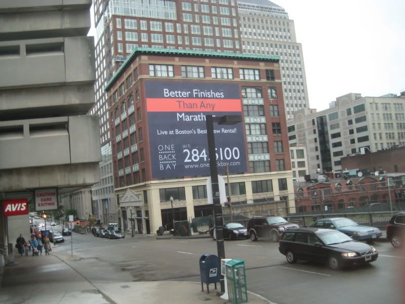
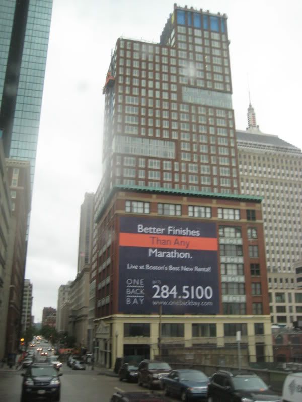
02124 - that's a great shot. From this vantage point, the Clarendon is almost inoffensive (ignoring the still incomplete / still blue crown). In the context of the overall skyline, it's just another unimaginative brick mass to be ignored.
This crap that passes as architecture underscores the beauty of it's neighbors - the Hancock building and Pei's tower. Stern's folly also makes 500 Boylston look elegant by comparison. Maybe the Clarendon's true value is as an example of opportunity missed.
This crap that passes as architecture underscores the beauty of it's neighbors - the Hancock building and Pei's tower. Stern's folly also makes 500 Boylston look elegant by comparison. Maybe the Clarendon's true value is as an example of opportunity missed.
- Joined
- May 25, 2006
- Messages
- 7,064
- Reaction score
- 1,990
Pei didn't do the Hancock, Henry Cobb did while working with Pei.
PlanBoston
Active Member
- Joined
- Jun 16, 2006
- Messages
- 128
- Reaction score
- 12
Pei didn't do the Hancock, Henry Cobb did while working with Pei.
True, Pei just got the lion's share of the glory since Cobb was working FOR him, not WITH him, at that time.
Boston02124
Senior Member
- Joined
- Sep 6, 2007
- Messages
- 6,936
- Reaction score
- 7,088
how most of my pix's come out!
JohnAKeith
Senior Member
- Joined
- Dec 24, 2008
- Messages
- 4,366
- Reaction score
- 115

Boston02124
Senior Member
- Joined
- Sep 6, 2007
- Messages
- 6,936
- Reaction score
- 7,088
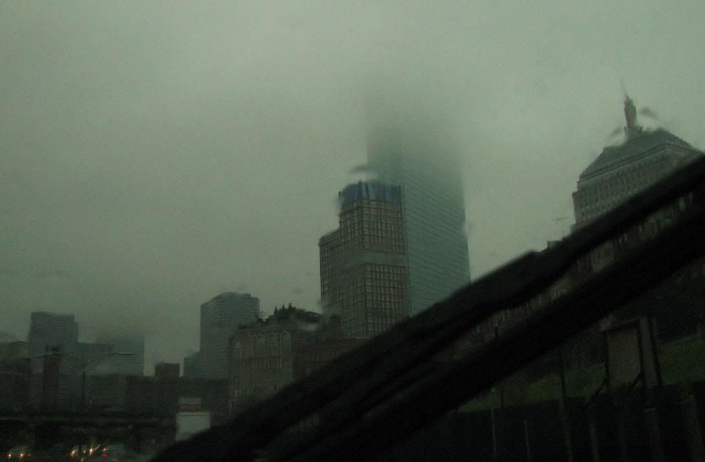
that must be an old pix cause the sun is out!


Boston02124
Senior Member
- Joined
- Sep 6, 2007
- Messages
- 6,936
- Reaction score
- 7,088
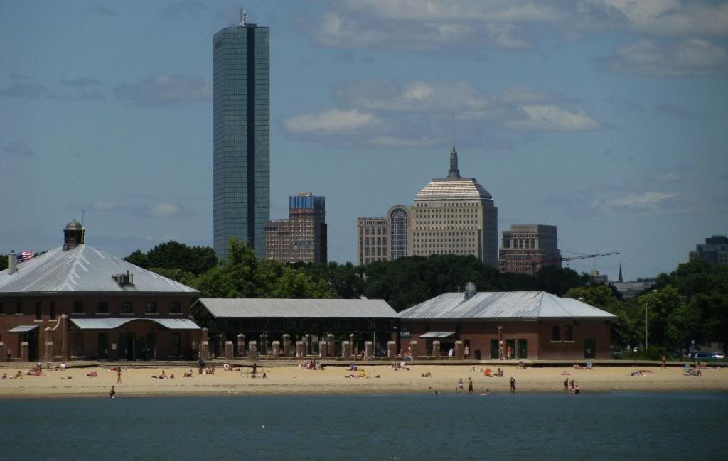
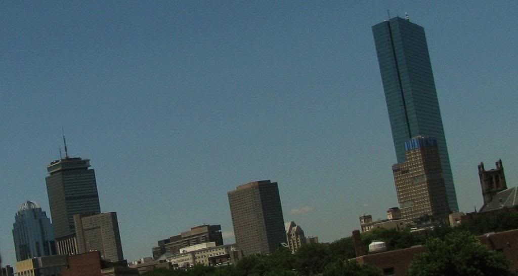
^I like the 1st one where it stands alone and tower's over Back Bay station.Here's a couple more from today from 93 so.
- Joined
- May 25, 2006
- Messages
- 7,064
- Reaction score
- 1,990
The first shot makes the Back Bay look really empty.
Patriots_1228
Active Member
- Joined
- Jun 19, 2007
- Messages
- 368
- Reaction score
- 1
This building really makes me want to die in the most painful way possible. Thats how bad it is.
I'm on-and-off about this building. At the ground level, it's not too bad. From a way, it's awful. And from the south, with the (dare I say it?) magestically ugly Christian Science tower*, they're two deformed nipples on the only hooker not taken at last call. (The thing in the middle? Yaa, that's her adam's apple. Try not to stare.)
it is kind of depressing to think that this is the design we get anymore when height is finally permitted. Is the BRA so aesthetically unaware? Does no one architect have an original or even just a mildly attractive idea? Is no one willing to spend any money not toward building a non-bland box of boring?
(* NOTE: The FCCS tower works extremely well in the context of the concrete campus but remains an ugly blot on the Boston landscape, only providing interest in the atrosity of its utter instrusion in a city crammd with bland boring blah towers. As if Comrade Stolichnaya had a few too many before putting pencil to paper.)
Joe_Schmoe
Active Member
- Joined
- May 25, 2006
- Messages
- 374
- Reaction score
- 0
I'm glad a consensus has emerged that bland boring boxes are bad. Bland boring boxes used to go under the title of "minimalism" aka modernism. Architecture is still stuck in the 1960s where sleek and minimalist was all the rage. The only trick today is that we can twist or bend the minimalist towers. Big whoop. Look instead to cutting edge fashion, where ornamentation and texture and exuberance has come back where architecture is still wearing the same clothes its been wearing since the 60s.
Look instead to cutting edge fashion, where ornamentation and texture and exuberance has come back where architecture is still wearing the same clothes its been wearing since the 60s.
Unfortunately when architects attempt to pull off texture and exuberance it ends up being gimmicky, repetitive and "I'm trying so hard to be different and zany! Look at me!" and the structure suffers for it. See also: Deconstructivism, Postmodernism
This building would have worked better had the faux brick not looked like a low resolution texture tiled over the surface of the exterior. I didn't think you could find the uncanny valley in architecture, but apparently it's possible.
- Status
- Not open for further replies.