The Clarendon

Status
Not open for further replies.
I think we need to add a new category to "Best of", that being "most Love/Hated New building". This would go up against Atlantic Wharf in an epic battle.
 
Not in love with "The Building at Russia Wharf" but it seems to fit more in the area than what they were able to come up with in the Back Bay.
 
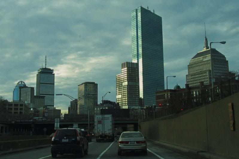
That building looks absolutely ridiculous near the Hancock Tower. It's actually embarassing. I'm not trying to get on a taller is better kick but a taller and wider non brick building could have looked amazing there. It looks like a trailer parked next to a mansion. How can Boston get it so much so wrong?
Practice.
 
Ha. Good one.

Once again, the goddamn crown kills it. Otherwise, it's really not a bad building at all. Goofy mullions, sure, but a hell of a lot better than any other high rise.
 
This building is so confused as to what it wants to be. Stern tried to split the difference between modern and traditional and ended up doing both a disservice, though I should add that it doesn't leave me searing the way it does others -- I just look at it with a pitied "meh."
 
Stern tried to split the difference between modern and traditional and ended up doing both a disservice

This describes a lot of Stern's work. My guess is the clients love the idea of "traditional" and then want modern amenities / layouts, so almost everything he builds looks like it got the cartoonish McMansion treatment.
 
4853708367_bb1b09b9f7_b.jpg


4854326974_12c24a19f7_b.jpg
 
The One Back Bay (luxury apts) entrance is on Clarendon Street. The Clarendon entrance is not on Clarendon Street, it's on Stuart Street. Weird, but neat.
 
IMO the rooftop gardens as originally rendered need to be prominently displayed, which at present, they are not. The top of the building needs to be reworked. Some architectural element needs to be installed to give the illusion of a more recessed appearance on those floors that are clear glass. Again, looking at the original rendering of this building, all the features that made it cool are absent in the final product.
 
Wow, the sun's hitting the buildings in the same spot and everything!
 
Boston 02124 I edited the pru's spire on your pic to see if it would make it looks a little less squat with about 50 more feet on it and I think it looks great.

prud.jpg
 
Status
Not open for further replies.

Back
Top