The Clarendon

Status
Not open for further replies.
^ Joint ventures generally involve a design architect (Stern), who designs the building; and an architect-of-record (CBT), who produces the working drawings. Here the inadequacy starts with the design. The working drawings can hardly be expected to rescue the design.

This building deserves a solid "D".
 
The Clarendon isn't specifically mentioned in this piece but I think it fits into the conversation well.

Boston.com - January 12, 2010
Hope yet for those Gilded Age mansions
Posted by Scott Van Voorhis January 12, 2010 07:00 AM

I am a fan of old homes. There is a charm you won't find in most new cookie cutter construction, not to mention a durability rare now in our throw-away society.

So I was cheered by the news a tech mogul has taken a liking to a classic Newport mansion.

The head of a private equity fund controlled by Oracle founder Larry Ellison, a multibillionaire and one of the world's richest men, has plunked down $10.5 million for the Astors' Beechwood estate.

Apparently, Ellison and gang got a steal. The property, a 39-room, 1850s Italianate mansion was first listed for more than $18 million. It was then put on the market again for $12.9 million before selling for $10.5 million.

What the rich do with their money is their business, but most seem content right now with obese and ugly new suburban mansions or overpriced high-rise penthouses.

The robber barons of the Gilded Age may have been a ruthless bunch, but at least they left behind something worth looking at. I am not sure the same can be said for the collection of mostly boring hotel condo towers that have sprouted up across Boston.

Despite the obscene prices, new construction hasn't always proved to be so durable.

Trinity Place was the rage in the late 1990s, but it didn't take long for all sorts of expensive problems to crop up there.

Just look at Harbor Towers, another once hot address that is now in danger of falling apart and in need of tens of millions in repairs.

By contrast, Ellison's new pad, which sits on a five acre site overlooking Newport's Cliff Walk and the Atlantic Ocean, has been around for 160 years. (The fact the Silicon Valley billionaire is a fanatical sailor is probably also a key factor in this deal.)

A sprawling 19,000 square feet, the Astors' Beechwood is packed with enough architectural variety to put any new warehouse-like suburban mansion and its ugly "great room" to shame.

And while $10.5 million is hardly chump change, it's about what some of the superrich were shelling out a few years ago for top units at the new Mandarin Oriental near the Prudential Center.

Since then, a number of Mandarin buyers have had second thoughts, throwing their condos back on the market.

Will someone shell out the equivalent of $10.5 million for a condo at one of these currently trendy downtown towers 160 years from now, in say 2170?

Frankly, I'm skeptical.

The problem (and I'm not sure if Scott would agree with this or not) isn't that they are "trendy towers" but they are poorly built "trendy towers". There a lots of trendy towers built around Central Park. They have and will hold their value as well as any Newport Manse.
We just need to starting building to that level of quality.
 
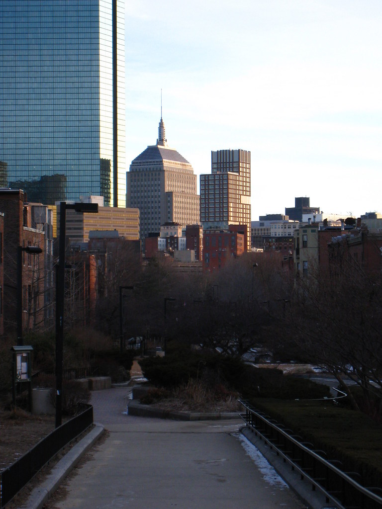
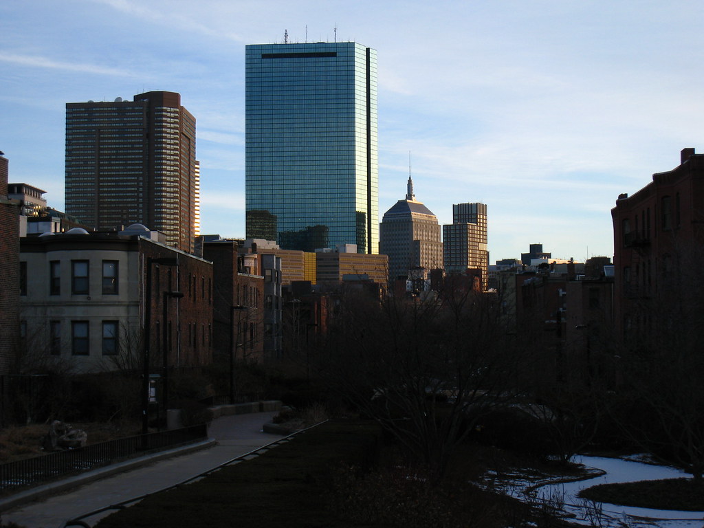
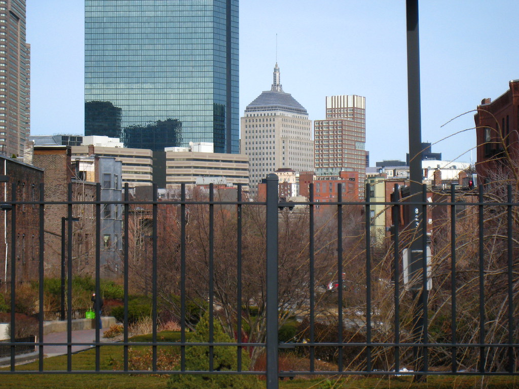
There is a wonderful back-story on the design of the Clarendon that makes it the most perfect symbol of development in Boston...

The original drawings/plans for the building show the bulky lower wing that now fronts Clarendon Street was actually always meant to be the side facing towards Berkeley Street. In these early renderings, the building has a much nicer balance.

Some people complained about their views being disrupted, or some other mild neighborhood complaint, and the developers agreed to just swap the wing to the other side of the building.

Architectural theory? Beauty? Balance? Aesthetics? Everything that Stern put into his design? Tossed out the window for some neighborhood complaint.

This building was actually designed by these petty complaints. The entire mid-rise wing was unceremoniously Frankenstiened onto the other side of the property, completely upsetting the building's design and balance. It's much different than those original renderings. It's design had nothing to do with architecture.

I apologize for being shoddy on the details - maybe somebody else can fill in more of the details here, or has some of the original drawings?
 
The original drawings/plans for the building show the bulky lower wing that now fronts Clarendon Street was actually always meant to be the side facing towards Berkeley Street. In these early renderings, the building has a much nicer balance.

This building was actually designed by these petty complaints. The entire mid-rise wing was unceremoniously Frankenstiened onto the other side of the property, completely upsetting the building's design and balance. It's much different than those original renderings. It's design had nothing to do with architecture.


clarendon1.jpg
??
 
Still stubby. It doesn't really matter what side the uberstub is on. It still looks like a pimple.
 
Agreed... but it's still an interesting case study how an architect can spend time designing a building to interact with the streetscape and its neighboring buildings, balance with its surroundings, etc... and then have all that architectural theory thrown into the garbage because some yahoo is crying "blocked views!"

It shows how little people in the real estate and development world actually care about architecture.

This is not a work of art, this is an investment vehicle to generate profit.

So who really cares what it looks like?
 
Last edited:
An owner should care what a building looks like, because an attractive building is more marketable than an ugly one.
 
Yes... and no. A buyer of a $1.5M brand new construction condo has limited options. And if they want to be in the Back Bay... they have one option. This one.

The finishes inside this building are Boston's best. Probably ever. Far better than the Mandarin, which has been plagued with complaints, and has seen many units return to the market.

The amenities are immense, and beyond anything Boston has ever seen. In this shitty market, they are outperforming every other benchmark in the city (W, 45 Province, etc)

All that, and the building is... ugly.

Doesn't seem to matter a whole lot to buyers. Living in the building is a great experience. Plus, you don't have to look at it.
 
Yes, the rendering is at the corners of Stuart and Clarendon streets. To the right (out of range) is the YWCA. The lower building behind The Clarendon is 131 Clarendon Street, previously the home of the Hard Rock Cafe. Behind that, part of the proposed Columbus Center project.
 
Yay! A building with windows! (Thanks! I like that walk too.)
 
Status
Not open for further replies.

Back
Top