You are using an out of date browser. It may not display this or other websites correctly.
You should upgrade or use an alternative browser.
You should upgrade or use an alternative browser.
The Hub on Causeway (née TD Garden Towers) | 80 Causeway Street | West End
- Thread starter choo
- Start date
Bananarama
Active Member
- Joined
- Mar 18, 2020
- Messages
- 582
- Reaction score
- 1,172
There's a lot of concrete curb area around the bike lanes going down the middle. I don't know what the minimum width for one of those honey locust plots is, but maybe there's room there?Usually, I would be "amening" that strongly.
But in THIS particular spot - - - Where????? The problem is there is only so much room on this street that feeds the Garden, Amtrak, Commuter Rail, Green Line, Orange Line, the new stores/bars, etc of the Hub. Once post-Covid, this will probably more than Boylston Pru Center or Copley Square during an outdoor concert for most per sq ft sidewalk pedestrian traffic. Putting in rows of trees in this soon-to-be very tight area is only going to create more human logjams that will spill into the streets quickly. I'm imagining weekday gamenights/concert nights around 5:30-7:00pm ~120 times per year.
........and I'm an inveterate advocate for more trees in the city. I want them just about everywhere.
Perhaps make Causeway Street one-way and widen the sidewalks to accomodate the crowds and trees? That's the only solution I can imagine that would work aside from just putting a few in the median.
I do wish they would've paved those with brick instead of concrete. They've got the grey ones along the south side already. The curbs on the newer Common Ave bike lane near BU do so with red brick and it's pretty nice. They also utilize them with bike racks, but probably a different use potential being in the middle of the road rather than off to one side.
DigitalSciGuy
Active Member
- Joined
- Apr 14, 2013
- Messages
- 670
- Reaction score
- 421
I'm actually really happy with the trend of relegating brick pavers to sidewalk trim and ensuring they're permeable pavers, like on Boylston St in Fenway. I know that most brick these days ends up getting laid on top of a base layer of asphalt anyway to limit the amount of shifting that happens over time, but I'd hate to see more than half of any sidewalk and especially any majority of the main path be done in brick pavers. They're so bad for accessibility and can be awful to walk on as it ages.
As I was saying on the previous page, I lament that BTD missed the opportunity to further reduce the road width to two lanes on Causeway St when they were putting in the center-running cycle track as part of the Connect Historic Boston project.
This is a pretty typical section of Causeway St today (looking north).
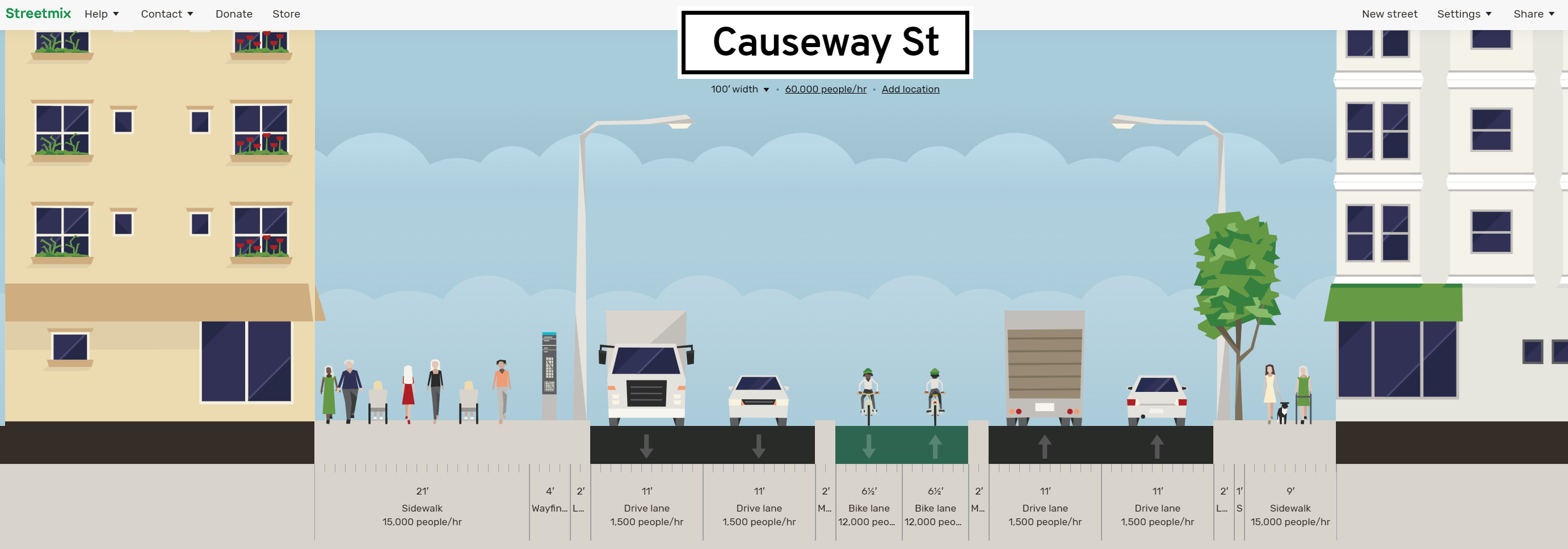
It does have some smaller decorative trees on the eastern side of the street from Staniford to Canal, but the sidewalk pinches to as narrow as 9 feet on the eastern side of the street between Haverhill and Beverly. That's 9 feet at that busy corner further constrained at one point by a traffic signal box and the pedestrian traffic light.
Even if you only take one lane away, that's roughly 11 feet you can reallocate to more sidewalk on the eastern side of the street for more on-street dining options and heck even decorative trees in the cycle track median to make drivers slow down here even more.
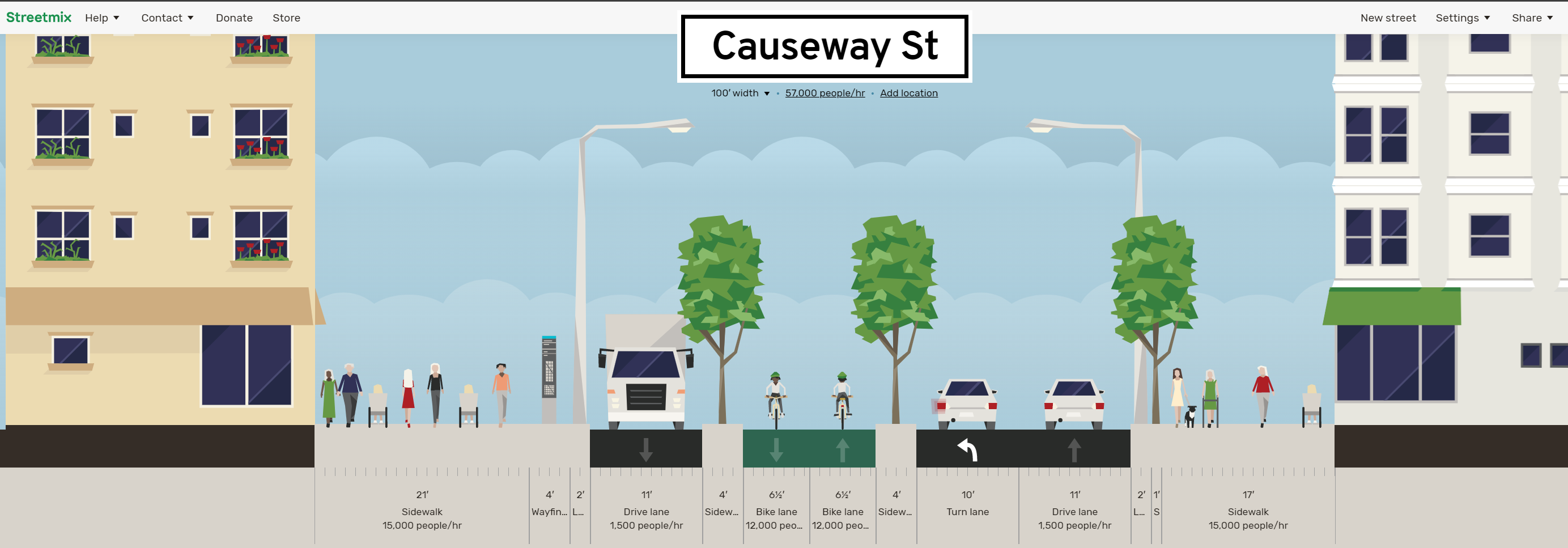
Anyway... interested to see if people start using the much wider western side of the street along the new development when things start to return to normal. My hunch is that the eastern side will still be VERY busy between Canal and Beverly Sts, which is where the pinch for sidewalk space is the worst. People already on the street SEE the MBTA head house there and tend to gravitate toward it. It's too bad we couldn't get both the tunnel directly into North Station AND the Causeway St head house connecting into the underpass in the new development otherwise maybe the constrained sidewalk space wouldn't be such an issue as it feels today.
As I was saying on the previous page, I lament that BTD missed the opportunity to further reduce the road width to two lanes on Causeway St when they were putting in the center-running cycle track as part of the Connect Historic Boston project.
This is a pretty typical section of Causeway St today (looking north).
It does have some smaller decorative trees on the eastern side of the street from Staniford to Canal, but the sidewalk pinches to as narrow as 9 feet on the eastern side of the street between Haverhill and Beverly. That's 9 feet at that busy corner further constrained at one point by a traffic signal box and the pedestrian traffic light.
Even if you only take one lane away, that's roughly 11 feet you can reallocate to more sidewalk on the eastern side of the street for more on-street dining options and heck even decorative trees in the cycle track median to make drivers slow down here even more.
Anyway... interested to see if people start using the much wider western side of the street along the new development when things start to return to normal. My hunch is that the eastern side will still be VERY busy between Canal and Beverly Sts, which is where the pinch for sidewalk space is the worst. People already on the street SEE the MBTA head house there and tend to gravitate toward it. It's too bad we couldn't get both the tunnel directly into North Station AND the Causeway St head house connecting into the underpass in the new development otherwise maybe the constrained sidewalk space wouldn't be such an issue as it feels today.
Nibbles O’Plenty
Active Member
- Joined
- Aug 24, 2020
- Messages
- 213
- Reaction score
- 738
Trees please. This stretch of road has always lacked them. It still feels a little dead as if the elevated Green Line is haunting it. Don’t get me wrong, I appreciate this project, just hoping they add some greenery
Nibbles O’Plenty
Active Member
- Joined
- Aug 24, 2020
- Messages
- 213
- Reaction score
- 738
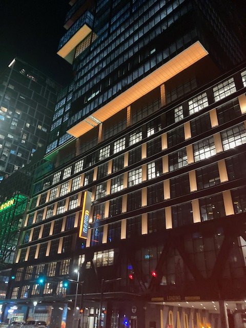
Mood lighting has been turned on. 
stick n move
Superstar
- Joined
- Oct 14, 2009
- Messages
- 12,066
- Reaction score
- 18,807
The lighting on the base looks great.
bigpicture7
Senior Member
- Joined
- May 5, 2016
- Messages
- 3,896
- Reaction score
- 9,518
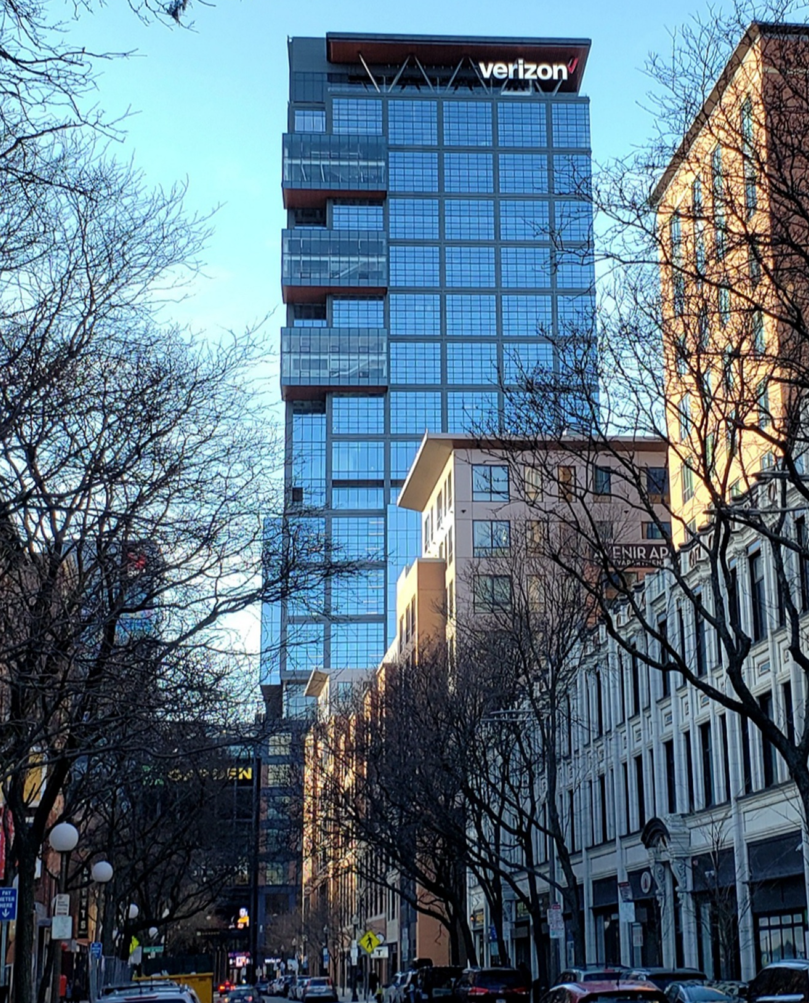
Today
Downburst
Senior Member
- Joined
- Jul 20, 2012
- Messages
- 1,452
- Reaction score
- 347
Today
Possibly the sharpest angle this tower has, if only because the midrise "bustle" is obscured. Nice shot!
bigpicture7
Senior Member
- Joined
- May 5, 2016
- Messages
- 3,896
- Reaction score
- 9,518
Possibly the sharpest angle this tower has, if only because the midrise "bustle" is obscured. Nice shot!
Thanks. It's not easy to find a flattering view of this one. Notice that not only is the "midrise bustle" obscured, but they also relieved the bustle along the one corner of the tower I'm facing. It makes me believe that the architects were aware that the Canal st. buildings would obscure the bustle from most views on that street, so they then took the opportunity to relieve the bustle in the one location where it wouldn't be obscured from Canal St. In other words, Canal St. was the one view they "saved" when forced to compromise on the client's floorplate demands elsewhere. Just a theory.
Last edited:
JeffDowntown
Senior Member
- Joined
- May 28, 2007
- Messages
- 4,790
- Reaction score
- 3,647
I think there is a lot of conscious design alignment going on here and in Bulfinch Crossing (behind in this view) to prepare for Canal Street becoming a Pedestrian Mall.
I think there is a lot of conscious design alignment going on here and in Bulfinch Crossing (behind in this view) to prepare for Canal Street becoming a Pedestrian Mall.
Is Canal actually changing to ped only? I remember it happened for a day back in 2017, but I can't find anything on it happening again, temp or otherwise.
Is Canal actually changing to ped only? I remember it happened for a day back in 2017, but I can't find anything on it happening again, temp or otherwise.
It was ped only during most playoff Bruins games in 2019, but nothing permanent.
bigpicture7
Senior Member
- Joined
- May 5, 2016
- Messages
- 3,896
- Reaction score
- 9,518
This morning
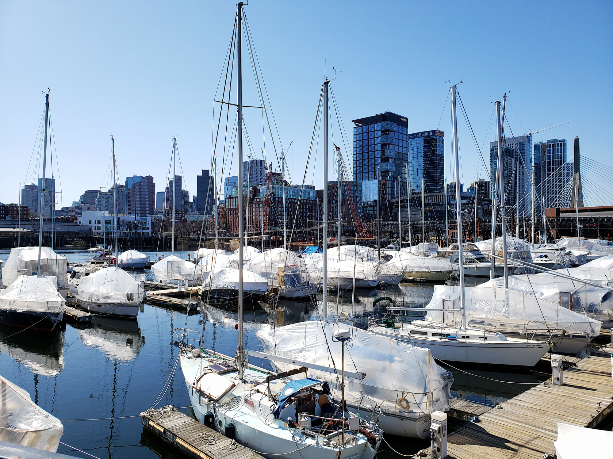
too bad those developers weren't put in charge of the verizon tower. i already can't wait until they implode verizon, it's by far the ugliest thing ever created.I know this is a thread for The Hub on Causeway, but man - Converse's HQ is such a pretty complex. And from the above angle, it visually steps up to The Hub well. From massing, height, and color perspectives.
That’s waaaaay more elegant and interesting than VerizonI'm sorry but "by far the ugliest thing ever created" is exclusively reserved for this

I actually rank Verizon ahead of both the Hub Residential and the Avalon tower in the NS cluster. I think a big part of that is that it was originally supposed to be around 400', with the residential well over 600'. This one ended up improving while the residential is among my biggest disappointments. The residential was supposed to be the area's peak, but now the area has no peak. It looks like 4 buildings of essentially the same height.
Overall ranking of new addition to the main skyline, spanning Government Center through North Station:
1: State Street Tower (expected) - Obviously not up yet, but I suspect this one will challenge MT, 1 Dalton, and potentially the Aquarium Tower if it happens, for best building out of the entire boom. It's the peak that legitimizes the area as a true extension of the financial district skyline. Also, I typically favor office buildings over other uses from an aesthetic standpoint, and it's been a while since we got a really good office tower like this.
2: The Sudbury - Classy, high quality materials, less bulky than expected, plays well with its neighbors. I love this one and am sad to see it disappear from the North so soon, although not THAT sad since it's SST replacing it.
3: The Alcott - Classy/classical look, glassy, bright. I like it a lot, but think the materials on The Sudbury (plus the extra height at a crowded level of the plateau) put this one behind the Congress Street Garage pair.
4: Verizon - I like the powerful, neo-industrial look, and the base section also looks great. The blob glass above the base is the worst part. Materials are good. Kind of looks like it belongs in Tokyo. Also, I'll take a surprise 500'+ building any day, every day.
5: Hub Residential - Very disappointing compared to what might/should have been from a height perspective. For what it is, glass looks OK, pattern is unique for the city, and the thin side from Government Center actually looks pretty great.
6. Avalon - I actually was perfectly satisfied with this one when it was first built. However, in context with the surrounding towers it's the shortest and blobbiest, with the worst materials. It kind of looks like a mess compared to the rest of them, but at least it adds to the density and set a new precedent for height in the neighborhood.

 IMG_6846
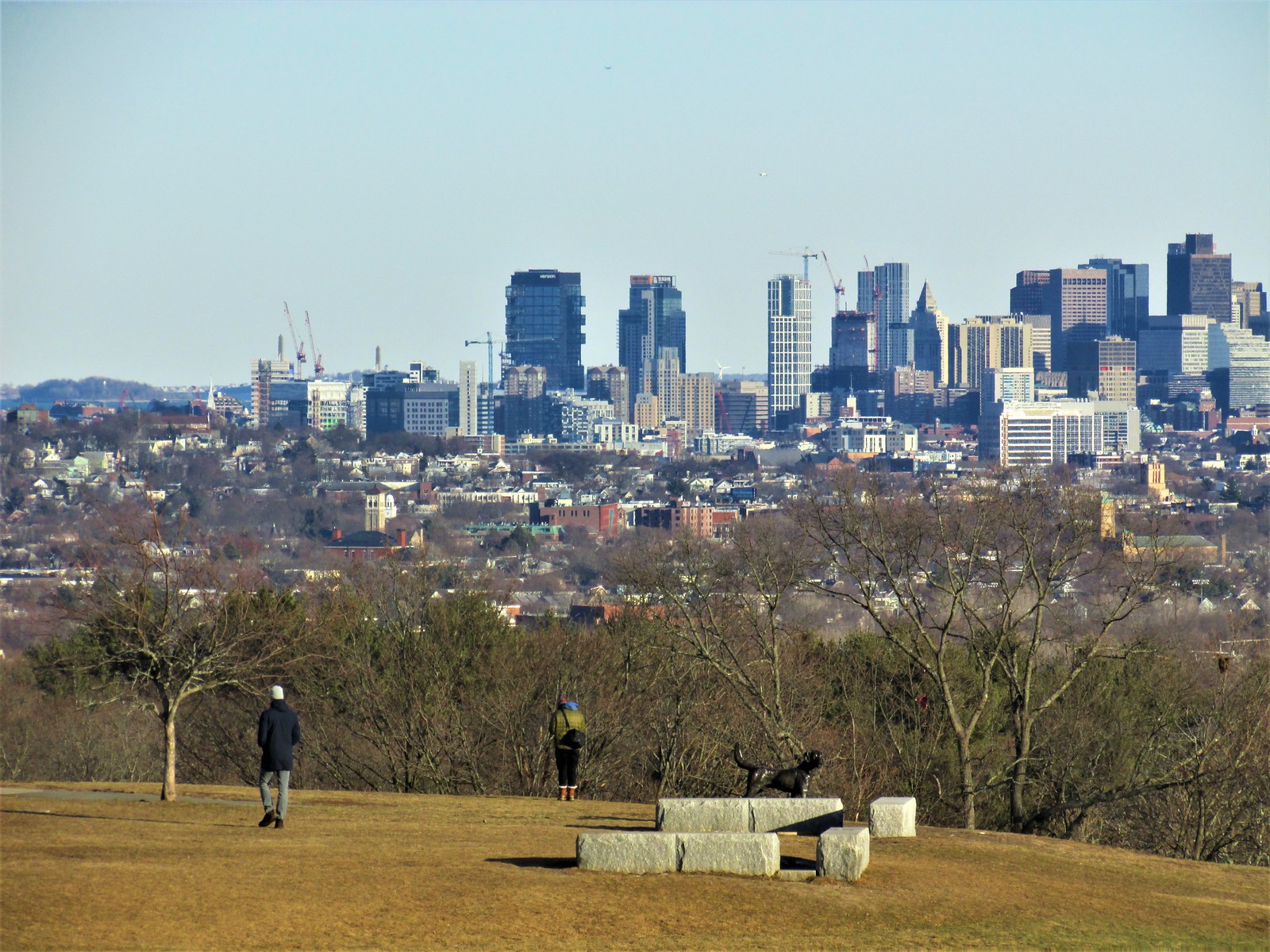 IMG_6863
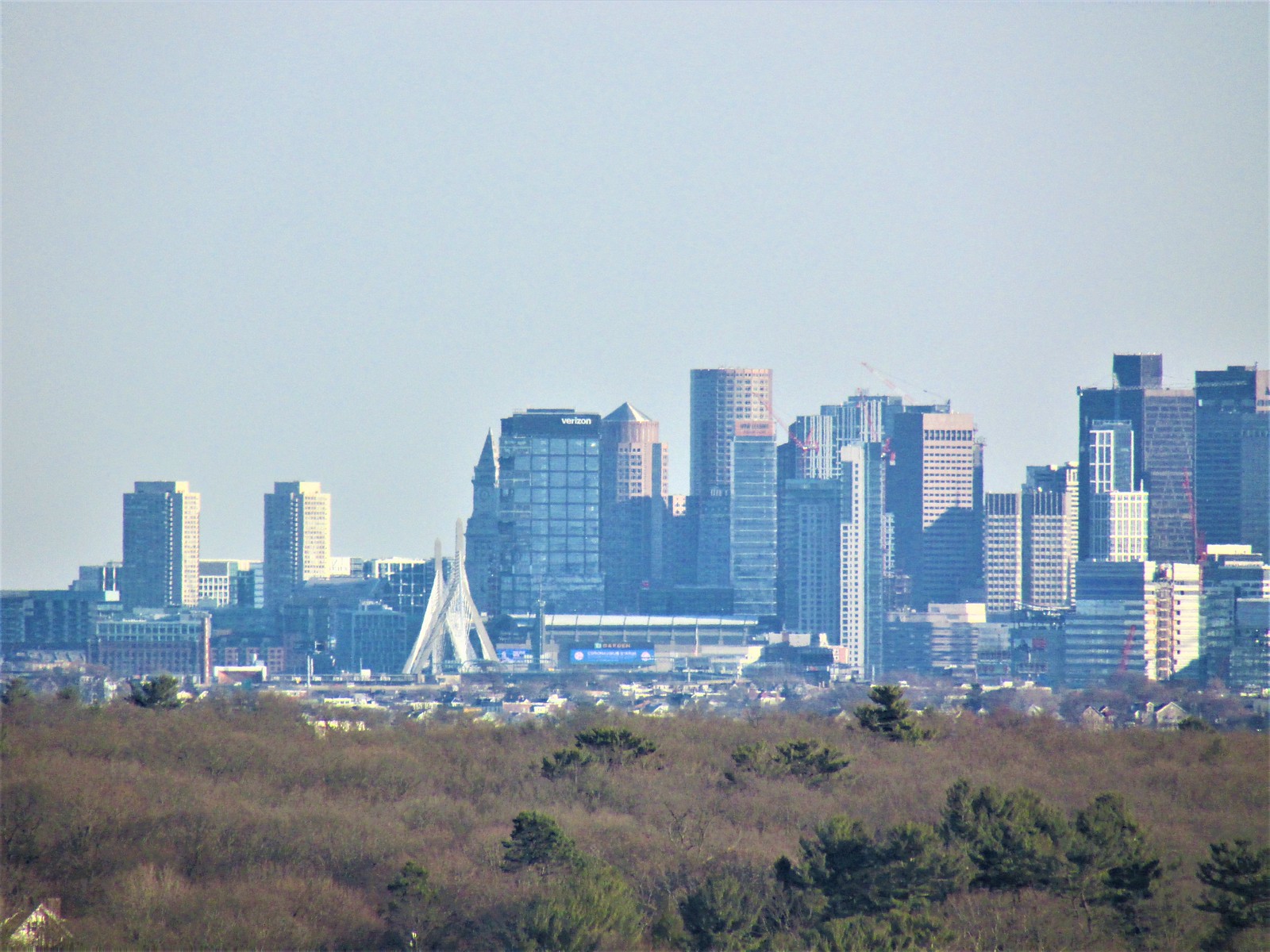 IMG_6922