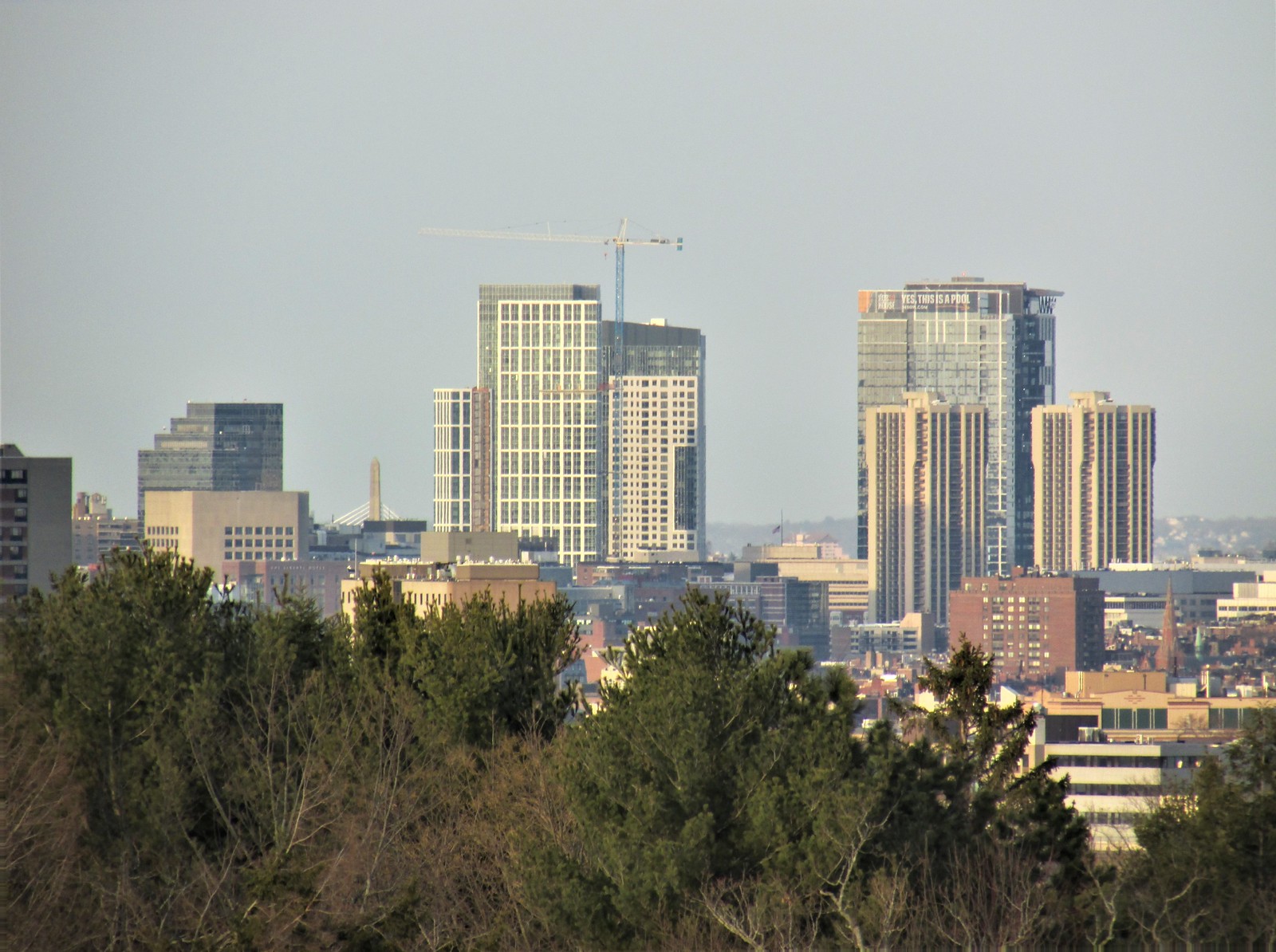
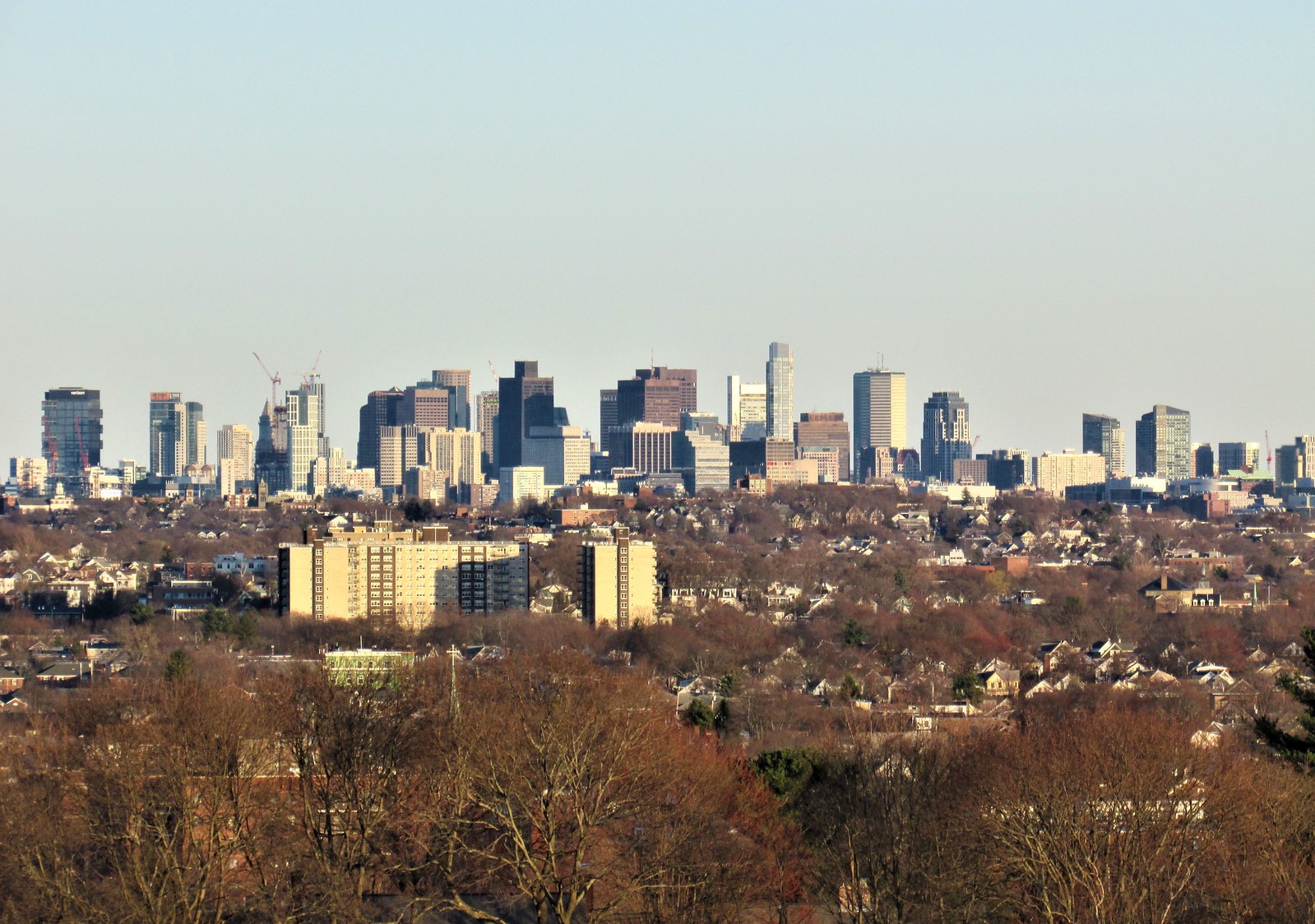
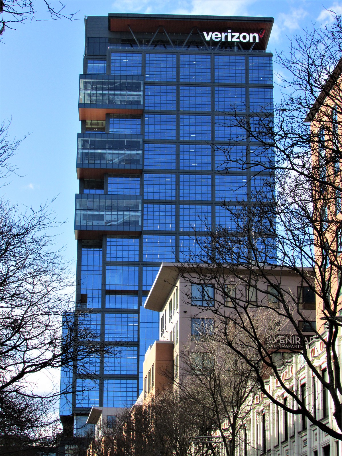
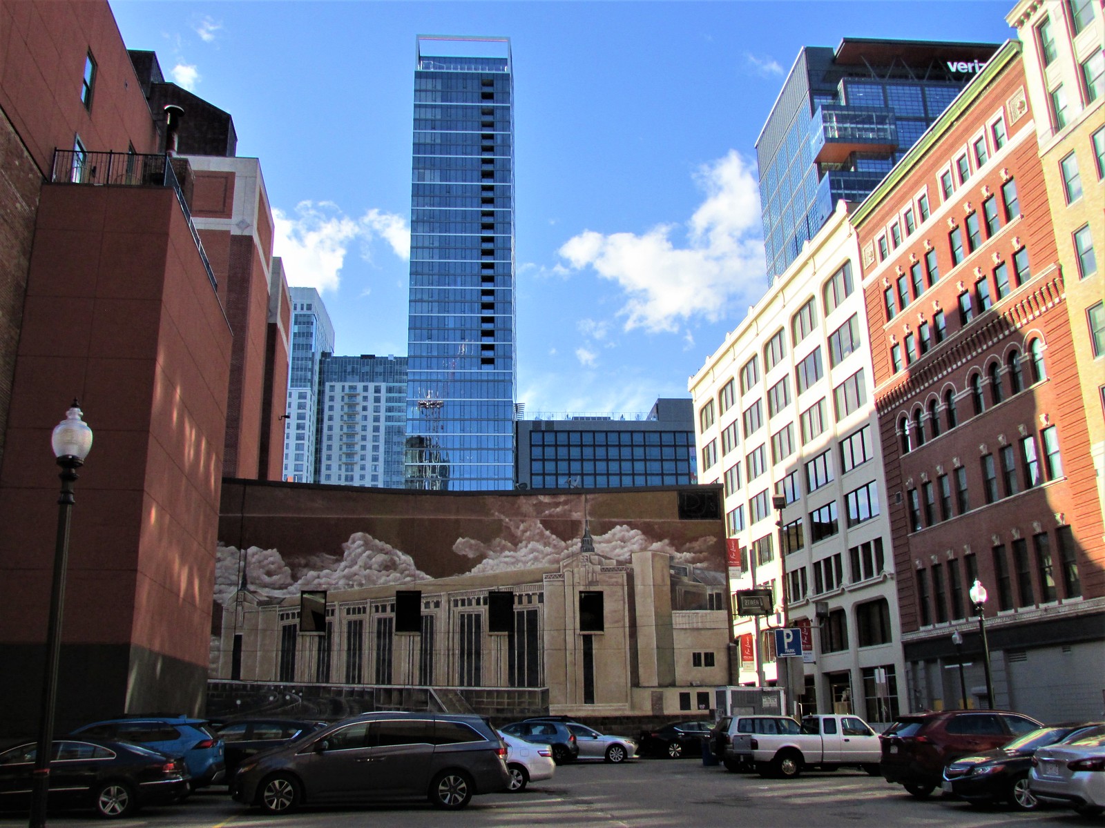
The Hub on Causeway (née TD Garden Towers) | 80 Causeway Street | West End

Like anything else, I always assumed it was Logan-related. With the FAA limiting heights throughout the city, most developers would just assume build right up to the artificial height limit and call it a day.

I think this correct. Cost of construction plus limited vertical potential means you end up with space maximizing designs... which generally means box with a flat roof.
 
2034B559-9C01-43F5-A6F7-06F1CC2C6D85.jpeg
712EBB4C-B5EE-4A85-9944-07A63C4B3266.jpeg
5FE1EA3E-2800-4C76-B63A-CD374C8C5884.jpeg
F72899AD-1207-4D5E-A748-D1846F15FAF2.jpeg
AF0FD1A5-43F3-498D-B597-7374F91CD6F7.jpeg
 
Hey Boston02124, new camera or just messing with a filter? Either way those look great.
 
From right out front on Causeway St. this project looks pretty good in person, better than in pictures IMO. It really needs its windows washed.
 
Hey Boston02124, new camera or just messing with a filter? Either way those look great.

I phone filter I wish I still had my old camera

I think the key for your picture quality is whether or not you crop. The uncropped ones have always looked between good to great. I appreciate the way the colors often pop. The cropped ones... Well, the big issue is that they get posted at the same size as the others. Some of them look so pixelated it's as if we're looking at Boston through an old Nintendo or even an Atari. IMO you should leave those ones out of your posts. If you are posting on your phone, you should view them on a larger desktop or laptop monitor to see what I'm talking about. They often bog down what are otherwise very strong posts. You do yourself a disservice when you post the blurriest, most pixelated/low quality pictures in the whole forum, side by side with your gems. It's definitely not the camera quality, and it's definitely not your abilities as a photographer. The cropped ones should be left out.

To illustrate what I'm talking about, this is taken from a recent post of yours. The first 3 show your camera taking perfectly fine pictures, and look quite good. The 4th and 5th, not so much, particularly that black and white one. I honestly want to know, when you have so many good pictures to post, why do you bother including those last ones? Can you really not tell how pixelated they get when you over-crop?

 
Excuse the photo of laptop screen shot but one of the more flattering view of this building is at night. Pic from a video still from yesterday's Celtics game
 

Attachments

  • 20210331_174210.jpg
    20210331_174210.jpg
    1.2 MB · Views: 240
Wow - - I hadn't seen that electonic scoreboard showing live scores from inside the Garden before. That's an awesome idea....love it!!!!!
ITA, I hadn't seen that touch either... although I think most of the time that board just shows variations on "This Bud's For You!"
 
Wow - - I hadn't seen that electonic scoreboard showing live scores from inside the Garden before. That's an awesome idea....love it!!!!!
Yeah, it's been there for a few years at least, but not too noticeable if you happen by when no game is in progress. The rest of the time it just looks like an annoying ad. What would be cool is if it always showed some sort of pertinent information about local sports or Garden events when not in use as an actual scoreboard.
 
Yeah, it's been there for a few years at least, but not too noticeable if you happen by when no game is in progress. The rest of the time it just looks like an annoying ad. What would be cool is if it always showed some sort of pertinent information about local sports or Garden events when not in use as an actual scoreboard.

"Madonna: 'Like a Prayer/Vogue (medley)' | Approx 57min remain in set"
 

Back
Top