The Hub on Causeway (née TD Garden Towers) | 80 Causeway Street | West End

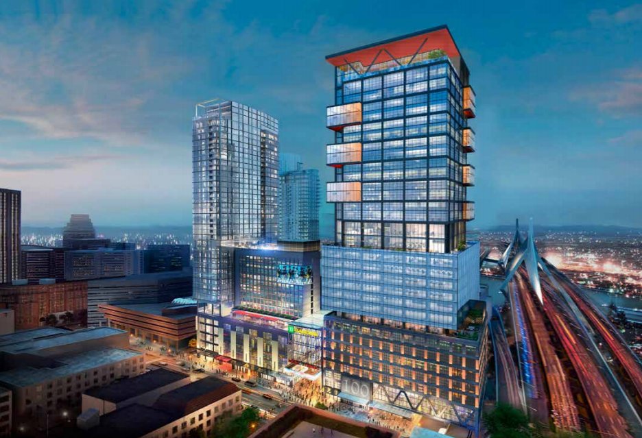
Whenever I walk by 101 Huntington Street, I always feel like the building is a lot taller and bigger than its 336 ft height.

It might be. In fact, it probably is. Nobody knows how tall things REALLY are in Boston. From Arlington it looks as high as the 371' Christian Science Tower. Also from Arlington, the 383' Marriott appears to be easily taller than the 395' Westin. There is no consistency with the way heights are reported here. It drives me NUTS.

IMG_1416 by David Z, on Flickr
 
Paco--I respect your perspective, and will try to see these kinds of buildings in that light. But despite your positive association with it, I have read and heard many architects describe its use as trying to minimize the scale and bulk of their buildings. I think what you say is true though--it's unsuccessful most of the time. A 500-foot box is going to feel like a 500-foot box. I'm more cynical than that though; I think a lot of people do it because a lot of people are doing it. No one really pushes back so its easy to rest on one's laurels, design-wise.

Kent--A Northeastern Husky who doesn't know it's Huntington Ave? For shame!
 
A 600' narrowing box a la original 115 Fed Accordia would have been so much nicer.

might have even won over a few North End Flat Earthers.
 
It might be. In fact, it probably is. Nobody knows how tall things REALLY are in Boston. From Arlington it looks as high as the 371' Christian Science Tower. Also from Arlington, the 383' Marriott appears to be easily taller than the 395' Westin. There is no consistency with the way heights are reported here. It drives me NUTS.

Out of curiosity, what do you use this information for that makes accuracy so important?
 
How do people not like this:


More than this?

DXjmLfwVMAAiomy.jpg:large


The first one has a lit spire and looks like a general nice building. Its not a try hard and its imo a great gateway to the city with the spire. It looks like a generally nice office tower. Yes its not world class but Its not bad at all either. I dont see how that 2nd option with the kitchen sink option and general bs scattered all over the place is better than something subtle with a lit spire. Maybe Im missing something but I thought we were better than settling for this. Not to mention the residential has always been horrible but it was going to be ignored because of the nice office tower. Now basically everything is a clusterfuck and its all going to look like trash. Im not a big complainer on here but come onnnnnnn, this is suchhhh a bad look for Boston. This is the gateway to the city and we get this......
 
This is pretty sad. Could high quality execution help this one? I am thinking of the black stuff in the top half is the same materials and finish as 10 Farnsworth?

Personally, I did not like the other stubby tower with the spire, either. IMO, it was a short, fat building with a big spire. Looked out of proportion to me. If memory serves, a lot of people here did not like it either.

I guess one upside is that this was basically a parking lot for about 20 years. Now, there is a high-quality podium - a lot better than Penn Station or the Port Authority here in NYC. When you add the other building on the other end of the parcel, plus the basketball city garage tower and the Avalon, this is slowly becoming a real place to live again.

Spire is being generous - it was more of an odd mast that was tacked on when they should have just built to the max height allowed anyways....
 
I'll say it again: simply continuing the black grid/glass facade (e.g., what's on the upper portion) over the whole height and putting some kind of interesting roof would have totally solved this.

The black grid/glass facade would have solved their aspiration to fit context/history. It is an industrial look fitting to the historic area.

The industrial look with this kind of window pattern is captured many places around here, e.g.:
https://goo.gl/maps/6taSV2kYpfP2
https://goo.gl/maps/eb8MeWa1cgG2
 
Last edited:
I completely agree with bigpicture on this the main issue is the anomalous light blue box at the base of the tower that looks stuck on. That is something that I think could be revised out prior to this being built, but at this point we just have to wait and see what happens.
 
I think that the designer is trying. It has to be very hard when the client gives you a dull envelope to work with.

It is like when you were a kid and you tried to decorate your lunch box with stickers. All your Mom cared about was that the box held your PBJ and Bosco.
 
The box at the base of the tower makes it look like someone stuck a cheap copy of Lever House on top of the podium, and then dressed it up with a crown.
 
This is pretty sad. Could high quality execution help this one? I am thinking of the black stuff in the top half is the same materials and finish as 10 Farnsworth?

To your first point - I don't think the finishes will help much, since the massing is both top heavy and girthy at the same time. Sometimes that overshadows everything else. 10 Farnsworth is excellent but part of what makes it so good is its congruent mass and harmony with its surroundings. If you had made it pregnant in floors 2-5 and threw a w shaped ledge on the top, we probably wouldn't be praising it as much.
 
Would it have killed the developer to simply do the right thing and make it an Art Deco/Chrysler building type of development to honor the history of the old Garden? That would have been beautiful and meaningful there.
 
Would it have killed the developer to simply do the right thing and make it an Art Deco/Chrysler building type of development to honor the history of the old Garden? That would have been beautiful and meaningful there.

i'd absolutely love that. hell, i think essentially any city skyline would benefit from an art deco building along the lines of the chrysler.

can you point me towards any examples built in the past 50+ years, or better yet, actually in recent (or recent-ish) years?

one liberty place and bny mellon (both in philadelphia) each have peaks that, in silhouette, are similar to classic art deco skyscrapers, but i don't especially like either and both are 30ish years old at this point. neither qualify as "art deco" either.

That's easy, Key Tower in Cleveland (Cesar Pelli, 1992):
669141761-key-tower-lake-erie-cesar-pelli-cleveland-ohio.jpg
 
fair enough. not wild about that one, either, but i agree it would've been neat to have something like that at n. station, rather than the current idea (although i'm one of the very few who don't hate the new design -- and did hate the limp-dick "spire" of the original design).
 

Back
Top