The Hub on Causeway (née TD Garden Towers) | 80 Causeway Street | West End

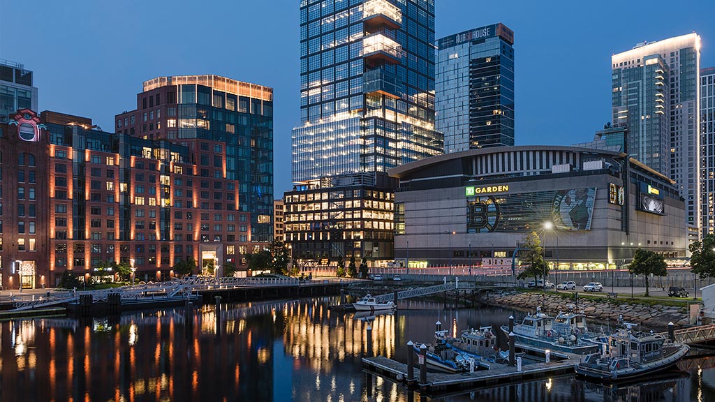
Glass is being added to the “bustle.” Boy does this thing loom.

OU6wQ9a.jpg


pYZ7mm1.jpg


wh8YKi4.jpg


gaIKP6S.jpg
 
Call me crazy but i don't mind the different planes and textures of the office box.
 
It dawned on me that the bump-outs on the office tower will essentially replace the effect of the 1 Post Office Square cantilevers on the skyline. I get that they aren't exactly the same, and certainly aren't in the same location, but I always found the cantilevers a bit whimsical and am glad we are keeping something like that in Boston. It should make a fascinating silhouette. The initial glass also looks great, although remember it's just that fatter portion at the bottom that gets that particular cladding.
 
i am wondering why there can't be some type of triangular wedge thingy on one side of the roof of Winthrop Square
to break up yet another flat roof.... or have the East Tower get a pointy spire up to full FAA.
 
Haverhill Street needs more than just trees. From my perspective, given the complete lack of retail frontage (and no real way to achieve it), and its use as merely a pick up and drop off for various shuttle buses, I'm not sure trees can salvage it. Expend resources elsewhere.
 
i often go against the flow on retail. But this street is unnecessarily (dead).
 
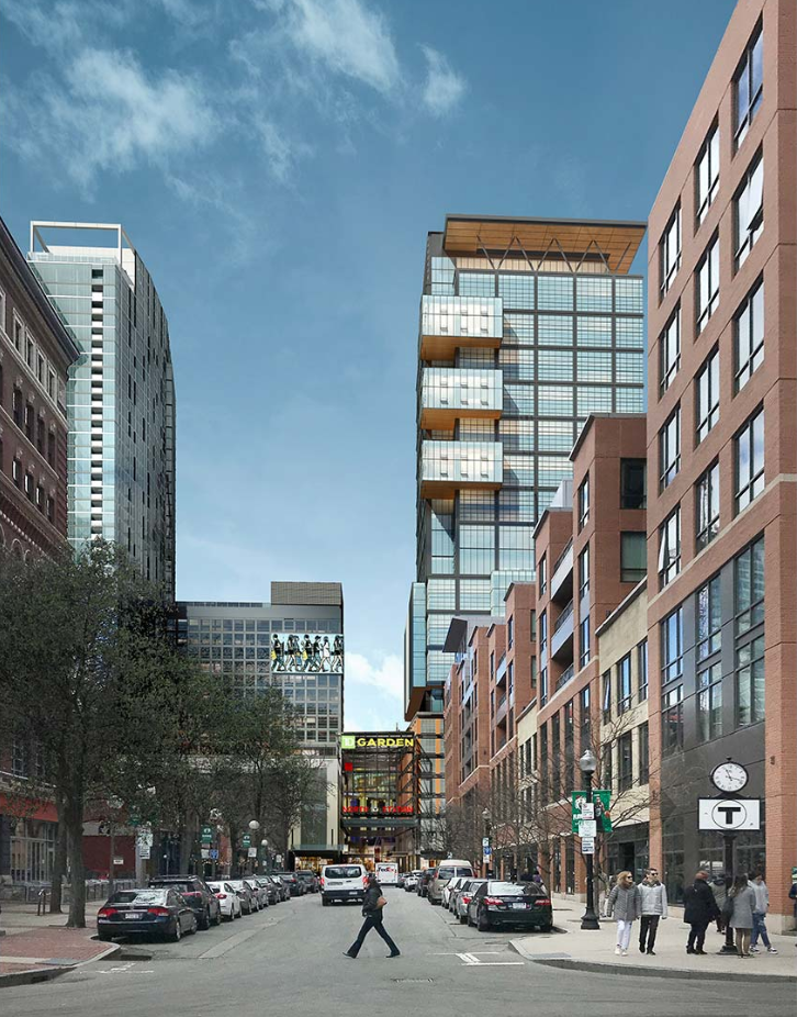
I'm not sure if I have seen this render before. The office building will dominate this angle! It will end up being a big deal from a visual perspective from many viewpoints and the only building to crack 500' immediately around North Station. I'm still disappointed that the residential tower was cut down so much, right on top of the city's second busiest train station!

Capture by David Z, on Flickr
 
Not quite sure why but that gap between the office tower and the hotel really bothers me. Might of looked better if the hotel stretched all the way to the office tower.
 
Not quite sure why but that gap between the office tower and the hotel really bothers me. Might of looked better if the hotel stretched all the way to the office tower.

Originally the hotel was actually supposed to be a 3rd tower, around 300'. Both the hotel and residential components were cut down and then combined into the one tower. On the other hand, the office tower is the only one that appropriately recognized its demand and grew accordingly. I like the gap because it allows the 2 towers to read as 2 separate buildings. The office tower is already very fat and the heights of both towers are already too close. Connecting them into a single monolith would further impact the vertical effect of both.
 
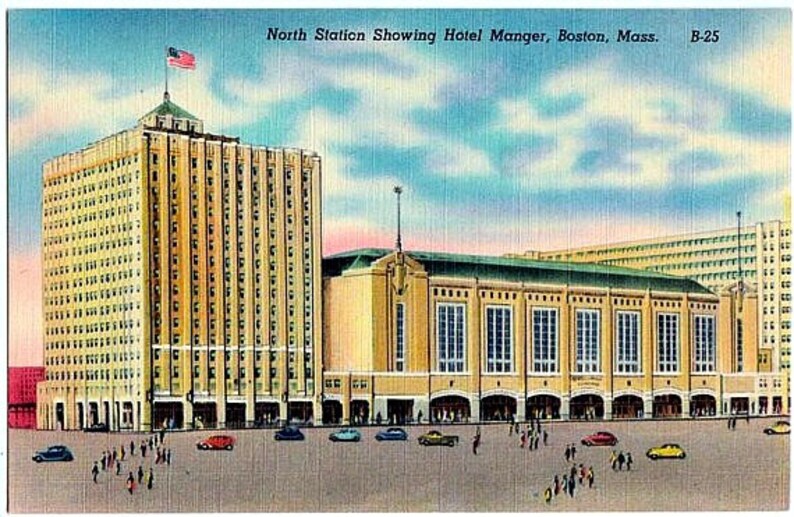
A bit reminiscent of another era in the same location
90
il_794xN.1420284933_a69y.jpg

Left to right -- Hotel [Madison, Manger and other names]*1, da Gahden, Office Block -- oh yea a railroad station shoehorned into the middle with a T station grafted onto the front

*1 The hotel that the Beatles stayed in when they "played Boston"
 
Last edited:

Back
Top