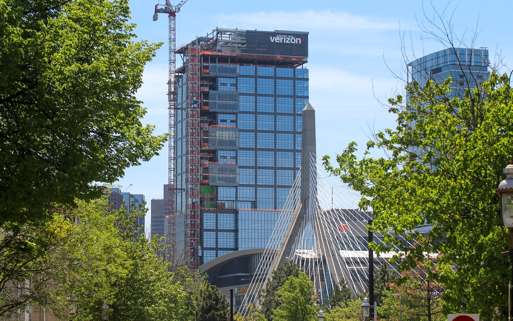
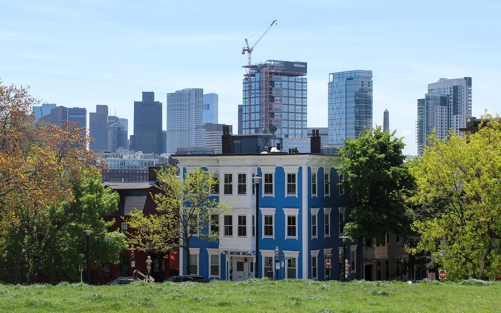
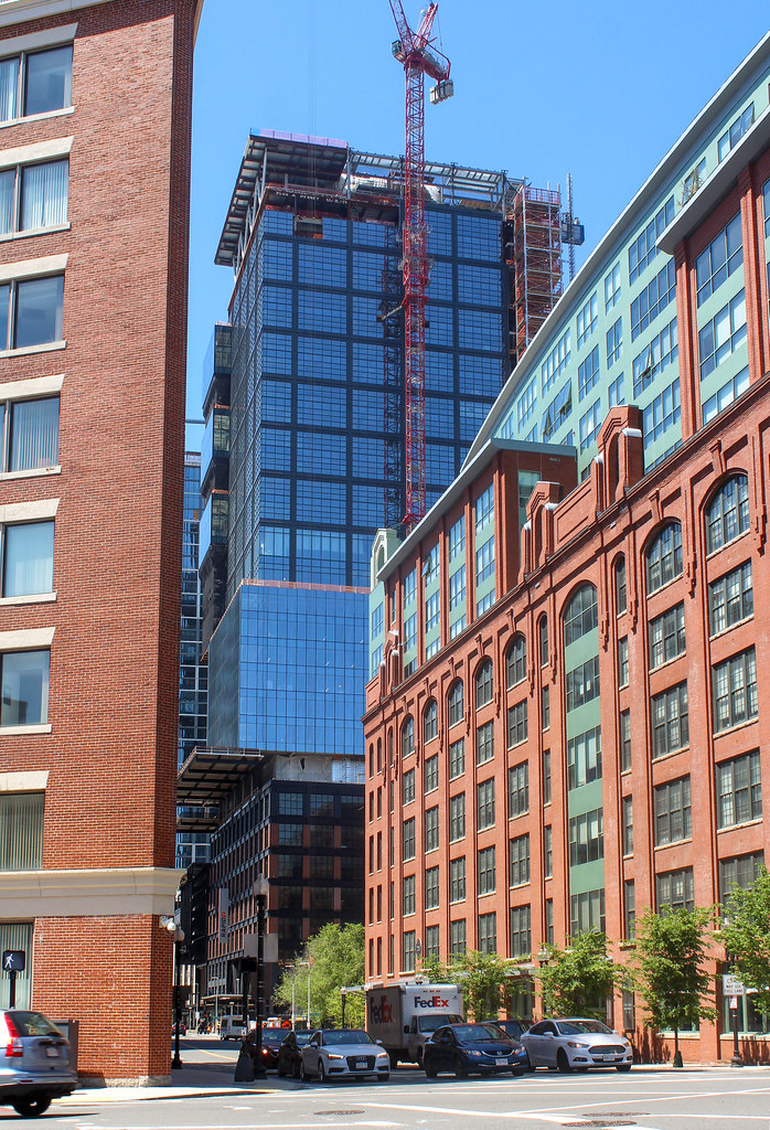
The Hub on Causeway (née TD Garden Towers) | 80 Causeway Street | West End

One of my first memories when I moved to Boston was walking under the old El at North Station. I felt like I was in a real city.
Same. I was trying to get to Science Park to see the Pink Floyd laser show and managed to get on a series of green line trains that didn't go that far. So we changed at Park, changed at GC, then at North Station, we ended up on the surface level and decided to just follow the el tracks on foot. It was dark, mysterious, somewhat dangerous feeling, and oh so authentically urban. The past 20 years have been anything but urban feeling there in any sort of good way, but I think that is all about to change/already changed.
 
I am the only one that thinks this office building is trying to do to many things? They could have cut out half of the ideas, it doesn't read as one language at all and that makes it look unresolved.
 
I am the only one that thinks this office building is trying to do to many things? They could have cut out half of the ideas, it doesn't read as one language at all and that makes it look unresolved.

In fairness, it IS unresolved. The cladding isn't done, the crown isn't done, scaffolding is in the way between the cutouts, and the cranes are in the way. That's just on the outside. This still has a lot of cleaning up to do before it presents its final product. I still have faith that the high quality materials, dominant grid pattern, and interesting angles with the cutouts (particularly in silhouette) will win the day.

I also still think the office tower is going to end up being the better of the two.
 
I'm beginning to see that when it's finally done and all the temporary apparatus and equipment is gone and the missing parts filled in, it might not look half bad.
 
Verizon has such an ugly logo. I would've been okay with just their V which seems iconic enough without the chunky generic lowercase text. Cheapens the rest of the building.
 
Verizon has such an ugly logo. I would've been okay with just their V which seems iconic enough without the chunky generic lowercase text. Cheapens the rest of the building.
I dont want to see the word Verizon on my skyline that's for sure.
 
Verizon has such an ugly logo. I would've been okay with just their V which seems iconic enough without the chunky generic lowercase text. Cheapens the rest of the building.

It cheapens the building? This building couldn’t be any worse in my opinion. It cheapens the whole skyline and thus how some, perhaps many, people view Boston as a city. There should be a stipulation that such signage be reserved for companies headquartered locally.
 
It cheapens the building? This building couldn’t be any worse in my opinion. It cheapens the whole skyline and thus how some, perhaps many, people view Boston as a city. There should be a stipulation that such signage be reserved for companies headquartered locally.
I don't disagree. The building is an awkward hodgepodge overall.

It's interesting to think of other branding in the city that has remained and become land-marked in some ways. Most comparable would be signage on the Pru, which I think is tasteful and recedes into the cap, unlike the high contrast white on black here.
What about the Citgo and Shell signs? None are headquartered here.

I guess Gillette gets a pass? I find "world shaving headquarters" really awkward and weird sounding though.
 
kz1000ps: "Can we please bring back postmodernism..?" Based on the Hub at One Causeway Verizon Building mess, I would say yes, in an updated form. Though there are some outstanding examples of current architecture such as the Sudbury tower, this Verizon building pushes the envelope the other way in a very bad direction.
 
While they may not be the most beautiful buildings in the world they are very much of a specific time and place.
 
kz1000ps: "Can we please bring back postmodernism..?" Based on the Hub at One Causeway Verizon Building mess, I would say yes, in an updated form. Though there are some outstanding examples of current architecture such as the Sudbury tower, this Verizon building pushes the envelope the other way in a very bad direction.

The Sudbury's design language is incredibly generic. Unless not completely screwing the pooch qualifies as an outstanding job, then I think you're using that word a little too loosely. Maybe most postmodernism isn't exactly outstanding either, but at least they gave you more design options than a gridded glass box or a randomized gridded glass box.
 

Back
Top