You are using an out of date browser. It may not display this or other websites correctly.
You should upgrade or use an alternative browser.
You should upgrade or use an alternative browser.
The Hub on Causeway (née TD Garden Towers) | 80 Causeway Street | West End
- Thread starter choo
- Start date
whighlander
Senior Member
- Joined
- Aug 14, 2006
- Messages
- 7,812
- Reaction score
- 647
Beeline I like those Zooms into the Penthouse -- obviously the construction suggests more than just mechanicals up thereIMG_2823 by Bos Beeline, on Flickr
IMG_2811 by Bos Beeline, on Flickr
IMG_2813 by Bos Beeline, on Flickr
IMG_2824 by Bos Beeline, on Flickr
IMG_2825 by Bos Beeline, on Flickr
IMG_2931 by Bos Beeline, on Flickr
- Joined
- Jan 7, 2012
- Messages
- 14,062
- Reaction score
- 22,726
 IMG_2972 by Bos Beeline, on Flickr
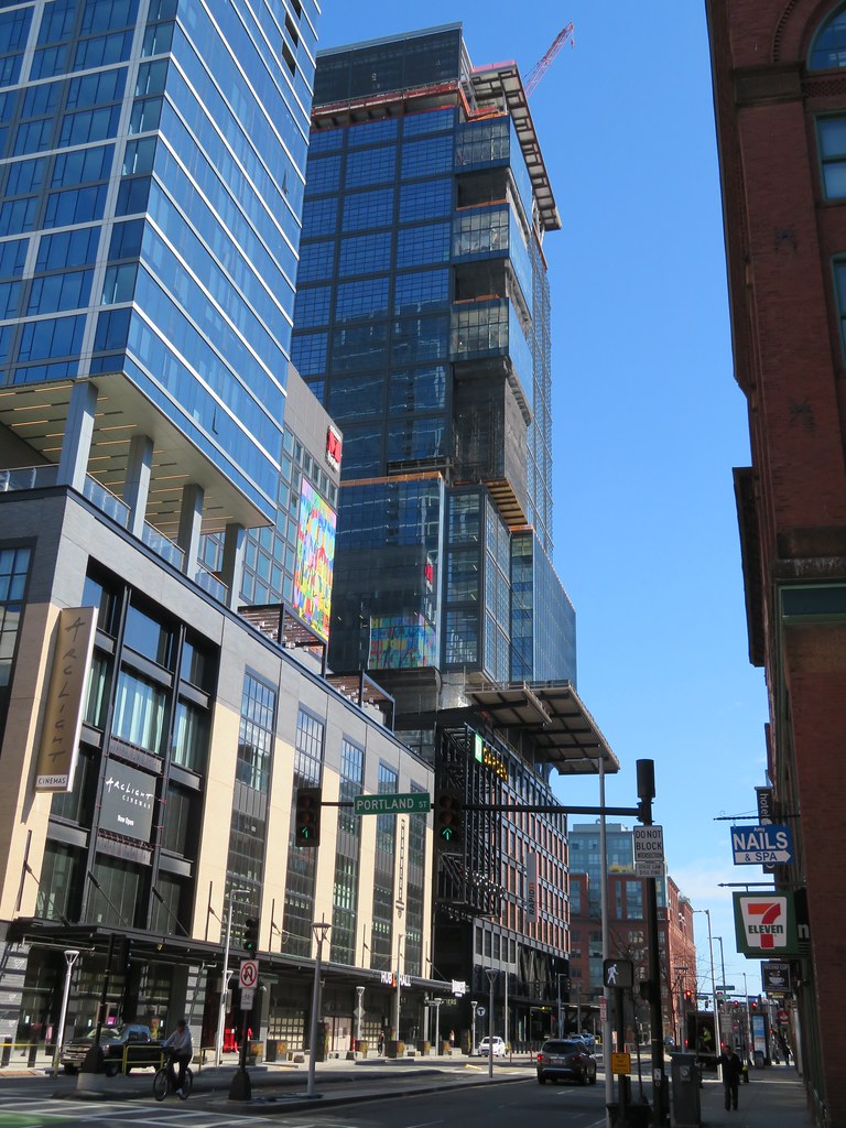 IMG_2976 by Bos Beeline, on Flickr
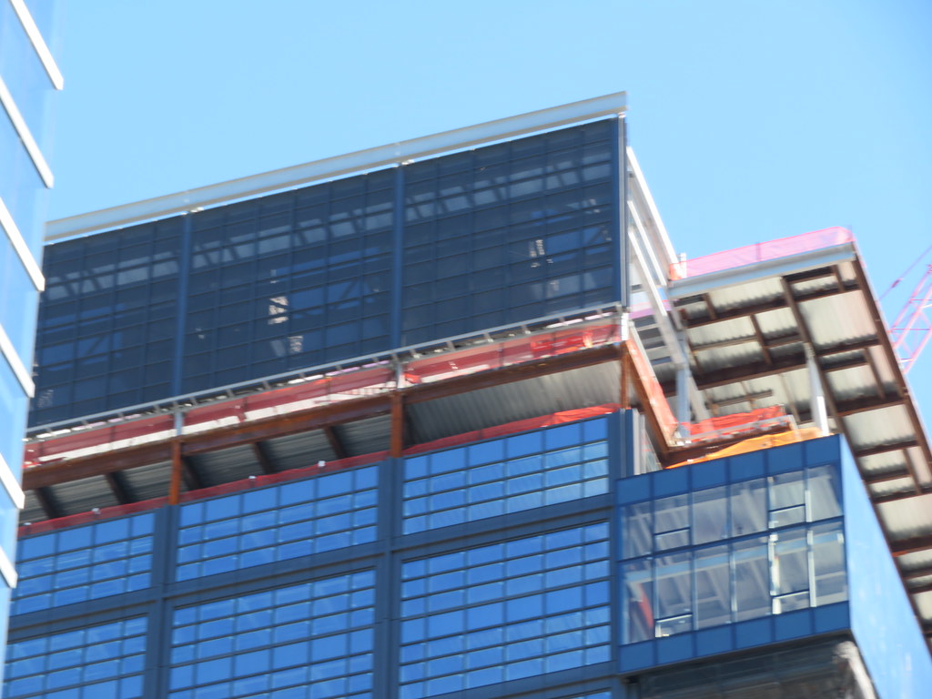 IMG_2977 by Bos Beeline, on Flickr
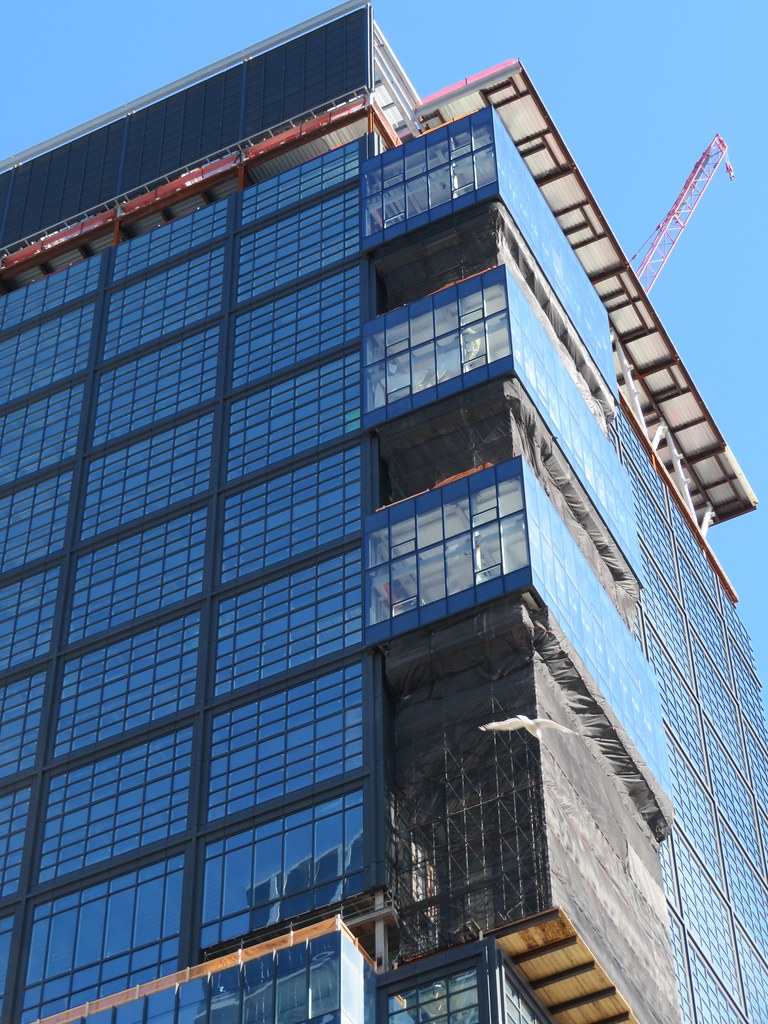 IMG_2980 by Bos Beeline, on Flickr
 IMG_2982 by Bos Beeline, on Flickr
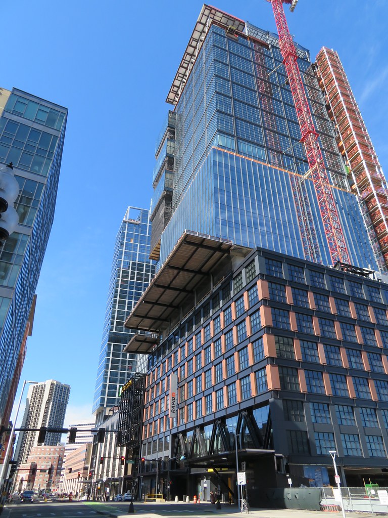 IMG_2984 by Bos Beeline, on Flickr
 IMG_2993 by Bos Beeline, on Flickr
- Joined
- Jan 7, 2012
- Messages
- 14,062
- Reaction score
- 22,726
 IMG_3028 by Bos Beeline, on Flickr
 IMG_3030 by Bos Beeline, on Flickr
 IMG_3031 by Bos Beeline, on Flickr
- Joined
- May 25, 2006
- Messages
- 7,033
- Reaction score
- 1,864
I think this is the ugliest new building in Boston.
Charlie_mta
Senior Member
- Joined
- Jul 15, 2006
- Messages
- 4,553
- Reaction score
- 6,471
I agree. To me it looks like a lot of random crap piled up.
It's an industrial-inspired building matching the neighborhood while creating a brand new active streetscape in one of the oldest sections of the city. It expanded one of the largest transit hubs in the city, expanded the arena to match other premier sports/entertainment centers, and provides housing, jobs, and a grocery store to an area in desperate need of all three. It brings a unique flavor to a previously barren entrance to downtown, and will provide amazing views of the city to the occupant. Count me firmly in the "Thank God this is almost complete" camp.
Edit: cranky cabin fever comment. I just grow tired of the "it's ugly" statements without any contextual critique of the design. With the knowledge that this building will likely be considered a success, what does the peanut gallery wish had been improved?
Edit: cranky cabin fever comment. I just grow tired of the "it's ugly" statements without any contextual critique of the design. With the knowledge that this building will likely be considered a success, what does the peanut gallery wish had been improved?
Last edited:
Not ready to judge it until it's done. I am leaning towards "like it" though. Good cladding, powerful massing, and the unique neo-industrial feel make me bullish. I'm very curious how the pop-outs will look when the scaffolding is removed.
It's an industrial-inspired building matching the neighborhood while creating a brand new active streetscape in one of the oldest sections of the city. It expanded one of the largest transit hubs in the city, expanded the arena to match other premier sports/entertainment centers, and provides both housing, jobs, and a grocery store to an area in desperate need of all three. It brings a unique flavor to a previously barren entrance to downtown, and will provide amazing views of the city to the occupant. Count me firmly in the "Thank God this is almost complete" camp.
All of this can be true while the building itself still looks like the result of writing all the trendy design tropes of the past decade on ping-pong balls and drawing a few at random ala the Channel 4 lottery broadcast. I was hopeful for a bit, given that the material qualities appear high. But Dior Addict on an Iberian is still lipstick on a pig.
stick n move
Superstar
- Joined
- Oct 14, 2009
- Messages
- 12,054
- Reaction score
- 18,767
At least its confident in its attributes, the residential is the weaker of the two imo.
KentXie
Senior Member
- Joined
- May 25, 2006
- Messages
- 4,195
- Reaction score
- 766
My complaint is the overall shape rather than the facade. It's blocky, squat, with no emphasis on verticality. I think this is the fattest tower in the non-Back Bay cluster (even then it's possible that this tower is more rotund than the Pru). I'm also not a fan of the disjointed facade that shows 3 different styles though I'll admit, you can't see it from far away. I mean this is what Verizon wanted, corporate, though you can have "good" corporate design such as the new State Street tower going up. I wish it was a more iconic design because this looks like a poor man's Hearst tower. This building is essentially the 2020s generation of the 1970s One Beacon Street, 100 Federal Street, and One Federal Street.It's an industrial-inspired building matching the neighborhood while creating a brand new active streetscape in one of the oldest sections of the city. It expanded one of the largest transit hubs in the city, expanded the arena to match other premier sports/entertainment centers, and provides both housing, jobs, and a grocery store to an area in desperate need of all three. It brings a unique flavor to a previously barren entrance to downtown, and will provide amazing views of the city to the occupant. Count me firmly in the "Thank God this is almost complete" camp.
Edit: cranky cabin fever comment. I just grow tired of the "it's ugly" statements without any contextual critique of the design. With the knowledge that this building will likely be considered a success, what does the peanut gallery wish had been improved?
Last edited:
Wait a minute. The Hearst tower?!? Talk about a building that doesn't respect its podium. Could it be taller - sure. But this building is at least intentional in its blocki-ness throughout.I'm also not a fan of the disjointed facade that shows 3 different styles though I'll admit, you can't see it from far away.
I wish it was a more iconic design because this looks like a poor man's Hearst tower.
(PS - I actually love the Hearst building because it was a sustainability pioneer - the South Station Tower folks certainly will have some comparisons as to design execution)
I actually thought this reminded me of Hearst a bit too. In fact, I had that thought a couple hours before KentXie's post! Obviously it's squares vs triangles but it's like the pieces both fell out of the same toy box. The only thing I truly like better about Hearst are the slightly slimmer/taller proportions.
My complaint is the overall shape rather than the facade. It's blocky, squat, with no emphasis on verticality. I think this is the fattest tower in the non-Back Bay cluster (even then it's possible that this tower is more rotund than the Pru). I'm also not a fan of the disjointed facade that shows 3 different styles though I'll admit, you can't see it from far away. I mean this is what Verizon wanted, corporate, though you can have "good" corporate design such as the new State Street tower going up. I wish it was a more iconic design because this looks like a poor man's Hearst tower. This building is essentially the 2020s generation of the 1970s One Beacon Street, 100 Federal Street, and One Federal Street.
spot on with refernces to the brown '70s disasters. this is the ugliest building built in boston in the past 40 years, easily. absolute garbage.
KentXie
Senior Member
- Joined
- May 25, 2006
- Messages
- 4,195
- Reaction score
- 766
I agree that the base is the best part of this tower. That's high quality work there.Wait a minute. The Hearst tower?!? Talk about a building that doesn't respect its podium. Could it be taller - sure. But this building is at least intentional in its blocki-ness throughout.
View attachment 4500View attachment 4502
(PS - I actually love the Hearst building because it was a sustainability pioneer - the South Station Tower folks certainly will have some comparisons as to design execution)
Blackbird
Senior Member
- Joined
- Feb 2, 2014
- Messages
- 1,207
- Reaction score
- 1,721
On a walk... Can't wait for the State Street tower to add to the gateway view.
You might not be able to see it from that angle.
stick n move
Superstar
- Joined
- Oct 14, 2009
- Messages
- 12,054
- Reaction score
- 18,767
On a walk... Can see the Sudbury peeking, and can't wait for the State Street tower to add to the gateway view.View attachment 4539
Boston is almost always the sum of its parts. Individually these arent great, but as a collective with the zakim, river, rest of the skyline.. it ends up being pretty nice.
Boston02124
Senior Member
- Joined
- Sep 6, 2007
- Messages
- 6,893
- Reaction score
- 6,639

 IMG_0600
 IMG_0609
 IMG_0721
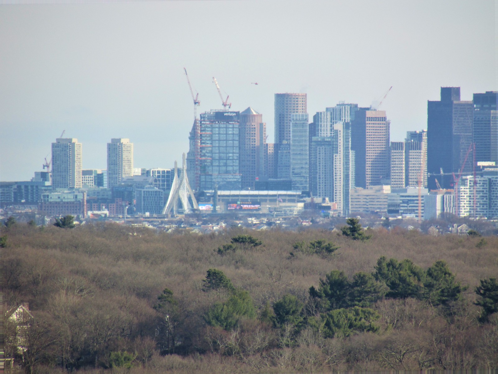 IMG_0723