Are you talking about One Bowdoin Square? Nonsense. It's always been one of my favorite, and -along with another Gund building, the Boston Ballet- is probably one of the most significant pieces of postmodern architecture in Boston. It certainly gives some of Johnson's ridiculously tacky and overwrought late-career stuff (International Place, 500 Boylston, etc) a good run for their money.That little green roofed building is probably prime candidate for demo in the next 20 to 30 years. It's not architecturally signifigant in any way and is sitting on some pretty prime real estate, especially once all the other towers are up around it. I'll be shocked if it makes it to 2050.
You are using an out of date browser. It may not display this or other websites correctly.
You should upgrade or use an alternative browser.
You should upgrade or use an alternative browser.
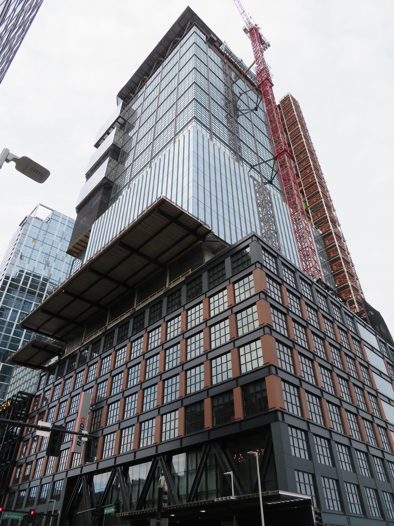
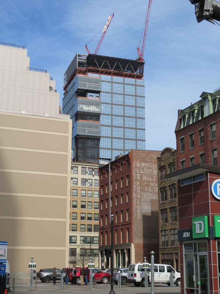
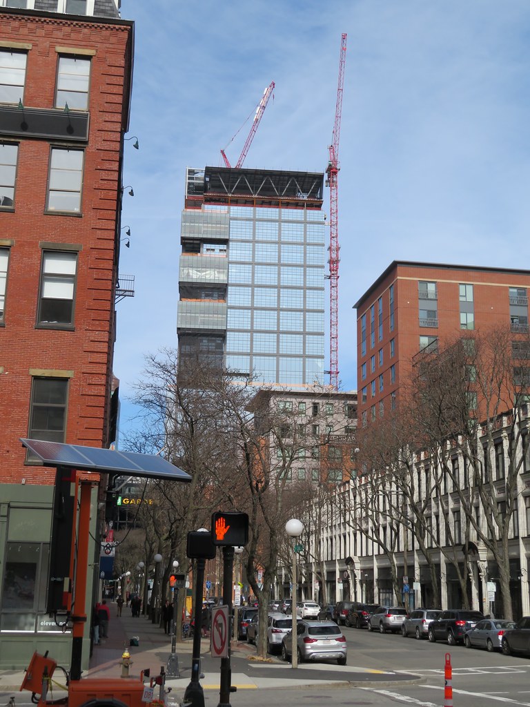
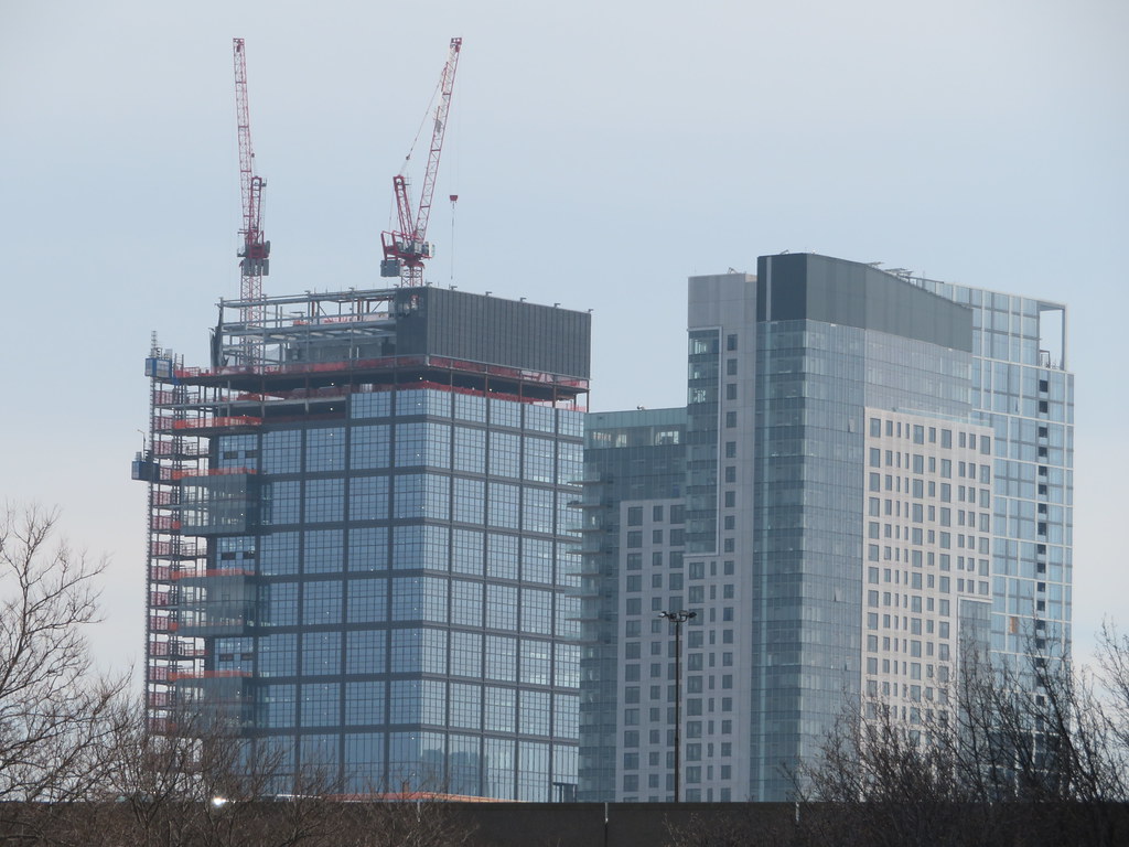
The Hub on Causeway (née TD Garden Towers) | 80 Causeway Street | West End
- Thread starter choo
- Start date
I was waiting for someone to say something like this ^^^. While I'm not a big fan of PoMo or One Bowdoin, in particular, I know more than a few who absolutely adore that building. In that it's considered by many to be an stellar example of a significant style/movement, it should be preserved just as the finer examples of Brutalism in Boston deserve to be considered worthy of appreciation.
Brad Plaid
Senior Member
- Joined
- Jan 17, 2013
- Messages
- 1,310
- Reaction score
- 1,559
- Joined
- Jan 7, 2012
- Messages
- 14,062
- Reaction score
- 22,731
 IMG_1172 by Bos Beeline, on Flickr
 IMG_1213 by Bos Beeline, on Flickr
 IMG_1215 by Bos Beeline, on Flickr
 IMG_1214 by Bos Beeline, on Flickr
 IMG_1210 by Bos Beeline, on Flickr
 IMG_1208 by Bos Beeline, on Flickr
- Joined
- Jan 7, 2012
- Messages
- 14,062
- Reaction score
- 22,731
 IMG_1176 by Bos Beeline, on Flickr
 IMG_1181 by Bos Beeline, on Flickr
 IMG_1209 by Bos Beeline, on Flickr
 IMG_1182 by Bos Beeline, on Flickr
 IMG_1206 by Bos Beeline, on Flickr
 IMG_1184 by Bos Beeline, on Flickr
 IMG_1188 by Bos Beeline, on Flickr
 IMG_1190 by Bos Beeline, on Flickr
 IMG_1192 by Bos Beeline, on Flickr
- Joined
- Jan 7, 2012
- Messages
- 14,062
- Reaction score
- 22,731
 IMG_1229 by Bos Beeline, on Flickr
 IMG_1230 by Bos Beeline, on Flickr
 IMG_1244 by Bos Beeline, on Flickr
 IMG_1253 by Bos Beeline, on Flickr
 IMG_1260 by Bos Beeline, on Flickr
whighlander
Senior Member
- Joined
- Aug 14, 2006
- Messages
- 7,812
- Reaction score
- 647
Beeline -- excellent update -- finally there's a Verizon ✔ to be seen [at ground level]IMG_1176 by Bos Beeline, on Flickr
IMG_1181 by Bos Beeline, on Flickr
IMG_1209 by Bos Beeline, on Flickr
IMG_1182 by Bos Beeline, on Flickr
IMG_1206 by Bos Beeline, on Flickr
IMG_1184 by Bos Beeline, on Flickr
IMG_1188 by Bos Beeline, on Flickr
IMG_1190 by Bos Beeline, on Flickr
IMG_1192 by to Bos Beeline, on Flickr
Life Coach Mike
Active Member
- Joined
- Aug 26, 2019
- Messages
- 317
- Reaction score
- 481
This is turning out better than I had hoped. I love the industrial vibe and the Art Deco rounded glass corners. I know we all wish it were taller, more proportionate for its girth, but in the end I think it's working out due to its quirky design.
stick n move
Superstar
- Joined
- Oct 14, 2009
- Messages
- 12,096
- Reaction score
- 18,876
Its definitely unique. In the age of glass anonymity I think thats a nice touch.
Czervik.Construction
Senior Member
- Joined
- Apr 15, 2013
- Messages
- 1,932
- Reaction score
- 1,162
I defs don't like the height and proportions of the office tower, but it seems so well executed and the materials look top-notch for a project like this. But above all of that, this thing really moves North Station forward as a destination, not just seedy stretch of road with a stadium and train station.
Boston02124
Senior Member
- Joined
- Sep 6, 2007
- Messages
- 6,893
- Reaction score
- 6,639
whighlander
Senior Member
- Joined
- Aug 14, 2006
- Messages
- 7,812
- Reaction score
- 647
Boston -- I guess you have to say there is a bit more than a passing resemblance
If only the Fed's would sell the JFK lowrise so something interesting could be built in its place -- a thin all glass curve of tower to match the Sear Crescent
Great opportunity
- Joined
- Jan 7, 2012
- Messages
- 14,062
- Reaction score
- 22,731
 IMG_1461 by Bos Beeline, on Flickr
 IMG_1463 by Bos Beeline, on Flickr
 IMG_1462 by Bos Beeline, on Flickr
 IMG_1476 by Bos Beeline, on Flickr
 IMG_1470 by Bos Beeline, on Flickr
 IMG_1480 by Bos Beeline, on Flickr
 IMG_1484 by Bos Beeline, on Flickr
 IMG_1499 by Bos Beeline, on Flickr
 IMG_1500 by Bos Beeline, on Flickr
 IMG_1595 by Bos Beeline, on Flickr
Boston02124
Senior Member
- Joined
- Sep 6, 2007
- Messages
- 6,893
- Reaction score
- 6,639
Charlie_mta
Senior Member
- Joined
- Jul 15, 2006
- Messages
- 4,560
- Reaction score
- 6,482
I would've preferred deleting the bulge-outs and extending the square pattern and width/depth of the upper floors all the way down to the 8-story base. The loss of floor space could have been made up by expanding the width/depth of the tower a bit and extending its height. It would have been a much cleaner, sleeker tower with those changes.
stick n move
Superstar
- Joined
- Oct 14, 2009
- Messages
- 12,096
- Reaction score
- 18,876
Also moving the tower up and over to the corner of the base and continuing the facade down to ground level on the front and right sides of the base is a nice touch that could have been used to show the buildings true height and made the proportions look better, along with making it look taller with no actuall height added. Still I like the finished product overall.
whighlander
Senior Member
- Joined
- Aug 14, 2006
- Messages
- 7,812
- Reaction score
- 647
Westend -- Excellent photo
Great vantage point and high resolution
As for the building -- it doesn't hide very much -- amazing level of transparency!
Still waiting for the Verizon ✔
stick n move
Superstar
- Joined
- Oct 14, 2009
- Messages
- 12,096
- Reaction score
- 18,876
I love the retro checkerboard glass, intended to look like each square is made up of lots of smaller squares. Nice touch.
Also we keep waiting for more lit crowns, thankfully one is on the way here so theres going to be a new lit crown on the skyine soon. I hope it doesnt block the zipper LED up the side of North Station tower too much though, I really like it and it looks really good on the skyline. If both the light strip at NST and the lit crown here can be seen together it will be much better than crown only imo.
Also we keep waiting for more lit crowns, thankfully one is on the way here so theres going to be a new lit crown on the skyine soon. I hope it doesnt block the zipper LED up the side of North Station tower too much though, I really like it and it looks really good on the skyline. If both the light strip at NST and the lit crown here can be seen together it will be much better than crown only imo.
Last edited:
