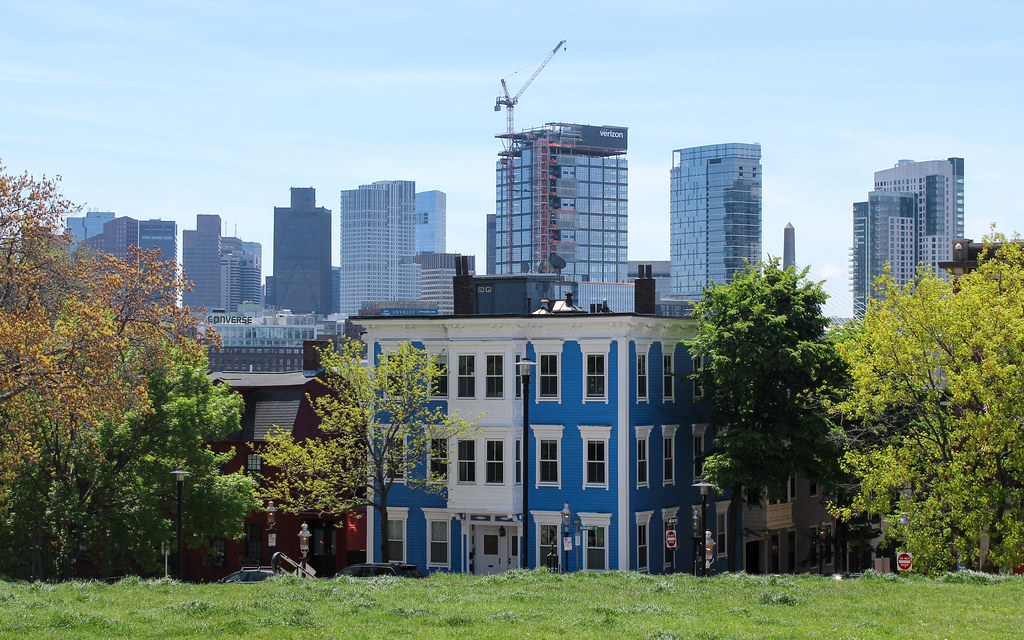
the verizon tower joins one federal, one beacon, and the mccormack as the most aggressively offensive buildings in the city -- and this one is more distractingly disgusting b/c of its prominence in the cluster it occupies. the only good outcome would be if this building were to be found to be structurally or otherwise unsound after the fact and the whole gross mess torn down. this thing would be an eyesore in albany or louisville and it makes boston look terrible.
You are using an out of date browser. It may not display this or other websites correctly.
You should upgrade or use an alternative browser.
You should upgrade or use an alternative browser.
The Hub on Causeway (née TD Garden Towers) | 80 Causeway Street | West End
- Thread starter choo
- Start date
FormFollowsBudget
Senior Member
- Joined
- Jan 15, 2015
- Messages
- 2,318
- Reaction score
- 4,106
I've gotta say, I don't like it that much, but it came out better than I had expected, and might grow on me more as they really button this up. Definitely a disappointing 'gateway' tower, overall, though..
They really screwed the pooch on the residential. In particular, the lack of height differentiation between not only these 2, but also Avalon and soon to be Alcott, make the whole area look like a blob from most angles. That's why the State Street tower is now so important. It's going to be the key showstopper that not only better "connects" the rest to the downtown skyline, but also draws the eye away from these other buildings.
anything that draws the eye away from the verizon tower can only be a good thing. when driving past on 93 (which i did just over an hour ago), i do my best to concentrate on the road and the converse building and avert my gaze from that mess. street-level, i'm all in with hub on causeway, but the towers -- and i find verizon to be way more troubling than the residential -- are nothing short of embarrassing.
.....but the towers -- and i find verizon to be way more troubling than the residential -- are nothing short of embarrassing.
The reason the residential is worse is because it was essentially pre-approved to go 650', which would have become the key attention-getter AND removed the overall blob effect. Even if we ended up with the same office design we are getting, a 650' would have easily drawn the eye away from it. From an overall skyline standpoint we have a new plateau neighborhood and that will always be less pleasing than a more peaks-and-valleys one.
stick n move
Superstar
- Joined
- Oct 14, 2009
- Messages
- 13,487
- Reaction score
- 24,541
The reason the residential is worse is because it was essentially pre-approved to go 650', which would have become the key attention-getter AND removed the overall blob effect. Even if we ended up with the same office design we are getting, a 650' would have easily drawn the eye away from it. From an overall skyline standpoint we have a new plateau neighborhood and that will always be less pleasing than a more peaks-and-valleys one.
Thats not the only reason lol. Its yet another "kitchen sink" facade with colossal order here, stilts there, a notch here, random balconies there... I think its the worse of the two. I actually dont hate the office tower, but the resisential is horrible.
Also Ill agree to disagree with the earlier post on the sudbury. I think its a wonderful tower that looks good from all angles and actually improves upon the skyline with its addition.
Also Ill agree to disagree with the earlier post on the sudbury. I think its a wonderful tower that looks good from all angles and actually improves upon the skyline with its addition.
I love the Sudbury. I think you're confusing me with KZ here. We both have the Z's going on.
kz1000ps
Senior Member
- Joined
- May 28, 2006
- Messages
- 9,186
- Reaction score
- 13,716
After being out of the Boston development loop for so long, it was only in the last week or so that I got familiar with all these new towers, and first approaching them at a distance from the west and north I found myself liking the bolder window fenestration of the Verizon tower over the other three. Up close it's something of a hot mess, but as a skyline element I kinda like its visual heft.
And as for the Sudbury, I just think if it weren't in such a highly visible location nobody would bat an eye at it. It's decent filler but nothing more. Maybe I'll warm up to it more..
And as for the Sudbury, I just think if it weren't in such a highly visible location nobody would bat an eye at it. It's decent filler but nothing more. Maybe I'll warm up to it more..
Last edited:
Bananarama
Active Member
- Joined
- Mar 18, 2020
- Messages
- 609
- Reaction score
- 1,262
Sudbury is nice because the designers understood proportions and kept a singular design vision intact. It's not earth-shattering, but is refreshingly pleasant to look at and doesn't fall prey to trendy randomized fenestration (seen on the new residential tower).
The causeway block looks like it was designed by a committee of 20. No cohesion between the facades. Chunky massings with awkward cut outs. It's doing what ever other major developer lead project is today and trying to look like a built-up, "authentic" Main Street. In this case, more like a mini Times Square.
But it doesn't work. The accumulation of developments and styles over time is what brings authenticity to places.
stick n move
Superstar
- Joined
- Oct 14, 2009
- Messages
- 13,487
- Reaction score
- 24,541
We need a 30 park place new deco tower in the vicinity to help make up for all of the cheapness. A copper crown and spire on top would be even better, too many flat roofs as well.
Boston02124
Senior Member
- Joined
- Sep 6, 2007
- Messages
- 6,936
- Reaction score
- 7,088
you mean like thisWe need a 30 park place new deco tower in the vicinity to help make up for all of the cheapness. A copper crown and spire on top would be even better, too many flat roofs as well.
And as for the Sudbury, I just think if it weren't in such a highly visible location nobody would bat an eye at it. It's decent filler but nothing more. Maybe I'll warm up to it more..
I basically think of it as a new, residential version of 60 State Street. I have the 2 towers essentially on par with one another, and I love 60 State! For those of you who don't know it off the top of your head, I'm saying I think the Sudbury is about on par with this:
 IMG_8978 by David Z, on Flickr
Charlie_mta
Senior Member
- Joined
- Jul 15, 2006
- Messages
- 5,150
- Reaction score
- 7,778
The current fad in some circles of haphazardly mixing up the facades has created some lousy towers, i.e. the Avalon and the Verizon building. Time for high-rise architecture to pull back a bit to the cleaner look of 60 State Street and the Sudbury. But that said, some postmodernism details would be good as well, a long as they aren't thrown on in a haphazard manner.
Bananarama
Active Member
- Joined
- Mar 18, 2020
- Messages
- 609
- Reaction score
- 1,262
We need a 30 park place new deco tower in the vicinity to help make up for all of the cheapness. A copper crown and spire on top would be even better, too many flat roofs as well.
https://www.shoparc.com/projects/9-dekalb/
SHoP is building a very elegant, deco-proportioned super-tall tower in Brooklyn now.
kz1000ps
Senior Member
- Joined
- May 28, 2006
- Messages
- 9,186
- Reaction score
- 13,716
I basically think of it as a new, residential version of 60 State Street. I have the 2 towers essentially on par with one another, and I love 60 State! For those of you who don't know it off the top of your head, I'm saying I think the Sudbury is about on par with this:
Point taken. I really like 60 State and definitely see the connection. I guess I would just add that 60 State seems a little more evolved thanks to the corners/chamfering and whatnot.


Last edited:
stick n move
Superstar
- Joined
- Oct 14, 2009
- Messages
- 13,487
- Reaction score
- 24,541
60 state is my favorite tower in Boston.
- Joined
- Jan 7, 2012
- Messages
- 14,173
- Reaction score
- 23,688
 IMG_4559 by Bos Beeline, on Flickr
 IMG_4563 by Bos Beeline, on Flickr
 IMG_4568 by Bos Beeline, on Flickr
 IMG_4576 by Bos Beeline, on Flickr