Teban54
Senior Member
- Joined
- Nov 13, 2021
- Messages
- 1,131
- Reaction score
- 2,814
First of all, I really like this map more than I thought I would.
Prominence of Buses on an Map
I understand the debate and differing opinions about how prominent buses should be displayed on such a map. Two points are at play here, though:
- I believe it's explicitly @Riverside's intention to design a map with a primary focus on buses (or at least as much as the subway). With that as the main goal, this is likely close to the best you can do.
- Personally, I think using thin lines for buses understates their value, much more so than @Riverside's map possibly overstates them.
(a) "an hourly bus that's slow and stuck in traffic",
than(b) "a train with fully grade-separated ROW that comes once every 3 minutes".
Even if we treat the 1 bus as "a bus that's slow and stuck in traffic, but comes every 7-9 minutes", I'd argue its utility is still much closer to (b) than to (a). But a map with buses simply labeled as "thin lines with numbers" likely falls closer to (a). In fact, I'd even argue that any bus with a number risks being thought of as (a) -- because statistically speaking, that's the majority of bus routes in the US, and even in greater Boston (see: 14, 38, 67, 85, 112, etc). Having them as very thin, barely visible lines only exacerbates that perception.
While the treatment on Riverside's map may seem extreme on first glance, it's still very useful in getting people to use the 1 for Hynes-Central instead of GL-RL, and more importantly, to establish confidence that it can be a sufficiently reliable alternative. (Unless you want a map that's explicitly only focused on subways, but even the T's official map today isn't like that.)
Remark: The emergence of many street-running light rail lines in US cities, many of which run every 15 minutes don't even have dedicated ROWs on some segments, further exacerbates the problem by reducing the value of (b). It's not a stretch to say that the 1 and 66 buses can be more useful -- and do have higher ridership -- than some of those systems. Keep in mind, a visitor to Boston who needs to actually use the map has a decent chance of coming from one of these cities.
Alternative Color Schemes
Having said that, I do agree with many others that the color scheme and thickness of the busiest routes may be overwhelming, particularly when compared to subway lines. In addition to what others have suggested, here are some of my own ideas:
- Apply 50% opacity to all bus lines to make them "fade out" a bit
- This may also help the map look less like a spaghetti, as a whole
- Use alternating dashed lines for bus routes instead of monochromatic lines, especially for double lines and/or routes that connect to multiple subway lines.
- Use slightly different colors, that are hopefully less vibrant and/or with different hue, but still somewhat convey the idea of the underlying subway line that the bus route is "based" on. For example, buses that are currently colored red can be turned to brown, magenta, etc.
#1:

(Technically I only did the bottom half and not the 101.)
#2:

(Imagine the green dashes having a center white line. You can even use red-green-orange-silver dashes to indicate all 4 "rapid transit" lines that the route connects to.)
#3:


(Again, imagine there's a center white line.)
(Technically I only did the bottom half and not the 101.)
#2:
(Imagine the green dashes having a center white line. You can even use red-green-orange-silver dashes to indicate all 4 "rapid transit" lines that the route connects to.)
#3:
(Again, imagine there's a center white line.)
Overall Spacing
I do see one of @Riverside's constraints is to fit within the existing frame with the same font size. That said, the northeast corner is particularly cramped, particularly due to the bus routes -- which may be a problem for a map with an elevated focus on buses. There may not be an easy solution, but this factor alone may offer an argument to enlarge the canvas, as @vanshnookenraggen mentioned.
(I do think you can mayyybe compress the SW quadrant a bit along the SW-NE axis, especially north of LMA and south of Brigham Circle, but that may be more trouble than it's worth.)
Miscellaneous
Suggestions:
- I think there's great value in explicitly showing Watertown (Square/Yard), as it's one of the few subway-less neighborhood centers to be served by 3 key bus routes. A very rough sketch:
I drew several alignments for the 57, each with pros and cons.
(While you're doing that, maybe also consider drawing the 73 to Waverly to meet the Fitchburg Line.)
- A few lines have weird inclinations that aren't consistent with nearby lines in the same quadrant. Concrete examples:
Somerville/Charlestown is probably the most notable example. The 47's north-south section near Union Sq and the 101 near Community College are about 10 degrees NW, but every other line here (GLE, Lowell, OL) are due north. It seems easy enough to convert the two bus routes to straight N-S, with the added benefit of showing the 101 further inside Charlestown, and improving its dot's appearance at Sullivan:

Another such case is near the BU Bridge, where the 47 is again on the 10 degrees NW heading, but the immediately adjacent Worcester Line is N-S. For this one, I'd probably slant the Worcester Line instead, parallel to the 47, 66 and 1. (I'd also add a walking transfer at St. Mary's St.)

Another such case is near the BU Bridge, where the 47 is again on the 10 degrees NW heading, but the immediately adjacent Worcester Line is N-S. For this one, I'd probably slant the Worcester Line instead, parallel to the 47, 66 and 1. (I'd also add a walking transfer at St. Mary's St.)
- The 22's treatment near Ruggles somewhat bothers me. My first attempt started by following it from LMA, and I got completely lost at Roxbury Crossing -- because the turn south at RBX is so invisible and below all these other layers. Two suggestions:
- Minor change: Add another "22" label within LMA
- Major changes: Rearrange the Francis St-Malcolm X bus routes. What I would do is: north to south, 12 - 28 - 66 - 22. Essentially, swap the 28 and 66, and move the 22 from the northernmost (west of OL) to the southernmost.
- Additional benefits of this: Sorts out the overlapping thick-line turns at Francis/Brookline, and make the 23 and 28 closer together east of Nubian (eliminate the gap from the 66 terminating).
- The 12 may need another label near Melnea Cass Blvd, as it too suffers the 22's problem of different segments not connecting well (though to a lesser degree due to a more distinctive color).
- It may be worth adding an intersection point between the 9 and the 12, possibly named "South Boston" or "D St".
- There seems to be some inconsistencies over how station labels are placed along sloped lines: whether the center line of the text passes through the dot, or whether the starting point of the text is perpendicular to the line. The most extreme case seems to be Mattapan Line, which is harder to read than, say, the B branch and even the Ashmont branch.
- The maps seems to exaggerate the distance between Blue Hill Ave and Mattapan (the trolley terminal). In fact, I don't know why there isn't a dashed line between them! Perhaps a westward of the Mattapan Line at around Central Ave may help.
- The 8's dot at Back Bay is barely noticeable. I'd put it either west of the commuter rail station or the 39.
- I'm slightly bothered by the 16 between Forest Hills and Franklin Park, both because the heading (10 degrees N of E) is rarely used in this part of the map, and because of the turns on both ends. It doesn't even make sense geographically, as the 16 heads east immediately after leaving Forest Hills, not north. Looks like the same heading is almost exactly the straight line between the two points (see below), so maybe try that?
This somewhat ruins the aesthetic of connecting lines at Forest Hills, but a bus route with a tangent at a subway terminal is not without precedent - the 101 at Kendall. If that's an issue, you can also make the 16 turn due west just before Forest Hills, parallel with the 32.
- You mixed up the 31 and the 32. The former goes to Mattapan, the latter to
Forest HillsReadville/Wolcott. - The 70 should go to Kendall/MIT.
- The 96 is mislabeled as the 111.
- There's a weird white dot over the "Shawmut" label.
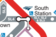
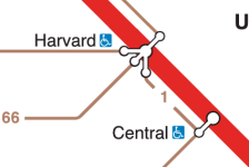
- Not sure if this is technically a bug - but what do the black lines connecting station dots represent? I'm seeing some, but not all, dots being connected between subway and bus routes, and it seems quite inconsistent overall. (There's also a thick black line at Tufts Medical Center.)
Last edited:
") Like the label alignment, this was something that I was trying a few different approaches for. In general, the black lines are meant to indicate "transfer here". All rapid transit transfers + commuter rail transfers are supposed to have them. (Chinatown lacks one because it will not be a "good" transfer point, see below.) The question then was whether to use them for the bus routes. It seemed like overkill to use them for all of the bus intersections (e.g. Everett Sq)... but it also seemed insufficient to not use them at all. The interim compromise was that the thick bus routes would get the transfer bars but the thin routes wouldn't; if a transfer station served both thin and thick routes, all would get the transfer bar.
Like the label alignment, this was something that I was trying a few different approaches for. In general, the black lines are meant to indicate "transfer here". All rapid transit transfers + commuter rail transfers are supposed to have them. (Chinatown lacks one because it will not be a "good" transfer point, see below.) The question then was whether to use them for the bus routes. It seemed like overkill to use them for all of the bus intersections (e.g. Everett Sq)... but it also seemed insufficient to not use them at all. The interim compromise was that the thick bus routes would get the transfer bars but the thin routes wouldn't; if a transfer station served both thin and thick routes, all would get the transfer bar.