The Official MBTA System Map

First of all, I really like this map more than I thought I would.

Prominence of Buses on an Map

I understand the debate and differing opinions about how prominent buses should be displayed on such a map. Two points are at play here, though:
  1. I believe it's explicitly @Riverside's intention to design a map with a primary focus on buses (or at least as much as the subway). With that as the main goal, this is likely close to the best you can do.
  2. Personally, I think using thin lines for buses understates their value, much more so than @Riverside's map possibly overstates them.
To elaborate on #2, the elephant in the room is that when an average US citizen thinks of a bus, their perception of it is much closer to
(a) "an hourly bus that's slow and stuck in traffic",​
than
(b) "a train with fully grade-separated ROW that comes once every 3 minutes".​

Even if we treat the 1 bus as "a bus that's slow and stuck in traffic, but comes every 7-9 minutes", I'd argue its utility is still much closer to (b) than to (a). But a map with buses simply labeled as "thin lines with numbers" likely falls closer to (a). In fact, I'd even argue that any bus with a number risks being thought of as (a) -- because statistically speaking, that's the majority of bus routes in the US, and even in greater Boston (see: 14, 38, 67, 85, 112, etc). Having them as very thin, barely visible lines only exacerbates that perception.

While the treatment on Riverside's map may seem extreme on first glance, it's still very useful in getting people to use the 1 for Hynes-Central instead of GL-RL, and more importantly, to establish confidence that it can be a sufficiently reliable alternative. (Unless you want a map that's explicitly only focused on subways, but even the T's official map today isn't like that.)

Remark: The emergence of many street-running light rail lines in US cities, many of which run every 15 minutes don't even have dedicated ROWs on some segments, further exacerbates the problem by reducing the value of (b). It's not a stretch to say that the 1 and 66 buses can be more useful -- and do have higher ridership -- than some of those systems. Keep in mind, a visitor to Boston who needs to actually use the map has a decent chance of coming from one of these cities.

Alternative Color Schemes

Having said that, I do agree with many others that the color scheme and thickness of the busiest routes may be overwhelming, particularly when compared to subway lines. In addition to what others have suggested, here are some of my own ideas:
  1. Apply 50% opacity to all bus lines to make them "fade out" a bit
    • This may also help the map look less like a spaghetti, as a whole
  2. Use alternating dashed lines for bus routes instead of monochromatic lines, especially for double lines and/or routes that connect to multiple subway lines.
  3. Use slightly different colors, that are hopefully less vibrant and/or with different hue, but still somewhat convey the idea of the underlying subway line that the bus route is "based" on. For example, buses that are currently colored red can be turned to brown, magenta, etc.
#1:
1722805571686.png

(Technically I only did the bottom half and not the 101.)

#2:
1722805127051.png

(Imagine the green dashes having a center white line. You can even use red-green-orange-silver dashes to indicate all 4 "rapid transit" lines that the route connects to.)

#3:
1722805288724.png

1722805648476.png

(Again, imagine there's a center white line.)

Overall Spacing

I do see one of @Riverside's constraints is to fit within the existing frame with the same font size. That said, the northeast corner is particularly cramped, particularly due to the bus routes -- which may be a problem for a map with an elevated focus on buses. There may not be an easy solution, but this factor alone may offer an argument to enlarge the canvas, as @vanshnookenraggen mentioned.

(I do think you can mayyybe compress the SW quadrant a bit along the SW-NE axis, especially north of LMA and south of Brigham Circle, but that may be more trouble than it's worth.)

Miscellaneous

Suggestions:
  • I think there's great value in explicitly showing Watertown (Square/Yard), as it's one of the few subway-less neighborhood centers to be served by 3 key bus routes. A very rough sketch:
1722807757272.png

I drew several alignments for the 57, each with pros and cons.

(While you're doing that, maybe also consider drawing the 73 to Waverly to meet the Fitchburg Line.)
  • A few lines have weird inclinations that aren't consistent with nearby lines in the same quadrant. Concrete examples:
Somerville/Charlestown is probably the most notable example. The 47's north-south section near Union Sq and the 101 near Community College are about 10 degrees NW, but every other line here (GLE, Lowell, OL) are due north. It seems easy enough to convert the two bus routes to straight N-S, with the added benefit of showing the 101 further inside Charlestown, and improving its dot's appearance at Sullivan:
1722808614237.png


Another such case is near the BU Bridge, where the 47 is again on the 10 degrees NW heading, but the immediately adjacent Worcester Line is N-S. For this one, I'd probably slant the Worcester Line instead, parallel to the 47, 66 and 1. (I'd also add a walking transfer at St. Mary's St.)
1722809231400.png
  • The 22's treatment near Ruggles somewhat bothers me. My first attempt started by following it from LMA, and I got completely lost at Roxbury Crossing -- because the turn south at RBX is so invisible and below all these other layers. Two suggestions:
    • Minor change: Add another "22" label within LMA
    • Major changes: Rearrange the Francis St-Malcolm X bus routes. What I would do is: north to south, 12 - 28 - 66 - 22. Essentially, swap the 28 and 66, and move the 22 from the northernmost (west of OL) to the southernmost.
      • Additional benefits of this: Sorts out the overlapping thick-line turns at Francis/Brookline, and make the 23 and 28 closer together east of Nubian (eliminate the gap from the 66 terminating).
  • The 12 may need another label near Melnea Cass Blvd, as it too suffers the 22's problem of different segments not connecting well (though to a lesser degree due to a more distinctive color).
  • It may be worth adding an intersection point between the 9 and the 12, possibly named "South Boston" or "D St".
  • There seems to be some inconsistencies over how station labels are placed along sloped lines: whether the center line of the text passes through the dot, or whether the starting point of the text is perpendicular to the line. The most extreme case seems to be Mattapan Line, which is harder to read than, say, the B branch and even the Ashmont branch.
  • The maps seems to exaggerate the distance between Blue Hill Ave and Mattapan (the trolley terminal). In fact, I don't know why there isn't a dashed line between them! Perhaps a westward of the Mattapan Line at around Central Ave may help.
  • The 8's dot at Back Bay is barely noticeable. I'd put it either west of the commuter rail station or the 39.
  • I'm slightly bothered by the 16 between Forest Hills and Franklin Park, both because the heading (10 degrees N of E) is rarely used in this part of the map, and because of the turns on both ends. It doesn't even make sense geographically, as the 16 heads east immediately after leaving Forest Hills, not north. Looks like the same heading is almost exactly the straight line between the two points (see below), so maybe try that?
1722809672559.png

This somewhat ruins the aesthetic of connecting lines at Forest Hills, but a bus route with a tangent at a subway terminal is not without precedent - the 101 at Kendall. If that's an issue, you can also make the 16 turn due west just before Forest Hills, parallel with the 32.
Minor bugs:
  • You mixed up the 31 and the 32. The former goes to Mattapan, the latter to Forest Hills Readville/Wolcott.
  • The 70 should go to Kendall/MIT.
  • The 96 is mislabeled as the 111.
  • There's a weird white dot over the "Shawmut" label.
  • Not sure if this is technically a bug - but what do the black lines connecting station dots represent? I'm seeing some, but not all, dots being connected between subway and bus routes, and it seems quite inconsistent overall. (There's also a thick black line at Tufts Medical Center.)
One last totally random comment: I somehow really low how the 9 bus turned out. No particular reason, just fascinating.
 
Last edited:
I've made some more (slow) progress on my map as well, and I think the thinner lines have worked wonders to making bits like Dorchester and Chelsea more legible:
View attachment 53492
This is actually elegant (my earlier comments of thin bus lines and GLE-OL's overly long parallels notwithstanding).

One thing I really like is your latest treatment of bus routes in the NE quad. Like, this is way more symmetrical and organized than I imagined (despite not being geographically accurate):
1722811167750.png

If possible, there may be some aesthetical value in aligning the 116's east-west segment with Malden Center (and thus the 104 and 96). In other words, straighten up the dashed line here:
1722811400724.png

This can be done by either moving the 116 south (probably easier, but kills its turn being exactly at the intersection with the Newburyport/Rockport line), or enlarging OL's stop spacing so that Malden Center is further north (a lot more changes involved and even gets GLE involved, though it may help with the inconsistent transfer symbols at Wellington and Malden Center, with 110's dot being NE of OL's but 104 being due E).

Minor bugs/suggestions:
  • The SL2's terminal label has a white ring around the "2" that stands out over the blue background. Probably better to turn it blue instead?
  • Did you leave out the 22's section from Franklin Park to Ashmont? I don't see a line that connects them (and Talbot Ave).
  • Likewise, you forgot the 47's section from Central to Union Sq.
  • If you have the 35/36 and 442/455 as shared 15-min corridors, then 220/222 from Quincy Center should also be on the map. (On that topic, the map is missing the Greenbush Line.)
  • There seem to be some inconsistencies with whether bus transfer points are labeled. Or perhaps you haven't finished adding all labels?
    • Two or more crossing routes: Watertown Sq, Allston Sq, Everett Sq and Woodlawn are labeled, but Franklin Park and Revere Center aren't.
    • Diverging routes: Grove Hall (23/28) has a circle, but Mount Auburn (71/73) doesn't. (I'm not counting 47/70 at Cambridgeport, as their actual bifurcation point is Central Sq itself. Same for 96/109 at Union Sq, and 101/109 at Sullivan Sq.)
      • (111/116 at Chelsea Sq may be worth a dot, as it's not exactly Bellingham Sq, but there's no space for a text label.)
  • Readville: Would it help to put Fairmount Line's terminal to the east of Providence Line instead? That's more geographically accurate, and also straightens out the 32. You can still indicate its terminal status by keeping the short curve hollow between the relocated Fairmount Readville and NEC. Also, the map currently gives the impression that you can't transfer between Fairmount Readville and NEC/Franklin Readville, so a dashed line would help.
 
Last edited:
The 111 is incorrectly drawn is going via Charlestown even though the 111 has ZERO stops in Charlestown.

It is extremely misleading for riders, especially newcomers. Imagine if someone wanted to get to the USS Constitution or the Bunker Hill Monument, only to be taken across the highway to the other side of the Mystic with no way back to Charlestown without going all the way to Encore Casino or to Downtown Boston.

I need to repeat this again, the 111 makes ZERO STOPS in Charlestown. This is the only FBR bus route to have an "express" portion.
While I do think you have a very good point for a problem that has the potential of being misleading, I feel you're probably blowing this out of proportion. Do we have any evidence of people who were actually mislead by it? Bunker Hill Monument and USS Constitution are not on the map, and I suspect the vast majority of people who want to go there are already checking their mobile maps or other maps, which would show the 111 not stopping there. If someone really thinks the 111 goes there solely because of the MBTA map's coastline shape - which does not indicate where the 111 stops at all - it sounds like the problem is on them. (That's like thinking the 1 serves Cambridgeport just because it looks that way on the MBTA map.)

Besides, with the Rutherford Ave redesign on the horizon, there's real potential of the 111 adding a stop in center-running bus lanes just before merging onto the Tobin Bridge ramps.

Even with all these said, there are probably simpler solutions at least for @Riverside's map:
1722813601396.png


The 111 is technically an "express bus" since it makes stops in suburbs outside of Boston and then proceeds to drive directly to downtown Boston. As quoted from the MBTA bus guide:

View attachment 53537
Read that carefully. Doesn't the 111 fit this description of "express"? I think it does. The first stop off the 111 inbound past the highway is just across the street from North Station. In the outbound direction, the last chance top get on or off the 111 is also, just across the street from North Station. After that, the 111 expresses directly to Chelsea.
The 111 fits the descriptions of "local" buses just as well, though? It's certainly a bus that "only travel(s) within Boston and the communities in the immediate area", since Chelsea is obviously in the immediate area.

Clearly, the paragraph you highlighted was not meant to be a strict definition of local vs. express buses, but rather, they're just broad descriptions of what these categories usually do. Otherwise, you can argue that local bus routes like 34E, 137, 230, 351, 451 shouldn't be considered local at all, because they travel through Walpole, Reading, Brockton, Burlington and Beverly respectively (the last two are exclusively within these cities), none of which are typically considered "the immediate area". On the other hand, you can also argue the 7, 39 and 93 are express buses, as they definitely "make stops in suburbs and communities outside the city" (South Boston, Huntington/JP/Forest Hills, Charlestown) and then "drive directly to downtown Boston".

Not to mention the MBTA has an official list of express routes:
1722814416669.png
 
While I do think you have a very good point for a problem that has the potential of being misleading, I feel you're probably blowing this out of proportion. Do we have any evidence of people who were actually mislead by it? Bunker Hill Monument and USS Constitution are not on the map, and I suspect the vast majority of people who want to go there are already checking their mobile maps or other maps, which would show the 111 not stopping there. If someone really thinks the 111 goes there solely because of the MBTA map's coastline shape - which does not indicate where the 111 stops at all - it sounds like the problem is on them. (That's like thinking the 1 serves Cambridgeport just because it looks that way on the MBTA map.)

Besides, with the Rutherford Ave redesign on the horizon, there's real potential of the 111 adding a stop in center-running bus lanes just before merging onto the Tobin Bridge ramps.

Even with all these said, there are probably simpler solutions at least for @Riverside's map:
View attachment 53562


The 111 fits the descriptions of "local" buses just as well, though? It's certainly a bus that "only travel(s) within Boston and the communities in the immediate area", since Chelsea is obviously in the immediate area.

Clearly, the paragraph you highlighted was not meant to be a strict definition of local vs. express buses, but rather, they're just broad descriptions of what these categories usually do. Otherwise, you can argue that local bus routes like 34E, 137, 230, 351, 451 shouldn't be considered local at all, because they travel through Walpole, Reading, Brockton, Burlington and Beverly respectively (the last two are exclusively within these cities), none of which are typically considered "the immediate area". On the other hand, you can also argue the 7, 39 and 93 are express buses, as they definitely "make stops in suburbs and communities outside the city" (South Boston, Huntington/JP/Forest Hills, Charlestown) and then "drive directly to downtown Boston".

Not to mention the MBTA has an official list of express routes:
View attachment 53564
The 111 is the only one that makes use of an actual highway for half of its route to bypass/deprive an entire neighborhood of high frequency service. For the 7 and 39 buses, none of their routes utilize highways, with dense stop spacing throughout. The 111 has a stop spacing of 4.5km (2.7 mi) between the last inbound stop in Chelsea until the stop just outside North Station. Compare that with just 800 meters for the last inbound stop of the 93, and 650 meters for the 7 bus

Take a look at the stop spacings for the routes you mentioned above
1722815563945.png
1722815603932.png
1722815616684.png
1722815639751.png
1722815677457.png


Now take the 111 and compare it with express buses like the 501 or 354
1722815718643.png
1722815775428.png
1722815753008.png
1722815738184.png


The 111 has more in common with the express buses than any of the local buses you mention. The 111 is unique in being the only express bus to offer all day, 7 day a week, high frequency service, unlike all the other express buses. No KBR or local bus route makes stops for only 50% of the route, then skip entire neighborhoods for the second 50% of the route driving directly to downtown Boston. Only express buses do that, and the 111 as well. The 111 absolutely should be represented differently on a map versus all other KBRs, with some indication it is express.

The Rutherford Ave. redesign is stuck in political inaction/gridlock, and isn't slated for construction for years I'd think. If the status quo is going to continue for several more years, the maps should absolutely make some indication of this excessively wide stop spacing.

Even with an infill shived in City Sq., parts of the Navy Yard will still be 1.6 -1.7 kilometers (1.1 mi) from the proposed infill at City Sq & Rutherford Ave., despite being a short 2 minute walk to the Tobin Bridge. The 111 would still have an egregious 3.7 km (2.3 mi) stop spacing between City Sq. and Chelsea. A planner could shive in 2 rapid transit stop infills with that large of a gap between stops. Spaulding Hospital out on the tip of the edge of the Navy Yard is only 1.3 km (0.8 mi) away from the first outbound stop of the 111 in Chelsea.

If it were me, I would maintain the "express" indicator for the 111 until the 111 gets at least a "Constitution Rd" stop, serving both Navy Park and the Monument, which would reduce the distance to the tip of the Navy Yard to about ~1km (0.6 mi). A "Spaulding Hospital" stop out by 16th or 15th St.. would be even better for the 111, which would reduce the stop spacing to match that of rapid transit.

How many other KBRs have stop spacings of 3.5km or more on any portion of the route? The 1 bus crossing the Charles can't even crack 1 mile, with only 1.1 km (0.7 mi) on either side of the Charles. Even the 31, 442, and 455 under BNRD can't come close, at 750 meters in Franklin Park, or 1.8km out on the slog from Oak Island to PoP in Revere. Today's large 3.4km gap between North Station and Chelesa on the 111 is the distance from North Quincy to nearly Fields Corner as the crow flies. Accounting for the loop ramps to get on the Tobin, the 4.5km gap between stops on the 111 is the distance from North Quincy to Savin Hill.
 
Last edited:
If you must have all this information on the map, then at least enlarge the canvas and give this information room to breath.
Like I said, one of my explicit goals is to work within the bounds of the existing canvas. I have some optimism that the whole map can be shifted down and maybe a little to the left, which might help open up the top right.
The 111 is incorrectly drawn is going via Charlestown even though the 111 has ZERO stops in Charlestown.
Figuring out the 111 was/is still on my list (as part of reworking the water on the map). I agree that it's a problem. I think all three of your solutions has pros and cons, so some experimentation/iteration will be needed, but I agree that the need is there.
While the treatment on Riverside's map may seem extreme on first glance, it's still very useful in getting people to use the 1 for Hynes-Central instead of GL-RL, and more importantly, to establish confidence that it can be a sufficiently reliable alternative. (Unless you want a map that's explicitly only focused on subways, but even the T's official map today isn't like that.)
To argue against myself, my recollection is that crowding on the 1 is high enough that redirecting Red <> Green riders might not work well. On the other hand, Red and Green themselves both have heavy crowding, so... But yes -- the idea is to present these bus routes as (theoretically) reliable alternatives.
Alternative Color Schemes

Having said that, I do agree with many others that the color scheme and thickness of the busiest routes may be overwhelming, particularly when compared to subway lines. In addition to what others have suggested, here are some of my own ideas:
  1. Apply 50% opacity to all bus lines to make them "fade out" a bit
    • This may also help the map look less like a spaghetti, as a whole
This could work, but will eventually run afoul of contrast issues.
Use alternating dashed lines for bus routes instead of monochromatic lines, especially for double lines and/or routes that connect to multiple subway lines.
I'm happy to be proven wrong, but this seems like it would be both more overwhelming and much less legible (and probably less accessible too). The only official map I can think of that uses alternating colors is PATH's night/weekends map, which is an exceedingly simple diagram:
1722813719299.png


Use slightly different colors, that are hopefully less vibrant and/or with different hue, but still somewhat convey the idea of the underlying subway line that the bus route is "based" on. For example, buses that are currently colored red can be turned to brown, magenta, etc.
Yeah, this is similar to @Brattle Loop's suggestion, and I'll try it soon enough.
I think there's great value in explicitly showing Watertown (Square/Yard), as it's one of the few subway-less neighborhood centers to be served by 3 key bus routes.
Yup, I like this idea. I wanted to build out the key (which will probably go in the top left) first and then see how much room was leftover. (This thing has taken so long between IRL stuff, and I really just wanted to get a reasonably complete draft out for discussion.)
Somerville/Charlestown is probably the most notable example. The 47's north-south section near Union Sq and the 101 near Community College are about 10 degrees NW, but every other line here (GLE, Lowell, OL) are due north. It seems easy enough to convert the two bus routes to straight N-S, with the added benefit of showing the 101 further inside Charlestown, and improving its dot's appearance at Sullivan:
This is an interesting point. I think I actually would be inclined (no pun intended) to go the other direction, and adjust the Medford Branch and Lowell Line to use the offset so that they are perpendicular to the 101. (As the quadrant divider, I think Orange is a reasonable place to switch to a directly due north alignment.)
Another such case is near the BU Bridge, where the 47 is again on the 10 degrees NW heading, but the immediately adjacent Worcester Line is N-S. For this one, I'd probably slant the Worcester Line instead, parallel to the 47, 66 and 1. (I'd also add a walking transfer at St. Mary's St.)
Agreed about the Worcester Line. This corner was such an absolute headache (for no good reason) that I think I subconciously decided to just not touch it again once I actually got the labels to fit! St Mary's is a good call, and I'm reminded that I was considering adding a Fenway <> Pilgrim Rd dotted connector as well. (More on those below.)
 
The 22's treatment near Ruggles somewhat bothers me. My first attempt started by following it from LMA, and I got completely lost at Roxbury Crossing -- because the turn south at RBX is so invisible and below all these other layers. Two suggestions:
  • Minor change: Add another "22" label within LMA
  • Major changes: Rearrange the Francis St-Malcolm X bus routes. What I would do is: north to south, 12 - 28 - 66 - 22. Essentially, swap the 28 and 66, and move the 22 from the northernmost (west of OL) to the southernmost.
    • Additional benefits of this: Sorts out the overlapping thick-line turns at Francis/Brookline, and make the 23 and 28 closer together east of Nubian (eliminate the gap from the 66 terminating).
I believe I did try what you are proposing here, but it didn't work (but I can't remember why it didn't work). One problem I do see -- and maybe this was the problem and I just didn't try hard enough to fix it -- is that the current design requires 5 "slots" going east-west at Roxbury Crossing: 15, 23/22, 12, 66, 28. And that / is important because it allows the 22 to share a slot with another service. If the 22 becomes the southernmost service, then you need 6 slots there.

When I was working on this portion of the map (earlier on), I was already concerned about how much space was going to be required here and how much it would have to distort the stop spacing. (Recall my point earlier about the knock-on effect of stop cadences -- if Brigham Circle + LMA need to be "6 slots plus bufferspace" apart, then LMA <> MFA will need to be similar. Even in this draft, Brigham and LMA feel almost too far apart.) So the consolidation to 5 slots seemed worthwhile.
  • Minor change: Add another "22" label within LMA
  • ...
  • The 12 may need another label near Melnea Cass Blvd, as it too suffers the 22's problem of different segments not connecting well (though to a lesser degree due to a more distinctive color).
Yes, the distribution of bus labels was an open question for me. Seemed easy to go "overboard" and create noise, and yes, in the case of the 12 specifically I opted for an even more conservative approach due to its distinctive color.
It may be worth adding an intersection point between the 9 and the 12, possibly named "South Boston" or "D St".
Interestingly, my intention wasn't to label every bus intersection, but I see that I basically did. I've been trying to avoid names like "South Boston" or "Charlestown" (below), so I'm not sure what I would call it. ("D St" works for the 9, but of course is odd for the 12 -- the bane of transfer station naming.)
There seems to be some inconsistencies over how station labels are placed along sloped lines: whether the center line of the text passes through the dot, or whether the starting point of the text is perpendicular to the line. The most extreme case seems to be Mattapan Line, which is harder to read than, say, the B branch and even the Ashmont branch.
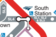
Yes, this is something @TheRatmeister and I have gone back and forth about. Sometimes when a horizontal label is next to a diagonal line, aligning the centerline of the text to the center of the dot means that the label is actually quite far away from the dot, in a way that (IMO) makes it hard to read. (See for example Walpole in this example -- not to pick on @TheRatmeister, especially since his CR diagram is amazing. I understand his reasoning even while I disagree with it from a design perspective.) This is why I tend to align labels such that the relevant corner of the label is as close to the circle as possible -- usually on a diagonal alignment. (Stops with accessibility symbols make this a little easier, as the diagonal alignment of the accessibility square's corner to the dot is more easily visible. See for example SL4 on my map.)

That being said, I did indeed try centerline alignment on a number of sections of the map, and it worked better than I expected. I agree that the Mattapan Line needs revision, and probably also the Needham Line stops as well.
The maps seems to exaggerate the distance between Blue Hill Ave and Mattapan (the trolley terminal). In fact, I don't know why there isn't a dashed line between them! Perhaps a westward of the Mattapan Line at around Central Ave may help.
Fair point. The allure of the Ashmont + Mattapan Line and Fairmount Line forming the side of a ladder, of which the bus routes were rungs, was too appealing to turn up. As mentioned above, this area of the map is probably the most promising in terms of creating space for the northeast quadrant, so I'd want to experiment with that first and see what can be done with BHA/Mattapan after that.
I'm slightly bothered by the 16 between Forest Hills and Franklin Park, both because the heading (10 degrees N of E) is rarely used in this part of the map, and because of the turns on both ends. It doesn't even make sense geographically, as the 16 heads east immediately after leaving Forest Hills, not north. Looks like the same heading is almost exactly the straight line between the two points (see below), so maybe try that?
The 16 went through several iterations, and in fact I think what you are seeing is partially an artifact of an earlier design where the 16 ran straight (no turns) from Forest Hills to just-east-of-Four Corner/Geneva. The simplicity was appealing, but the angle differences were too stark. I think your suggestion would work, though.
There's a weird white dot over the "Shawmut" label.
Yes, there's one at Englewood as well -- they are stray station markers that got moved around during editing and lost track of/forgot to delete.
Not sure if this is technically a bug - but what do the black lines connecting station dots represent? I'm seeing some, but not all, dots being connected between subway and bus routes, and it seems quite inconsistent overall. (There's also a thick black line at Tufts Medical Center.)
Dang @Teban54 you really are catching all of the WIP elements :) Like the label alignment, this was something that I was trying a few different approaches for. In general, the black lines are meant to indicate "transfer here". All rapid transit transfers + commuter rail transfers are supposed to have them. (Chinatown lacks one because it will not be a "good" transfer point, see below.) The question then was whether to use them for the bus routes. It seemed like overkill to use them for all of the bus intersections (e.g. Everett Sq)... but it also seemed insufficient to not use them at all. The interim compromise was that the thick bus routes would get the transfer bars but the thin routes wouldn't; if a transfer station served both thin and thick routes, all would get the transfer bar.

I do not love it. I don't love the black bars for the rapid transit transfers either, but I think I have little choice there. The bus routes, at least, feel like they should have a more elegant solution. (Maybe intersection points between thin routes, e.g. Everett Sq, might get thin black bars, and I'll just use them liberally across the map.)

"Transfer here" and walking transfers: two brief points here. First, there is intentionally some editorialization about where transfers are marked, in that some places will make better transfer points than others. (For example, I didn't and don't intend to mark transfers between every single 39 and E stop.) I have a similar approach in mind for walking transfers. The map from UrbanEric that @TheRatmeister shared provides a good example of a transfer I wouldn't show, Bowdoin <> Charles/MGH. On the one hand, I imagine it's there in order to indicate that you can walk from Bowdoin to the hospital. On the other hand, if you're looking for a Blue <> Red walking transfer, either State or GC will be much better (and much shorter) alternatives. So, a distinction worth making between a "walking transfer" and a "walking distance".

Second, for walking transfers I'm trying to keep it to the short end of things -- 5 minutes or less. I don't know that I've applied that consistently. But Mattapan <> BHA looks about 10 minutes, so it's excluded.

"Charlestown": it's true that this would address the 111 issue. But also, fitting in labels here was also a big headache, so I'm reticent to add another!

Alright, time for a nap.
 
Minor bugs/suggestions:
  • The SL2's terminal label has a white ring around the "2" that stands out over the blue background. Probably better to turn it blue instead?
  • Did you leave out the 22's section from Franklin Park to Ashmont? I don't see a line that connects them (and Talbot Ave).
  • Likewise, you forgot the 47's section from Central to Union Sq.
  • If you have the 35/36 and 442/455 as shared 15-min corridors, then 220/222 from Quincy Center should also be on the map. (On that topic, the map is missing the Greenbush Line.)
  • There seem to be some inconsistencies with whether bus transfer points are labeled. Or perhaps you haven't finished adding all labels?
    • Two or more crossing routes: Watertown Sq, Allston Sq, Everett Sq and Woodlawn are labeled, but Franklin Park and Revere Center aren't.
    • Diverging routes: Grove Hall (23/28) has a circle, but Mount Auburn (71/73) doesn't. (I'm not counting 47/70 at Cambridgeport, as their actual bifurcation point is Central Sq itself. Same for 96/109 at Union Sq, and 101/109 at Sullivan Sq.)
      • (111/116 at Chelsea Sq may be worth a dot, as it's not exactly Bellingham Sq, but there's no space for a text label.)
  • Readville: Would it help to put Fairmount Line's terminal to the east of Providence Line instead? That's more geographically accurate, and also straightens out the 32. You can still indicate its terminal status by keeping the short curve hollow between the relocated Fairmount Readville and NEC. Also, the map currently gives the impression that you can't transfer between Fairmount Readville and NEC/Franklin Readville, so a dashed line would help.
Most of these are just because it's not finished, like at all. My rather scattershot approach to working on stuff certainly doesn't help. I tend to bounce around a lot which leaves the state of completion across the map all over the place. I should have thought of that for Readville though, it indeed looks much better. I had also initially planned to just let the 71/73 split without a transfer dot but you're right that I think it's worth putting on there.
Illustrator_Realistic_Map_WIP2.jpg

Second, for walking transfers I'm trying to keep it to the short end of things -- 5 minutes or less. I don't know that I've applied that consistently. But Mattapan <> BHA looks about 10 minutes, so it's excluded.
In general this is the rule I used as well, .25 miles or less which works out to about 5 minutes. The exception I have is Fairmount/Hyde Park, more to highlight that they're close together rather than to suggest you should transfer between the two. I'm split on BHA/Mattapan but I'm also leaning no at the moment.
 
To argue against myself, my recollection is that crowding on the 1 is high enough that redirecting Red <> Green riders might not work well. On the other hand, Red and Green themselves both have heavy crowding, so... But yes -- the idea is to present these bus routes as (theoretically) reliable alternatives.
That's an interesting point. Living on the 1 bus myself, I can attest that it's already crowded enough that it may not have the capacity to absorb would-be subway riders. On the other hand, I have often used the 1 bus from downtown Green Line or even Orange Line stations instead of doing a Red Line transfer, and knowing that it runs every 10 minutes (and not 30-60) plays a big role in my decision making. I'd definitely say such alternatives are reliable enough that passengers should know about them, and that such information shouldn't be withheld just for crowd control reasons.

Yup, I like this idea. I wanted to build out the key (which will probably go in the top left) first and then see how much room was leftover. (This thing has taken so long between IRL stuff, and I really just wanted to get a reasonably complete draft out for discussion.)
Oops, I didn't know you planned to use the top left corner for a legend. In that case, it may be so cramped that Watertown can't fit.

That said... Doesn't the official map have a dedicated row at the bottom for the key? Unless you've already used that extra space towards your canvas, I'd say simply following their current format should be more than fine for you.

I believe I did try what you are proposing here, but it didn't work (but I can't remember why it didn't work). One problem I do see -- and maybe this was the problem and I just didn't try hard enough to fix it -- is that the current design requires 5 "slots" going east-west at Roxbury Crossing: 15, 23/22, 12, 66, 28. And that / is important because it allows the 22 to share a slot with another service. If the 22 becomes the southernmost service, then you need 6 slots there.

When I was working on this portion of the map (earlier on), I was already concerned about how much space was going to be required here and how much it would have to distort the stop spacing. (Recall my point earlier about the knock-on effect of stop cadences -- if Brigham Circle + LMA need to be "6 slots plus bufferspace" apart, then LMA <> MFA will need to be similar. Even in this draft, Brigham and LMA feel almost too far apart.) So the consolidation to 5 slots seemed worthwhile.
Don't you already have inconsistent stop spacing on both the E branch and OL around here, though?

Unless there are other aesthetic reasons you deeply care about, my opinion is that I don't see the importance of having the "6 slots" match precisely across the two halves. To be clear, what I'm suggesting is offsetting slots west of GLE vs. east of OL: (Forget about the 28/66 swap for now - more later)

Old, west of GLEOld, east of OLNew, west of GLENew, east of OL
"Roxbury Crossing""Roxbury Crossing"
"LMA"1515
2223"LMA"23
12121212
66666666
28282828
"Brigham Circle""Nubian"22"Nubian"
"Brigham Circle"

Essentially, you shift the entire complex west of GLE further south and leave the eastern half unchanged. One big advantage that I see is that it gives the "Longwood Medical Area" label more space. It seems that there's plenty of slack in all three other quadrants here, aka "Roxbury Crossing", "Brigham Circle" and "Nubian", but the LMA label is fixed and the lowest common denominator of the entire region, if not the entire map. By moving the 22 from the space-constrained NW quad to the rather empty SW quad, it allows you to compress the nearby stations vertically and free up space for the entire map.

Also, I realized that the 28/66 swap is actually independent of all of this. Even if you do keep the 22 unchanged, it may be worth looking into swapping them.

Fair point. The allure of the Ashmont + Mattapan Line and Fairmount Line forming the side of a ladder, of which the bus routes were rungs, was too appealing to turn up. As mentioned above, this area of the map is probably the most promising in terms of creating space for the northeast quadrant, so I'd want to experiment with that first and see what can be done with BHA/Mattapan after that.
I do think the parallel structure of Ashmont branch and Fairmount Line is great for making room for bus routes, but that benefit becomes much less relevant by the time it gets to Mattapan, as that's where the bus network also ends. (If anything, it would even be an interesting experiment to see if the end of the Mattapan line can line up directly with the horizontal segment from BHA to Readville -- not based on geography, just that it might be one of the more visually appealing alignments if you do decide to join the two lines here.)

That said, I realized that the commuter rail lines around Readville generally looks horrible. NEC (and the 32) going east-southeast just doesn't make sense, even though I understand it's to allow it to meet with the Fairmount Line. I suppose a rather modest modification can be like this:

1722835949818.png

The SSE slope of NEC is chosen both to match the 66's heading (in fact they coincidentally line up exactly, as shown by the dashes, though that's obviously not to be plotted), and to be perpendicular to the Readville-Fairmount axis. I also drew an example of the Mattapan Line joining that axis to make my earlier point clearer. Also, I gave two possible headings of the Franklin line, and you have the option of also lining it up with the Readville-Fairmount axis.

Another more drastic modification that aligns better with geography:
1722836382349.png

An unintentional drawback is that it makes the Needham Line and the D branch look too close together (though that's primarily because of the D). But other than that, such an arrangement may offer even more space savings and improve the overall space distribution of the area. The (Franklin - ) Readville - Fairmount ( - Ashmont) axis can alternatively be made exactly horizontal (like the 22 and the "32" buses nearby) or even NNW-SSE (like the original NEC and the last section of the original 28).
 

Attachments

  • 1722837424620.png
    1722837424620.png
    15.2 KB · Views: 20
  • 1722837432159.png
    1722837432159.png
    12.6 KB · Views: 31
Dang @Teban54 you really are catching all of the WIP elements :) Like the label alignment, this was something that I was trying a few different approaches for. In general, the black lines are meant to indicate "transfer here". All rapid transit transfers + commuter rail transfers are supposed to have them. (Chinatown lacks one because it will not be a "good" transfer point, see below.) The question then was whether to use them for the bus routes. It seemed like overkill to use them for all of the bus intersections (e.g. Everett Sq)... but it also seemed insufficient to not use them at all. The interim compromise was that the thick bus routes would get the transfer bars but the thin routes wouldn't; if a transfer station served both thin and thick routes, all would get the transfer bar.
I actually feel that from an aesthetics standpoint, if two thin bus lines have dots that are close together at an intersection, a line is probably not required for people to realize they transfer there. Current examples on the map include Everett Sq, Medford Sq, Kane Sq, the 8/16 transfer, and possibly the future 9/12 transfer. As for thick bus lines, I personally think if you're going to keep them as thick as the subway lines, then they should get the same treatment in transfer bars as the subway lines do: either always have them, or based on the convenience and necessity of transfer (as you elaborated below), or any other alternatives that I'll suggest below.
The above paragraph leads us to another question: What about thick-thin lines, or even some thick-thick lines? Which may lead to an alternative proposal: Bars based on clarity on the map. Some transfer points are already pretty obvious even without dashes: examples include Davis, Kendall/MIT, Government Center, and many others. But sometimes simply "dots that are close together" may not be enough, especially with a large number of lines available: Sullivan Sq, Roxbury Crossing, Central, etc. Under such a proposal, bars will likely be reserved only for the latter, to signal that all these stops form a transfer complex, and not for the former where the contextual cues are likely enough.

I can see scenarios where this proposal becomes problematic, though, especially if you do want to indicate ease of transfer. Haymarket vs. North Station offers perhaps the clearest example: I'm not sure why you didn't connect the 7 to North Station, but presumably because it's a less convenient transfer than Haymarket.

I do not love it. I don't love the black bars for the rapid transit transfers either, but I think I have little choice there. The bus routes, at least, feel like they should have a more elegant solution. (Maybe intersection points between thin routes, e.g. Everett Sq, might get thin black bars, and I'll just use them liberally across the map.)
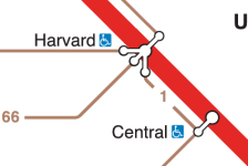
Technically, other label styles exist, such as the official map's.
1722839106795.png

1722839111135.png


"Transfer here" and walking transfers: two brief points here. First, there is intentionally some editorialization about where transfers are marked, in that some places will make better transfer points than others. (For example, I didn't and don't intend to mark transfers between every single 39 and E stop.) I have a similar approach in mind for walking transfers. The map from UrbanEric that @TheRatmeister shared provides a good example of a transfer I wouldn't show, Bowdoin <> Charles/MGH. On the one hand, I imagine it's there in order to indicate that you can walk from Bowdoin to the hospital. On the other hand, if you're looking for a Blue <> Red walking transfer, either State or GC will be much better (and much shorter) alternatives. So, a distinction worth making between a "walking transfer" and a "walking distance".
I like this line of thinking. To make it more systematic, I think two factors are at play here:
  • Convenience:Is the transfer within paid area or with a walkway? Do buses have dedicated facilities, most notably busways? How long of a walk is it? Does it involve crossing streets? Is there clear signage and wayfinding cues to guide passengers to the bus stops and station entrances?
    • The elephant in the room is that, outside of busways, most bus transfers involve crossing streets in at least one direction.
    • Sometimes, even at a unique transfer point between two lines, the bus stop still has a somewhat lengthy walk in addition to possibly crossing streets, with or without meeting the "5-min threshold". (Examples: 109 to GLE at East Somerville, 96 to GLE at Medford/Tufts, 66/109 to RL at Harvard, westbound 47/70 to RL at Central, 15/23 to OL at Roxbury Crossing, 39 to 1/GLE at Symphony, westbound 8/9/39 to GL at Copley.)
  • Utility: Is it a natural transfer point? Would it be useful? Is there an alternative transfer point that people would have used (because it gives either an easier transfer or a quicker ride)? Are the alignments of the two routes in such a way that people find a need to switch between them here?
I think your original comment (particularly the points about 39-E and RL-OL) mostly considers utility, which makes sense. The role of convenience is still rather unclear to me, and the two factors are definitely intertwined. But I think if you do want a consistent and quantifiable metric, there's value in considering both.

Second, for walking transfers I'm trying to keep it to the short end of things -- 5 minutes or less. I don't know that I've applied that consistently. But Mattapan <> BHA looks about 10 minutes, so it's excluded.
It looks like 5 minutes may be too restrictive and/or doesn't apply to people with a variety of physical conditions. In particular, the following popular examples may end up being excluded:
  • Red-Blue: Google Maps says DTX-State and Park-GC both take 6 minutes. In practice, it will probably be longer to account for the time from platforms to surface level.
  • B-C-D near the western end: Google Maps says Chestnut Hill Ave takes about 5-6 minutes to Cleveland Circle, and 7-8 minutes to Reservoir.
  • Brookline Village-Riverway: Google Maps says 8 minutes.
I believe these examples are the intuition behind walking transfers (especially since they're all-rail transfers), so it suggests the issue may be the definition itself.

(I did realize Mattapan-BHA is further away than I expected, though.)
 
Reading this discussion has led me remember a precept I know I've voiced before: the accuracy of a map should reflect the expectations created by the complexity of the network and the geography. That is to say: a simple map can be fairly distorted and serve its purpose, while a complicated map ends up having to be pretty close to geographically accurate in order to avoid being misleading.

If you're just showing the radial subway lines, or the radial commuter rail lines, then straight lines with evenly spaced stops is fine - the primary purpose of the map is to indicate transfer points and how many stops away you are. But once you add bus routes to the subway map, I think you have to make a lot of aesthetic concessions to geography. Otherwise, you end up with major distortions (like the NEC heading ESE).

In particular, if something is straight in real life, it shouldn't have curves added to it. Most significantly, it means that the Green Line should be straight from Cleveland Circle to Boylston, and make a fairly sharp turn at Boylston. In real life, Beacon Street is about 15 degrees from east-west. I couldn't make it look okay at anything less than a 22.5 degree angle - even a 30 degree angle really squishes the D and E branches.

This is the very very rough cut of my attempt using 22.5 and 45 degree angles. It's definitely ungainly, but I think there's promise.

1722846304962.png
 
I think there is a good point that @as02143 is making: The E and OL paralleling for their entire route is probably overkill.

I do think Symphony-Mass Ave and Boylston-Chinatown are close enough for a walking transfer designation. (The distances are even similar to State's long OL-BL tunnel in some cases.) Copley-Back Bay is obviously less convenient, but there has always been some momentum advocating for better connections between the two, so I think it still makes sense.

BUT: Geographically, the E and OL start diverging around the NEU/Ruggles vicinity.
  • Ruggles is technically a 5-min walk away from Northeastern University station (and it's a less disruptive walk than Copley-Back Bay), but I don't think that's a trip many people are willing to make. Besides, on @TheRatmeister's map, Ruggles is currently aligned with MFA, which is a bit further.
  • By the time it gets to Roxbury Crossing, the walking distances to the E become prohibitive. In fact, plenty of people connect to the 66 just to go to the Fenwood Rd area. Yet, the map may make you believe Roxbury Crossing-Brigham Circle is just as far as Symphony-Mass Ave.
  • Jackson Square aligning with Riverway just becomes misleading at that point.
I know this map is not intended to strive for geographical accuracy, but if one of the intentions was to show the closeness between OL and GLE, then these concerns as they get further apart should at least be considered.

A compromise that may work: How about either bending the Orange Line south, or the E branch west, starting at Ruggles/NEU? The former also helps make the 31 less stretched out, while the latter brings Riverway closer to the D. However, I imagine the latter may run into space issues.

View attachment 53014
I did end up (finally) getting this to work. Also, thoughts on the yellow bus blobs? I quite like them.

1722859524346.png
 
Some minor quibbles and mistakes I've noticed:
  • The 8 crosses Washington St at Union Park St, not Newton St
  • The 15 and 16 don't meet at Kane Sq, that's almost than half a mile away. Annoyingly, they meet at the actual Uphams Corner which makes it rather hard to label.
  • The 12 interchanges with (or at least gets very close to) the SL2 at Silver Line Way, quite a bit closer than Summer St @ D St which is about 5 minutes away from WTC
  • The coloring of the 7 is inconsistent with all the other bus routes, which are colored by a rapid transit line they intersect with at their terminus while the 7 is colored Blue despite not terminating at State
  • Why do Oak Sq and Brighton center get dots, while no other non-interchange/non-terminus bus stops do? The only reason I can think of is that they had streetcar service for 16 years longer than most other places more than 50 years ago, and I wouldn't really consider that a great reason.
  • Having all of the possible CR destinations and some through stops listed makes the map rather cluttered. The Providence/Stoughton one is particularly egregious. I'd probably cut some of the less notable through stops, such as Norwood, East/South Weymouth, Taunton, Canton Center, Attleboro and Wellesley
 
Last edited:
All of the above are good points which hopefully I’ll address soon. (I’m gonna be moving soon, so this project may sit on hold for a couple of weeks.) I can address this one really quick though:
The coloring of the 7 is inconsistent with all the other bus routes, which are colored by a rapid transit line they intersect with at their terminus while the 7 is colored Blue despite not terminating at State
Yes. The 7 was a tricky one because it also doesn’t have an “inner terminus” at a rapid transit station. Yes, it terminates at Sullivan, but the majority of ridership is oriented toward downtown, which is generally the criterion I’ve used (eg the 22, 23, 16, etc). There’s an argument for all potential colors. I chose Blue because there is only one other Blue bus on the map (as opposed to lots of Orange and Red and Green) and because the transfer at State is most conveniently oriented toward Blue, and sits close to the “inner core”/center of the line.

What color would you choose for it?
 
What color would you choose for it
I'd probably sort the lines into groups and then semi-arbitrarily color them from there. The groups I think I would make would be something along the lines of:
  • Crosstown routes (1, 47, 66), if we're doing thicker ones I think these should be the ones that get it (Bus yellow or official brown)
  • Nubian-centric routes (15, 23, 28) (Orange)
  • Harvard/Cambridge routes (70, 71, 73, 77, 96, 101, maybe 109) (Red)
  • Forest Hills routes (31, 32, 35/36) (Purple)
  • Downtown/Southie routes (7, 8, 9, 12) (Also Red, possibility a different shade?)
  • Chelsea/Everett routes (104, 109, 110, 111, 116) (Blue)
  • Former GL branches (57, 39) (Green)
 
It's fantastic. My only nitpick is that the outline of the land/water borer is needlessly choppy. It clashes with the clean lines of the transit.

I will always hate bus lines on a map like this, but at least these are as low-key as you could get.
 
Looks really GREAT! Super small nitpick. The text "Rental Car Center" is on top if the Silver Line. I don't think you have any other text on top of colored lines. Maybe just fix it by calling it "Rental Center" since the word "Car" is the only text on top of the Silver Line.

You should really submit this to the MBTA!

I might be in the minority, but I would like to see branches shown as multiple lines in the core area such as the Green Line and Red Line. I think having multiple lines would be better than labeling the Green Line as B,C,D,E on the core underground segment. I think you experimented with that awhile ago. I guess that would make the segment from Copley to Government Center as 4 distinct Green Lines, but maybe they could be much thinner than the branch segments?
 
Small nitpick, it's weird how Franklin park is scrunched up vertically and the 16/31 pass south of it. I would just stretch it back to normal and have the bus lines run through it. Morph the NE park edge to snap along the 22. It's graphically triggering seeing the bus lines just barely graze the edge of it 😅
I might even suggest dropping Allendale Woods and Cutler Park. They're more natural and less manicured than the other parks the map shows. And I think they call too much visual attention to that area of the map.
Not only that, but the fact that Franklin Park doesn't touch its namesake bus stop intersection is killing me. That said, I believe @TheRatmeister said on Reddit that the parks were something they were going to work on in later drafts so that appears to be on the radar.
 
While we're at Franklin Park, about the only thing that bothers me from this (otherwise fantastic) map is how Grove Hall is too far from Franklin Park and too close to Nubian. But that may be a compromise for having the 23 show up nicely.

I also think that while the idea of using yellow rectangles for bus terminals is great, the execution is a bit less than ideal. I find them less recognizable than even the numbers along bus routes. Perhaps enlarging the font and/or another color palette would be better?
 

Back
Top