You are using an out of date browser. It may not display this or other websites correctly.
You should upgrade or use an alternative browser.
You should upgrade or use an alternative browser.
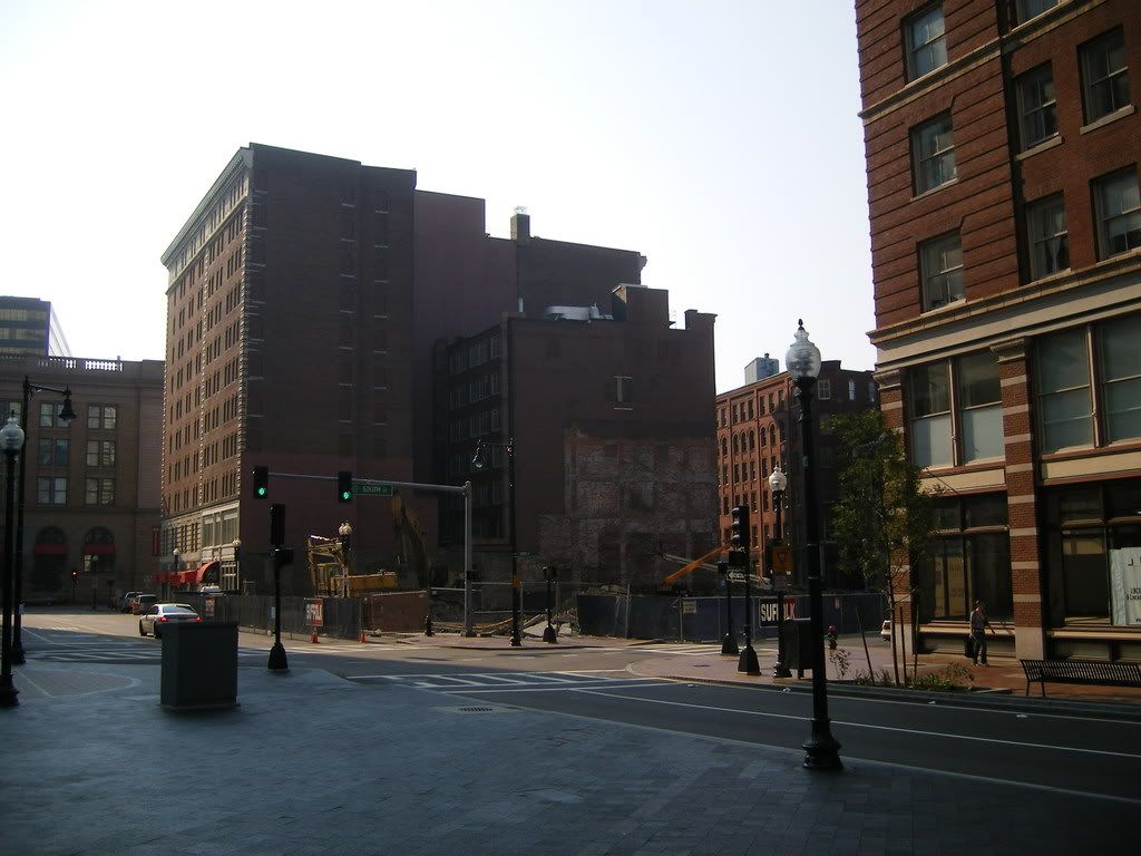
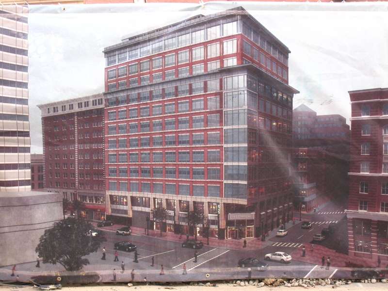
Two Financial Center
- Thread starter kz1000ps
- Start date
- Joined
- May 25, 2006
- Messages
- 7,064
- Reaction score
- 1,990
There are some very handsome buildings in that area.
very true. oddly, some of the best face the east welcoming cross street neighbors -- one financial and the south station backend / bus station and the market / car park. can't remember what's across from the steam plant, but I'd bet that bookend is also not bad.vanshnookenraggen said:There are some very handsome buildings in that area.

TheBostonBoy
Active Member
- Joined
- May 8, 2007
- Messages
- 442
- Reaction score
- 0
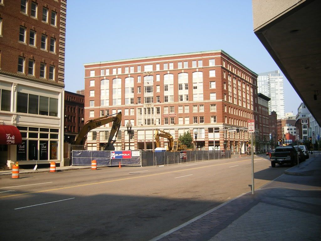
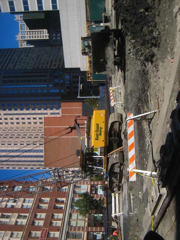
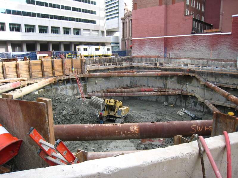
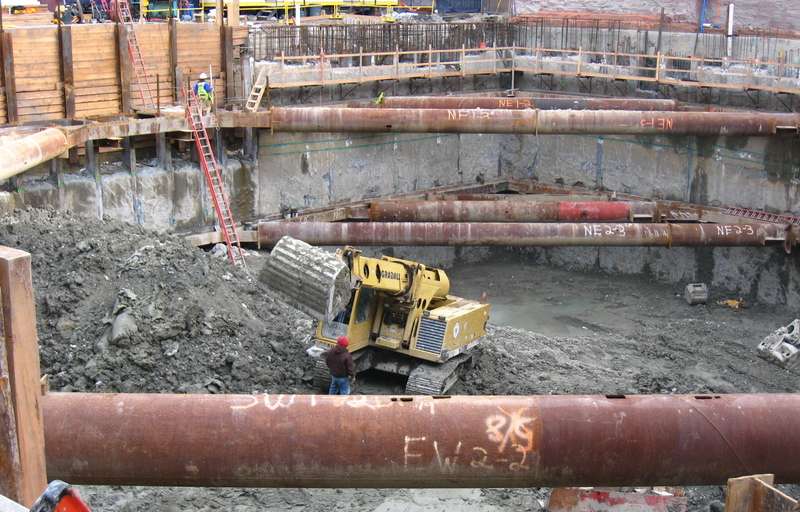
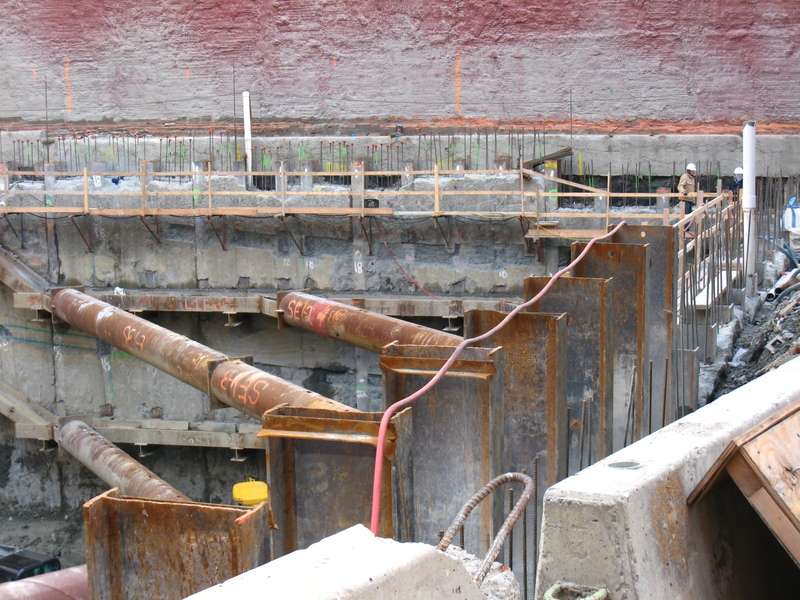
Wow, that is great. I am glad to see how quickly they moved and are moving on this project. This is gonna be done pretty fast, I think we will see steel going up in the next 3-5 months.

type001
Senior Member
- Joined
- Jun 29, 2006
- Messages
- 1,839
- Reaction score
- 395
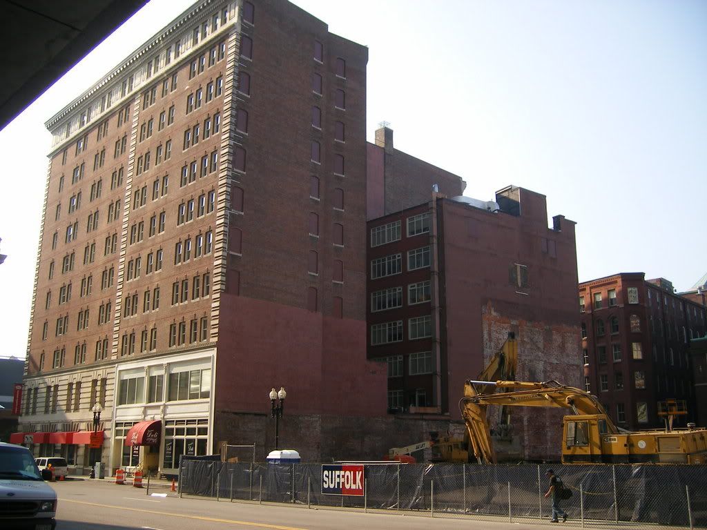
Nothing to tall. 20-25 stories, 250' or so. It would still transition nice, and be a little more dense to take advantage of it's location.
This is exactly what I was thinking. I wouldn't have wanted anything that rivaled 1 Fin. I thought a taper effect would have been ideal.
CZSZ said:I don't see the need. It looks like it transitions fairly nicely from the tower across the street to the fairly uniform-height brick buildings around it.
I think the building itself looks fantastic with the South neighborhood behind it. No arguments there. It's just that the neighborhood sort of just stops in the shadow of a 600ft beast. I think a 300-350ft building would have transitioned the neighborhood better. Then again, the Back Bay has always seemed to work with much more dramatic height distinctions.
Suffolk 83
Senior Member
- Joined
- Nov 14, 2007
- Messages
- 3,024
- Reaction score
- 2,512
"i wish i was a lil bit taller, i wish i was a baller, i wish i had a rabbit and a cat and i was 6 feet taller, i wish i had a girl i would call her."
...thats what this building is going to sing everyday for the rest of its life. those might be the wrong words its been a while.
...thats what this building is going to sing everyday for the rest of its life. those might be the wrong words its been a while.
tmac9wr
Senior Member
- Joined
- Jun 14, 2006
- Messages
- 1,446
- Reaction score
- 68
I really, really like this building. It's very simple, but it fits in with it's surroundings very well. I like that it has a little border going around the building that matches the roofline of its neighbor. It may not be perfect, but it's a great background building that blends in with its older neighbors and manages to have a fresh look of its own at the same time.
If only we could have density like this on the South Boston Waterfront.
statler
Senior Member
- Joined
- May 25, 2006
- Messages
- 7,944
- Reaction score
- 562
I disagree.
These half-ass attempts to bend in never seem to work.
Either make an effort to truly match your neighbor in scale and material or go all out and stand in contrast.
This thing looks like a jokey caricature of the building beside it.
These half-ass attempts to bend in never seem to work.
Either make an effort to truly match your neighbor in scale and material or go all out and stand in contrast.
This thing looks like a jokey caricature of the building beside it.
- Joined
- May 25, 2006
- Messages
- 7,064
- Reaction score
- 1,990
I have to agree with tmac9wr on this one. When I first say this rendering I went "damn that's handsome". This could easily be some shitty glass box or even worse just another prefab box. If you look at most of the buildings around there you will see that this is harmonious in scale and architectural vocabulary, but with a more modern take. Could it be better? Of course, but we shouldn't think that every building needs to be different. The reason I love the SBW is because of all those old Boston Warf Co. buildings and they are almost all identical (or they were when originally built.) If the new SBW had a couple of blocks worth of this caliber building then I think we would all be sleeping better at night.
It does a good job of picking up three salient horizontal lines from its neighbors. A simple thing like that can do wonders for the newcomer blending in, and it's surprisingly rare. No extra height is necessary; in fact, it would be even better without the top segment, or with a more significant setback.
justin
justin
Last edited: