TomOfBoston
Senior Member
- Joined
- Mar 29, 2007
- Messages
- 1,241
- Reaction score
- 465
Looking at that vacant Tremont Crossing site I just want to SCREAM!!!
 IMG_7180 by Bos Beeline, on Flickr
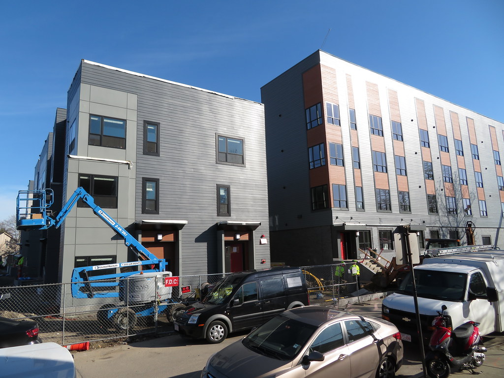 IMG_7183 by Bos Beeline, on Flickr
 IMG_7187 by Bos Beeline, on Flickr
 IMG_7190 by Bos Beeline, on Flickr
 IMG_7192 by Bos Beeline, on Flickr
 IMG_7196 by Bos Beeline, on Flickr
 IMG_7198 by Bos Beeline, on Flickr
 IMG_7202 by Bos Beeline, on Flickr
 IMG_7211 by Bos Beeline, on Flickr
I hundred percent agree. The suburban look of a lot of affordable housing gives it away for what it is, but I am not even sure this is a cost issue as much as a unfortunately legacy of garden city thinking and low expectations for design in affordable contexts. I think this project's design offers a lot more dignity to the residents in that it speaks the language of the rest of development happening in the city. Rather than reading distinctly as "affordable housing" it reads as "housing" which has been recently built and mindfully designed.It is like they finally got an architect that gets, "make it look urban, not suburban, and not cheap". Solid design.
I hundred percent agree. The suburban look of a lot of affordable housing gives it away for what it is, but I am not even sure this is a cost issue as much as a unfortunately legacy of garden city thinking and low expectations for design in affordable contexts. I think this project's design offers a lot more dignity to the residents in that it speaks the language of the rest of development happening in the city. Rather than reading distinctly as "affordable housing" it reads as "housing" which has been recently built and mindfully designed.
 IMG_0966 by Bos Beeline, on Flickr
 IMG_0968 by Bos Beeline, on Flickr
 IMG_0971 by Bos Beeline, on Flickr
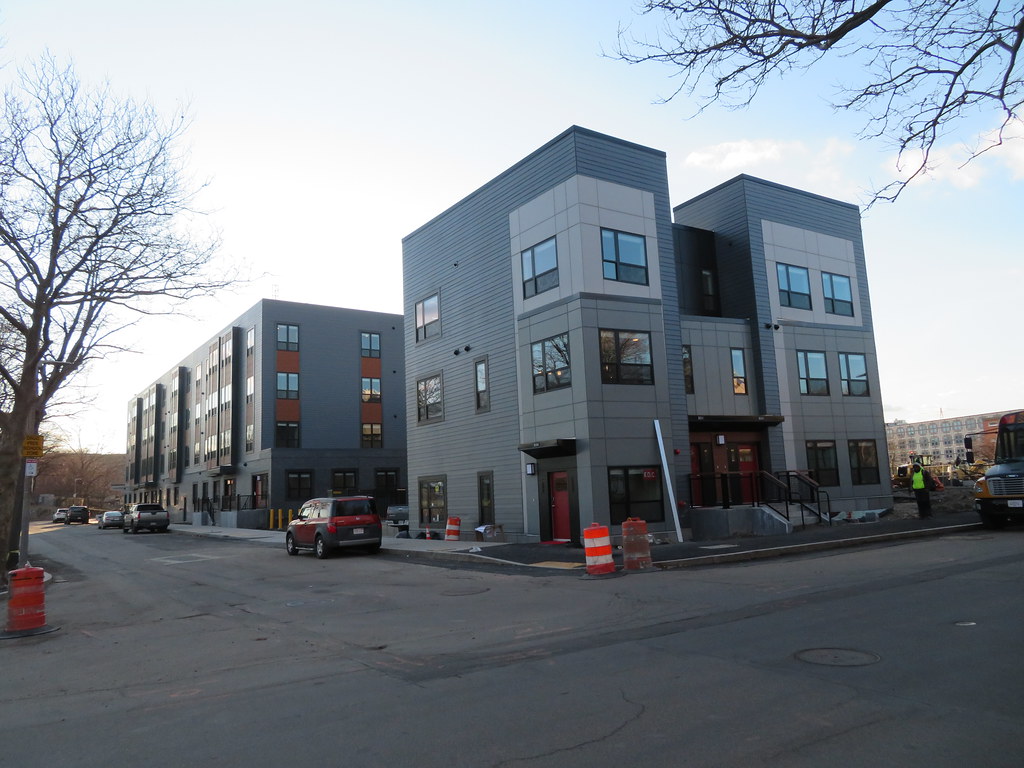 IMG_0972 by Bos Beeline, on Flickr
 IMG_0976 by Bos Beeline, on Flickr
 IMG_0979 by Bos Beeline, on Flickr
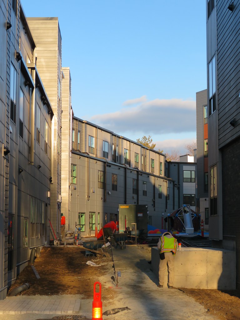 IMG_0984 by Bos Beeline, on Flickr
 IMG_0988 by Bos Beeline, on Flickr
 IMG_0989 by Bos Beeline, on Flickr
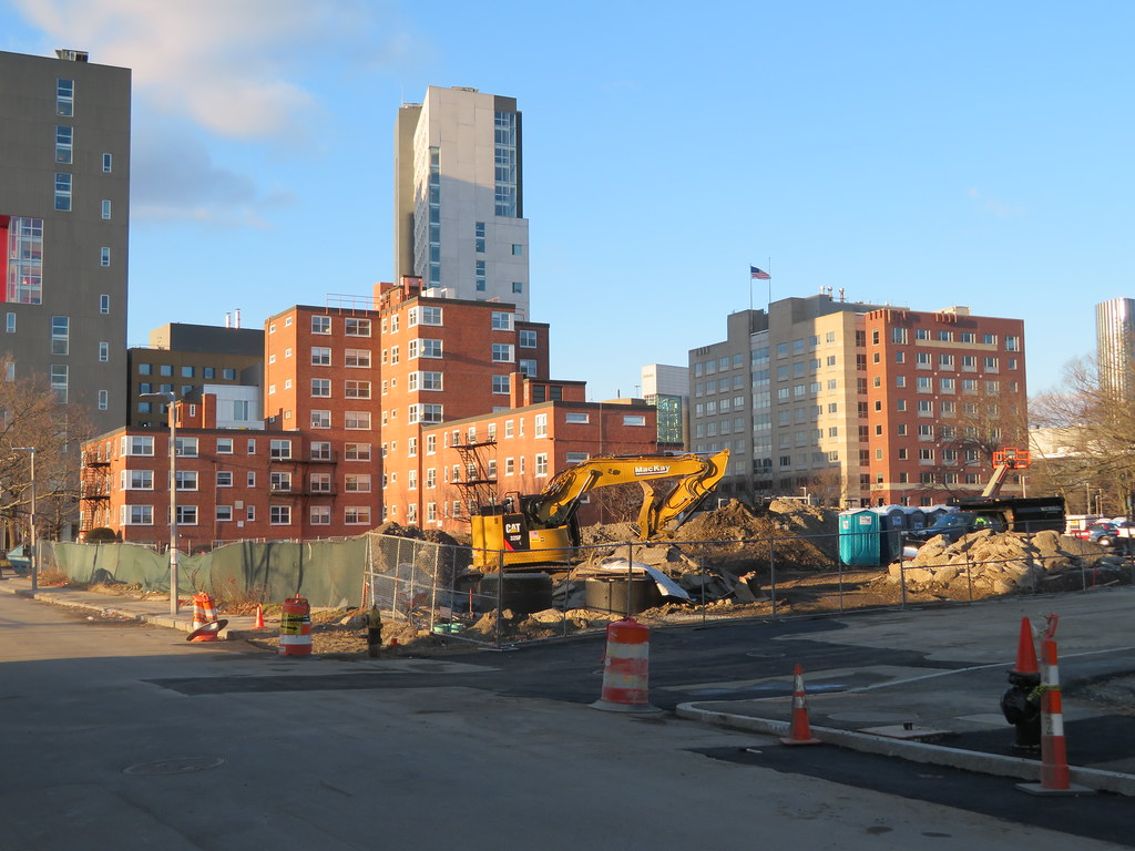 IMG_0986 by Bos Beeline, on Flickr
That's how Boston became known for triple deckers a century ago.Now copy, change colors, and paste these all over the neighborhoods on underdeveloped land.
 IMG_5853 by Bos Beeline, on Flickr
 IMG_5856 by Bos Beeline, on Flickr
 IMG_5858 by Bos Beeline, on Flickr
 IMG_5862 by Bos Beeline, on Flickr
 IMG_5860 by Bos Beeline, on Flickr
 IMG_5866 by Bos Beeline, on Flickr
 IMG_5867 by Bos Beeline, on Flickr
 IMG_5870 by Bos Beeline, on Flickr
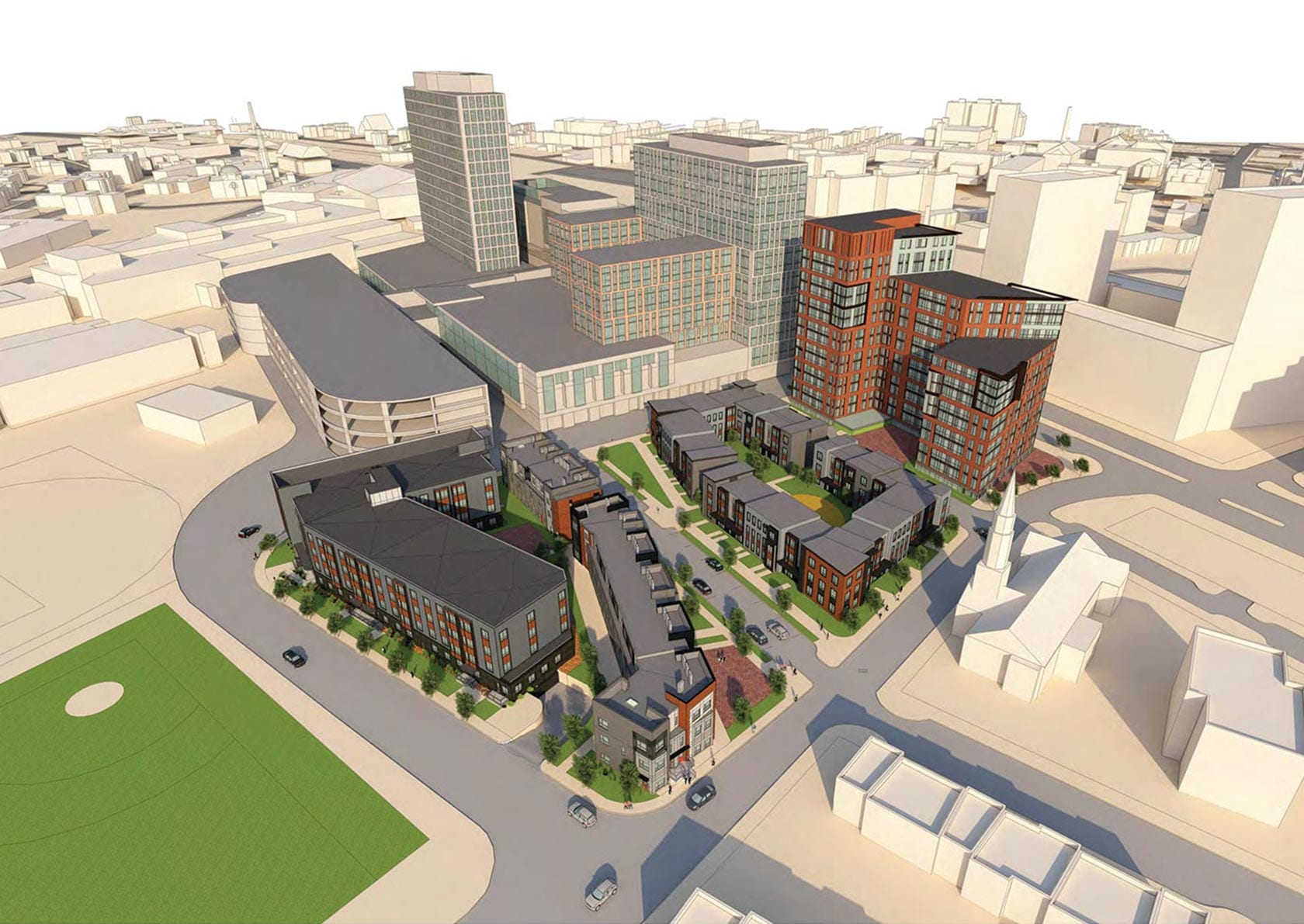
So phase 3 is the midrise on Tremont?Second phase is moving along quickly

So phase 3 is the midrise on Tremont?
