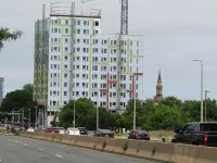
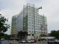
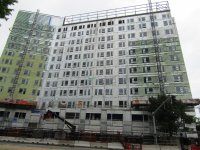
The proportions of the red squares looks absolutely horrendous for some reason. If all of that was removed and you just had the grey facade underneath it appears like it would have looked fine. It comes across like at the last second they remembered that in boston we have a mandatory unwritten staggered windows requirement so they slapped this red stencil over top of the facade and called it good. If they wanted to add color they should have just made a couple of the vertical facade lines red instead, that would have come across much better.


