Winthrop Center | 115 Winthrop Square | Financial District

Great points. If this was a normal proposal I think we all would have been happy with what was built, but the timeline of the project prevents it from being any better than mediocre. Even if the 1,000+ footer was never going to happen, some of the realistic proposals that followed were great and the original version of this particular proposal was still very good. The fact that it slowly degraded into what we see now is very frustrating and it never should have happened on a plot that was always hailed by the city as the site of a landmark tower.

Menino hailed it as a spot for a landmark tower. Walsh hailed it as a property the City could offload for a lot of money. Blame the City here as much as the developer.

Also, this is worlds better than a garage and every one of those proposals was going to get VE'd and rationalized as the boom ended. For all we know, MP was the only developer that would even have stuck with it to build anything. I'm dubious that Accordia, for example, would have produced anything other than a vacant lot.

Also, I think it's worth comparing what was built to what the other teams were proposing, lest we look through rose-colored glasses. Even as concepts, we had:


Accordia - The green version of what was built, frankly. Glass with some unique accents, likely to see VE later.
Lendlease - A veiny sex toy that was supposed to be anchored by WeWork, so there's that.
HYM - This was my favorite because of the site swap with the church, but they would have had to work out the site swap with the church. Also, we all know how good HYM has turned out to be at demolishing garages.
MP - Worth noting how much the Tower was VE'd in addition to the connector. The pleats were supposed to come all the way to the ground.
Trans National - Not a serious developer, and the proposal was for two filler towers that would have been essentially invisible.
Trinity - Awful TAT design, interesting concepts for affordable residential use that probably would have doomed the project as they went around asking for handouts.

And bear in mind that the height reduction from 725' would have happened for each of these, though MP had started higher at 750. As would the shadow fight. Would other developers have persevered? MP now has a track record of building over 600' at sites in the Financial District. MT was a huge surprise when they proposed it for more than 400' and they delivered. WST exists. That's something. Tall buildings are hard.
 
Last edited:
Menino hailed it as a spot for a landmark tower. Walsh hailed it as a property the City could offload for a lot of money. Blame the City here as much as the developer.

Also, this is worlds better than a garage and every one of those proposals was going to get VE'd and rationalized as the boom ended. For all we know, MP was the only developer that would even have stuck with it to build anything. I'm dubious that Accordia, for example, would have produced anything other than a vacant lot.

Also, I think it's worth comparing what was built to what the other teams were proposing, lest we look through rose-colored glasses. Even as concepts, we had:


Accordia - The green version of what was built, frankly. Glass with some unique accents, likely to see VE later.
Lendlease - A veiny sex toy that was supposed to be anchored by WeWork, so there's that.
HYM - This was my favorite because of the site swap with the church, but they would have had to work out the site swap with the church. Also, we all know how good HYM has turned out to be at demolishing garages.
MP - Worth noting how much the Tower was VE'd in addition to the connector. The pleats were supposed to come all the way to the ground.
Trans National - Not a serious developer, and the proposal was for two filler towers that would have been essentially invisible.
Trinity - Awful TAT design, interesting concepts for affordable residential use that probably would have doomed the project as they went around asking for handouts.

And bear in mind that the height reduction from 725' would have happened for each of these, though MP had started higher at 750. As would the shadow fight. Would other developers have persevered? MP now has a track record of building over 600' at sites in the Financial District. MT was a huge surprise when they proposed it for more than 400' and they delivered. WST exists. That's something. Tall buildings are hard.

I get what you are saying. I don't even mind the height reduction, lack of observation floor, or non-lit crown. It's the STREET experience that disappoints me. The first "Great Hall" concept drawings looked a bit like BCE place in Toronto with a cathedral-like architecture. It was a place you might want to explore, and it could have been a true Financial District "destination." Now, we basically get a glorified corporate lobby. That's what I'm most upset about. When Millenium Partners axed the observation requirement that was required within the proposal, they heavily sold us on the "Great Hall" concept instead. That's the BIGGEST bait and switch in my opinion.
 
Accordia is the one I wish had happened (though I appreciated aspects of Lendlease's "sex toy," as you put it). Honestly, of all the proposals Millenium's was the most boring and so here we are. A rectlinear, reflective glass box with no distinguishing features or public amenities.

But yeah: better than a falling-down garage.

I get that "tall buildings are hard," but seems kinda weak to just settle for "Well, it's an improvement over a condemned garage." Tall buildings are "hard" everywhere. How is it that other major cities manage to put up more than a few vaguely interesting ones, but we have to be content with this shit?

Thank goodness for One Congress.
 
Accordia is the one I wish had happened....

I do wonder if it still would have looked as good with the extra 30' forced to be lopped off. Instead, what I wish is that Accordia would build a similar, FULL HEIGHT version of this at the Hurley site. I don't know why more people aren't pushing for something like that. There's a higher FAA allowance there, and it's already a substantially more difficult site that it should be amenable to a project of this caliber. Instead they basically want to give us another McCormack and Saltonstall building where there could be something great.
 
Menino hailed it as a spot for a landmark tower. Walsh hailed it as a property the City could offload for a lot of money. Blame the City here as much as the developer.

I will raise my hand and say I didn't realize Walsh had pivoted so strongly vs Menino. Though to be honest, I was blaming the city more than the developer in this case haha. Regardless of who's to blame, I'm still a bit bummed.

Also, this is worlds better than a garage

Absolutely...that's why I prefaced my previous post with the idea that if this were just some proposal downtown, we'd all be happy with what we have here. It's not a terrible tower, it's just disappointing relative to the hype. I guess part of that is on me and others who didn't temper expectations, but I'm still disappointed nonetheless.

However I disagree with the idea that Accordia was just a green version of what we got (Accordia). Yeah any of the proposals would have been VE'd, shortened, etc. so who knows what would have happened, but I'll always think of 'what could have been' when I see this tower.
 
"Accordia’s strategy for siting and massing the tower is focused on respect. The design shows respect for the historic Winthrop Square scale by not overwhelming it, and honors the direct abutters with setbacks to provide light and air, instead of building against their walls."

Exactly.
 
"Accordia’s strategy for siting and massing the tower is focused on respect. The design shows respect for the historic Winthrop Square scale by not overwhelming it, and honors the direct abutters with setbacks to provide light and air, instead of building against their walls."

Exactly.
I just want to remind people that all of the initial proposals were fatally flawed, and could not actually be built. They all ignore the huge elevation difference between Devonshire and Federal Streets (you can see that is totally missing in the cross-section in 9. in the Accordia doc). There was never going to be a flat, open, level, grand passage through the building. The conceptual designers were all working with incomplete site information.
 
Got a chance to tour the building recently and have a few thoughts.

First, the views are spectacular, especially west towards back bay and east to the harbor if you’re above the BoA building. Towards back bay there are no obstructions on any residential floor, so I imagine that will be a popular exposure.

The amenity spaces will be world class and are absolutely massive. They’re spread over two floors, 3 and 35. The latter is the highest floor of the full footprint and uses the roof of the office section as an outdoor amenity. Tons of offerings and beautiful finishes throughout, and things that I couldn’t imagine using like a rock wall, sports simulator, and a room that’s designed to block electromagnetic frequencies (why?!). There’s also residential coworking space for those who want to work from “home”.

The great hall will be fine but it’s not grand or cathedral-esque. It will be a very nice corporate lobby with several food and beverage offerings open to the public. I imagine they’ll do a killing during the lunch rush once it’s at full capacity.

First residential closings are in April, but amenities and food/beverage will be later in the year. It’s all coming along nicely but there’s still a ton to do over the next few months. Of all the places I saw, none were close to finished (cabinets ongoing, no hardware installed, but floor tiles and drywall were setting).

The street activation actually seems like it will be better than I anticipated. The opening up of Winthrop Square “park” and Devonshire going through the block will connect the building to both the DTX/Summer side and the finance/Franklin side. If I were truly in the market for a $2-3M place I’d give it a hard look. From what I saw it was very high quality throughout, although some lower floors do suffer from the office canyon effect.

E43934D4-4CC4-4D50-9C11-4E542A202543.jpeg
FA4DA4B8-093B-4312-98D2-F0621877318B.jpeg
E6906F34-FACE-4681-A071-E867E61188CE.jpeg
6CE63308-1DD2-441C-A66B-5A05C133D99B.jpeg
67F3F16F-B023-4D21-AAE5-643136023A1A.jpeg
 
Got a chance to tour the building recently and have a few thoughts.

First, the views are spectacular, especially west towards back bay and east to the harbor if you’re above the BoA building. Towards back bay there are no obstructions on any residential floor, so I imagine that will be a popular exposure.

The amenity spaces will be world class and are absolutely massive. They’re spread over two floors, 3 and 35. The latter is the highest floor of the full footprint and uses the roof of the office section as an outdoor amenity. Tons of offerings and beautiful finishes throughout, and things that I couldn’t imagine using like a rock wall, sports simulator, and a room that’s designed to block electromagnetic frequencies (why?!). There’s also residential coworking space for those who want to work from “home”.

The great hall will be fine but it’s not grand or cathedral-esque. It will be a very nice corporate lobby with several food and beverage offerings open to the public. I imagine they’ll do a killing during the lunch rush once it’s at full capacity.

First residential closings are in April, but amenities and food/beverage will be later in the year. It’s all coming along nicely but there’s still a ton to do over the next few months. Of all the places I saw, none were close to finished (cabinets ongoing, no hardware installed, but floor tiles and drywall were setting).

The street activation actually seems like it will be better than I anticipated. The opening up of Winthrop Square “park” and Devonshire going through the block will connect the building to both the DTX/Summer side and the finance/Franklin side. If I were truly in the market for a $2-3M place I’d give it a hard look. From what I saw it was very high quality throughout, although some lower floors do suffer from the office canyon effect.

View attachment 34446View attachment 34447View attachment 34448View attachment 34449View attachment 34450

That view of the airport would be bonkers when Logan is doing departures on 27. The planes would look like they're coming right for you every time.

Gives a bit of an illustration as to why FAA height limits exist.
 
Absolutely. You can barely see it in the pic but on the far right there’s a wide body coming in from Europe (33L?) and even from that direction it feels like you’re right on top of the action. Can also glimpse the harbor and see the ships coming and going.
 
Agreed. I couldn't quite capture it with my phone (I think you'd need a zoom lens to do the framing right), but it looked pretty neat in the evening light Sunday as I looked east along Boylston from Copley-ish.

Here's a flavor of the view from the Public Garden:

PXL_20230218_222312062.jpg


The subtly different angles on the condo part of the tower gives it a striped effect that feels unique in a skyline that's either gridded or horizontally striped, and the faceting on the upper stories/mech penthouse are especially noticeable as the sun sets, making for a noticable (if not especially adventurous) contrast to the body of the tower. Too bad they didn't emphasize that faceting just a bit more.
 
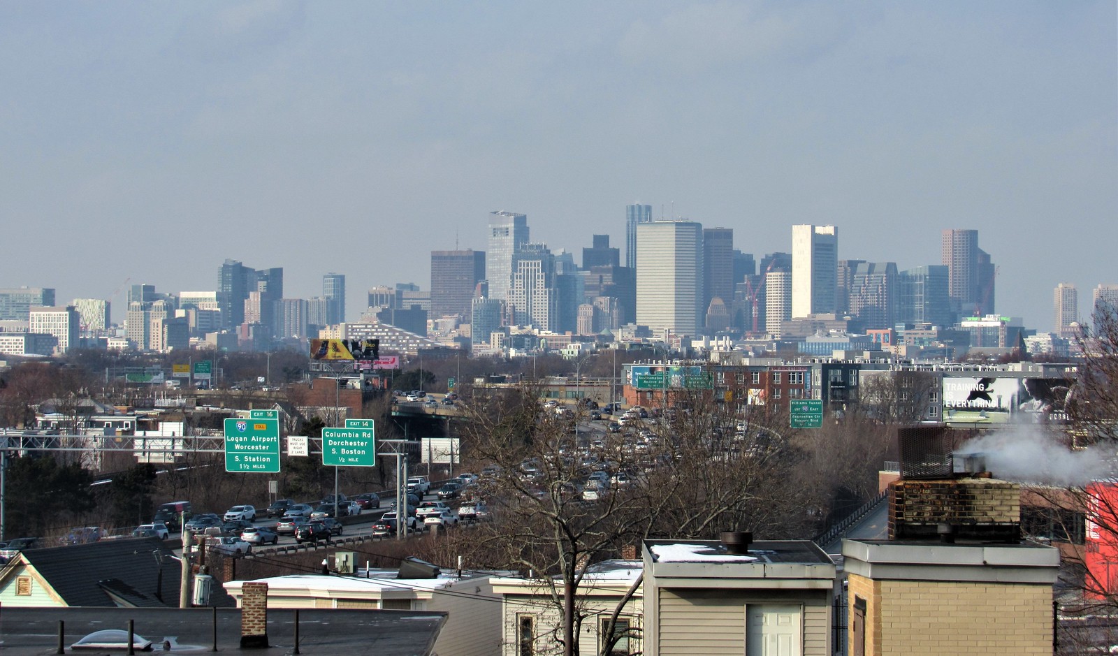
2/26 From Savin Hill

Excellent photos of the skyline. It still really bothers me that Millennium Tower has that open roof on the South side to show all the mechanicals. The photos show Winthrop clearly taller than Millennium. It will be interesting to see South Station Tower from this vantage point in a few years.
 
Something strange about the wording. It's not going to be certified by the sound of it, just "use passive house design." Also, if I recall correctly, only the office is passive (or the other way around).
 

Back
Top