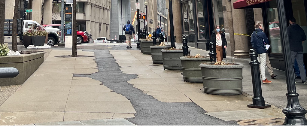
Why do they do this? Dig up a pedestrian walkway to do utility work I am assuming, and then leave it looking like this? The seams between the concrete and asphalt will lead to further cracks and damage to the walkway.
You are using an out of date browser. It may not display this or other websites correctly.
You should upgrade or use an alternative browser.
You should upgrade or use an alternative browser.
Winthrop Center | 115 Winthrop Square | Financial District
- Thread starter vanshnookenraggen
- Start date
awood91
Active Member
- Joined
- Jun 7, 2006
- Messages
- 507
- Reaction score
- 594
Passive House, developed in Germany, is an international set of standards widely regarded as the most advanced sustainability building code in the world.Something strange about the wording. It's not going to be certified by the sound of it, just "use passive house design." Also, if I recall correctly, only the office is passive (or the other way around).
Building Certification PHI
 passivehouse.com
Dr. Rosen Rosen
Senior Member
- Joined
- Jul 19, 2021
- Messages
- 1,197
- Reaction score
- 7,023
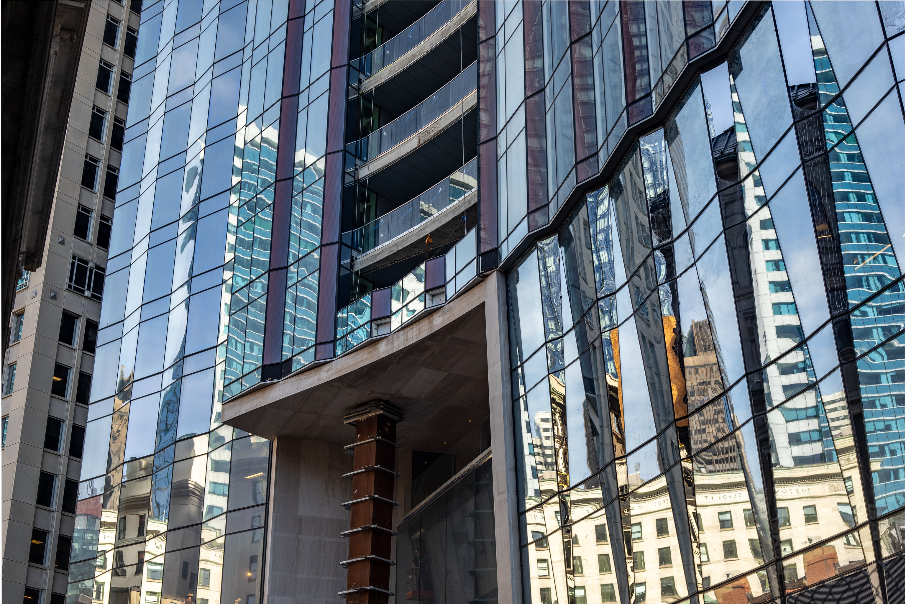
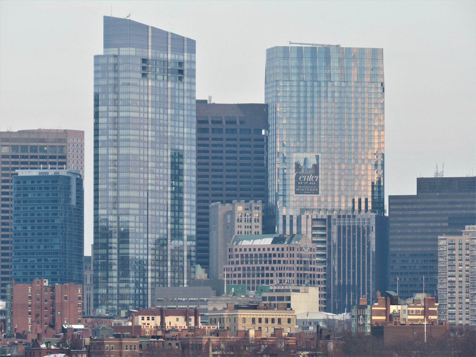
Notice in the first couple pics the fine vertical stripe pattern within the narrow glass. It really catches the surrounding colors.
Also, if there was ever a hidden-in-plain-sight CIA training center a la Jason Bourne, the red and pink foreground building would be it! Seriously what is that place??
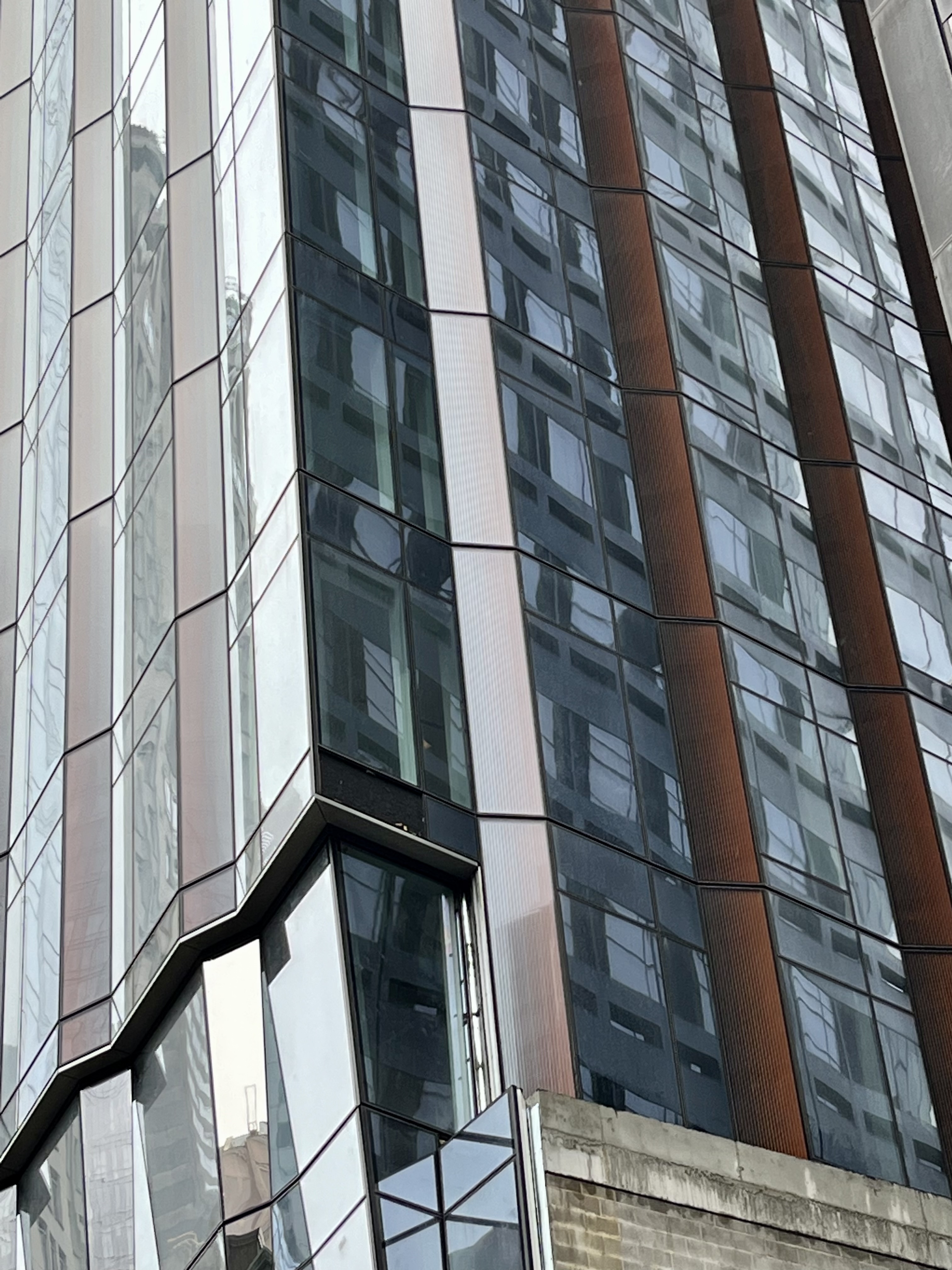
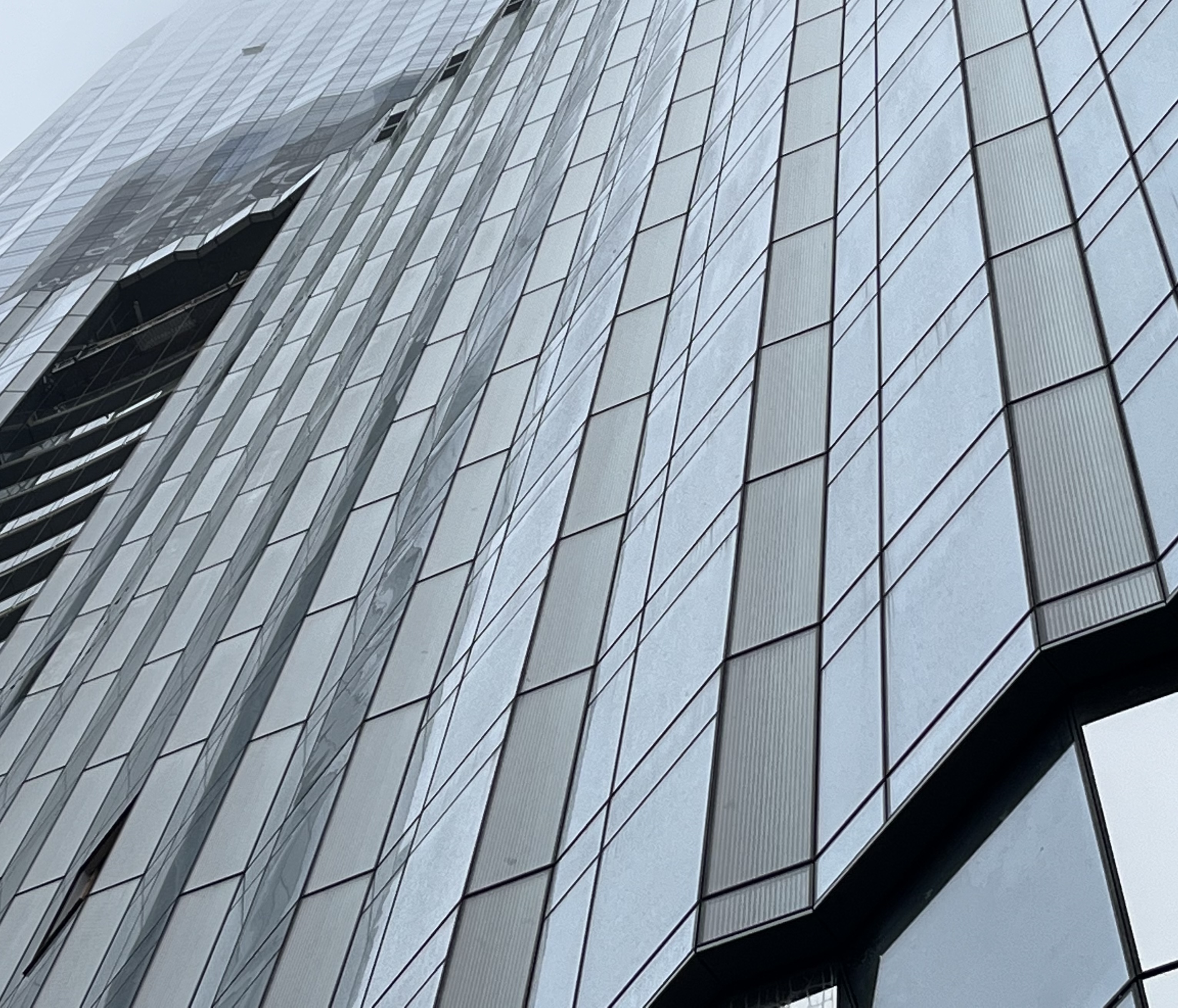
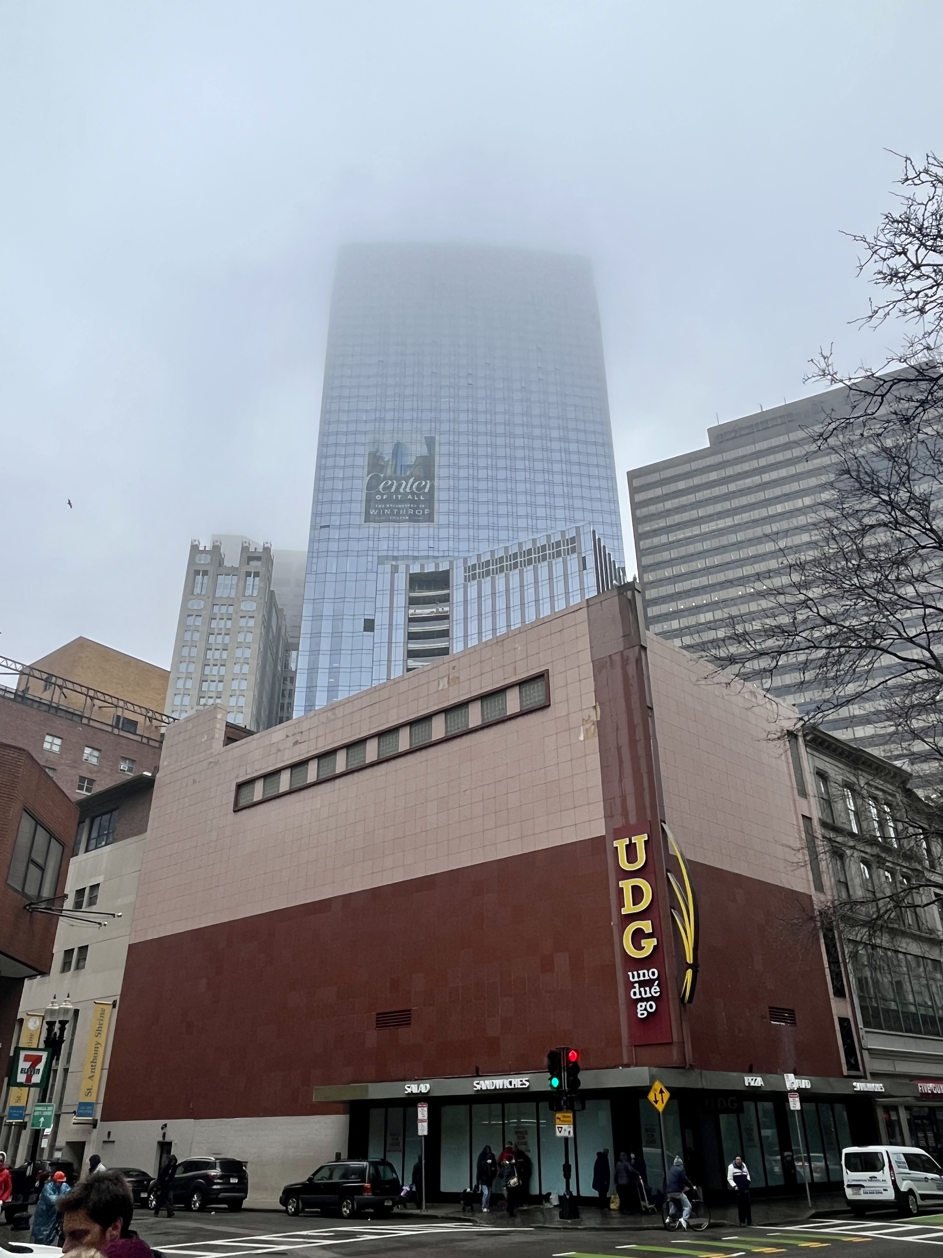
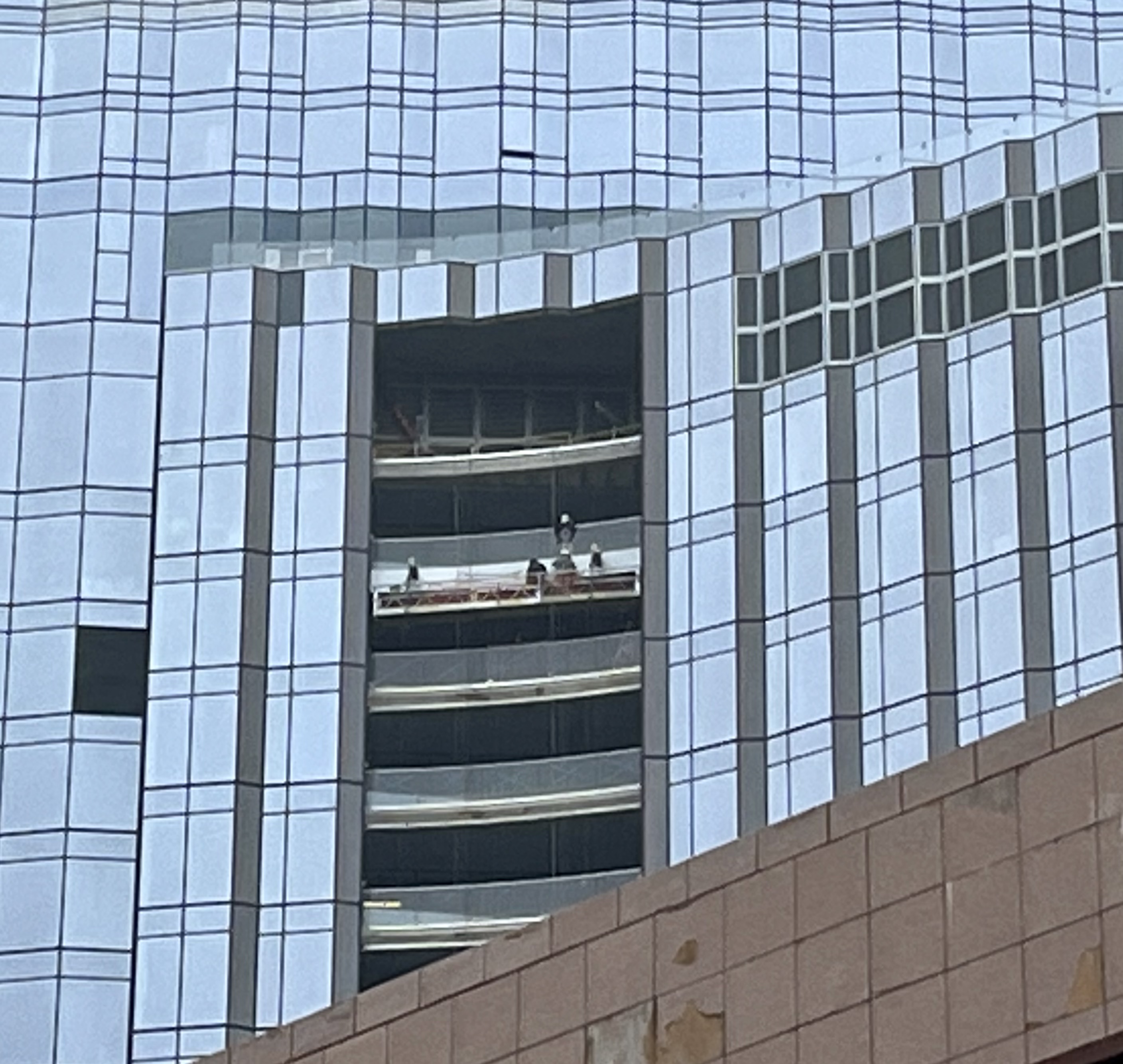
Also, if there was ever a hidden-in-plain-sight CIA training center a la Jason Bourne, the red and pink foreground building would be it! Seriously what is that place??
Also, if there was ever a hidden-in-plain-sight CIA training center a la Jason Bourne, the red and pink foreground building would be it! Seriously what is that place??
Bro, do you even bench? Clearly not--or at least, not in DTX, otherwise you'd be seeing all the hulking specimens that comprise Emerson College's legendary football powerhouse going in there constantly to get diesel.
(In all seriousness, there's a very large and conspicuous "EMERSON" decal stenciled on the Arch Street doorway. From there it was just a matter of Googling "Emerson" and "Arch" together. Very first hit.)
TomOfBoston
Senior Member
- Joined
- Mar 29, 2007
- Messages
- 1,268
- Reaction score
- 507
Actually, the presence of a restaurant and a college fitness center in the building does not preclude there being a CIA ops center in the building.Bro, do you even bench? Clearly not--or at least, not in DTX, otherwise you'd be seeing all the hulking specimens that comprise Emerson College's legendary football powerhouse going in there constantly to get diesel.
(In all seriousness, there's a very large and conspicuous "EMERSON" decal stenciled on the Arch Street doorway. From there it was just a matter of Googling "Emerson" and "Arch" together. Very first hit.)
The UDG on the first floor used to be a CVS. The ugly facade is now crumbling. A perfect cover!
Doesn’t Druker own it?Actually, the presence of a restaurant and a college fitness center in the building does not preclude there being a CIA ops center in the building.
The UDG on the first floor used to be a CVS. The ugly facade is now crumbling. A perfect cover!
stick n move
Superstar
- Joined
- Oct 14, 2009
- Messages
- 13,361
- Reaction score
- 23,942
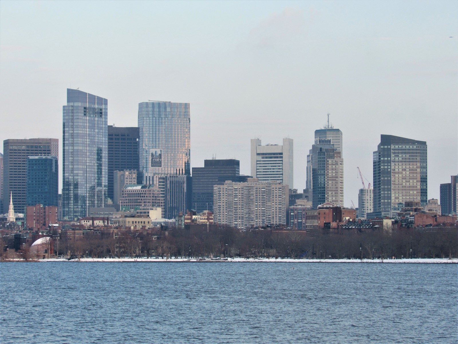
The fact that its taller than millennium tower kind of ruins for me the way it appears in the skyline, because your brain expects it to be the defining tower of downtown, but its not. In reality MT is a perfectly appropriate tower to be downtowns centerpiece and it looks great, I just have to get over its height on paper and accept that it is still the centerpiece of downtown and theres nothing wrong with that.
Youre average person who looks at the skyline will just see MT as the crown of downtown without any preconceived notions about what “should” be the tallest, and see it for what it is in practice. My brain just has to get over this fact and then instead of subtle disappointment with the final result I can just be happy with some great new additions and with MT as the centerpiece of the downtown cluster (from most angles).
Youre average person who looks at the skyline will just see MT as the crown of downtown without any preconceived notions about what “should” be the tallest, and see it for what it is in practice. My brain just has to get over this fact and then instead of subtle disappointment with the final result I can just be happy with some great new additions and with MT as the centerpiece of the downtown cluster (from most angles).
BosDevelop
Senior Member
- Joined
- Jul 25, 2006
- Messages
- 1,533
- Reaction score
- 396
The glass looks almost purpleish in the second pic in the last set. Very cool.
Patrick Winn
Active Member
- Joined
- Aug 19, 2020
- Messages
- 264
- Reaction score
- 523
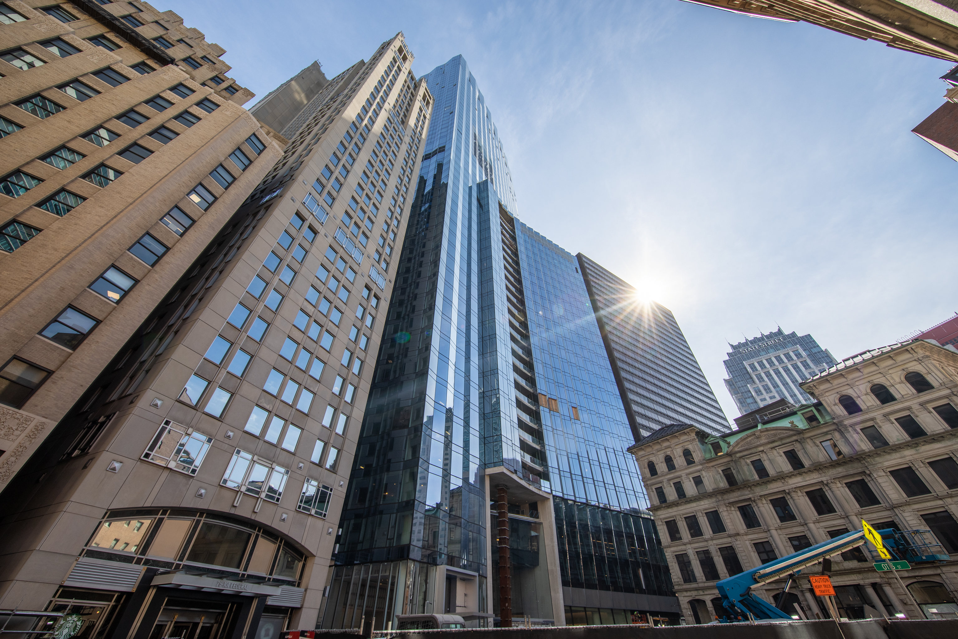
This building is epic in the skyline approaching from the south on 93N. it's the skinny side, those vertical lines are prominent, and it's substantially bigger than the surrounding towers. sweet-ass-sweet. I also think due to proximity and perspective, the South Station Tower will absolutely loom on the 93N approach.
FormFollowsBudget
Senior Member
- Joined
- Jan 15, 2015
- Messages
- 2,309
- Reaction score
- 4,100
Life Coach Mike
Active Member
- Joined
- Aug 26, 2019
- Messages
- 322
- Reaction score
- 486
For decades it was the Bond Shoe Store, a familiar sight near Jordan Marsh.Bro, do you even bench? Clearly not--or at least, not in DTX, otherwise you'd be seeing all the hulking specimens that comprise Emerson College's legendary football powerhouse going in there constantly to get diesel.
(In all seriousness, there's a very large and conspicuous "EMERSON" decal stenciled on the Arch Street doorway. From there it was just a matter of Googling "Emerson" and "Arch" together. Very first hit.)
Nibbles O’Plenty
Active Member
- Joined
- Aug 24, 2020
- Messages
- 213
- Reaction score
- 738
I bought a few leisure suits at Bond’s back in the 70’s!For decades it was the Bond Shoe Store, a familiar sight near Jordan Marsh.
I don’t get it. I admit that I’m as fallible as the next guy. My taste is just that – my taste. There’s no accounting for it… mine or yours…
But this is our city. And some choices, as we all know, last for decades.
To my eye, this is a fat generic box. Look at it. Design questions wrestled and answered? Really? Seems more like money questions wrestled and answered. It’s do-re-mi at stake here, my friend, I’m afraid, not quality design or, God forbid, the public realm. To my eye.
Creases in glass. That makes it, what, more Boston-like? More distinctive? This building would be equally undistinguished, I believe, in any city in the world no matter the setting. Most cities, yes, would shrug their shoulders, uncaring, grateful for the taxes. Most cities dream of having our assets, our history, our walkability, our brand. They don’t. We’re Boston. We’re different. Unfortunately, a little less so now.
And MP’s not done. They clear-cut an urban parklet – yes, one fraught with modern-day urban ills, no argument – to refashion it. I’m not optimistic. (Will they build what they proposed? One might ask.)
I know many agree there were other worthy proposals. Were they more representative of Boston? Who’s to say? They were certainly more adventurous. This one won, one assumes, because of the exorbitant fee MP offered to pay the city, and the dramatic public space it proposed for the lobby. The fee has since been reduced and the public realm substantially altered. Some might call that bait-and-switch.
MP is in business to make money. No finger-pointing. Understood. The city needs this kind of business. But I don’t think MP really cares much about Boston. I know some among us admire Millennium Tower; personally, I hope they never get to build in our city again.
What is slowly getting nibbled away - what makes Boston truly Boston - cannot be reclaimed when lost.
Is this better than what was once there, a public garage? That’s the wrong question. The better question: Was this the best we could do? I say, no.
I don't mean to beat a dead horse and won't ask anymore, but is it now a given there will be no lighting at the top of this tower? I mean...exterior construction has been mostly complete for a while now. And NO lighting at the top at night. Nothing. Is this it?
Disappointed? Very.
Am I shocked? No, not in Boston.
Disappointed? Very.
Am I shocked? No, not in Boston.
What is slowly getting nibbled away - what makes Boston truly Boston - cannot be reclaimed when lost.
Is this better than what was once there, a public garage? That’s the wrong question. The better question: Was this the best we could do? I say, no.
I'm not one to defend Winthrop Center, but, this is pretty contradictory. Could this have been better? Yes, of course. Was the condemed concrete parking garage something that made Boston truly Boston that it replaced? Really? If anything that garage was the thing that slowly chipped away at what makes Boston, Boston and was long already lost before this building came along.

 IMG_0680
 IMG_0682
 IMG_0695
 IMG_0707
 IMG_0718
 IMG_0741
 IMG_0762
 IMG_0776
 IMG_0780
