Equilibria
Senior Member
- Joined
- May 6, 2007
- Messages
- 7,079
- Reaction score
- 8,302
I think it's just a lunch counter. Paid with Toast.What's the coffee place in the Connector? .....Starbucks, Blue Bottle, Peets, etc?
I think it's just a lunch counter. Paid with Toast.What's the coffee place in the Connector? .....Starbucks, Blue Bottle, Peets, etc?
You may not be saying this tower sucks, but that doesn’t change the fact that this tower sucks.
As the saying goes, opinions are like _________ -- everyone's got one. I agree with a lot of your points, but the only aspect in which I deem this fat, rectilinear, almost aggressively UNcreative "tower" ahead of MT is the night lighting. MT's roof (lack of) bothers me and always will and I think both it and 1 Dalton missed huge opportunities to enhance the overall skyline by opting for *zero* crown lighting (Hey, at least MT didn't promise such an element, only to fail in delivery), but Winthrop is so. fucking. boring. "Hey, look -- a glass filing cabinet! Neat-o!" Boston should have demanded better. At least, given its placement, WT is largely anonymous except from the East.I'd slot this ahead of Millennium Tower from a visual standpoint. Getting past the disappointment of this being under 700', and the excitement of MT's major height gain across iterations, there's 3 reasons I put this ahead:
1. Nothing visually catastrophic here. If covid hadn't happened and we had that fat bulge in the back I'd be singing a different tune, but there is nothing approaching the grossness of Millennium Tower's open roof.
2. Better consistency from all viewpoints. Besides the brutal open roof from the South, MT also looks quite awkward from the East across the harbor. To be fair, the view of MT from the river (during the DAY) is better than any singular look from Winthrop.
3. It has an actual night presence. Although understated, that line of lights delineates Boston's new raised ceiling on its downtown, and is visible at night from virtually everywhere. I can't help but smile every time I see those lights piercing through the darkness. On the other hand, I can barely place MT at all once the sun goes down.
It's extremely close, to the point where if MT solved either #1 by enclosing the roof, or #3 by adding lighting, it might be enough for me to switch their positions. If MT addressed both it would be the clear winner.
Great post! I agree 100 percent. The open roof on MT bothers me, but I'm always driving up from the South Shore, and that's where you see it the most. I will say that MT has good street activation and retail if you include the Filene's building next door plus the outside steps or amphitheater or whatever they call it.I'd slot this ahead of Millennium Tower from a visual standpoint. Getting past the disappointment of this being under 700', and the excitement of MT's major height gain across iterations, there's 3 reasons I put this ahead:
1. Nothing visually catastrophic here. If covid hadn't happened and we had that fat bulge in the back I'd be singing a different tune, but there is nothing approaching the grossness of Millennium Tower's open roof.
2. Better consistency from all viewpoints. Besides the brutal open roof from the South, MT also looks quite awkward from the East across the harbor. To be fair, the view of MT from the river (during the DAY) is better than any singular look from Winthrop.
3. It has an actual night presence. Although understated, that line of lights delineates Boston's new raised ceiling on its downtown, and is visible at night from virtually everywhere. I can't help but smile every time I see those lights piercing through the darkness. On the other hand, I can barely place MT at all once the sun goes down.
It's extremely close, to the point where if MT solved either #1 by enclosing the roof, or #3 by adding lighting, it might be enough for me to switch their positions. If MT addressed both it would be the clear winner.
 IMG_0349 by David Z, on Flickr
 IMG_0353 by David Z, on Flickr
 IMG_0393 by David Z, on Flickr
 IMG_0798 by David Z, on Flickr
 IMG_0828 by David Z, on Flickr
 IMG_0839 by David Z, on Flickr
 IMG_0841 by David Z, on Flickr
 IMG_0936 by David Z, on Flickr
 IMG_0300 by David Z, on Flickr
 IMG_0355 by David Z, on Flickr
 IMG_0360 by David Z, on Flickr
 IMG_0406 by David Z, on Flickr
 IMG_0713 by David Z, on Flickr
 IMG_0741 by David Z, on Flickr
 IMG_0751 by David Z, on Flickr
 IMG_0752 by David Z, on Flickr
 IMG_0791 by David Z, on Flickr
 IMG_0830 by David Z, on Flickr
 IMG_0848 by David Z, on Flickr
 IMG_0872 by David Z, on Flickr
 IMG_0931 by David Z, on Flickr
 IMG_0938 by David Z, on Flickr
 IMG_0939 by David Z, on Flickr
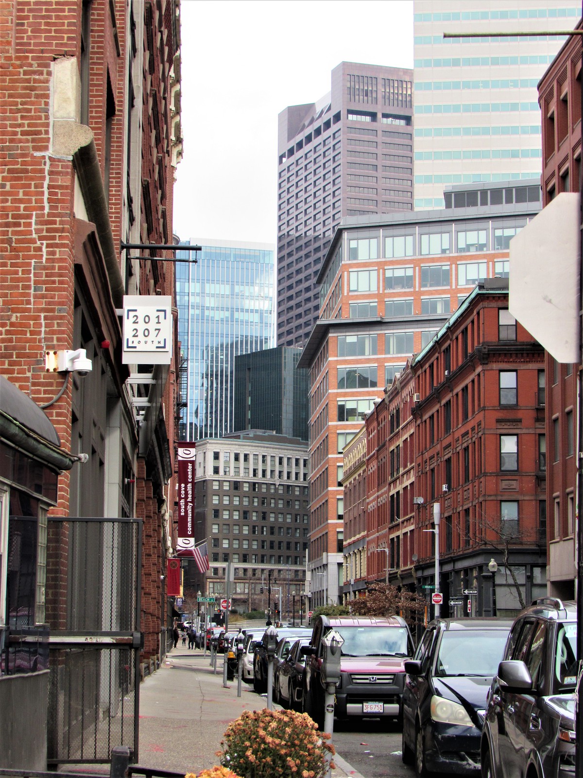
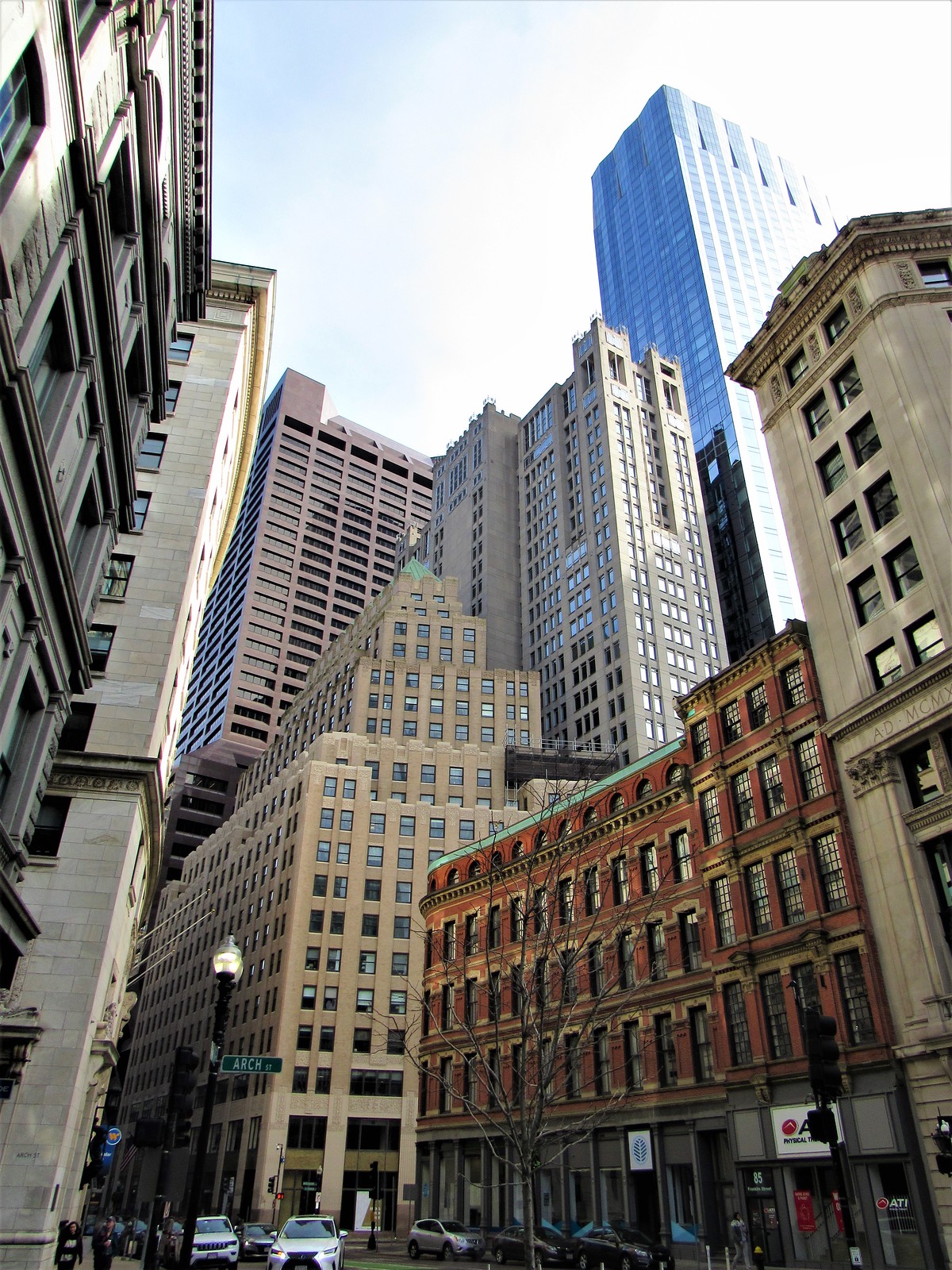
Love the emphasis on the old vs new in these shots. The best part about this and most other large buildings going up is that theyre replacing dilapidated garages or empty lots vs knocking down existing buildings like these. Its great seeing the empty lots slowly becoming less and less prevalent.
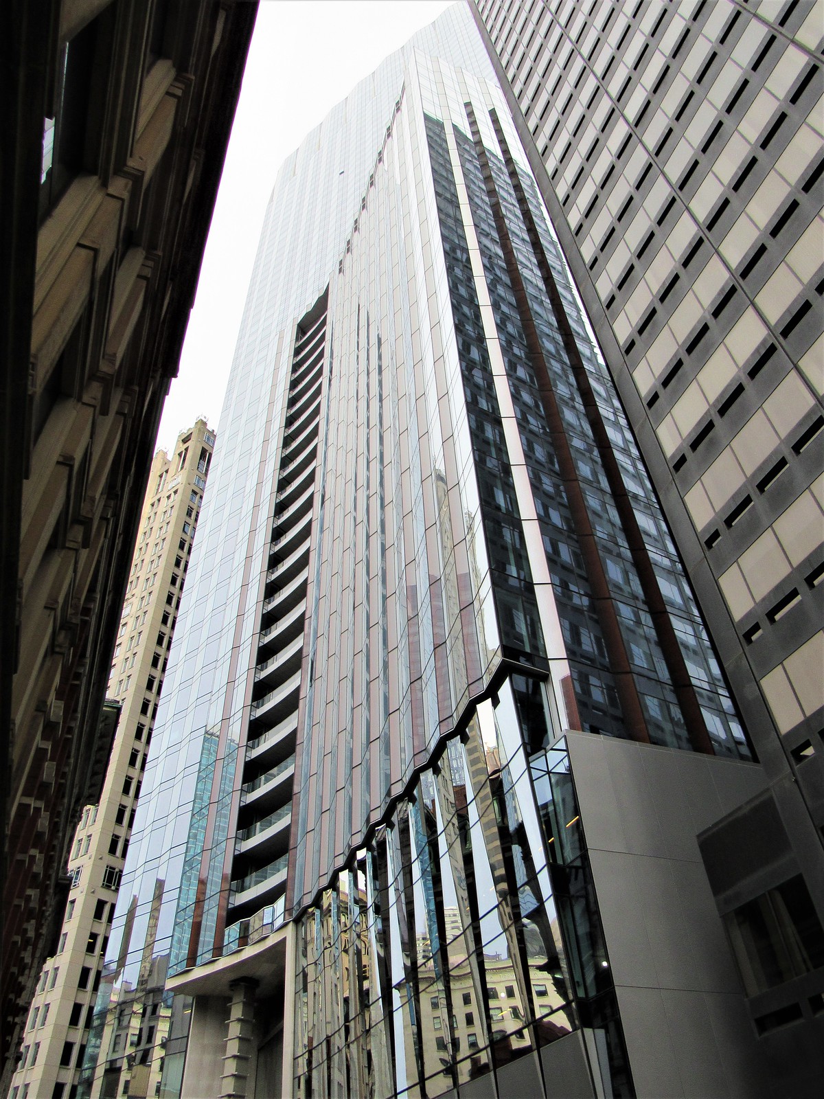
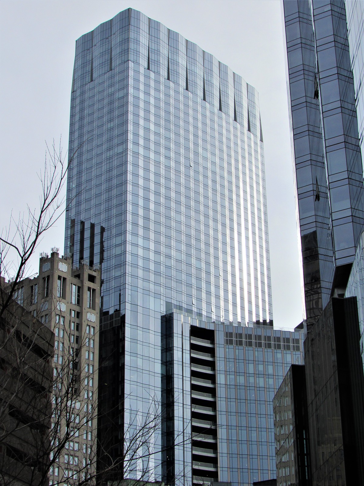
It's a good looking skyscraper, but certainly NOT the iconic design that Menino intended for this location.
