Winthrop Center | 115 Winthrop Square | Financial District

You may not be saying this tower sucks, but that doesn’t change the fact that this tower sucks.

I'd slot this ahead of Millennium Tower from a visual standpoint. Getting past the disappointment of this being under 700', and the excitement of MT's major height gain across iterations, there's 3 reasons I put this ahead:

1. Nothing visually catastrophic here. If covid hadn't happened and we had that fat bulge in the back I'd be singing a different tune, but there is nothing approaching the grossness of Millennium Tower's open roof.
2. Better consistency from all viewpoints. Besides the brutal open roof from the South, MT also looks quite awkward from the East across the harbor. To be fair, the view of MT from the river (during the DAY) is better than any singular look from Winthrop.
3. It has an actual night presence. Although understated, that line of lights delineates Boston's new raised ceiling on its downtown, and is visible at night from virtually everywhere. I can't help but smile every time I see those lights piercing through the darkness. On the other hand, I can barely place MT at all once the sun goes down.

It's extremely close, to the point where if MT solved either #1 by enclosing the roof, or #3 by adding lighting, it might be enough for me to switch their positions. If MT addressed both it would be the clear winner.
 
Every time I’m reminded of the massive bulge in the back of the tower that was proposed then removed at the last second I breathe a sigh of relief that this did indeed happen. Thank god!
 
I'd slot this ahead of Millennium Tower from a visual standpoint. Getting past the disappointment of this being under 700', and the excitement of MT's major height gain across iterations, there's 3 reasons I put this ahead:

1. Nothing visually catastrophic here. If covid hadn't happened and we had that fat bulge in the back I'd be singing a different tune, but there is nothing approaching the grossness of Millennium Tower's open roof.
2. Better consistency from all viewpoints. Besides the brutal open roof from the South, MT also looks quite awkward from the East across the harbor. To be fair, the view of MT from the river (during the DAY) is better than any singular look from Winthrop.
3. It has an actual night presence. Although understated, that line of lights delineates Boston's new raised ceiling on its downtown, and is visible at night from virtually everywhere. I can't help but smile every time I see those lights piercing through the darkness. On the other hand, I can barely place MT at all once the sun goes down.

It's extremely close, to the point where if MT solved either #1 by enclosing the roof, or #3 by adding lighting, it might be enough for me to switch their positions. If MT addressed both it would be the clear winner.
As the saying goes, opinions are like _________ -- everyone's got one. I agree with a lot of your points, but the only aspect in which I deem this fat, rectilinear, almost aggressively UNcreative "tower" ahead of MT is the night lighting. MT's roof (lack of) bothers me and always will and I think both it and 1 Dalton missed huge opportunities to enhance the overall skyline by opting for *zero* crown lighting (Hey, at least MT didn't promise such an element, only to fail in delivery), but Winthrop is so. fucking. boring. "Hey, look -- a glass filing cabinet! Neat-o!" Boston should have demanded better. At least, given its placement, WT is largely anonymous except from the East.

I do like the lighting (although, as noted by many, even on that they VE'd the original plan. "Iconic lit crown" my ass)
 
I'd slot this ahead of Millennium Tower from a visual standpoint. Getting past the disappointment of this being under 700', and the excitement of MT's major height gain across iterations, there's 3 reasons I put this ahead:

1. Nothing visually catastrophic here. If covid hadn't happened and we had that fat bulge in the back I'd be singing a different tune, but there is nothing approaching the grossness of Millennium Tower's open roof.
2. Better consistency from all viewpoints. Besides the brutal open roof from the South, MT also looks quite awkward from the East across the harbor. To be fair, the view of MT from the river (during the DAY) is better than any singular look from Winthrop.
3. It has an actual night presence. Although understated, that line of lights delineates Boston's new raised ceiling on its downtown, and is visible at night from virtually everywhere. I can't help but smile every time I see those lights piercing through the darkness. On the other hand, I can barely place MT at all once the sun goes down.

It's extremely close, to the point where if MT solved either #1 by enclosing the roof, or #3 by adding lighting, it might be enough for me to switch their positions. If MT addressed both it would be the clear winner.
Great post! I agree 100 percent. The open roof on MT bothers me, but I'm always driving up from the South Shore, and that's where you see it the most. I will say that MT has good street activation and retail if you include the Filene's building next door plus the outside steps or amphitheater or whatever they call it.
 
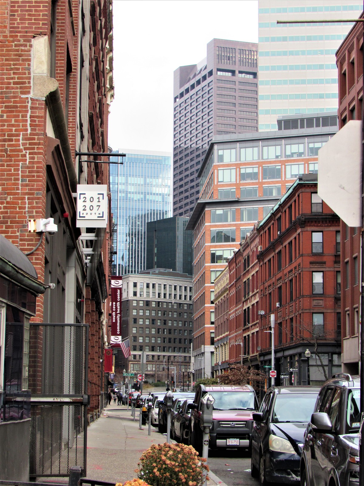
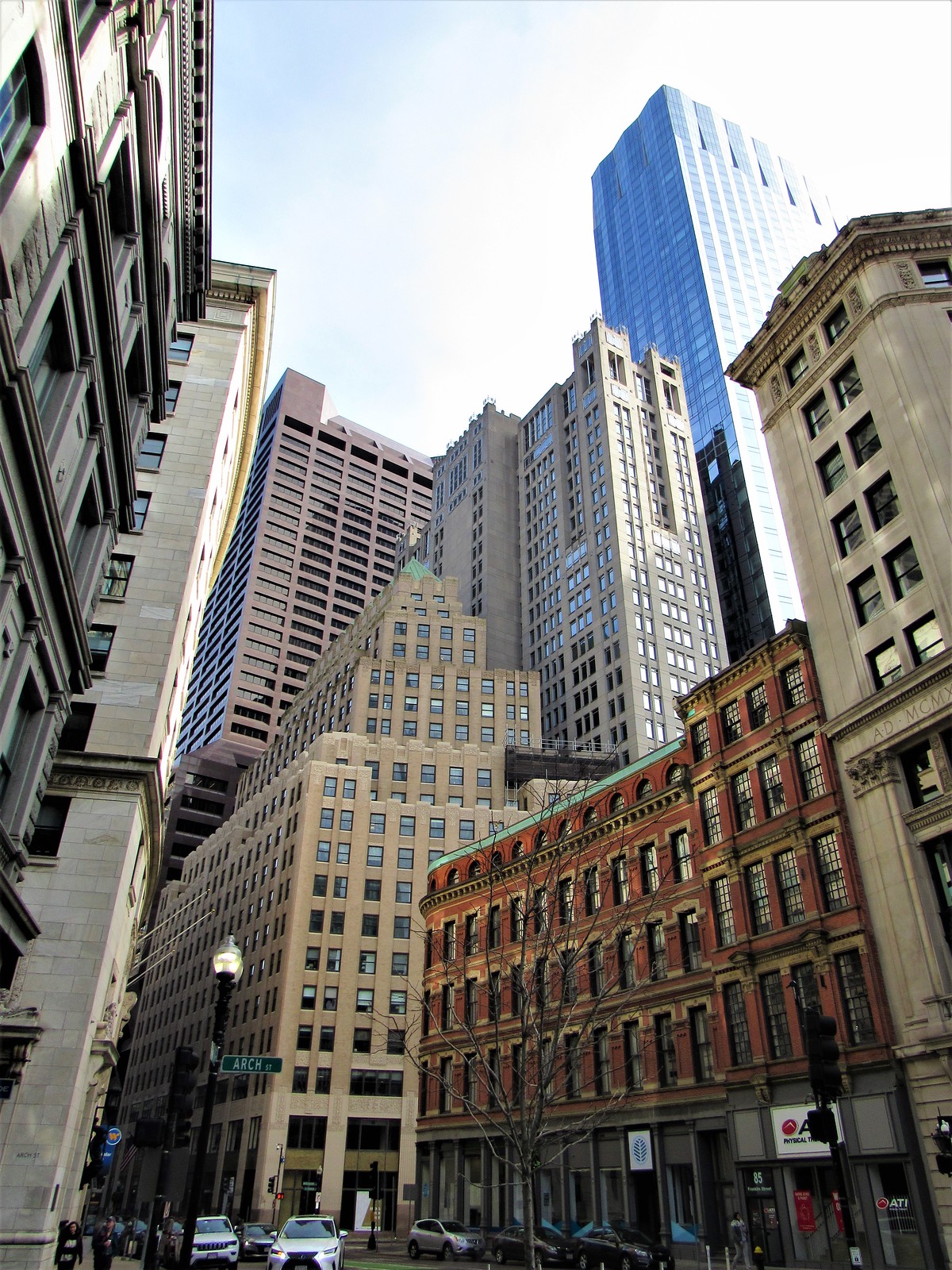
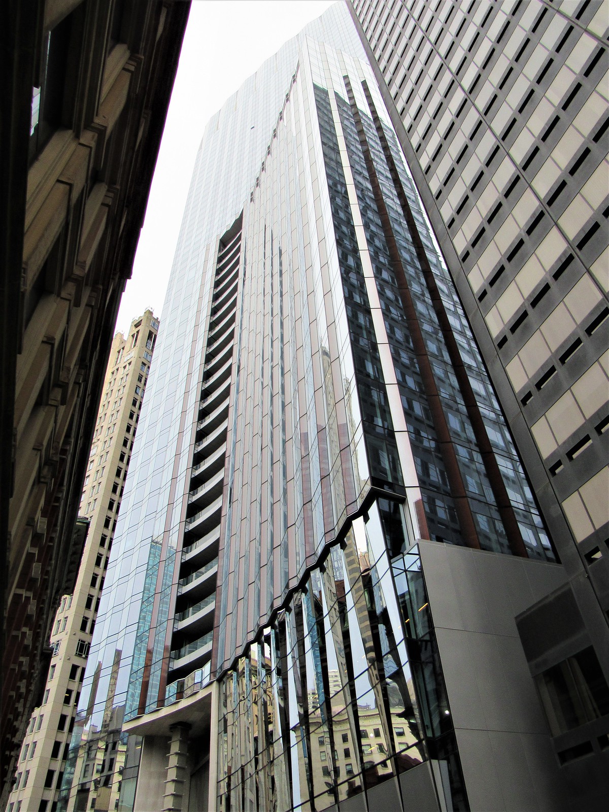
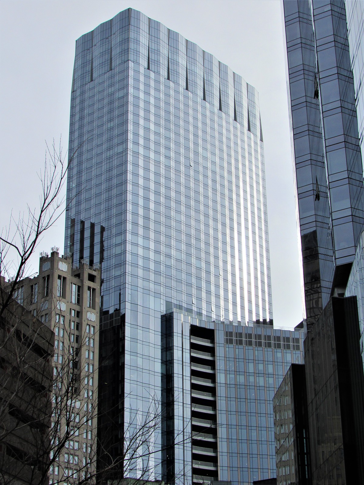
The rest from 12/10. Sorry for so many, but I snapped off 674 pics in 2:45 before the rain came in, and a disproportionate amount were of this building. I'm a big fan in case you can't tell from the pictures.

IMG_0300 by David Z, on Flickr

IMG_0355 by David Z, on Flickr

IMG_0360 by David Z, on Flickr

IMG_0406 by David Z, on Flickr

IMG_0713 by David Z, on Flickr

IMG_0741 by David Z, on Flickr

IMG_0751 by David Z, on Flickr

IMG_0752 by David Z, on Flickr

IMG_0791 by David Z, on Flickr

IMG_0830 by David Z, on Flickr

IMG_0848 by David Z, on Flickr

IMG_0872 by David Z, on Flickr

IMG_0931 by David Z, on Flickr

IMG_0938 by David Z, on Flickr

IMG_0939 by David Z, on Flickr
 

Love the emphasis on the old vs new in these shots. The best part about this and most other large buildings going up is that theyre replacing dilapidated garages or empty lots vs knocking down existing buildings like these. Its great seeing the empty lots slowly becoming less and less prevalent.
 
Love the emphasis on the old vs new in these shots. The best part about this and most other large buildings going up is that theyre replacing dilapidated garages or empty lots vs knocking down existing buildings like these. Its great seeing the empty lots slowly becoming less and less prevalent.

Love the beautiful, expessive and caring detail on the old buildings. Today's buildings are Ken Dolls.

.
 
Today by me
IMG_5332.JPG
 
Then again, I believe it's long been an unspoken requirement from the BPDA/BRA that no skyscrapers are permitted to be designed to be iconic in a good way. That suites developers, because iconic designs are stickier to change or destroy.
 
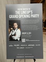
I think some of the food stalls may already be open when I walked through earlier this week, but they're having an official opening party later this month.
 

Attachments

  • IMG_2502.jpeg
    IMG_2502.jpeg
    1.9 MB · Views: 166
  • IMG_2504.jpeg
    IMG_2504.jpeg
    1.9 MB · Views: 165
  • IMG_2505.jpeg
    IMG_2505.jpeg
    1.9 MB · Views: 164
It's a good looking skyscraper, but certainly NOT the iconic design that Menino intended for this location.

Menino should have reviewed the FAA map for more than 0 seconds and chosen a plausible location. It wouldn't have been a supertall, but at least it could have prevented most of us from going our entire lives without witnessing a new tallest in Boston. This specific location got way too much fanfare for something that could never eclipse 700', and even put additional shadow laws into place that may prevent taller buildings in the future.

Imagine an international competition for winning bids for Hurley around 750', O'Neill just over 800', and Hynes around 950'. Those are the true locations that deserve the same type of consideration we got here. Menino blew it. Par for the course with him though, as overall construction was pathetic under his reign. Maybe he gets more of a pass because of his tragic death shortly after retiring, but I remember hating him with a fiery passion as Boston stagnated for years.

I'm happy enough with this building. Snagging all 5 of these in 1 boom is an embarrassment of riches for our city, especially given the prior 25 years. I know we could have done better, and I know there are some outlier cities to be "jealous" of, but I got beaten down by disappointment for such a long time that every time I see these new towers all I can think is "Thank God."

1704674013355.png
 
I'm not sure if this warrants its own thread, so I'm plunking this here, given how the trajectories of Winthrop Center and 133 Federal have been so intertwined for so long that in a way they are coupled. Anyway, this in theory is a particularly compelling/intriguing BLC landmarking proposal given Paul Rudolph's profound legacy...

There was already a hearing a month ago, so, this might get get the thumbs-up or thumbs-down relatively soon?

https://www.boston.gov/news/blue-cross-blue-shield-building-study-report
 
What exactly is the current status of the "Grand Hall"? I was trying to peek in yesterday for the first time, I really needed to get out of the cold, and found the doors locked. It is supposed to be open, right?
 

Back
Top