You are using an out of date browser. It may not display this or other websites correctly.
You should upgrade or use an alternative browser.
You should upgrade or use an alternative browser.
Winthrop Center | 115 Winthrop Square | Financial District
- Thread starter vanshnookenraggen
- Start date
We can probably say pretty much the same about the Harbor Garage proposal... Hopefully with that, as with this, something substantive will be built in the end. I would be fine if the step down from the current proposal to what's realized is 'merely' proportional to the step down we've seen here.This thread is sixteen years old.
I wonder if they'll put Deloitte signage at the top of the building. That would look cool
I can't imagine a world where that would ever "look cool."
I wonder if they'll put Deloitte signage at the top of the building. That would look cool
Do you mind if I ask why you think that would be cool? I admit I don't like business signs on buildings. They feel kind of tacky and try hard to me--like something you see in a second tier city. But I know there are a lot of people on this board who like them. This might be derailing (mods, please remove), but the only think I can think of is that Boston architecture tends to be bland so the signs are interesting?
St. Botolph Street
New member
- Joined
- Jun 10, 2021
- Messages
- 73
- Reaction score
- 450
Do you mind if I ask why you think that would be cool? I admit I don't like business signs on buildings. They feel kind of tacky and try hard to me--like something you see in a second tier city. But I know there are a lot of people on this board who like them. This might be derailing (mods, please remove), but the only think I can think of is that Boston architecture tends to be bland so the signs are interesting?
I think a well done business sign can enliven an otherwise boring or bland building. It also helps to let passerbys know who is in the building as opposed to just another anonymous office. Granted a fantastic building doesn't need a sign to make it more interesting but many buildings are just square boxes of leasable space. I think business signs are more common on buildings in Europe and Asia, less so here in the US. Hong Kong, Sydney, Paris (La Defense) come to mind.
I think a well done business sign can enliven an otherwise boring or bland building. It also helps to let passerbys know who is in the building as opposed to just another anonymous office. Granted a fantastic building doesn't need a sign to make it more interesting but many buildings are just square boxes of leasable space. I think business signs are more common on buildings in Europe and Asia, less so here in the US. Hong Kong, Sydney, Paris (La Defense) come to mind.
Thanks! I appreciate having a thoughtful conversation about this. I agree that it would be nice to have more fantastic building!
Boston02124
Senior Member
- Joined
- Sep 6, 2007
- Messages
- 6,934
- Reaction score
- 7,068
From Dot ave
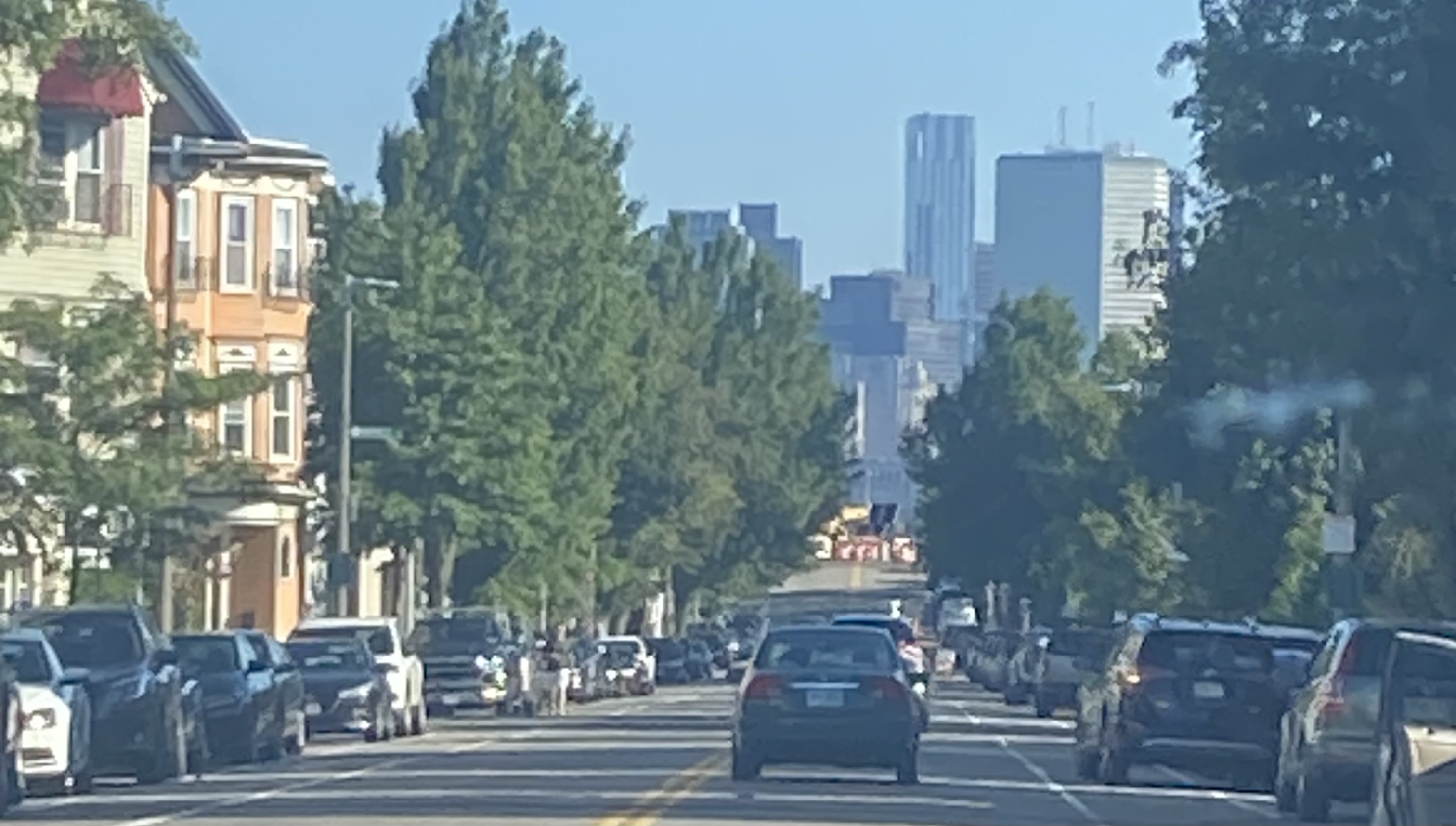
Dr. Rosen Rosen
Senior Member
- Joined
- Jul 19, 2021
- Messages
- 1,197
- Reaction score
- 7,026
From the passenger seat…
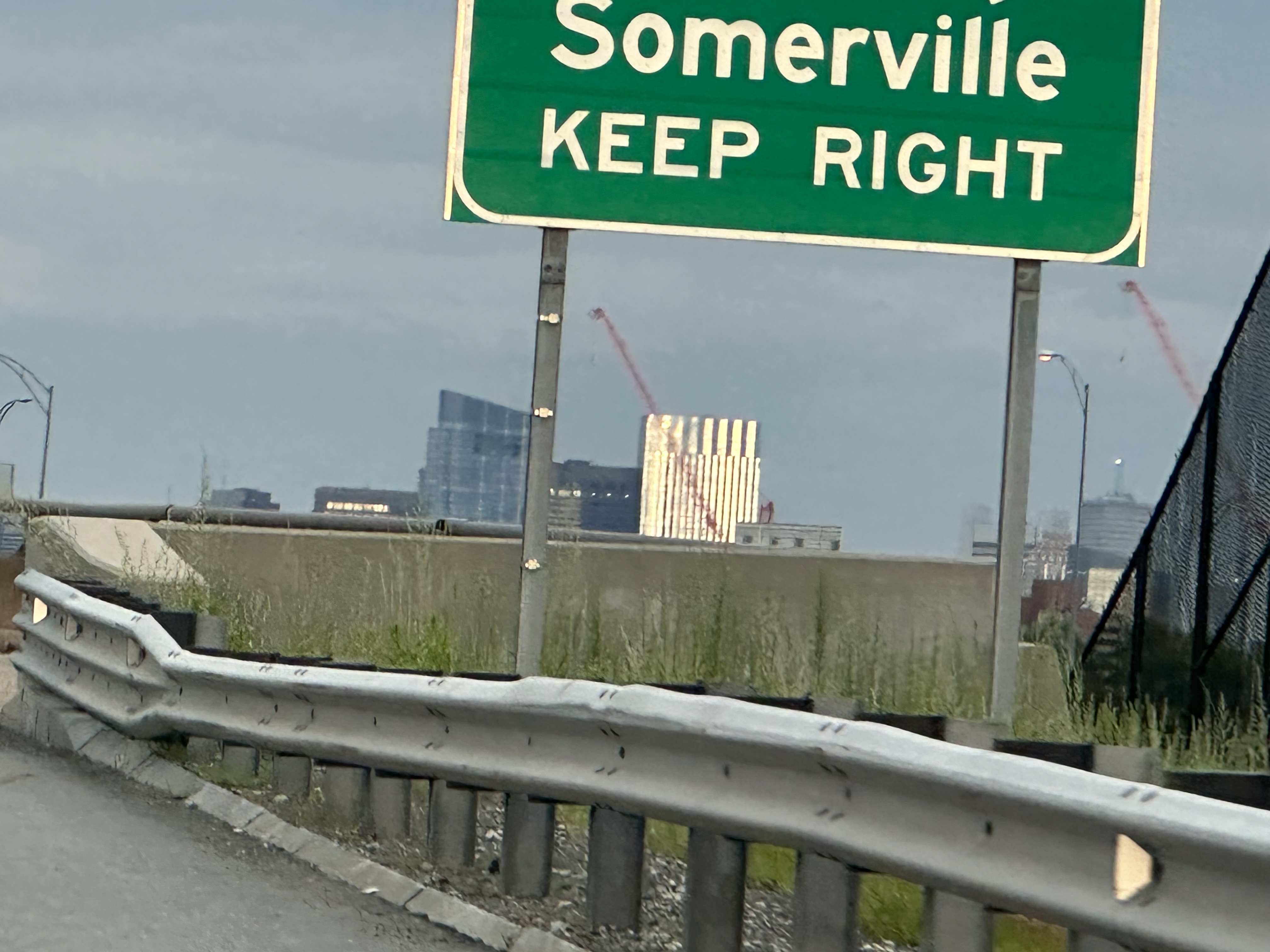
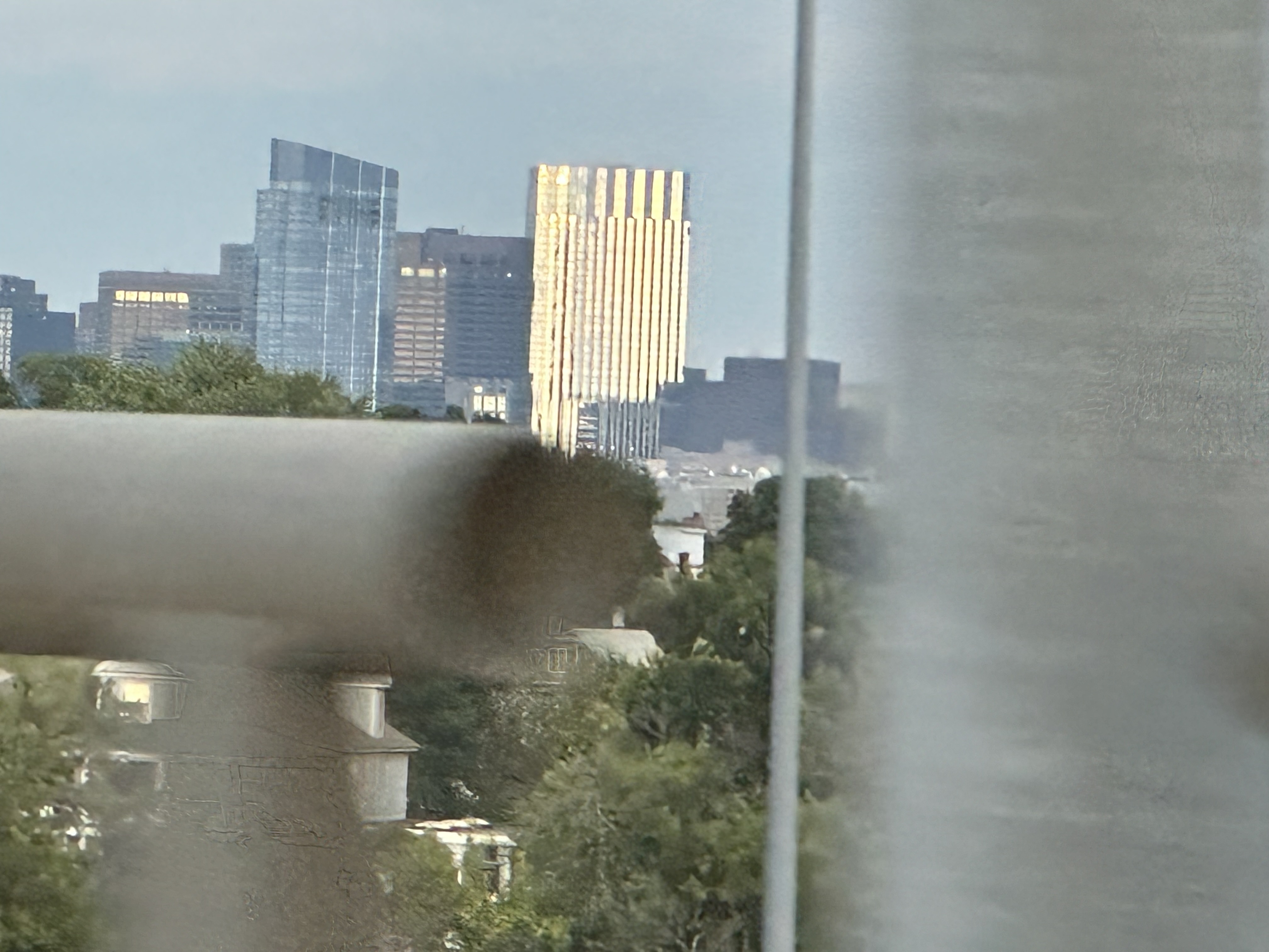
Dr. Rosen Rosen
Senior Member
- Joined
- Jul 19, 2021
- Messages
- 1,197
- Reaction score
- 7,026
Head on, from Bunker Hill Monument.
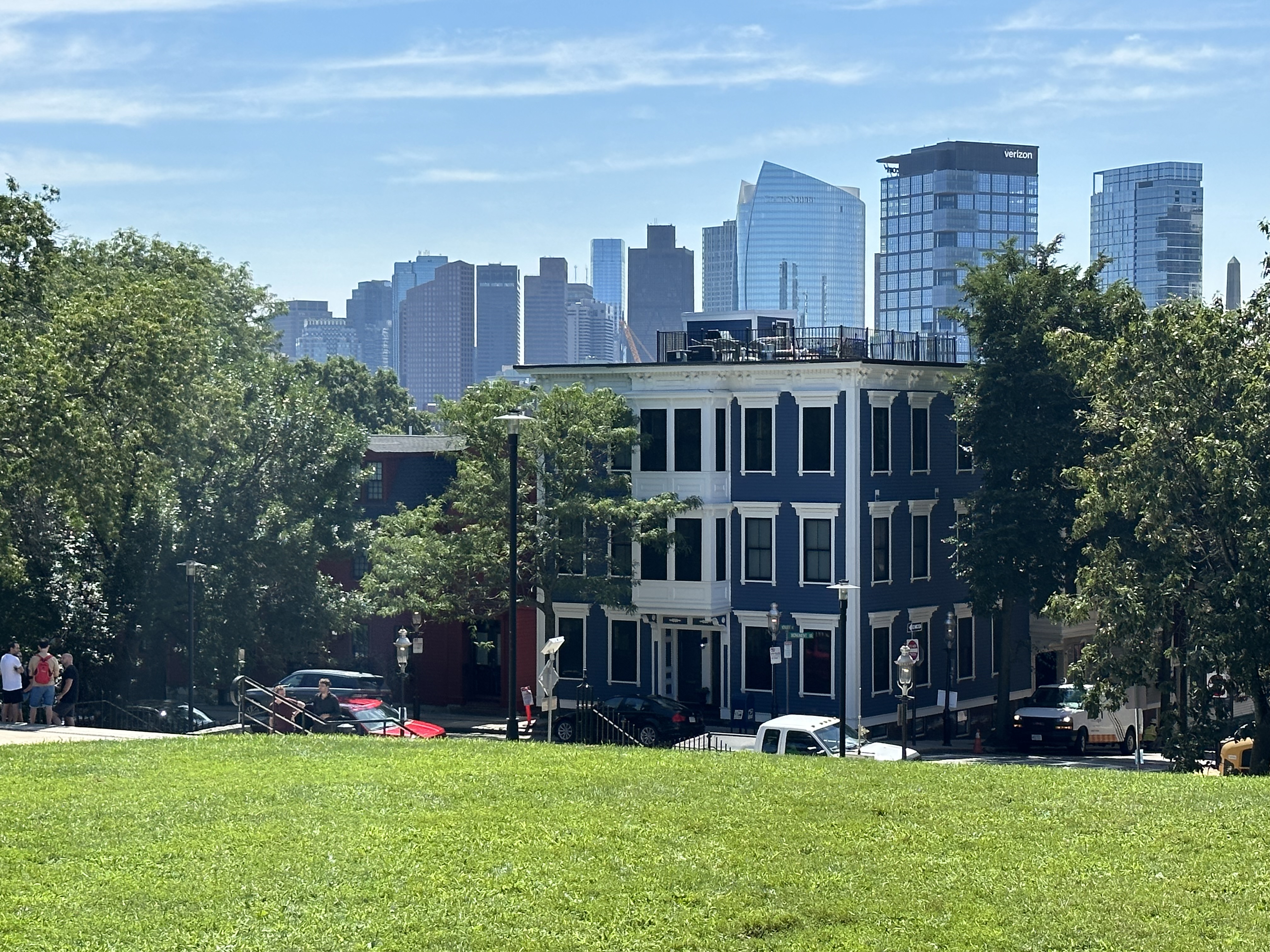
Boston02124
Senior Member
- Joined
- Sep 6, 2007
- Messages
- 6,934
- Reaction score
- 7,068
atlantaden
Senior Member
- Joined
- May 31, 2006
- Messages
- 2,675
- Reaction score
- 3,324
stick n move
Superstar
- Joined
- Oct 14, 2009
- Messages
- 13,361
- Reaction score
- 23,947
For a second there it looked like they had finally turned on the entire length of crown lighting that had been shown in the renders. Guess not… damn. It looks good too, actually better than when they only light the very tips of the metal bars.
Jahvon09
Senior Member
- Joined
- Oct 2, 2011
- Messages
- 3,406
- Reaction score
- 848
This thread is sixteen years old.
But just look how exasperatingly long it took for the building to be built.
Jahvon09
Senior Member
- Joined
- Oct 2, 2011
- Messages
- 3,406
- Reaction score
- 848
This thread is sixteen years old.
But just look how exasperatingly long it took for the building to be built.

 IMG_0371
 IMG_0374
 IMG_0450