You are using an out of date browser. It may not display this or other websites correctly.
You should upgrade or use an alternative browser.
You should upgrade or use an alternative browser.
State Street HQ | One Congress | Bulfinch Crossing | West End
- Thread starter FitchburgLine
- Start date
KentXie
Senior Member
- Joined
- May 25, 2006
- Messages
- 4,210
- Reaction score
- 834
Looks awful in my opinion. They just took the old sign and welded it on to a new building, but the font and style of that sign in no way works with the style for the building. I hope this is just a quick mock-up and not any kind of real plan. The sign needs to both say, "yes, this is definitely State Street, but no, it's not the old stodgy version, look at the wave of this building, that's our new corporate brand."
Personally I think they should put a ship at the bottom so it is riding that "wave" on the building. It would be a clear homage to their logo:
whighlander
Senior Member
- Joined
- Aug 14, 2006
- Messages
- 7,812
- Reaction score
- 647
Hell with a sign
State Street needs to commission a public sculpture for the Greenway -- something like Fearless Girl but Sea-themed -- perhaps a Merperson fountain?
State Street needs to commission a public sculpture for the Greenway -- something like Fearless Girl but Sea-themed -- perhaps a Merperson fountain?
atlantaden
Senior Member
- Joined
- May 31, 2006
- Messages
- 2,679
- Reaction score
- 3,344
We have a somewhat similar building here in Atlanta with decorative fins. Recently the firm of King & Spaulding attached their name to the building. It's was jarring at first seeing it, especially at night, so I get the reluctance. I think the ship logo would probably work better. Having said that, this is a beautiful building and I don't think the sign will take away from that beauty.
https://atlanta.curbed.com/2019/2/1...180-peachtree-atlanta-tower-midtown-equitable
https://atlanta.curbed.com/2019/2/1...180-peachtree-atlanta-tower-midtown-equitable
Equilibria
Senior Member
- Joined
- May 6, 2007
- Messages
- 7,229
- Reaction score
- 8,759
FWIW, that may not be a render of the actual sign but just a promo shot to say "this building is ours". We've been expecting a sign on this identical to the last two State Street HQs since they signed the lease (that allowed this tower to be built at all).
Honestly, a STATE STREET sign on the upper rim of the skyline is a Boston icon in and of itself...
Honestly, a STATE STREET sign on the upper rim of the skyline is a Boston icon in and of itself...
We have a somewhat similar building here in Atlanta with decorative fins. Recently the firm of King & Spaulding attached their name to the building. It's was jarring at first seeing it, especially at night, so I get the reluctance. I think the ship logo would probably work better. Having said that, this is a beautiful building and I don't think the sign will take away from that beauty.
https://atlanta.curbed.com/2019/2/1...180-peachtree-atlanta-tower-midtown-equitable
Wow, jarring is well-put. I haven’t taken any design classes in two decades, but to me the negative space above and below the King & Spaulding logo is too out of proportion with the negative space on the left and right. It’s too thin. This tells me the logo is too big for its location; it’s awkward.
This building wasn't designed to have a sign, and it shows. I wonder if the front and back are wide enough to stack State on top of Street and have the sign be that way instead. I would rather not see one at all, but it's a total fail on the wide sides.
Czervik.Construction
Senior Member
- Joined
- Apr 15, 2013
- Messages
- 1,964
- Reaction score
- 1,235
I'm a little confused. Do people not like the building design, like the design but not the proportions (fat), or just don't like the signage?
I f-ing love this building. I don't care if it is plump and shorter than my apartment building.
I f-ing love this building. I don't care if it is plump and shorter than my apartment building.
I'm a little confused. Do people not like the building design, like the design but not the proportions (fat), or just don't like the signage?
I f-ing love this building. I don't care if it is plump and shorter than my apartment building.
I'm pretty sure it's just the sign for most of us. The proportions could be better but the building itself still looks great, particularly for Boston.
the sign is fine and will likely change, anyway. it certainly doesn't negate how cool the tower is. calm down.
i'm more worried about how comparatively "bleh" one lincoln is going to look without any signage on top. 225 franklin went from extremely distinctive on the skyline (much larger sign than either of the subsequent buildings) to flat-out gross when "state street bank" was removed from the crown.
i'm more worried about how comparatively "bleh" one lincoln is going to look without any signage on top. 225 franklin went from extremely distinctive on the skyline (much larger sign than either of the subsequent buildings) to flat-out gross when "state street bank" was removed from the crown.
whighlander
Senior Member
- Joined
- Aug 14, 2006
- Messages
- 7,812
- Reaction score
- 647
the sign is fine and will likely change, anyway. it certainly doesn't negate how cool the tower is. calm down.
i'm more worried about how comparatively "bleh" one lincoln is going to look without any signage on top. 225 franklin went from extremely distinctive on the skyline (much larger sign than either of the subsequent buildings) to flat-out gross when "state street bank" was removed from the crown.
How about ONE LINCOLN or maybe even WE WORK
excerpts from Biz Journal story February 5, 2019 Cameron Sperance, Bisnow Boston
https://www.bisnow.com/boston/news/...or-its-newest-and-largest-boston-office-97351
WeWork Signs Lease For Its Largest Boston Office Yet
WeWork's 232K SF lease at the tower means the company will eclipse the 1M SF mark for its overall Boston space, according to Perry Director of Intelligence Brendan Carroll. With that commitment, WeWork will control 41% of the 2.5M SF Boston coworking market. “One Lincoln Street is a huge win for WeWork Boston,” WeWork Northeast General Manager Dave McLaughlin said in a prepared statement. “It will be our largest location, growing our community by nearly 50%, and is more space in one building than we had in our first three years of operating in the city. This type of product offering will enable us to meet the demands of our growing enterprise business.”
One Lincoln Street is where the Leather District, Chinatown and Downtown Crossing merge and is also blocks from WeWork’s original Boston office at 745 Atlantic Ave. The company has grown from smaller office buildings and into more trophy products in Boston, including leases at One Beacon Street and 33 Arch St. It will eventually have room at the One Lincoln tower to expand, as State Street recently announced plans to move in 2023 to One Congress, a planned 43-story office tower at Bulfinch Crossing.
While the sign may look a little meh (I don't think it's that bad) this project is going to be one of the top projects in the city in a very long time. The ugly garage is essentially coming down and is being replaced by a nice modern looking glass tower. I still can't believe this whole project is happening.
HenryAlan
Senior Member
- Joined
- Dec 15, 2009
- Messages
- 4,473
- Reaction score
- 5,256
I'm a little confused. Do people not like the building design, like the design but not the proportions (fat), or just don't like the signage?
I f-ing love this building. I don't care if it is plump and shorter than my apartment building.
I love the building design, always have. My critique was strictly for the incongruous sign.
fattony
Senior Member
- Joined
- Jan 28, 2013
- Messages
- 2,099
- Reaction score
- 482
I love the building design, always have. My critique was strictly for the incongruous sign.
+1
- Joined
- Jan 7, 2012
- Messages
- 14,173
- Reaction score
- 23,688


- Joined
- Jan 7, 2012
- Messages
- 14,173
- Reaction score
- 23,688
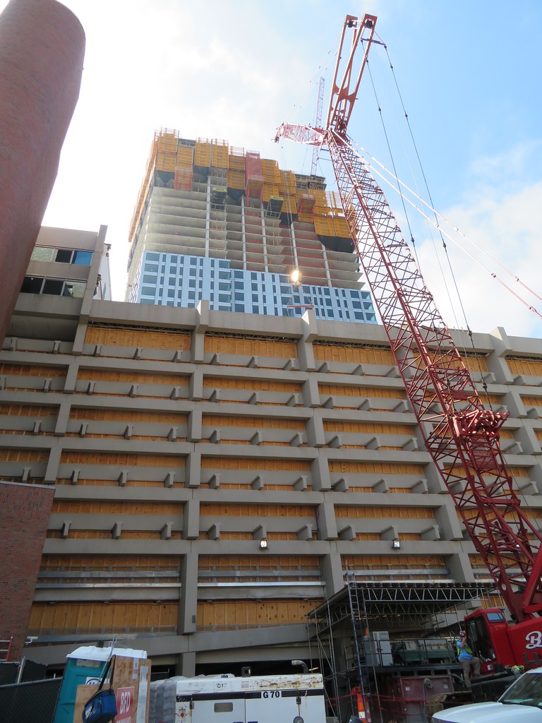
They have blocked off more of the garage. As you can see they have closed off 3 more bays towards the east from where I took the above photo last week..
 https://flic.kr/p/2gqDP17
https://flic.kr/p/2gqDP17stick n move
Superstar
- Joined
- Oct 14, 2009
- Messages
- 13,480
- Reaction score
- 24,526


stick n move
Superstar
- Joined
- Oct 14, 2009
- Messages
- 13,480
- Reaction score
- 24,526
Cesar Pelli died yesterday. This tower is probably his last to break ground, crazy.
https://www.google.com/amp/s/www.boston25news.com/amp/news/famed-architect-cesar-pelli-dies-at-92/968705211
https://www.google.com/amp/s/www.boston25news.com/amp/news/famed-architect-cesar-pelli-dies-at-92/968705211
Looks awful in my opinion. They just took the old sign and welded it on to a new building, but the font and style of that sign in no way works with the style for the building. I hope this is just a quick mock-up and not any kind of real plan. The sign needs to both say, "yes, this is definitely State Street, but no, it's not the old stodgy version, look at the wave of this building, that's our new corporate brand."
Yea, it's a boring as can be. Signage on buildings is unfortunately a bit part of Walsh's Boston but the companies should at least be trying. Ideally, it would be integrated into the building the way it was on the old one.