The Clarendon

Status
Not open for further replies.
The rendering makes it look more like the brick? they used at 45 Province,not the brown brick we see today? I'm still wating until it's finnished to pass final judgement.
97-Clarendon.jpg
 
It would be nice if the brick were a little... more red.

Does anyone think that they'll actually have the rooftop and terrace greenery like the green in the rendering?
 
That rendering doesn't even show the right configuration of the building.

I bet anything every frill has been cut.

Most unfortunate change from that rendering, though? Columbus Center.
 
Besides the color being a lot less rich in the real life product...

The rendering had windows that were webbed....ie they were indented which gave the building a nice contrast between the red and the glass....

The final product is just entirely flat and ugly...the brown dominats the glass windows....which are too small

The glass half-ribbons are also indented in the drawing but are entirely lifeless in reality. And their inclusion was important because that part was slightly cantilevered which is what helped give the rendering that zig-zag feel, that lack of continuity.

This is an upsetting development....just a total 100% letdown.....

It's basically a modern housing project....

Hopefully the finished top can distract from the abysmal base....
 
That rendering doesn't even show the right configuration of the building.

I bet anything every frill has been cut.

Most unfortunate change from that rendering, though? Columbus Center.

That's the old rendering. This is the current rendering.

theclarendonbackbay.jpg
 
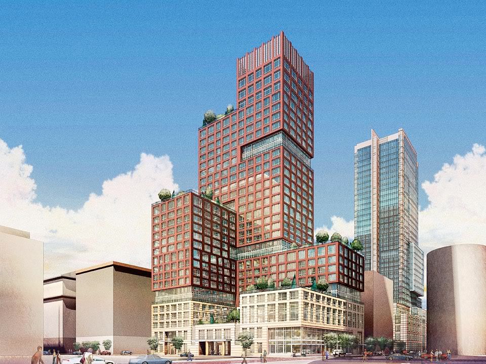
Just by comparing the renderings to what we have now, I'd have to say that I'm happy they went with the second one. Obviously we mostly agree that the building is a little more squat than it should be. The renderings seem to show this building a bit more elongated than it is in reality. If the design in the old rendering had been built, it would look a lot fatter and stubbier than it does now.

Having said that, I still wish it were more red than brown and the lighter stone on the lower floors was, well, lighter than what's there now.
 
I see your point that the new rending shows a more slender tower, but I still prefer the old rendering. I would take the added bulk on the middle and lower floors with the more interesting and varied setbacks shown on the old scheme.
 
From Kenmore Square... I was driving so please excuse the crappiness:

img9970.jpg
 
A welcome to the family portrait:
clarendon_bb_skyline.jpg


From the other side:
bb_skyline_clarendon.jpg
 
Wow, those are two of the most impressive Boston cityscapes I've seen in awhile.
 
the old hancock building is such a blight on the back bay skyline

weather beacon or no weather beacon the building is like Roseanne Barr standing next to Heidi Klum
 
the old hancock building is such a blight on the back bay skyline

weather beacon or no weather beacon the building is like Roseanne Barr standing next to Heidi Klum

I assume that's sarcasm.
 
the old hancock building is such a blight on the back bay skyline
weather beacon or no weather beacon the building is like Roseanne Barr standing next to Heidi Klum
Think of it as Boston's stumpy take on the Empire State Building.

briv, where is each of those pictures taken from?
 
^ The first is from Tremont St. in the Theater District, the second is from Beacon in the Back Bay.
 
Think how much better cityscape #2 would be sans 500 Boylston...

But, man, your camerawork is pro.
 
^ The first is from Tremont St. in the Theater District, the second is from Beacon in the Back Bay.
Sorry, I meant ... which buildings? Was either locale publicly accessible?
 
If you take a picture of The Clarendon from the Boston COmmon, it looks incredibly tall and slim (though that's an illusion). I'll see if I can take a shot today.
 
Status
Not open for further replies.

Back
Top