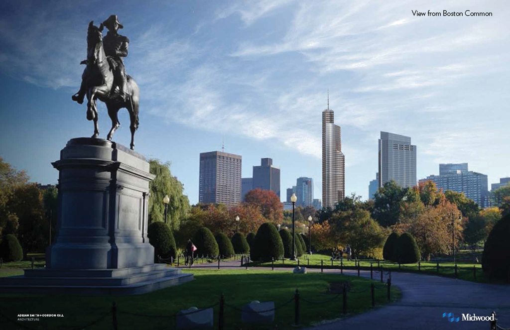
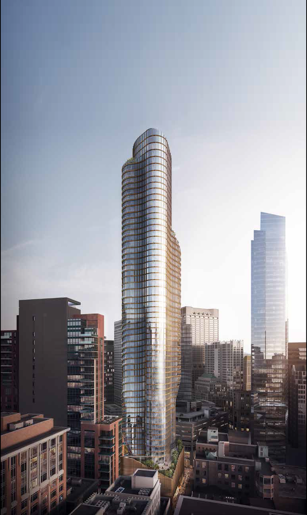
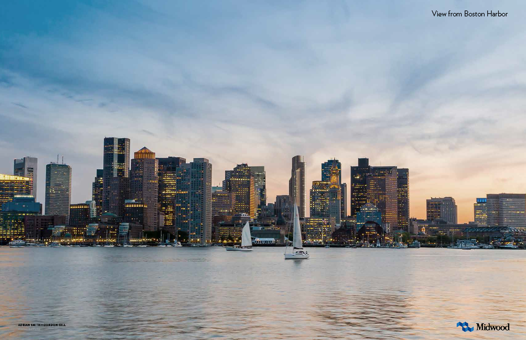
11-21 Bromfield Street | DTX | Downtown

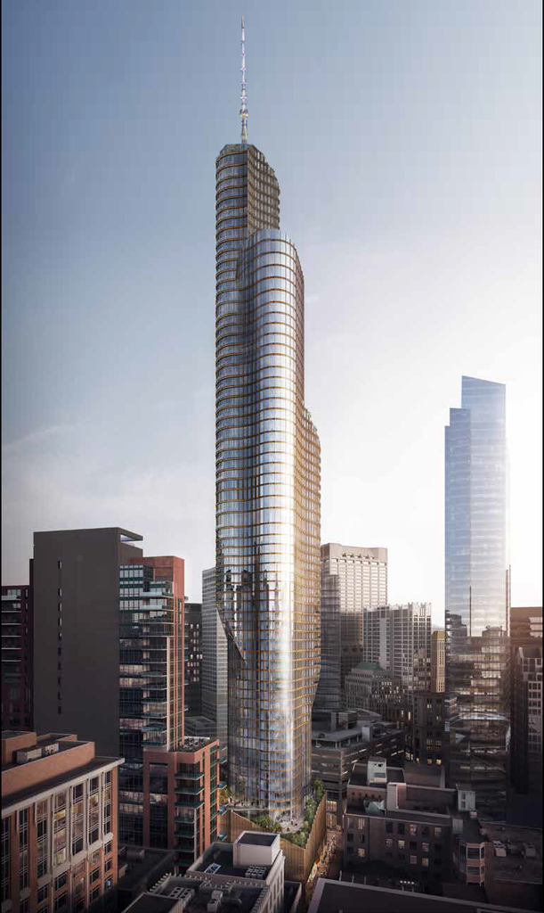
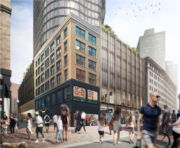
The Bromfield treatment MUST be fixed. That sort of front-and-center outsized carport has been allowed over and over again by the BRA ... in the 2010s (AVA onto Stuart), in the 2000s (The massive carport at One Charles), back to the 1980s (ridiculous carport at the Four Seasons across from the Common). From a streetscape perspective, the BRA's sense of priorities hasn't evolved appreciably since they shoved through the 57 development (now Revere Hotel) in the early '70s. You don't see this sort of crap in NYC or the cities we SHOULD be regarding as comparable ... garages, where they are even allowed, have cramped/tight entrances away from pedestrian flow. This isn't Charlotte, folks. But to the BRA, the ability to discharge multiple vehicles under a roof away from the elements seems always to trump any sense of good urbanism. Bromfield, a street with heavy pedestrian traffic, is treated like an alley. Total fail. Developers should KNOW this is a non-starter, it shouldn't take pitchforks from the locals to bring the BRA up to common sense of urban best practice circa, oh, 1980.
 
That preservation of the Payless building actually looks a lot better than I originally thought it would.
 
DaveM's photoshop job just beat the collective efforts of the Boston civic design commission and the BRA to improve any proposed project over the past 25 years.
 
Ok you can't just state that just because one building's design has cantilever, that it is outdated. Are you guys saying that all cantilever buildings belong in the 60s/70s?

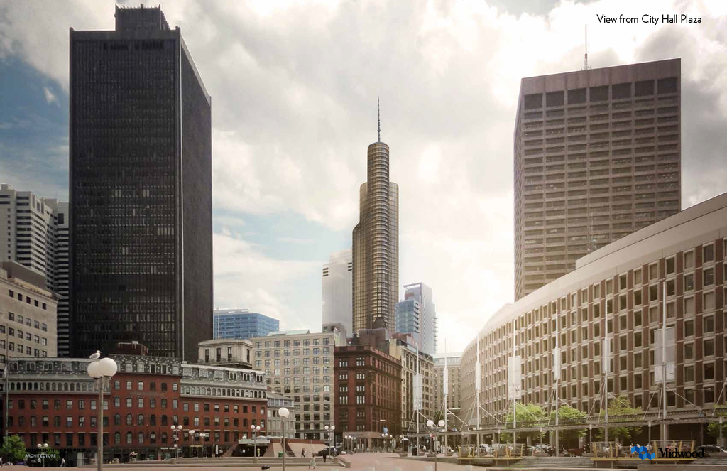
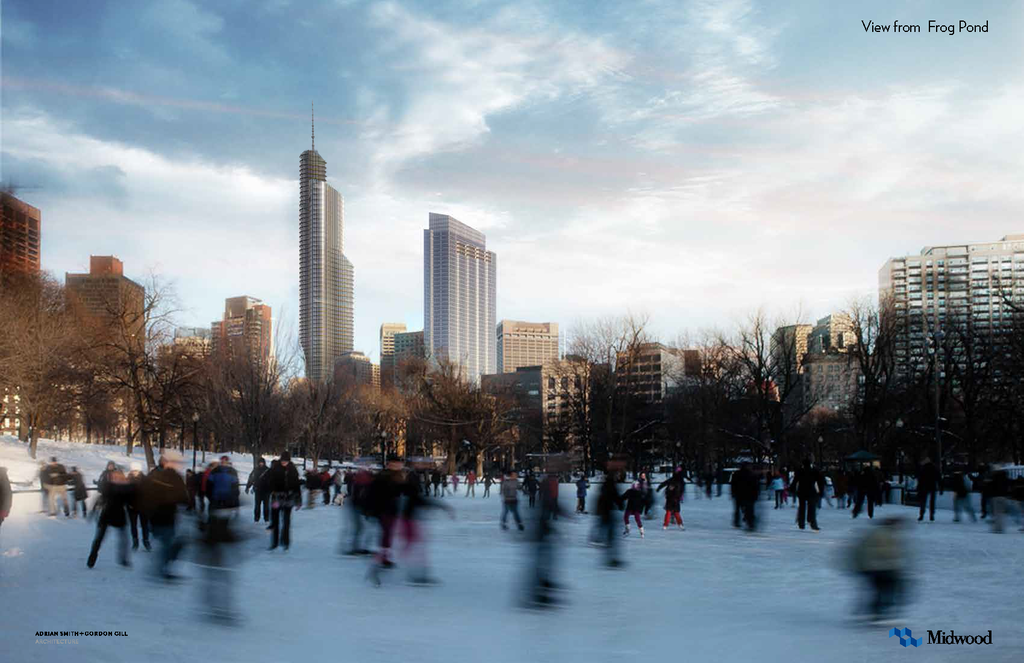
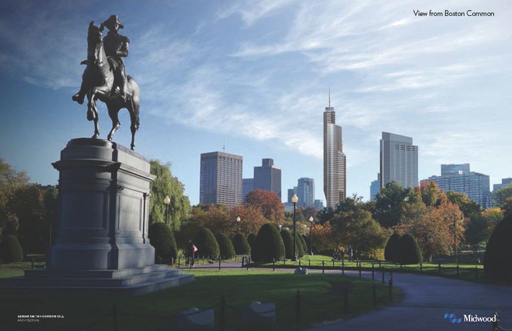
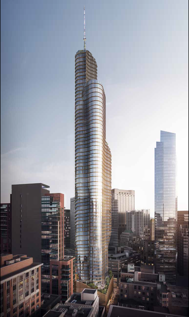
^^I wouldn't necessarily equate cantilever with 60/70's. It just looks like they cloned a Copley Place Tower-like-design, fattened it up where it juts out, and called it a day. (and I like the rounded Copley design) The result to me is a dated looking design from many angles, especially from the Memorial Drive side. Something just doesn't work here, and I can't really say exactly what it is, but I think I'd actually like it a lot better without those rounded cantilevered sections. (but the potential view from inside would be awesome) All I know is that when I look at those renders, the "wow" factor does not exist for me.
 
Wasn't the Millennium Tower listed at something like 625' when proposed? I hope we get that extra boost here too.

DaveM's photoshop job just beat the collective efforts of the Boston civic design commission and the BRA to improve any proposed project over the past 25 years.

Right. Its hilarious how a few architecture fans on a local forum can within 10 minutes see a plan, realize exactly what its missing, and address it. All without months of behind closed doors meetings, money...etc. Just a vision, a few minutes, and some photoshop and the big whigs can be dominated. Makes me wonder why these guys get paid so much when its so obvious what should be done in the first place. Its like their job is just to try to screw it up as little as possible which they still fail at. Makes me appreciate the northern ave bridge redesign being open to the public and I think they should do that much more often. Let the public vote on what we collectively want for our city. Obviously not with everything, but for the very important projects it would be nice.
 
So finally got a chance to really look at the renderings. Tower is fine, but that carport is a scar. Talk about ruining a street. I think the BRA/BCDC needs to stand firm on this one and demand the developer not do that.
 
My version of 1BF with a spire. The uppermost cantilever continues up above the building core to add balance and additional height. Of course this means, due to FAA regulations, that the core would have to be shorter to allow for the extra height on the the cantilevered spire.


Can you extend the canteleivers to ground level so we can see how that would look?
 
My version of 1BF with a spire. The uppermost cantilever continues up above the building core to add balance and additional height. Of course this means, due to FAA regulations, that the core would have to be shorter to allow for the extra height on the the cantilevered spire.
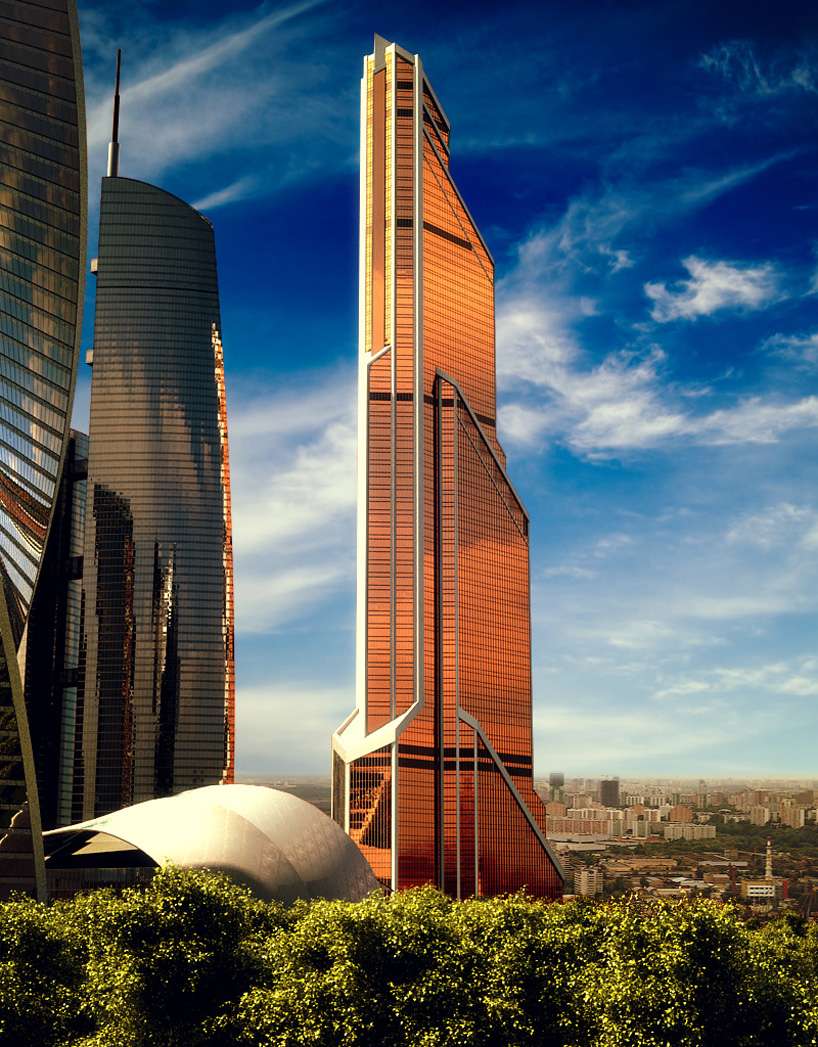
Reminds me of the mercury city tower in Moscow
031wl.jpg
 
I removed the cantilever on the MT side because I thought it looked awkward. IMO, its not outdated, its just that it doesn't look right.
(Thanks for the edit with the spire, ngb)
Now that I removed the cantilever, however, its starting to look a little like 1 Dalton.
KkHKiXQ.jpg
 
Thank you ngb. That is an incredible job you have done in a short time! From many angles, your rendition resembles Moscow's Mercury City Tower, which of course had the spire removed in an unfortunate revision.

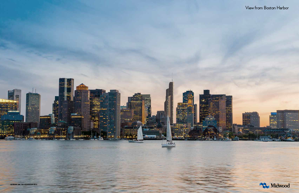
Based on the FAA map it appears this area can only go about 750'-760' at absolute max, which would hinder the plan for a spire. However, I think I prefer this as it is currently proposed. The spire here feels like a cheap height grab and doesn't really go with the rest of the city.
 
is off a bit and I'm pretty sure the scale is too, but you get the idea:
25635192504_44fd192364_o.png

Find a way to mitigate that garage and then this should be built. Today. Right this second. I'll take it.
 
I removed the cantilever on the MT side because I thought it looked awkward. IMO, its not outdated, its just that it doesn't look right.
(Thanks for the edit with the spire, ngb)
Now that I removed the cantilever, however, its starting to look a little like 1 Dalton.

These revisions make for a better result!
 
Can you extend the canteleivers to ground level so we can see how that would look?

Here's a new version...
I think this looks significantly better. I will try another version with the original top, but the cant on the bottom extended down to the ground.


Ok - original design, but with the cantilever extended downward. It kind of messes up their whole "More sunlight" thing, but It looks much better from afar.


citylover - your drawing is now live on the digram. Nice work!
 

Back
Top