11-21 Bromfield Street | DTX | Downtown

Waiting for bostonbred to give his opinion before forming mine.

IAM syin tHANks yOu all FOR VOTES. BUT. and this is MAIN POINT::

if yoU NO LIKE hole iN head, NOT DRILL HOLE in HEAD!!!!

GO IN THRU OTHER HOLE!!!!

So.

WHER other hole you CAN uSE on THIS????

IF YOU LOOK YOU FIND
 
The cab-only lane of the pass-thru will be grossly underutilized. Cut that out to add to retail frontage on Bromfield. That leaves a single-lane through the building, possibly with a passing lane inside to prevent jams. There is no need for more than a single-lane curb cut on either Bromfield or Province Ct.
 
Eliminate all parking access from Bromfield and put up a proper street wall (including a more gradual step down to 44 Province St.) The property can use Province Court for parking and loading access. Tremont on the Common, which is pretty big looking, uses less space for its parking access.
 
Anybody think maybe the carport was put there on purpose, to serve as a "concession" by the developer?
 
Absolutely. In negotiations my clients always ask for more than they expect, and we set up sacrificial offerings to create a phony bonhomie of "win-win".

The Province Court access is more than enough, and the developer could create an entire traffic turn around inside the building footprint if required to do so.
 
How many copper glass towers do we have in Boston right now? ZERO. I'd be a lot more disappointed if this was (nearly) the same color as Millennium next door, CSC Tower, Hancock, Exchange Place, etc. I like the darker color. It's brooding. Probably the closest thing we will get to NYC's Metropolitan Tower. (always wanted one in Boston!!!)

^Accordia has a proposal for a copper glass tower....and I LOVE that one, this one, not so much. Just wish they were already chosen for that project.
 
Anybody think maybe the carport was put there on purpose, to serve as a "concession" by the developer?

Great point! I was wondering that myself. They probably don't even want to deal with that carport when they could have additional retail or larger lobbies. Could Parking as a whole be the "concession"? Could a residential building like this get through without ANY parking at all?
 
The cab-only lane of the pass-thru will be grossly underutilized. Cut that out to add to retail frontage on Bromfield. That leaves a single-lane through the building, possibly with a passing lane inside to prevent jams. There is no need for more than a single-lane curb cut on either Bromfield or Province Ct.

^Agreed!...this current setup looks like a hotel setup with lots of 24hr action. There isn't even a hotel component....and it's not a "bike lobby", because the "bike garage" entrance is on Province Court.
 
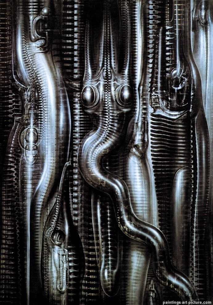
Does the design of this building strike you as a place where H.R. Giger might feel at home?


The dark (as someone else called it "brooding") pallet and pronounced ribbing gives me that sense.
 
I really can't disagree with this strongly enough. Saving the Payless building facade would make all the difference in the world from that sterile, bland and featureless glass wall they want to throw up.

I'm also in favor of saving the low level buildings on either side and building on top of them as well.

I'm sorry to disappoint you on this one, statler. As you'll recall, I've been a vocal and public advocate for preservation and adaptive reuse of numerous architecturally significant buildings in and around Boston. The issue with the Payless building and its neighbors is simply that none of them approach the "value" of the Arlington Building and its neighbors on Boylston Street. If the retail capacity and street activation of the new building replaces what it removes, I think it's an acceptable trade. I present this as opinion only, not a statement of fact.

I hope I don't look like too much of a hypocrite...

The cantilevered, biomorphic tower is great though it would be better with a smoother, more minimal skin.

To quote statler: "I really can't disagree with this strongly enough."

The facade treatment on this building is more interesting than anything else we've got in the pipeline right now. Again, it's a matter of taste.
 
I agree that the Payless building (I wish I knew its proper name) is uninspired compared to it's pre-war contemporaries, but even as such I think the new podium is a massive downgrade. And I don't even hate the podium that much (carport aside). If it were being built on a parking lot or even across the street on the garage site I wouldn't complain at all (except for the carport). I realize I am a bit of zealot when it comes to pre-war buildings but once they are gone, they are gone. CCA explained why buildings of that caliber can never realistically be built again. It's important to me to save the ones we have.
Sorry for the rant. I'll drop it now.
 
On Skycraper City they list the heights of the buildings in the thread titles once known.

be cool if we adopted that practice.

I agree we should also adopt putting the most current renders in the first post of the thread so you don't have to dig through pages upon pages to find what your looking for.
 
Does the design of this building strike you as a place where H.R. Giger might feel at home?


The dark (as someone else called it "brooding") pallet and pronounced ribbing gives me that sense.
Hmm, interesting observation. I hadn't thought about that, but I do have the sense that it would fit in well on Coruscant (which I believe was Giger inspired).

maxresdefault.jpg


By the way, to add my 2 cents on the design, I really like this building. It's substantially different from most Boston towers, and does a very nice job of synthesizing some older concepts with newer sensibilities. I think it looks great from a variety of directions, and works well at the street level, too. Build it, build it now (minus the car tunnel).
 
I still don't like it but I would rather have it than not so build it.
 
it's not a large parcel, but i like their podium.

generally, a cladding i like for a podium close to the Burial Grounds or Common is made of some type of stone...

http://www.hksinc.com/wp-content/uploads/park-tower-hotel-condominiums-3-1200x466.jpg

i'm here for the meeting... so, if anyone has any ideas for podiums...

^^Great! I'm curious what the reaction will be by the BCDC at the presentation, and if there seems to be sizable opposition from the neighbors. Especially in relation to the "hotel" drop-off area.
 
The lower 2 or 3 floors of the podium should be a modern interpretation of the Washington / Ladder Blocks commercial style

The corner at the street level should be square and the facade up to level 3 or so should either be stone and glass or if all glass retain some of the stone facade style of windows and doorways and the cornice should be strong and definitive

Above the human scale -- let the architect's curvaceous tower blossom free and tall
 

Back
Top