30 Dalton St. Residences | Back Bay

^ amen exactly what I am saying. Cant think of anything that looks like the Copley tower a dynamic round shaped high rise with setbacks.
300px-OneMuseumPark_05_25_08_edit4.jpg


Cant think of another building that looks like this either. Then you add the street level presence of Boston and its on another playing field.
images


Next up dare I say Iconic. Well have to wait and see.

thumb.jpg
The above three is comparable to what is being proposed in Boston. Granted, Boston is going in the right direction with their taller proposals, their fillers however, are bottom of the barrel designs, compared to what many other cities are seeing.
 
Those three really arent comparable at all. They all lack any sort of grace and they all have empty context. I mean you're comparing that building in SF which is in the wasteland of SOMA to one that would be next to the Christian Science Plaza:
Condo-boston-1.jpg

Context is literally EVERYTHING in terms of what a building actually adds to a city, and anyone who is just going around rating buildings wily-nily without taking that into consideration, should probably stay far away from architecture.
 
The above three is comparable to what is being proposed in Boston. Granted, Boston is going in the right direction with their taller proposals, their fillers however, are bottom of the barrel designs, compared to what many other cities are seeing.

None of those buildings are filler. One Museum Park dominates its end of the Chicago Skyline from Grant Park. One Rincon Hill is the most prominent building in San Francisco (due to the eponymous hill) and stands apart from the rest of the skyline as an eye-magnet on the Bay Bridge. I don't know the third one, but given the money invested in that crown I can promise you it wasn't intended to just be a filler apartment block.

No one has posted pictures of true filler in other cities. Because it is filler, and no one bothered to take pictures of it.
 
I don't know the third one, but given the money invested in that crown I can promise you it wasn't intended to just be a filler apartment block.

That 3rd building in KentXie's post is the 1180 Peachtree St. building or the King and Spaulding building here in Atlanta. Definitely not a filler building, it's one of the tallest in the city and it sits on the corner of Peachtree and 14th St., the heart of Midtown Atlanta. Trust me, it's not all that impressive though the decorative top is unusual. I see this building about every day and never once, did I ever think that the proposed office tower at the Government Center Parking Garage resembled this building though I can see how one can make the inference with the crowns. The Boston proposal is so much more beautiful and impressive.
 
One dalton is on a triangle plot with rounded corners, rincon is a box with a water tank on top... That Atlanta monstrosity-another box with a crown, govt garage has a circle footprint with an opening bath robe look extending from the ground floor to the crown, the chicago one is the closest of the examples but still not very similar. Copley has a uniform facade on a round tower and that one in chicago is more of an opening flower pedal footprint like the burj dubai.
 
As a huge skyscraper geek, I spend a lot of time perusing skyscrapercity and skyscraperpage, so I'm pretty familiar with much of the new construction. If you compare Boston to similar sized cities/skylines in their own building booms, (for instance Montreal, San Francisco, Philadelphia, Seattle) the designs stand up pretty nicely. To me the best part of the "filler" is that Boston is building a variety of "filler crap" rather than the same looking piece of cloned crap like in Vancouver and Toronto. It keeps things more interesting around here.

Many outsiders have raved about MT. It has great cladding (particularly for a residential) and nice clean, vertical lines. Outside of NYC, I couldn't point to a nicer looking residential building in North America. Also it would be the tallest building in a number of cities, most notably Montreal and Vancouver.

I don't know what planet some of you are living on if you really think other COMPARABLE cities are currently building far superior towers to Boston. We have a fine crop of projects in the pipeline.
 
I too spend an unhealthy amount of time on SSP and SSC, plus work sends me around all of the big APAC cities regularly. I've got a good handle on both Boston's peer city skylines in the North America, and what's new in places like Seoul, Singapore, Jakarta, and Hong Kong.

Compared to North American peers or cities one tier down, Boston's pipeline trophy towers stack up well. Philly, San Fran, Montreal, Seattle, Dallas, Houston . . . nothing like One Dalton or Copley in the works in any of these. MT would be a nice if unremarkable addition to NYC, Toronto, and Chicago - that's it for North America. Put MT in any other skyline and it would become a new focal point. Might get lost in the middle of downtown Dallas or Houston, but not if it were situated more towards the edges or in one of their many secondary nodes (like the Galleria in Houston). MT would even stand out in Tokyo today, again depending on the station it were built above.

That being said, I do agree that our shorter residential filler is laughable. The same list of peer North American cities from above puts out much better 20-30 story residential towers than Boston does. Seattle is doing amazing work in that area. Hell, San Diego does a much better job than we do with this type of residential. So does Atlanta. Atlanta...
 
So does Atlanta. Atlanta...

Woohoo, this is the first positive comment about Atlanta I've ever seen on ArchBoston! Seriously, some of the newer residential construction in Midtown is very nice with great street presence, tons and tons of retail and restaurant space on the ground floor. The city's finally seeing the light!
 
We're so off topic its insane but rarely do these debates happen because we are just talking about whether (insert new building) sucks or can we live with it. Its enjoyable reading different takes on what we have, need, and are doing right or wrong.
 
None of those buildings are filler. One Museum Park dominates its end of the Chicago Skyline from Grant Park. One Rincon Hill is the most prominent building in San Francisco (due to the eponymous hill) and stands apart from the rest of the skyline as an eye-magnet on the Bay Bridge. I don't know the third one, but given the money invested in that crown I can promise you it wasn't intended to just be a filler apartment block.

No one has posted pictures of true filler in other cities. Because it is filler, and no one bothered to take pictures of it.

I didn't say any of those three are fillers. Contrary to the point, I'm saying there are comparable buildings that stick mentioned in other cities. However, what I'm saying that even these comparable buildings wouldn't stick out as much in their respective cities as they would in Boston, BUT that it is a good direction. That being said, the three buildings that stick referenced are also NOT filler towers, meaning it didn't really contribute to the point that we are arguing, that Boston's fillers lack cohesion, creativity, and effort.
 
Those three really arent comparable at all. They all lack any sort of grace and they all have empty context. I mean you're comparing that building in SF which is in the wasteland of SOMA to one that would be next to the Christian Science Plaza:
Condo-boston-1.jpg

Context is literally EVERYTHING in terms of what a building actually adds to a city, and anyone who is just going around rating buildings wily-nily without taking that into consideration, should probably stay far away from architecture.

I'm speaking specifically about the design but again it is not exclusive to have both design and a good context (like One Dalton). People who think this is exclusive should be the one that stay far away from architecture. That being said, you are all missing the point. I'm speaking of the fillers not MT, One Dalton, or Copley. Basically the fillers we are getting in Boston can be liken to the modern version of the Hilton Hotel or the Sheraton hotel 20 years from now.
 
And I said that everything that we have gotten with the exception of the kensington and waterside do their job well as fillers. A good filler is going to not be offensive but not stand out either-- otherwise its not a filler. Honestly I don't even know what the definition of a filler is anymore it just seems like its anything that isn't tall. Is liberty mutual a filler because its short? Is Avalon North Station not a filler because it is tall even though liberty mutual is clearly worlds ahead of it?

The moral of the story is the kensington happened, so did waterside place, and one marina park drive, 45 stuart street is up for debate but thats 4 buildings out of the biggest building boom in Boston history.

Everything else serves its purpose very well (w hotel, 888 boylston, atlantic wharf, the clarendon, one greenway, radian, 101 seaport, vertex, goodwin proctor--all damn good fillers) and we have some fuckin gems in there as well (hayward place, liberty mutual, that terra cotta one in the seaport I forgot its name, lovejoy wharf). We are doing fine and its only going to get better next year. 2016 is going to be insane all the way from the "fillers" to the high rises that are going to change the skyline forever, there is honestly nothing bad coming online next year.

In reference to this actual thread 30 dalton street is the definition of a good filler. It has high quality glass, one really good side, it has a blank wall that is good as far as blank walls go, and it has the side that people seem to dislike that I think looks fine. If it was perfect it would not be a filler, but since it is I think its as good as its gonna get and I am fine with it.
 
Last edited:
I agree with stick people are overreacting and exaggerating how bad Boston's filler buildings are.

W Hotel- split facade is weird
Kensington- ugh just no
Waterside Place- gross cladding
Ava Theater District- almost manages to be two buildings in one not great but better than the previous ones
The Radian- okay disappointing for what was lost but the building itself isn't bad just not very memorable- solid filler
Lovejoy wharf- good
Most of the Seaport is good filler although a bit boring and glass dominated
Avalon Exeter- very good filler
315 A street- great use of terra cotta high quality filler
30 Dalton- good filler
Avalon North Station- nothing special but looks good so far

Millennium Place- very high quality filler

Liberty Mutual- not really filler could have been taller but the Neo Art Deco design is great

I know I didn't list them all but out of a pretty long list only 3 were really bad and a couple are just borderline which matches up to what other cities appear to be getting based on SSP and SSC. The ground level in most of Boston's buildings aside from the couple bad ones also tend to have at least as much or often more activation than many other cities new infill. I think the issue here is that people see these designs so much and scrutinize them so hard the flaws jump out at them and they don't as much in other cities buildings.

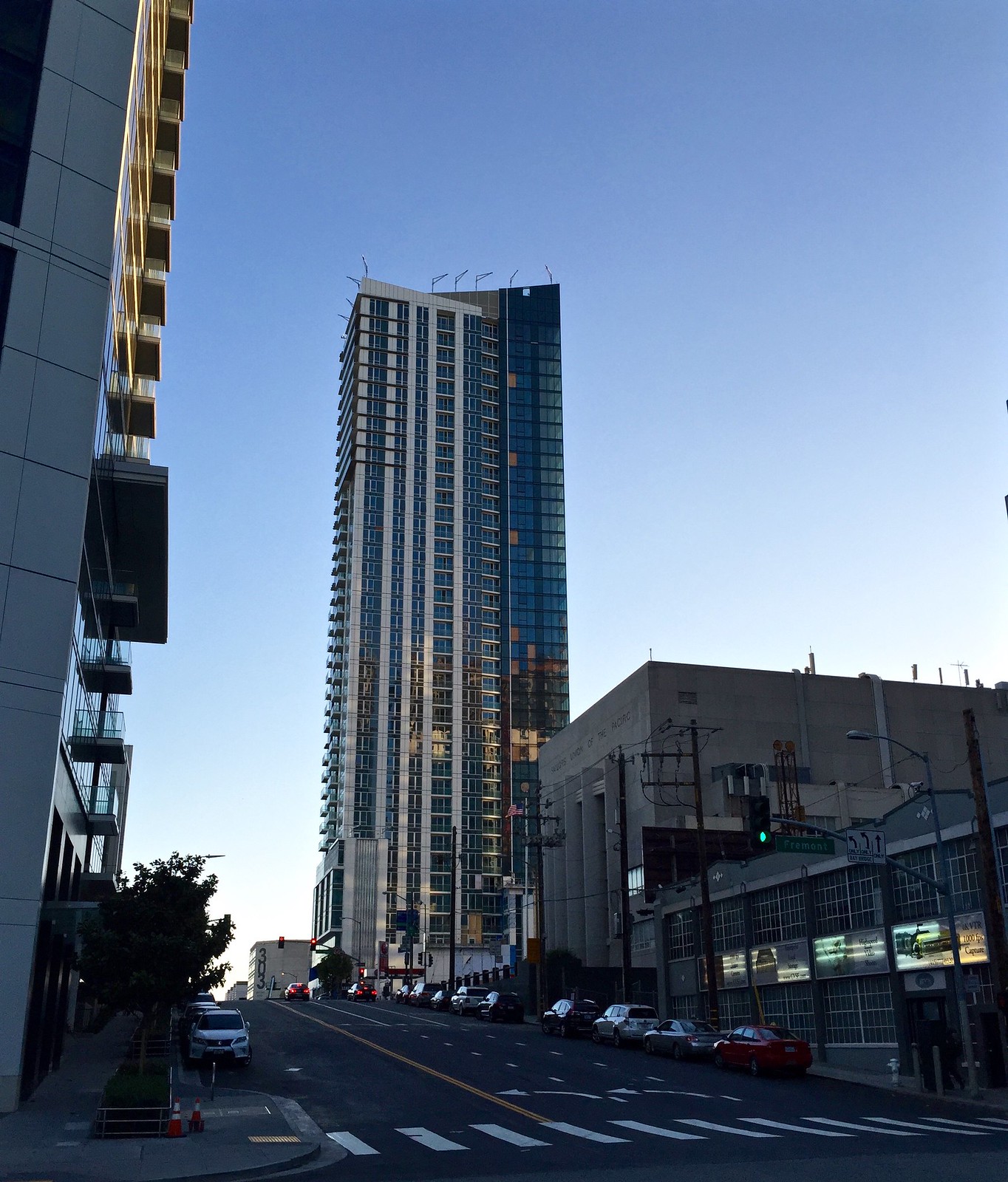
We should be happy we aren't getting a building like the Jasper in SF it is pretty bad especially because it has a large blank wall and the other side is not as nice as 45 Province so it is a mediocre building with a large blank wall and it isn't even thin like 45 province so there isn't as easy an excuse either.

The bad side
17009793939_d1e9c035fe_z.jpg


The good side
21258298461_7ab72a6c25_h.jpg
 
Yea I walk by the Jasper everyday and it's pretty blech. Other buildings in the area are solid but nothing too memorable or unique. SOMA has a lot of new buildings but yet they add absolutely nothing to the area. It's just stacking medium height glass towers on top of each other. The street activation is awful. The grid feels claustrophobic and it's all pretty grimy. Hell the best place around there is by far lower South Beach and that has had very little new development.

The great thing with Boston filler is that it's nearly all going into established neighborhoods and bettering them, even if some designs are bland. The closest SOMA equivalent we have in Boston is the Waterfront development. And the odds are good that it will be a nicer, cleaner neighborhood than SOMA. People I think overlook the fact that, despite design deficiencies for some projects, they are all highly impactful and fit into the fabric of the city. And are not just haphazardly placed.
 
Just as an aside, you do realize the John Hancock is one of the most innovative and groundbreaking glass skyscrapers ever made, right?....The most livable places in Europe are all tower negative ... Toronto has a couple nice ones and then a ton of generics and a shitty street level.... Vancouver, great street level but full of generics.....It's really hard for a city to hit that sweet spot of a Boston-like street presence, jam packed with great modern towers but not be overbearing. Maybe London does this best.

With the Copley Tower, the CSC and Govt Center garage project all looming, we're going to have some of the most unique money shots of old and new with great design and blending. That's under-appreciated around here.

Assuming this is how it roughly turns out, look at the street level elegance of this....

It's not just one tower lost in a sea of towers, it gracefully coexists with all of the classic buildings of Copley Square. You get a full view. It's really a special interaction you won't find in most any city. Not every new project has to be measured against the grain of starchitect structures. What matters is hitting those right notes at the right spot in the city. And we have some great ones coming.

Bubbybu -- Very well stated!!

The key to Boston that only London can really compare with is the variety of the buildings and streetscapes which have developed over centuries and which today are "shoulder to shoulder" at strange angles

The combination of having been at the leading-edge as a city for centuries along with the topographical underpinnings coupled with city land making produces a overall variety that is close to unique

Where else can you Stand at the intersection of State - Court with Washington and have One Boston Place [aka BNY Mellon] directly adjacent to the Old Statehouse -- one of the places upon whose balcony where the Declaration of Independence was first read in 1776

Look across State Street and you see both modern towers of varying ages and the Ames Building [eponymous Ames Plow and Shovel Co] by Shepley Bulfinch and Coolidge [1893] the tallest building in Boston [except for church steeples] until the Custom House Tower and the second tallest masonry load-bearing wall structure in the world, behind Chicago’s Monadnock Building. Looking up One Washington Mall gets you an eyeful view of the Boston City Hall -- a now 1960's brutalist icon []

Look toward the Harbor down State Street and you see Long Wharf and the Customs House Tower [496 ft (151 m)] by Peabody and Stearns [1915]-- one of the world's first 500 foot towers -- and in-turn built upon the Ammi B Yong's neoclassical temple [1849] where ships tied-up to have their cargoes inspected and duties collected up to about 1860

Now as you pivot 90 degrees and look down Washington St*1. you will see both Old South where the Tea Party began and diagonally across the street MT


PS: even if you are not near to Boston -- you can Google 1 Boston Place on Google Map and take the above tour

PPS: just a bit past the One Boston Place was the workshop at 109 Court St. operated by Charles Williams Jr. the employer of one Thomas [Mr. Watson, come here, I want to see you] it was also the site of the first telephone call to a residence*2 and where Telephone numbers 1 and 2 were located


Notes:
  • 1 actually you will need to walk a few hundred feet down Washington to see the Old South as the street curves just enough to block the view with shorter close in buildings
  • 2 left to the reader where was the other end of the first telephone line?
 
I'm speaking specifically about the design but again it is not exclusive to have both design and a good context (like One Dalton). People who think this is exclusive should be the one that stay far away from architecture.

:D +1

Also, I think the points being made are not that "our filler is worse than other cities' filler" so much as (at least from my perspective) our "best" is less impressive than many cities'* (I really dislike Atlanta--lived there 17 years--but it has some very classy/engaging buildings; ditto for Pittsburgh, Dallas, Philly, SF, NY, Chicago, Houston, Seattle...not to mention all the international cities that are setting the bar). But my point was that even if daring architecture is not one of Boston's strong suits, we have other strong suits.

*though I really like the JHT and it certainly gets props for innovation!
 
Personally I am not all that impressed by that building. It's nice but it's not any more iconic than the Hancock imo. Other than being taller I don't see what makes it so much better and the context it is in is not as nice as that of the Hancock. The triangle at the top is cool but it is not exactly groundbreaking and the Hancock was groundbreaking although there are now a ton of other reflective glass towers it was one of the first.
 
Really tall buildings in moderate sized cities like OKC and Indianapolis always come off as desperate and try-hard to me, and they always look goofy on the skyline. Context matters in architecture and I don't think these buildings can be evaluated on their own merit. No matter how nicely they are built I find them grotesque and insulting - like they think the ability to build an 800+ foot building makes them a better city than they are. You aren't fooling anybody.
 

Back
Top