You are using an out of date browser. It may not display this or other websites correctly.
You should upgrade or use an alternative browser.
You should upgrade or use an alternative browser.
30 Dalton St. Residences | Back Bay
- Thread starter Equilibria
- Start date
- Joined
- Jan 7, 2012
- Messages
- 14,072
- Reaction score
- 22,815
the one positive thing i can say about the facade that faces the plaza is that if that facade had included more glass, it mightve been more interesting but wouldve also distracted the eye away from the plaza more - which with this building, not being anything special, would be a negative. at least as is, the boringness sits in the background.
Suffolk 83
Senior Member
- Joined
- Nov 14, 2007
- Messages
- 2,996
- Reaction score
- 2,403
In a few years the view from the plaza would include the all glass 1 Dalton (am I getting that right?) tower so I bet they had that in mind when they designed this. Doesn't make it right that the design sucks from 2 sides but maybe it softens the blow.
KentXie
Senior Member
- Joined
- May 25, 2006
- Messages
- 4,195
- Reaction score
- 766
In a few years the view from the plaza would include the all glass 1 Dalton (am I getting that right?) tower so I bet they had that in mind when they designed this. Doesn't make it right that the design sucks from 2 sides but maybe it softens the blow.
The 1 Dalton skyscraper will be to the right of this tower. It won't be blocking the backside of 30 Dalton from the plaza.
Suffolk 83
Senior Member
- Joined
- Nov 14, 2007
- Messages
- 2,996
- Reaction score
- 2,403
^I'm fully aware
- Joined
- Jan 7, 2012
- Messages
- 14,072
- Reaction score
- 22,815
- Joined
- Jan 7, 2012
- Messages
- 14,072
- Reaction score
- 22,815
- Joined
- Jan 7, 2012
- Messages
- 14,072
- Reaction score
- 22,815
palindrome
Senior Member
- Joined
- Jun 11, 2006
- Messages
- 2,281
- Reaction score
- 131
This project moved FAST!
stick n move
Superstar
- Joined
- Oct 14, 2009
- Messages
- 12,148
- Reaction score
- 19,081
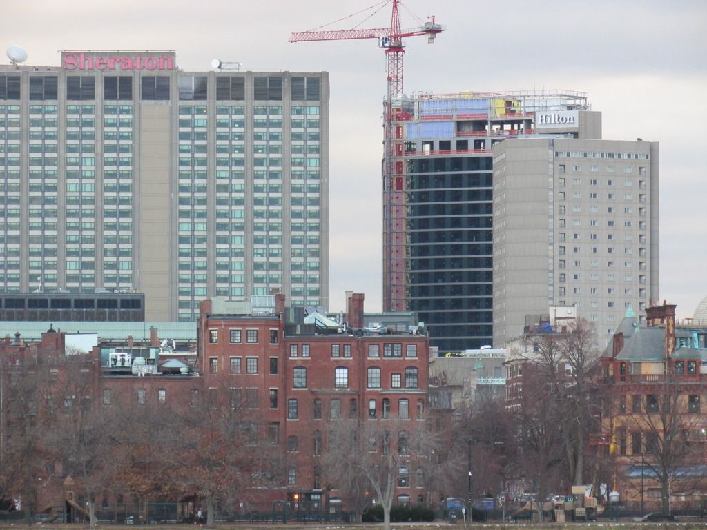
I may be the minority but very dark blue to black glass to me is very welcomed because it just looks serious. Every time I am in Manhattan even the old boring boxy black glass towers just scream serious business occurs here and bring a no frills feeling of money and productivity. Too many blue glass buildings look too light and airy and I feel you need some anchor black glass to tie it together. Obviously this is not an office tower and it has silver accenting but I like that it brings some darker glass to the back bay to contract the majority blue and red palette that is common here.
Last edited:
stick n move
Superstar
- Joined
- Oct 14, 2009
- Messages
- 12,148
- Reaction score
- 19,081
agreed.
jpdibenedetto
Active Member
- Joined
- Oct 23, 2012
- Messages
- 150
- Reaction score
- 0
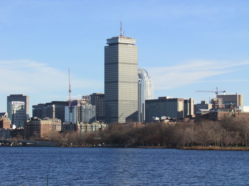
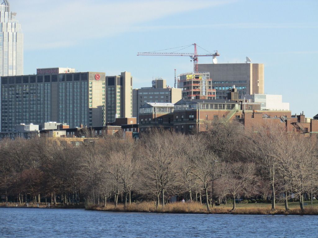
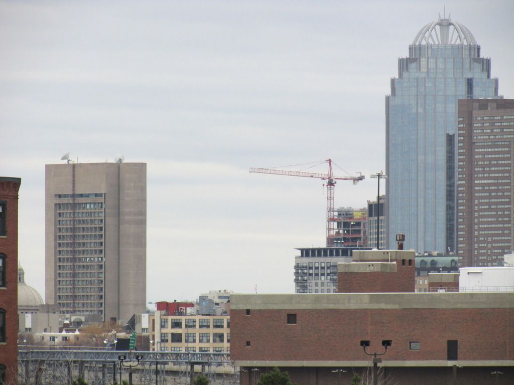
This building looks much taller in person and much more dramatic. When looking from afar you can barely tell it exists. Still I'm excited to see what a plaza looks like when you add this in with FS. This is going to bring a ton of life to the area that traditionally has been a lot of large concrete plazas.
I may be the minority but very dark to blue black glass to me is very welcomed because it just looks serious. Every time I am in Manhattan even the old boring boxy black glass towers just scream serious business occurs here and bring a no frills feeling of money and productivity. Too many blue glass buildings look too light and airy and I feel you need some anchor black glass to tie it together. Obviously this is not an office tower and it has silver accenting but I like that it brings some darker glass to the back bay to contract the majority blue and red palette that is common here.
+1
Nice take on that. i can see what you're saying.
- Joined
- Jan 7, 2012
- Messages
- 14,072
- Reaction score
- 22,815

