315 on A | 315 A Street | Fort Point

The Batterymarch building does this trick where it uses darker colored bricks on the bottom, and subtly becomes lighter as it goes up. It produces the effect of making it seem taller and gives it more vertical thrust.
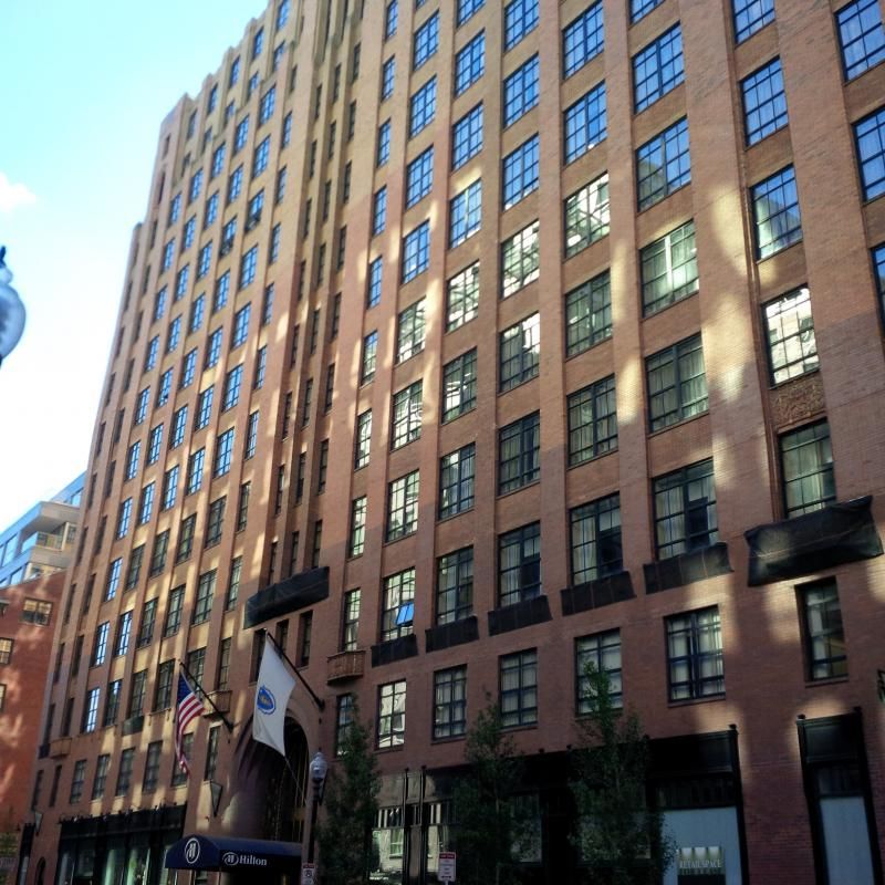
IMG_00000017_zpsad61e8c0.jpg


I'd love to see someone try the same trick with these terra cotta blocks.

Having posted this, I just noticed how much the Mandarin on Boylston takes from the Batterymarch. Never noticed it before.

Batterymarch has always been one of my favorites when I do a walk-about either by myself or with guests

Copy this one with a bit of the excessively exhuberant "Art Deco exuberance" toned-down -- a sort of Authentic "Neo Art Deco" -- and you could not fail to please -- well at least me
 
This building is the definition of class, incredible addition to the seaport.
 
This building is the definition of class, incredible addition to the seaport.

Stick -- Agreed -- now let's see if it sets a standard that others want to emulate or even surpass

Note that there is still a whole lot of Innovation and even some Seaport to be developed -- including that huge parking lot in the foreground of the picture
 
Well done but should have been at least 5 floors taller. Tired of the double height window sectioning here and in many others. They really can dilute the sense of verticality.
 
Here's a question that I don't know can be answered, but:

What's with the double height windows? Is it architects being fixated on the design? A misguided attempt at contextualizing? A roundabout way of making their buildings looks shorter so as to avoid NIMBY wrath? Seems Boston is getting more than its fair share of the colossal order lately.
 
Some interesting fog yesterday


"Skyline Shot" (sans skyline)


Ding ding. The Colossal Order simply makes buildings appear shorter.

Colossal order, maybe. Pinning this on a way of "avoiding NIMBY wrath," no.

Having attending every meeting on this project since 2006 (dragged on and on by the former owner, not the community), I can tell you "NIMBY wrath" wasn't part of the discussion.

BTW, I look forward to voting for this project as a shoe-in for Best of 2013.
 
I look forward to voting for this project as a shoe-in for Best of 2013.

Its funny the front runners for best and worst are within a few blocks of each other, and very similarity proportioned.

Regarding the colossal order; I think it makes the building. It wouldn't be nearly as dramatic with standard height, imo.
 
Cannot praise this development enough. It does exactly what it needs to, it takes cues from the surrounding area and using them throughout, its the perfect height for the area, it stands above the buildings around it and also creates the step up from south boston to the boston skyline, its built with quality materials, it even has an above ground garage that seamlessly blends in and looks like it was not an afterthought which is very rare, found a way to add balconies and not look cheesy, and its looks old but also has modern design elements. This thing is an A+ for Boston and this is exactly what we hope for every time something new gets built, but it somehow seems like nothing ever lives up to expectations. This building lived up to them and also surpassed them. Hopefully other developers will look to this and realize that you can have a quality development without having to go over the top, it just takes quality materials, a sense of scale and symmetry, and not being afraid to do something different while still not being over the top. The only negative I can even think of is that it would have been even better if it was taller, but this is the seaport and even as is it is a good height.
 
Cannot praise this development enough. It does exactly what it needs to, it takes cues from the surrounding area and using them throughout, its the perfect height for the area, it stands above the buildings around it and also creates the step up from south boston to the boston skyline, its built with quality materials, it even has an above ground garage that seamlessly blends in and looks like it was not an afterthought which is very rare, found a way to add balconies and not look cheesy, and its looks old but also has modern design elements. This thing is an A+ for Boston and this is exactly what we hope for every time something new gets built, but it somehow seems like nothing ever lives up to expectations. This building lived up to them and also surpassed them. Hopefully other developers will look to this and realize that you can have a quality development without having to go over the top, it just takes quality materials, a sense of scale and symmetry, and not being afraid to do something different while still not being over the top. The only negative I can even think of is that it would have been even better if it was taller, but this is the seaport and even as is it is a good height.

Stick -- we are witness to the birth and early childhood of a district of Boston which I think for several reasons will be as well known in the future [say 2050] as the Back Bay is today

There is a significant amount of development to come just to complete the original 2 major chunks [Fan Pier and Seaport Square] and the fringe along the harbor and Fort Point Channel

Later -- there will be a whole lot more away from the water as parking lots and 1 story warehouses give way to higher value use of the land -- and I would bet a lot of it will be residential construction

315 on A has set the bar fairly high -- let's see if the others are up to it
 
Well done but should have been at least 5 floors taller. Tired of the double height window sectioning here and in many others. They really can dilute the sense of verticality.

Brad, I fully agree. I'm not fond of this "Collossal Order" style (The new Brutalism?). We see alot of long, wide landscrapers, and the ones that threaten verticality are cooled off with double height windows. The Exeter tower (which could have been a strikingly tall building) is one example. I rarely see that in Manhattan or Chicago. It is as if Calvinist Boston is embarrassed by tall buildings and wants them to look less imposing.
 
Brad, I fully agree. I'm not fond of this "Collossal Order" style (The new Brutalism?). We see alot of long, wide landscrapers, and the ones that threaten verticality are cooled off with double height windows. The Exeter tower (which could have been a strikingly tall building) is one example. I rarely see that in Manhattan or Chicago. It is as if Calvinist Boston is embarrassed by tall buildings and wants them to look less imposing.

That is a valid design critique ... in this case the proportions are handled masterfully and I cannot say that it is poor design. I am on of those who cannot find a significant flaw with this project. I was down there a couple of week ago and kicked the tires. It does only what it has to ... and does it well. Unfortunately its one of the few projects we have seen that do that. I hope for more.

cca
 

Back
Top