88 Seaport Blvd | Seaport Square Parcel D | Seaport

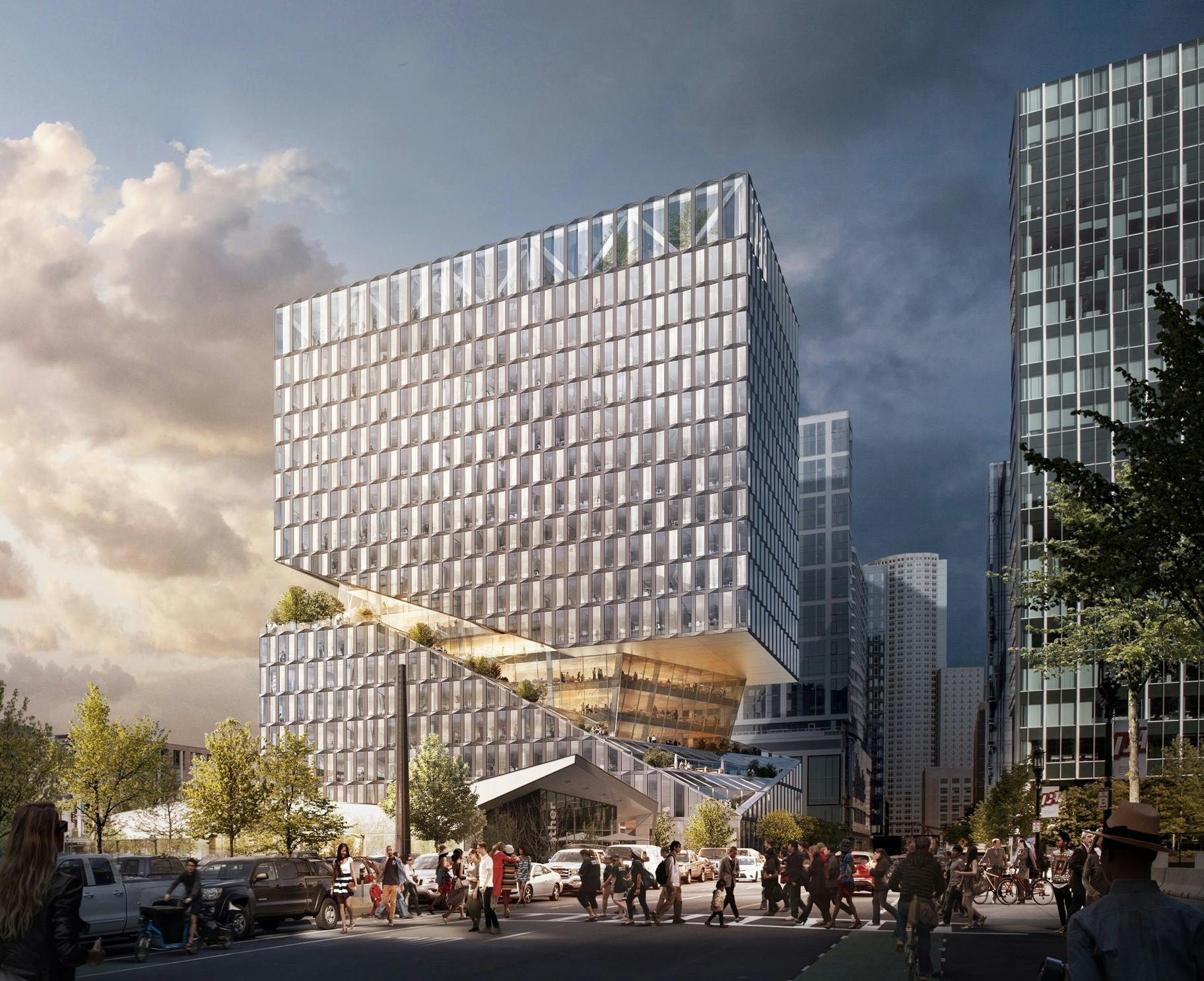
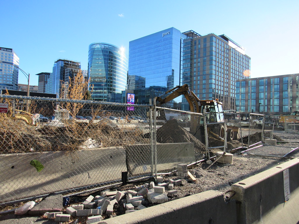
Are they just demolishing the church and then either waiting or paving the lot or are they going to jump right from this into construction of the tower right after? If they are building the tower right after this thats good news I didn't know if that render was the finalized project or if it was an idea of what could happen here when kinda looking outside of the box as far as Seaport architecture goes. It looks interesting and againnnnnn from what I can see the trees on the roof and outlines of people would lead me to believe this has yet another roof deck. I don't know if its public, but the more the merrier. Plus that deck halfway up the tower looks pretty cool especially if they have like steps going up the cut. I think I like it and thats great news if yet another parcel is going to go u/c. Anyone know the timeline?

Don't know if the design is final or not, but from what I gather from WS, it would be an office building and the deck would be for tenant use.
 
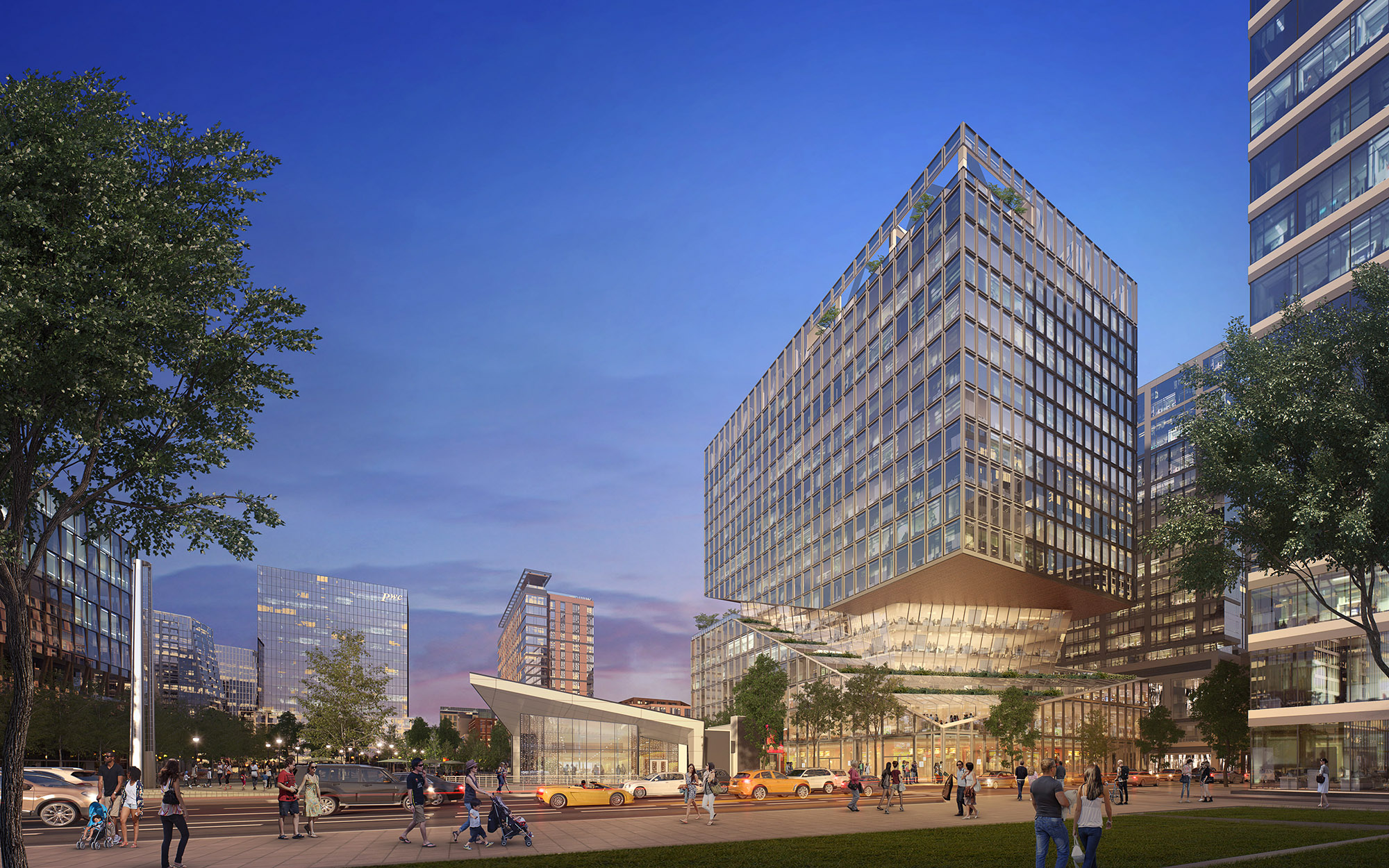
Found a new render that looks pretty cool.

file.jpg


vs the side we've already seen: Remember that triangle you are seeing at the base is a part of the innovation lounge and not this structure, but it confuses the eye for a second.

rk6ttrhidfq2ykup.jpg


It appears to tie into the other parts of Seaport Square at least on this side of the building to add to the retail element along Seaport Blvd, but its hard to tell from the renders how much. The first 3 floors do appear noticeably different than the rest of the tower though. That is consistent with Via and the Benjamin. If that is the case in the picture above there would be a very small public outdoor area for the 3rd floor of retail, if thats indeed what it is. In all the pictures though it appears as if only the first two floors are double height so maybe thats it here idk. We do know this adds another 60,000 sq ft of retail to Seaport Square though, so itll be interesting to see what goes in here, but it definitely extends what we have now further along Seaport Blvd and right up against the park and soon to be street which is a win.

686184216_960.jpg
 
Last edited:
This is great. Especially for it's location....

As opposed to that (error) set to go up at 380 Stewart Street.
 
Its location is also right next to the park so its strategically located to stick out more than most buildings as youll be able to see the entire side of it for most of seaport blvd. Since its one of the more "exciting" designs this will make the area overall look more exciting. If your down by parcel K you will have 150 seaport and this within your direct view on the right side of seaport blvd and parcel M on the left dominating that side. Its going to look good. Then as you go past this building which is covering the rest of seaport sq you will mainly see the very lively retail floors of the benjamin and via next to you and if you look up the rest of the towers which I think came out good imo but their not flashy.

Just like with any city some nice buildings placed in highly visible areas and the less flashy more tucked away give a better overall appearance. 150 seaport is really going to be a game changer for the area architecturally as well as thats probably going to be the crown jewel of the seaport as far as a single tower goes. The court yards of parcel M and the rest of seaport sq I think are also going to be massive successes. The way seaport sq connects to summer st. with the steps makes the entire project a very short walk through beautiful fort point to south station so it has great transit access too with these steps leading to and from summer st. I think thats one of the most important aspects of that project and for the seaport overall. When you have interesting things to walk past it makes it much nicer of a walk than a bunch of parking lots or empty space. South station is very close to the area it just feels further because of how disconnected it is. Once it fills out and your walking past people, store fronts, trees, and the fort point neighborhood its going to be much better. In reality its a very short walk straight down summer st then heading down these steps leads you right into the heart of the seaport.
 
This is architecture with a capital A. If that excites you ... thank feel free to be excited. If it bothers you ... well ... it's going to be quite a ride.
 
This is architecture with a capital A. If that excites you ... thank feel free to be excited. If it bothers you ... well ... it's going to be quite a ride.

Yeah, but we haven't heard much about this for about 2 years now. Not sure this doesn't come back heavily VE'd.
 
I don't hate it... I guess. It still just looks like a glass box that someone randomly cut some pieces out of for no good reason. At least those new renders aren't set in heroic lighting like the ones from March.
 
"Hello Boston: we're trying to stuff 360,000 sq ft into 260' of height. Aren't you all excited?? We sure are!!"
 
Damn, I just saw this thread and thought, Oh man, finally, it's gonna happen and with the design I love. Such a letdown!
 
Stick, what's the source of the new renders? I was really hoping OMA would be able to shine with their first commission in Boston, but it's already losing some texture/complexity in the newest renders...
 
Yeah, but we haven't heard much about this for about 2 years now. Not sure this doesn't come back heavily VE'd.

Stick, what's the source of the new renders? I was really hoping OMA would be able to shine with their first commission in Boston, but it's already losing some texture/complexity in the newest renders...

Bingo! That's what I was just thinking. If the recently posted renders are indeed newer, then it is already being VE'd from the looks of it.
 
1. no news.
2. possibly VE'd if (anything) but nothing official.
3. This is Boston.
4. Stick bumped it.
5. Can't speak for the rest. But i feel dirty, and manipulated.
6. The thought of this building going up is about as exciting as a day spent in *Tucumcari, NM.
rinse and repeat.


*(It's just not that great. Please excuse me, if you're from Tucumcari).
 
Umm if you read my post I was clear that there was no news and came across new renders while looking for something else, so I posted them. So... the people who wanted to see them, could, nobody even needed to respond at all and it would be on pg 2 by now. You manipulated yourself lol...
 
Last edited:
Umm if you read my post I was clear that there was no news and came across new renders while looking for something else, so I posted them. So... the people who wanted to see them, could, nobody even needed to respond at all and it would be on pg 2 by now. You manipulated yourself lol...

But there's a noticeable difference in the texture of the facade between the ones you just posted and the ones we had previously seen. The most recent ones appear to have flat, square panels, while the older ones had a visible folding pattern. It already looks much flatter.
 
I asked someone on the design team about these - these are older renderings from an old leasing deck distributed to brokers i the early days of this project, not newer ones. This person said the newer, more textured facade design, is still current.
 
I asked someone on the design team about these - these are older renderings from an old leasing deck distributed to brokers i the early days of this project, not newer ones. This person said the newer, more textured facade design, is still current.
Good to hear, thanks!
 

Back
Top