You are using an out of date browser. It may not display this or other websites correctly.
You should upgrade or use an alternative browser.
You should upgrade or use an alternative browser.
ACKS | Alexander Center Kendall Sq. | 50 Binney | E Cambridge
- Thread starter BeeLine
- Start date
cca
Senior Member
- Joined
- Aug 19, 2008
- Messages
- 1,408
- Reaction score
- 12
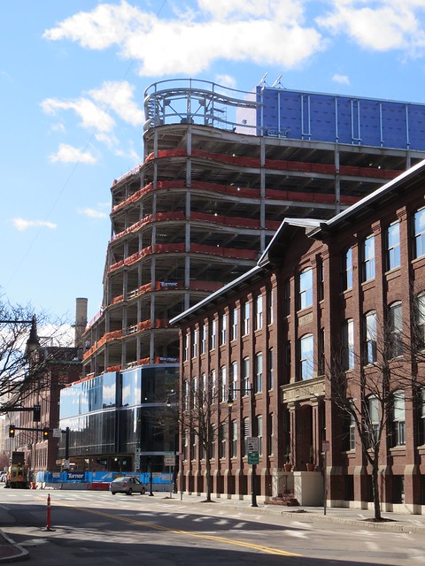
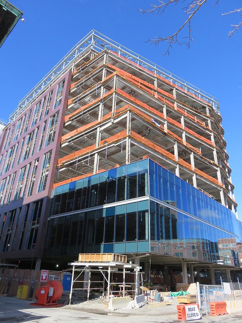
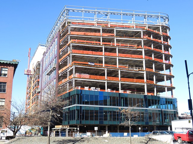
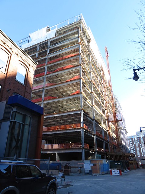
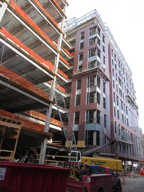
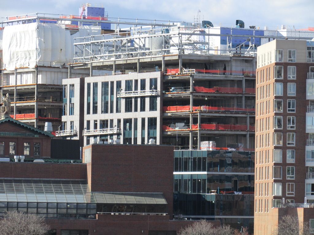
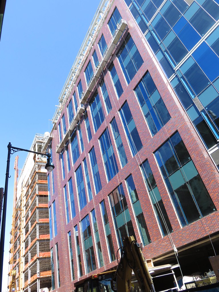
I like the color, but the dimensions of the "brick" panels are so clearly not masonry (too slim, too tall) that it screams fakery. Like the vinyl wood grain stickers put on the sides of 80's era station wagons.
See post 59. Precast panel with integrated thin brick. Cheap and fast (and sometimes handsome which this might end up being).
cca
Ps. All exterior materials of commercial/institutional quality buildings are "fake". The wall that is doing all the work is behind that "stuff" that you see. Brick=Veneer. Stone=Veneer. Terra-Cotta=Veneer Metal Panel=Veneer. Exterior cladding should always be thought of as "thick paint". This is not true for smaller scale construction however. Clapboards are still clapboards.
- Joined
- Jan 7, 2012
- Messages
- 14,062
- Reaction score
- 22,731
- Joined
- Jan 7, 2012
- Messages
- 14,062
- Reaction score
- 22,731
- Joined
- Jan 7, 2012
- Messages
- 14,062
- Reaction score
- 22,731
- Joined
- Jan 7, 2012
- Messages
- 14,062
- Reaction score
- 22,731
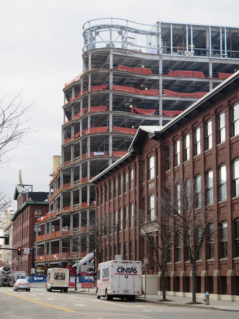
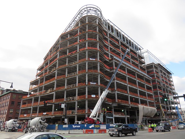
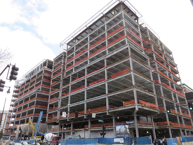
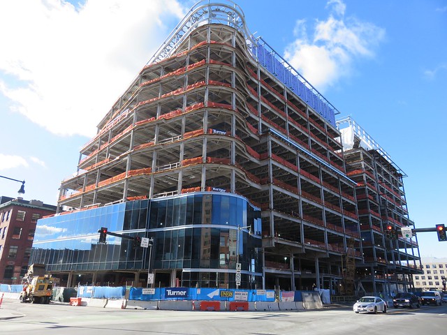
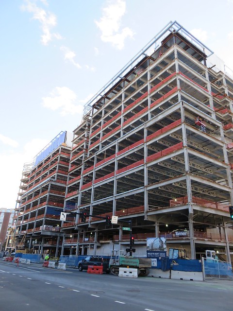
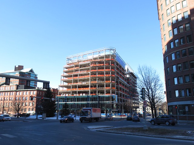
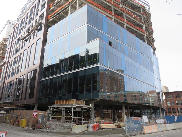
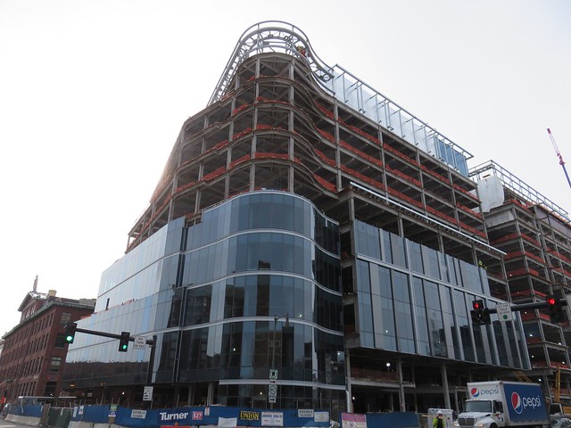
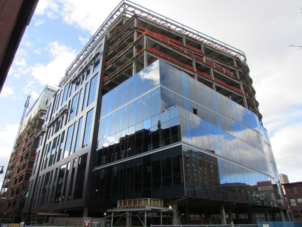
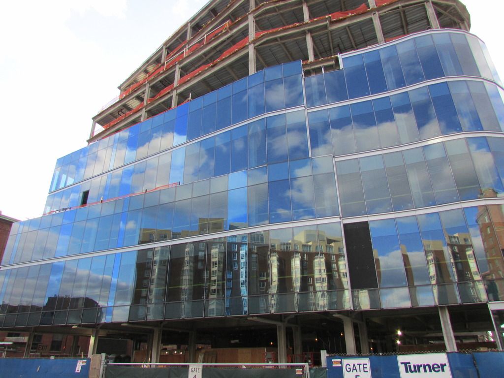
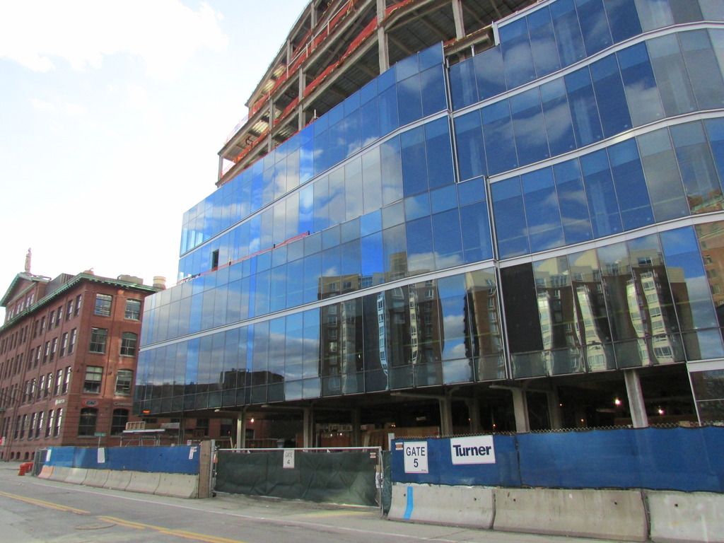
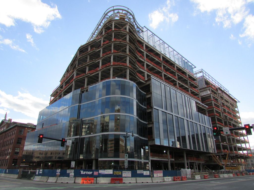
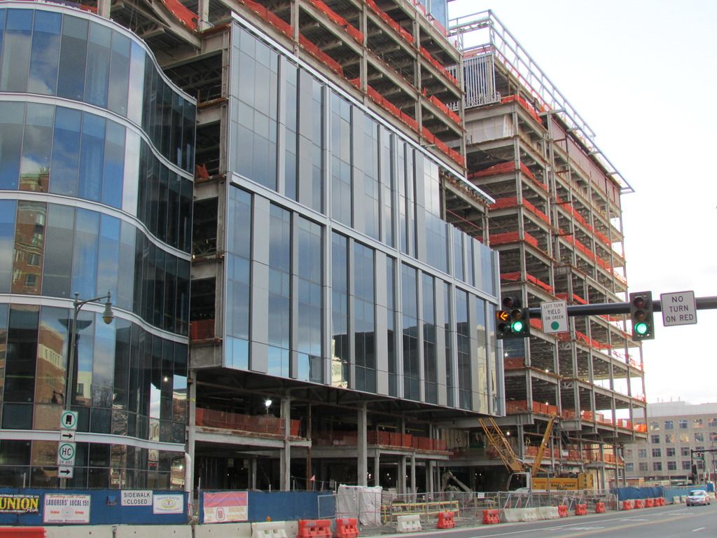
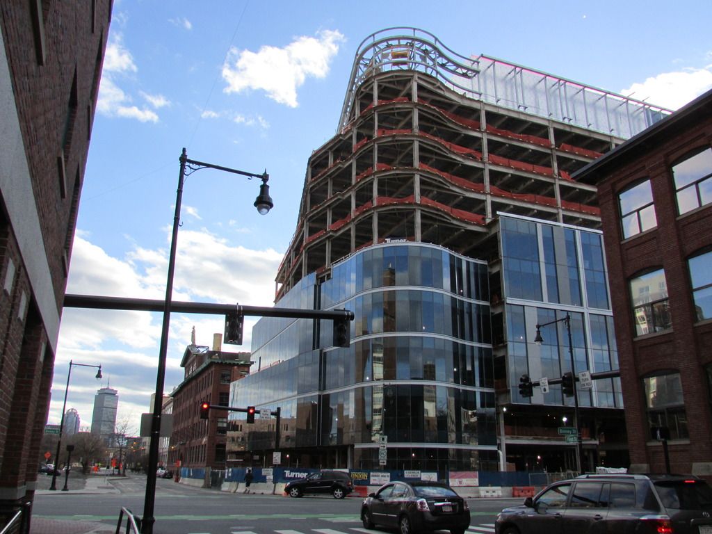
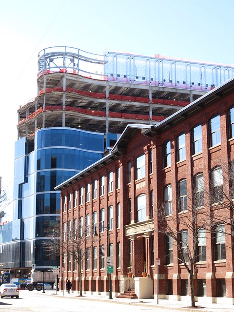
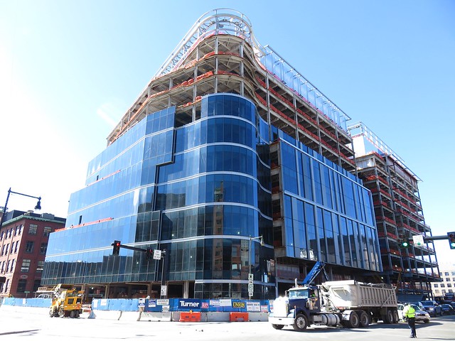
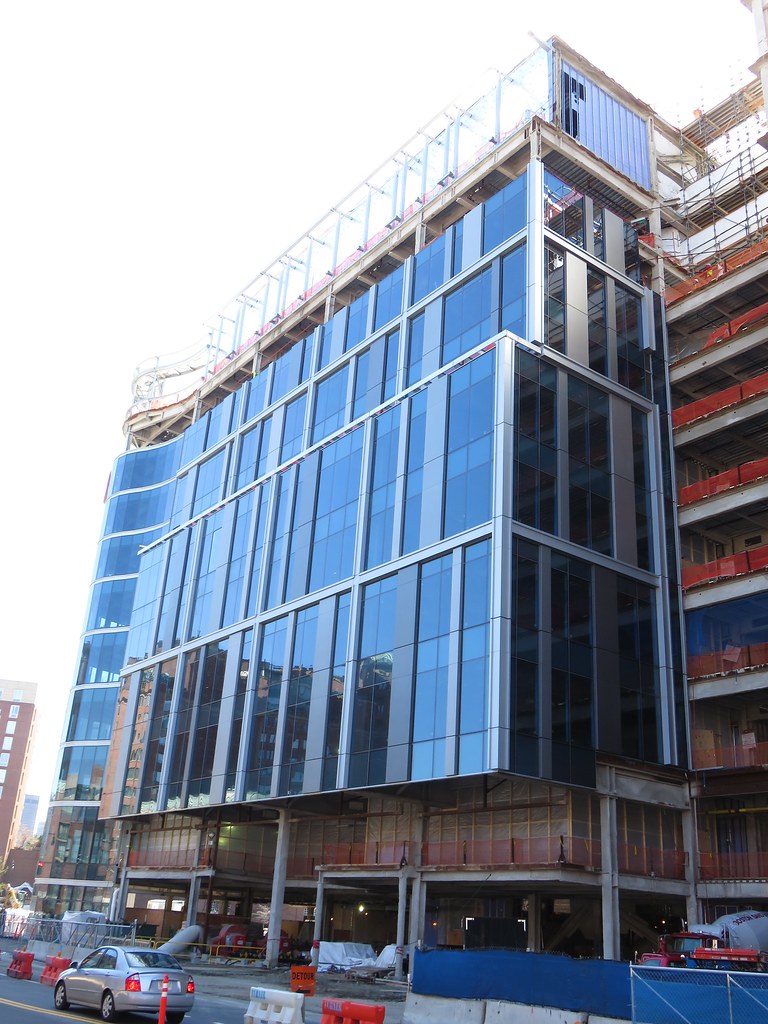
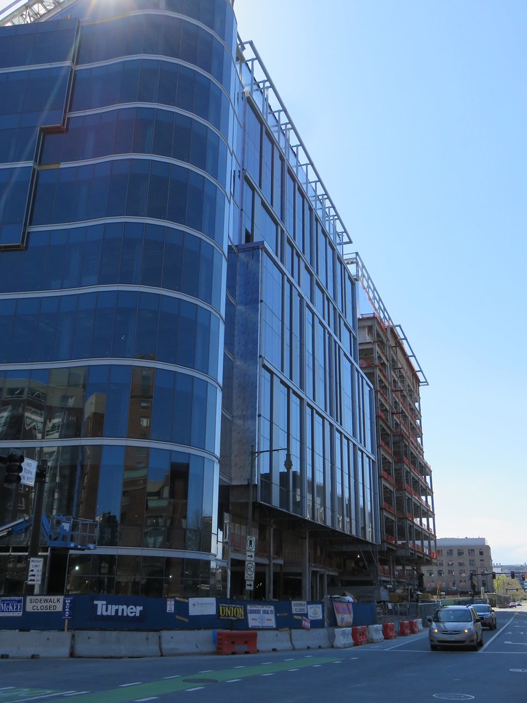
I like the scale of the building and the glazing and everything, but I think that the transition from the curved corner to the splayed angles looks very sloppy. It could be just me, but I don't dig it.
Yeah. I'm really trying to like the building. I think if the point of tangency of the curve was aligned with the angle of the splay (if that makes any sense), this would be much more appealing to me, IMHO. I will wait until glazing is complete to render final judgement.
mdd
Active Member
- Joined
- Mar 14, 2008
- Messages
- 805
- Reaction score
- 170
Yeah. I'm really trying to like the building. I think if the point of tangency of the curve was aligned with the angle of the splay (if that makes any sense), this would be much more appealing to me, IMHO. I will wait until glazing is complete to render final judgement.
Yeah, that's exactly what I was thinking.
JeffDowntown
Senior Member
- Joined
- May 28, 2007
- Messages
- 4,795
- Reaction score
- 3,660
Yeah. I'm really trying to like the building. I think if the point of tangency of the curve was aligned with the angle of the splay (if that makes any sense), this would be much more appealing to me, IMHO. I will wait until glazing is complete to render final judgement.
I had the same impression looking at the pics. I will wait for completion, but that glazing junction just looks sloppy.
- Joined
- Jan 7, 2012
- Messages
- 14,062
- Reaction score
- 22,731
- Joined
- Jan 7, 2012
- Messages
- 14,062
- Reaction score
- 22,731
- Joined
- Jan 7, 2012
- Messages
- 14,062
- Reaction score
- 22,731
- Joined
- Jan 7, 2012
- Messages
- 14,062
- Reaction score
- 22,731
RandomWalk
Senior Member
- Joined
- Feb 2, 2014
- Messages
- 3,324
- Reaction score
- 5,201
That curve just doesn't look like it will age well.

