You are using an out of date browser. It may not display this or other websites correctly.
You should upgrade or use an alternative browser.
You should upgrade or use an alternative browser.
Apple Store Thread ][
- Thread starter statler
- Start date
- Joined
- May 25, 2006
- Messages
- 7,034
- Reaction score
- 1,875
It would be better at night with the statue lit up holding a glowing Apple.
kz1000ps
Senior Member
- Joined
- May 28, 2006
- Messages
- 8,983
- Reaction score
- 11,829
Last night:
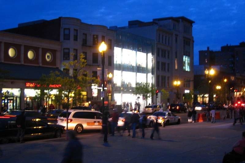

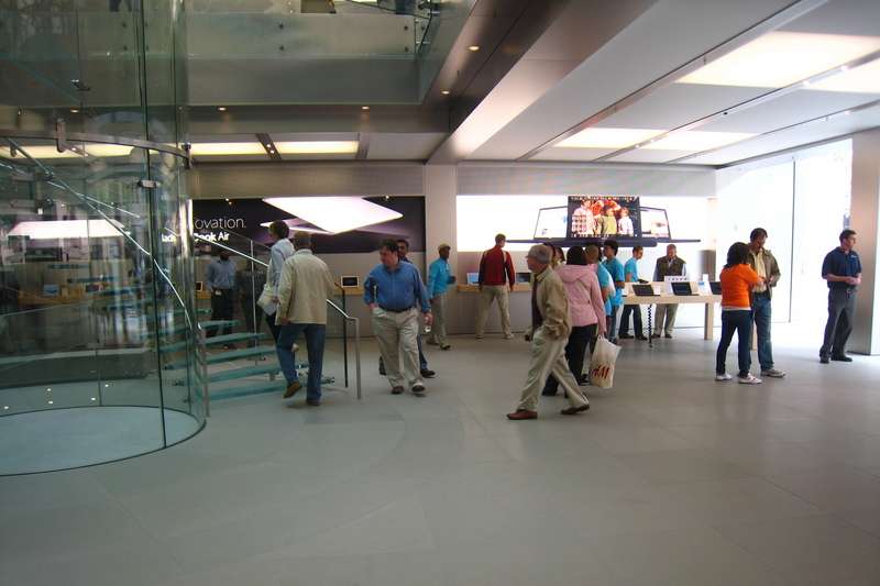
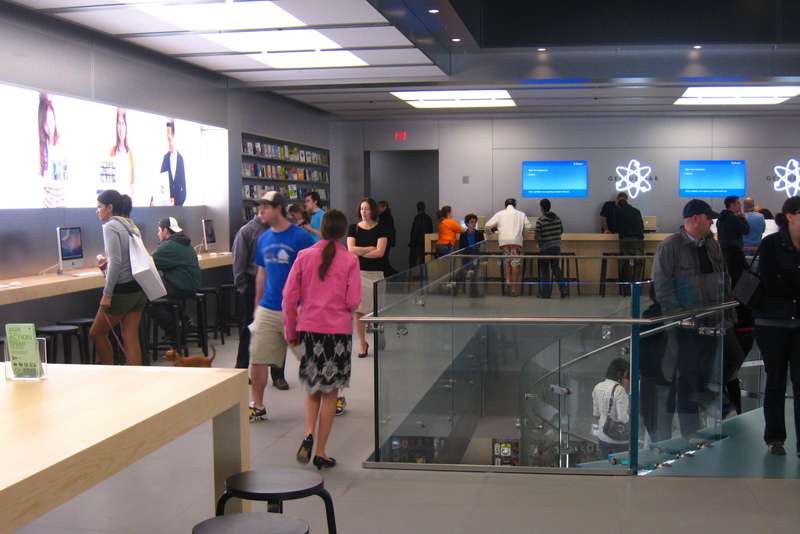
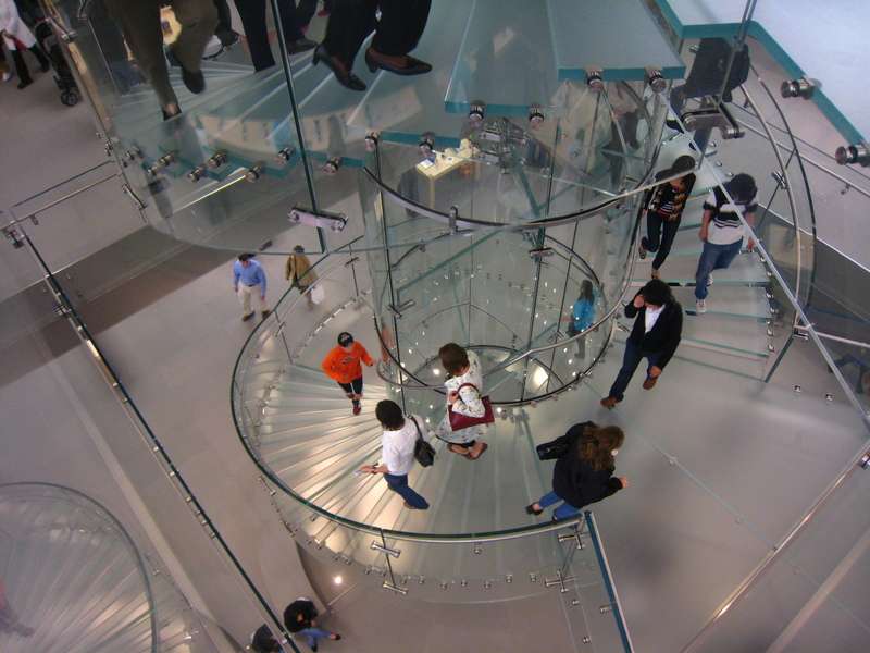
the transition from outside to inside is nearly seamless, almost disconcertingly so.
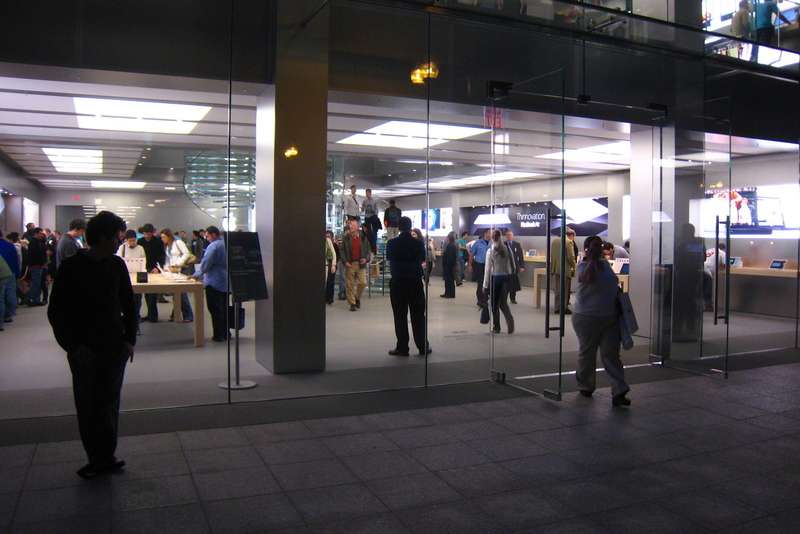

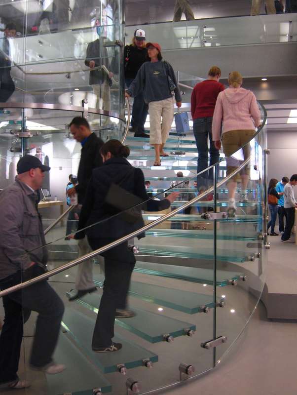


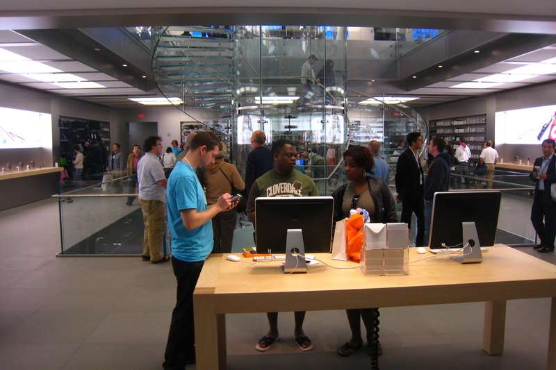
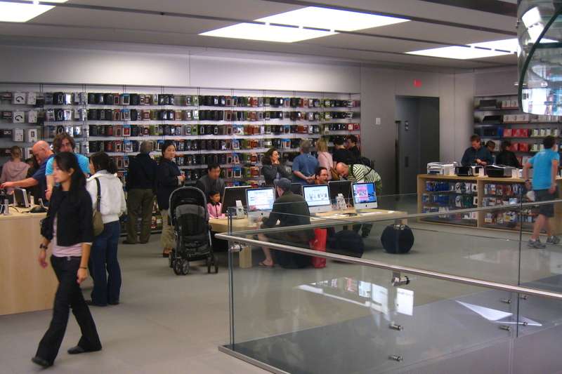
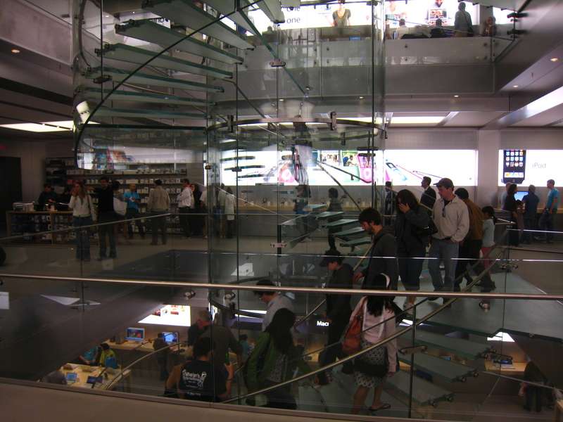
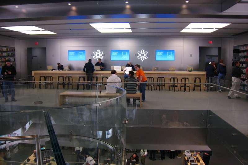
my genius bar is bigger than yours
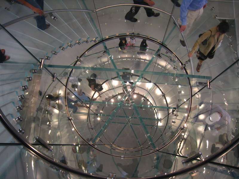
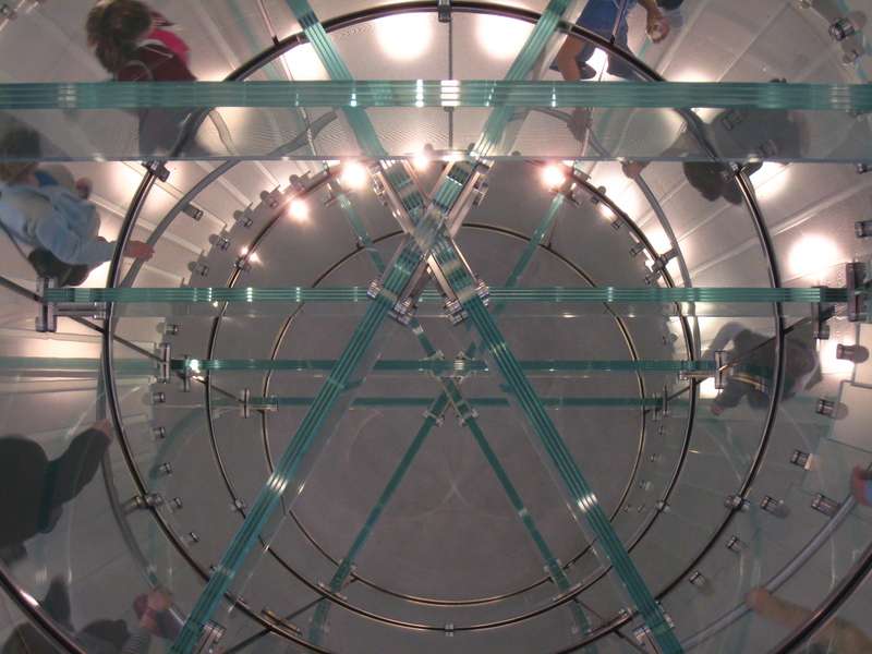



B&W

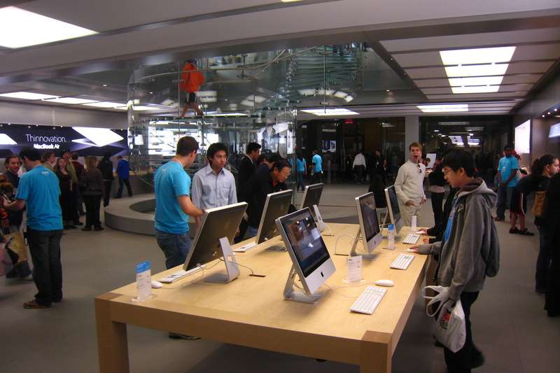
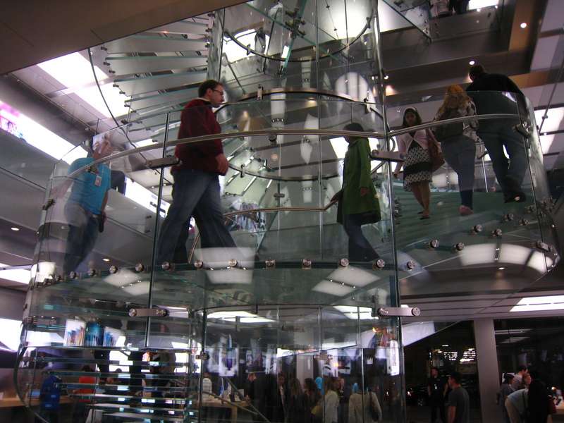
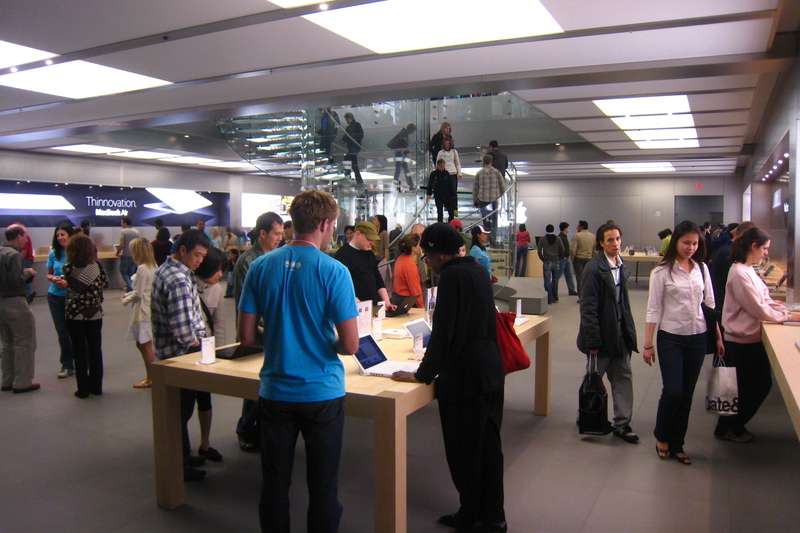
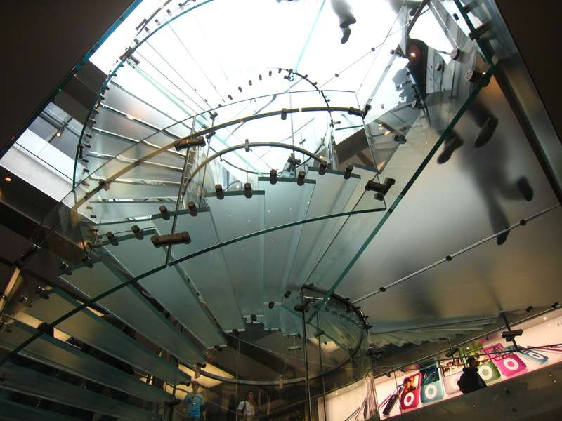
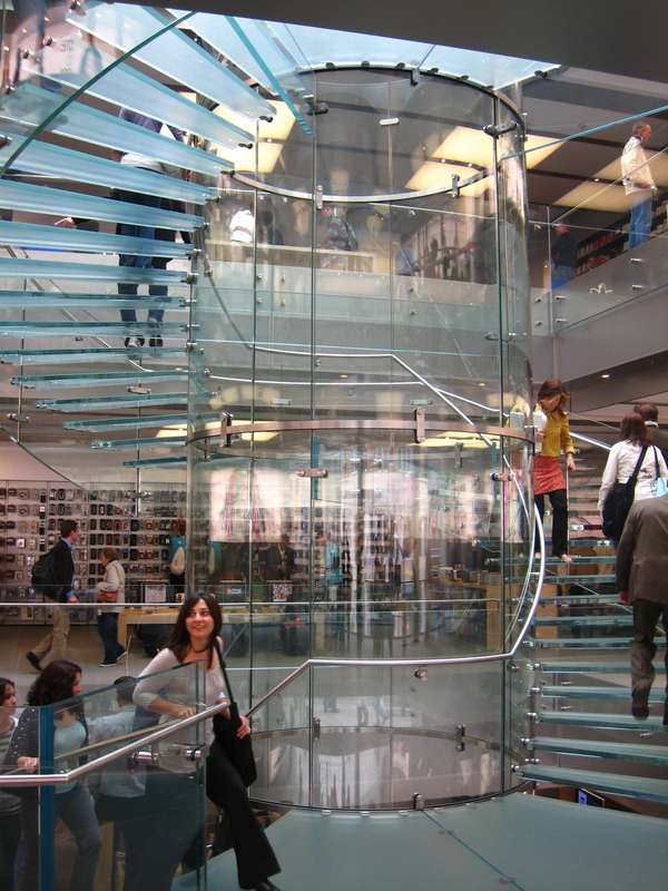
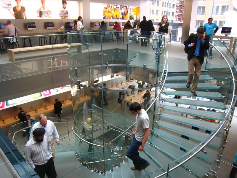
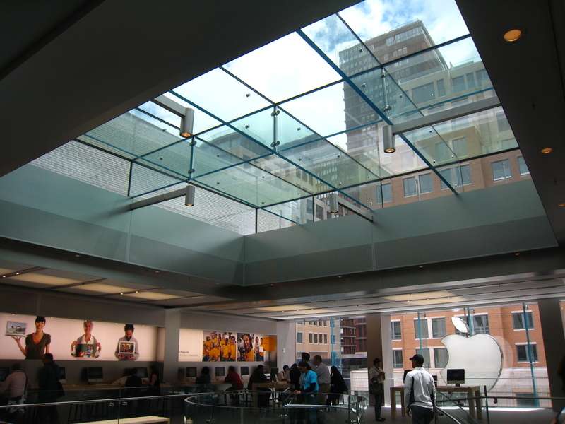
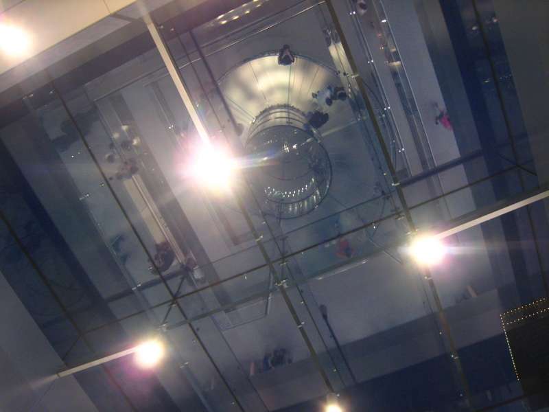
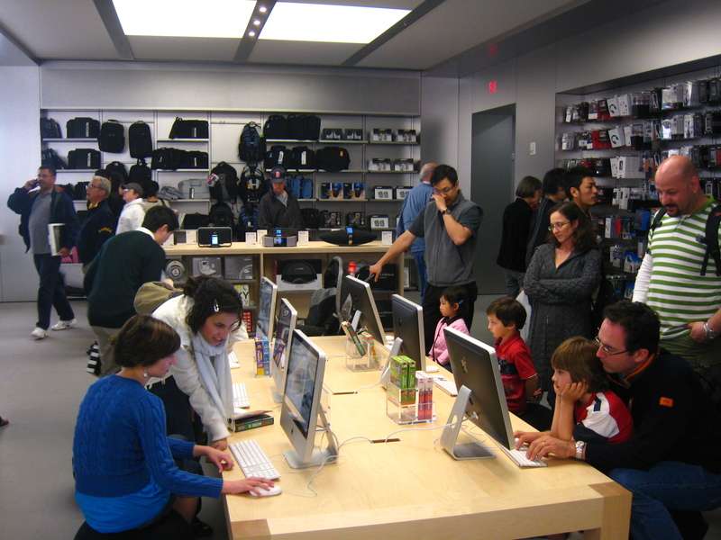
It's very, very grey in there, but the staircase is great, if a bit disorienting (if you look down at or think about walking up the steps, you'll probably trip). Also, the store is rediculously bright from outside.


the transition from outside to inside is nearly seamless, almost disconcertingly so.


my genius bar is bigger than yours


B&W


It's very, very grey in there, but the staircase is great, if a bit disorienting (if you look down at or think about walking up the steps, you'll probably trip). Also, the store is rediculously bright from outside.
Ron Newman
Senior Member
- Joined
- May 30, 2006
- Messages
- 8,395
- Reaction score
- 13
Mike the Mad Biologist has some issues with the design of Boston's Apple Store. Most notably: did the architect realize that Boston often has rain?
I decided to do a bit of research on the rain thing, and I was surprised at some of the statistics:
Number of days per year of .01 inch of precipitation:
Syracuse: 171
Cleveland: 156
Seattle: 154
Detroit: 136
Miami: 129
Boston: 126
Chicago: 126
Indianapolis: 126
Milwaukee: 125
New York City: 121
Anchorage: 117
Philadelphia: 117
Atlanta: 115
Tallahassee: 115
Baltimore: 113
St. Louis: 111
Columbus: 110
Memphis: 107
Houston: 106
Kansas City: 106
Honolulu: 98
Denver: 89
San Antonio: 82
Dallas/Ft Worth: 79
San Francisco: 65
El Paso: 49
San Diego: 42
Phoenix: 36
Los Angeles: 35
BarbaricManchurian
Senior Member
- Joined
- Mar 12, 2007
- Messages
- 1,067
- Reaction score
- 65
Three new videos of the grand opening:
Apple Store Boylston - Slideshow
[youtube]sZtRFKGyMLg[/youtube]
Apple Store - Boylston - Boston, MA
[youtube]CiAiQ4GAbR0[/youtube]
Apple Store Grand Opening - in Line
[youtube]RGKONMsMrOY[/youtube]
Apple Store Boylston - Slideshow
[youtube]sZtRFKGyMLg[/youtube]
Apple Store - Boylston - Boston, MA
[youtube]CiAiQ4GAbR0[/youtube]
Apple Store Grand Opening - in Line
[youtube]RGKONMsMrOY[/youtube]
palindrome
Senior Member
- Joined
- Jun 11, 2006
- Messages
- 2,281
- Reaction score
- 131
He returns!!!! 
This building is lovely. Perhaps the only really good Boston building of recent yrars? Restores faith in modernism.
I beg to differ. It took real talent to make a building that matches the height of its neighbors, fills its lot, and still manages to feel like a missing tooth in the streetwall:

The gray grid behind the glass was, I think, put in at the behest of neighborhood context-guardians, and it helps to some extent. But only so much: in addition to being ugly, it doesn't so much as syncopate with any of its neighbors' rhythms.
This is architecture as corporate logo, an infinitely more tasteful cousin to those Cheesecake Factory storefronts.
justin
Last edited:
the site joins with its neighbors. facade is understated, but unique within boston. the materials are intentional, rather than cost based, and represent, in part, a perspective on the building's civic place.
you can argue about the style, but a) it's far from the worst apple has put up, and b) it's barely branded. and to the degree brand is a factor, the brand is of the world of architecture and the building itself represents apple's licensing fee.
you can argue about the style, but a) it's far from the worst apple has put up, and b) it's barely branded. and to the degree brand is a factor, the brand is of the world of architecture and the building itself represents apple's licensing fee.
Beton Brut
Senior Member
- Joined
- May 25, 2006
- Messages
- 4,382
- Reaction score
- 338
You're a tough man to please, justin, though I can't really disagree with:
An Apple fan would suggest you consider that the "value of design" has always been part of Apple's brand identity. This simple, quiet whisp of a building is trying to express its contents.
Craig Ellwood & Gordon Bunchaft would both like it. That's good enough for me.
justin said:This is architecture as corporate logo, an infinitely more tasteful cousin to those Cheesecake Factory storefronts.
An Apple fan would suggest you consider that the "value of design" has always been part of Apple's brand identity. This simple, quiet whisp of a building is trying to express its contents.
Craig Ellwood & Gordon Bunchaft would both like it. That's good enough for me.
Considerable truth to what you say, justin. What do you think of the bite Guggenheim takes out of Fifth Avenue's streetwall?I beg to differ. It took real talent to make a building that matches the height of its neighbors, fills its lot, and still manages to feel like a missing tooth in the streetwall.
underground
Senior Member
- Joined
- Jun 20, 2007
- Messages
- 2,390
- Reaction score
- 3
^Were those taken on Monday ~4-5pm-ish? I saw someone taking pictures and thought it might be an ArchBoston-er.
Crit Happens
New member
- Joined
- Apr 21, 2008
- Messages
- 18
- Reaction score
- 0
The "missing tooth" comment is apt, and yet . . .
Even though in photos taken from across the street the Apple Store seems "less" than its neighbors (less opaque, less reflective, less solid) my impression is that it also has considerable charisma and presence. I realize that these are harder qualities to measure, let alone describe, and I don't want to start a debate on whether this building has them; my point is only that if it does, that can make up for a lot. (Not unlike the Guggenheim.)
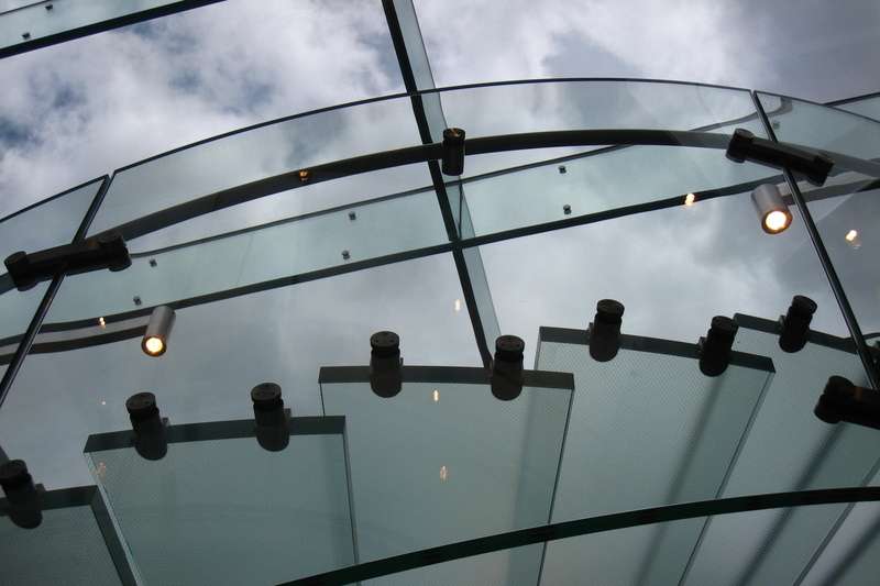
The unfortunate thing that I've observed is that by day, when approached from the west or the east, the Apple Store reflects enough light that it does perform its neighborly duty of continuing the street wall, but from those angles it also looks completely off-putting and, because of irregularities in the glass, a little flimsy.
So, ironies: The expensive skin turns out, from some angles, to look cheap; and the building has its greatest presence both when that expensive skin is at its most invisible (from across the street) and at its most visible (from up close, where you can see the panes and the hardware).
I consider myself a very amateur architectural critic, but to me, I've very fond of this building. To me it says, Boston is still relavent and still in touch with trends. It's not so much that boston needs to be a "trendy" city, but when a current architectural style is noticebly missing, it is an indication that the city lapsed during a period.
As a popular trend now across much of the western world is minimalist, translucent, rectangles, I think this building scores very well against its peers. It takes a style that is difficult to engage at the street level, and does that well, while also providing subtle detailing, that makes it slightly more than a translucent recantangle, while escaping the now worn-out trend of visible x-bracing.
The fact that it is a "missing tooth" in my opinion is what makes it unique and invites further discovery by the average pedestrian. In this example, I think it excels, because the scale and detailing are correct, and the person who just did a double-take, will move on realizing that a tooth wasn't missing (can't be said for the corner of Newbury and Dartmouth), but that a snapshot of Boston history has been modified (tastefully) to include a small nod to a changing world.
The challenge will be for this to blend timelessly, which its too soon to know. I would argue that Back Bay's previous attempt (the "glassstone" on Marlborough near Hereford) failed in this regard, but it was a matter of context where the prevailing style there was so focused, it never had a chance to become part of the streetscape.
Ok...ending my faux-architectural critique....in other business, the crappy condition of theprint shop next door is now magnified next to this gleaming building.
Ron Newman
Senior Member
- Joined
- May 30, 2006
- Messages
- 8,395
- Reaction score
- 13
So, a question for all of you who followed this saga closely: did the Back Bay neighbors' input improve this project, diminish it, or have no real impact?

